Research on Man Ray and Moholy Nagy, 1920-1930.
|
Man Ray
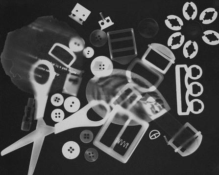
Man Ray was an American photographer born in 1890 and died in 1976 in Paris. He is most famous for his cameraless photography such as his photograms which he would call his "rayographs" which he would take by placing objects on photosensitised paper and exposing it to light. Man Ray was a photographer in the 1920's but his unique style and images put his work on the same level as avant-garde painters at that time; because of how abstract and also representational Man Rays' "rayographs" were, he created a new way of seeing which pleased the Dadiast poets of that time who appreciated his work which leaded the way to Surrealist writes and painters who then followed on from the Dadiast Poets. When creating his "rayographs", Ray would often capture the stark and unexpected effects of an negative image, variations in exposure time for different objects in an image, movement of the objects while materials were being exposed and the unusual positioning of objects such as necklaces and spoons. In addition to these, Man Ray would also often use stationary objects such as paper clips, scissors and other small piece such as buttons and many objects with spiral patterns. |
Moholy Nagy
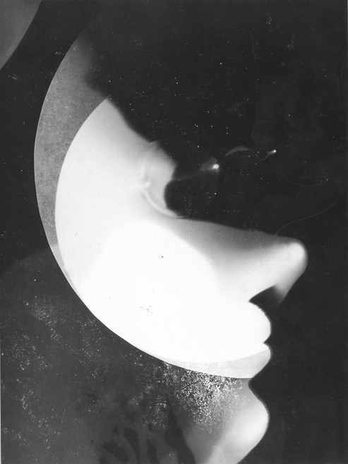
Moholy Nagys work was often an embodiment of the utopian spirit of the avant-garde's. His work often portrayed Post-war artist, modernist, Commercial designs themes. Bauhaus teachings he brought to US photogram technique: Moholy Nagy would place things such as his hand, face, paintbrush and other objects on a sheet of photographic paper and expose it to light. Exploring the optical and expressive properties of light Nagy believes that photography will transcend painting and incorporate it to be one of the most vital mediums of artistic expression in the modern age. |
Floris Neusüss
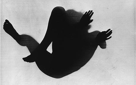
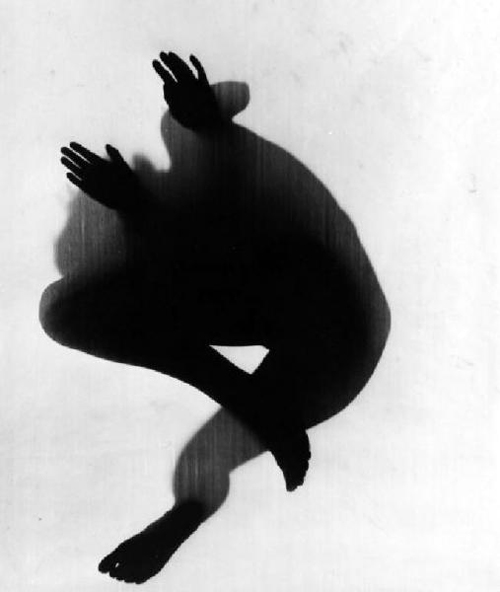
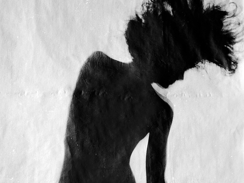
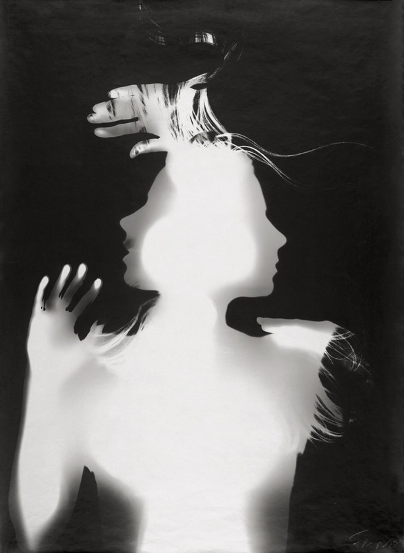
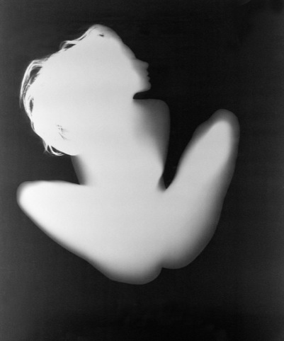
Floris Neusüss created full-body photograms, inspired by the work of Man Ray and Lazlo Moholy-Nagy. When creating his photograms, Neusüss would have his subjects lay on photosensitive paper and then expose them to light. The result of the photograms would be similar to stencils and Neusüss himself referred to these kinds of photograms as "nudogramms" due to the sensual interpretation of the human body.
In Neusüss' images, he captures women in the foetal position, making them look like they are simultaneously moving but staying still and removed any identities of the women by showing no facial details other than the basic silhouettes. Often the subject would also be central to the image and with nothing but them in it; other times Neusüss has used things such as flowers or buildings in the background or overlaid to give more depth to the image.
His work has very low contrast so the images often seem flat or only have grey tonal shadows within them and the shadows have not got harsh distinguishing lines between the blacks and the shadows/highlights.

|
|
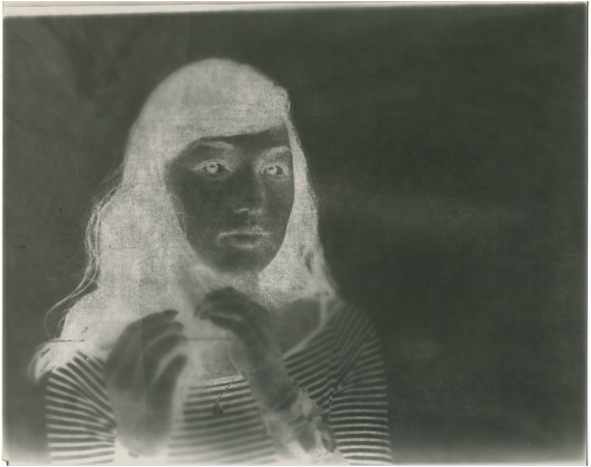
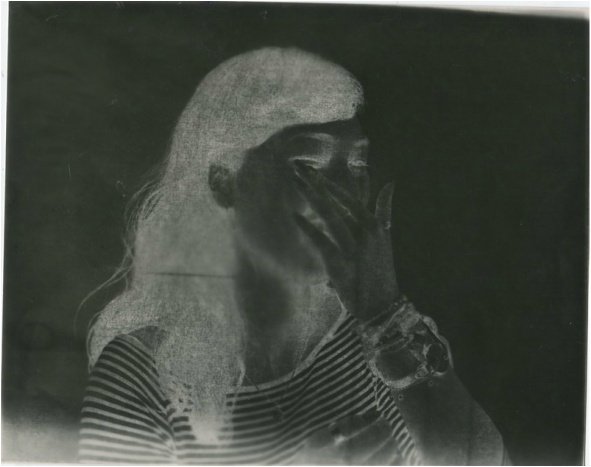
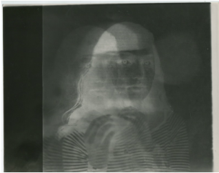
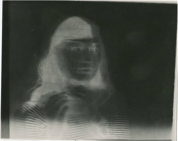
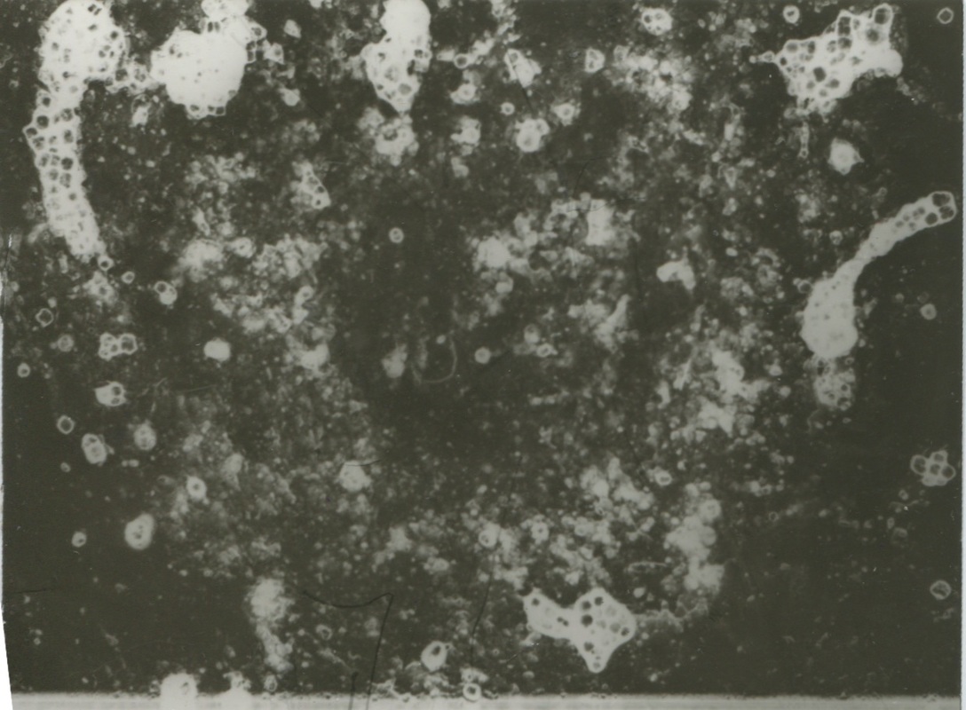
Photogram experimentation. (Number 1) |
While creating these photograms as a response to Man Ray and Maholy Nagy's work, there were a few images that didn’t develop in the way that they should have and therefore I have a different outcome than I had initially expected.
Some of my photograms show my image in a clouded manner rather than the standard black and white image a photogram normally creates. Two of my original photograms have come out in this way as I used different aperture settings and possibly the development times were different for the second experiment process and there was error in the development process. For example, I may not have placed in the developing fluid as long as it should have been or a time ratio that didn't fully developed the images. However, I decided to write about these images as although they didn't come out as I expected, I like the effect they created and can use them to improve my next work.
Some of my photograms show my image in a clouded manner rather than the standard black and white image a photogram normally creates. Two of my original photograms have come out in this way as I used different aperture settings and possibly the development times were different for the second experiment process and there was error in the development process. For example, I may not have placed in the developing fluid as long as it should have been or a time ratio that didn't fully developed the images. However, I decided to write about these images as although they didn't come out as I expected, I like the effect they created and can use them to improve my next work.
Photogram, Aperture experimentation. (Number 2)
While creating these photograms, there was again a few images that I didn't like the turn out of them as they were either over-exposed or I had under-developed them and the outcome was not as affective as I had wanted.
When creating my photograms, I experimented with the aperture settings and how long the paper was exposed to light to see how this would change the photograms and how the light would effect the objects. For my first two photograms, I used a piece of paper that I had twisted and folded to make a spring like shape.
For my other photograms, I experimented with having images placed on top of the paper and then changed the settings to see how these would affect the contrast within the photograms. I found that for these photograms that f8 was the best aperture setting with a 5 second exposure to light. By using these settings I found that I had the best range of contrast and tone. The image was less blurred and details were more poignant. I chose not to display the other photogram as it came out as stark black and I felt as if it did not represent how I wanted the experiment to turn out.
|
|
For two of my images, using the images placed over the top, I tried moving them to see how this would change the photograms and whether or not it made them more interesting or not. I started doing this by what I thought was an accident when I moved the paper before the light timer had gone and i got a blurred, movement motion when I developed the photogram. I really liked this affect so I did it to another one but changed the time setting to 6 seconds and purposefully moved the image overlaying the paper every 2 seconds slightly to get a more defined figure each time I had moved the paper and it resulted with a very gaunt-like image which I felt exactly what I wanted and decided that It was my favourite image from the whole experiment.
|
|
Research of the work of Pierre Cordier
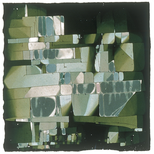
Pierre Cordier is known as "The father of Chemigrams" and was born in 1933, Brussels. He is considered as the pioneer of the chemigram and the development of it used in an a way of artistic expression. He discovered chemigrams in 1956 ; he discovered that a resistant could hold back on the chemical effects of the developer and of the fixer on black or white photo paper. He found that if the paper had been exposed to normal room light for various amounts of time, it would turn black, expect for when he had used a resistant to block the chemical reaction from occurring.
Pierre Cordier Photogram Evaluation
I am interested in this photogram because each chemical drip looks like a silhouette, which gives it the elusion that each drip is a person. The contrast becomes a sort of gradient as at the bottom of the image there is high contrast and you can see deep blacks and bright whites but as your eyes move up the image, the contrast becomes softer and there is less depth in the blacks and the whites become more of a warm tone. Cordier has produced an abstract image as all the the shapes in this image are unrecognisable and you cannot make out what the objects in this image could have been. There is a lot of texture in this image due to the contrasting tones and the changes in those tones so it makes you feel as if each part of the paper where the chemicals have not dripped, are sunken in added depth and texture to the chemigram so that you could imagine feeling the surface of it. Cordier used household things to use as resists so in this chemigram it is possible that he would have used oil, which is a soft resist, or wax or varnish, which are hard resists. Because of the way the chemicals have dripped down the paper it is most likely that he either sprayed them off from a close distance or dripped them on with something like a dropper.
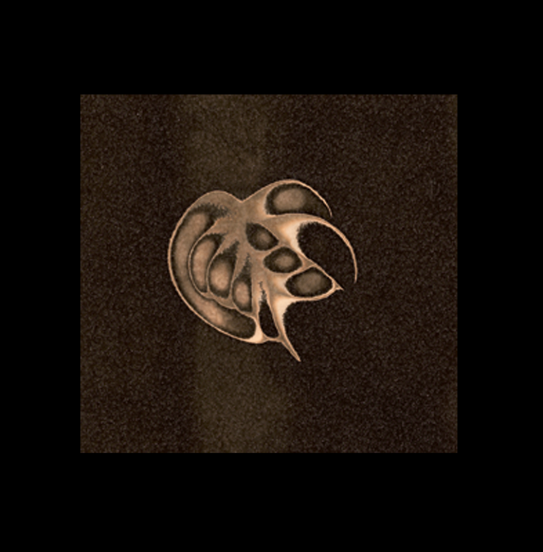
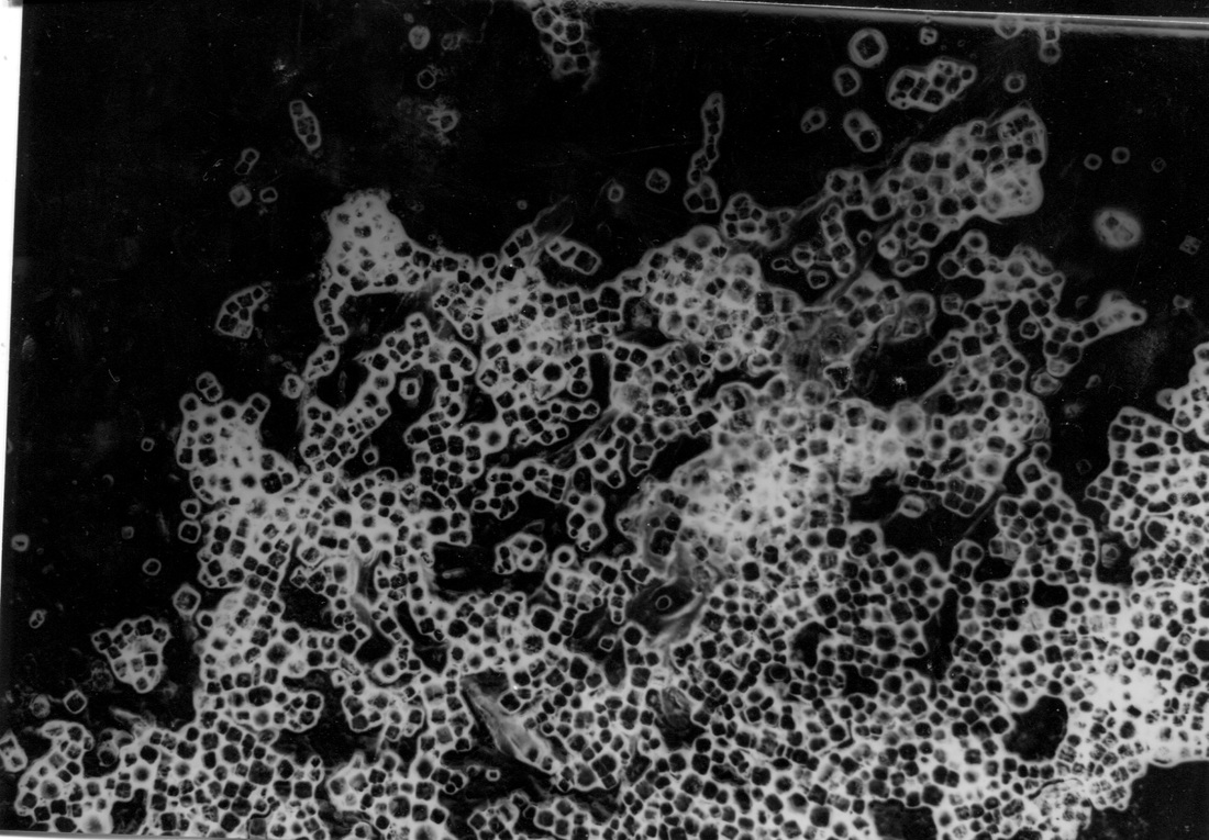
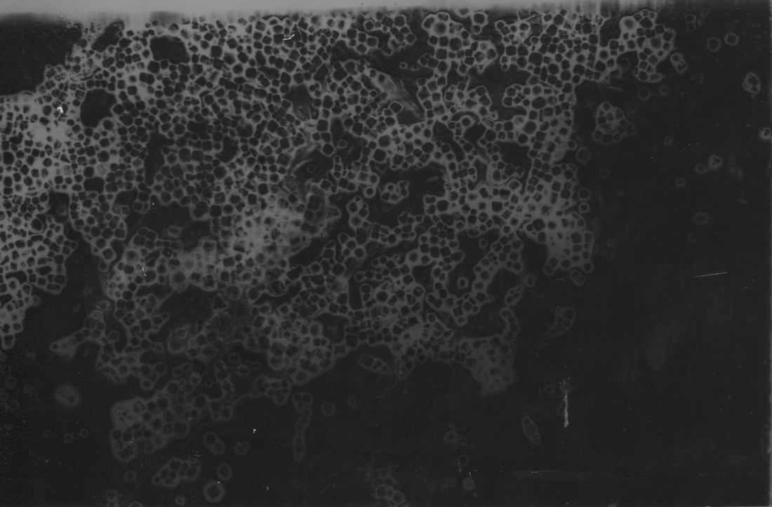
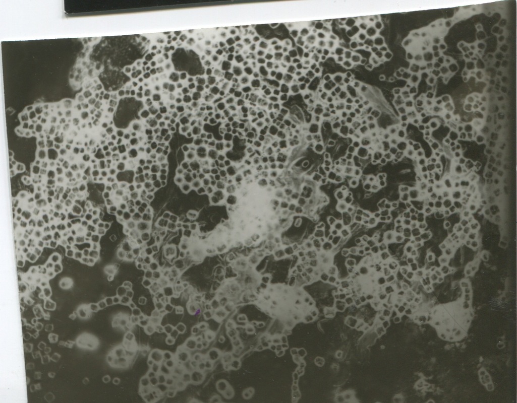
Photogram Experimentation. Specific Objects. (Number 3)
For this third photogram experimentation, I focused on specific objects and how they reflected light. I chose to focus on rocks and crystals to see how the opacity of the rock would change how the light was presented in the photograms.
When the rocks were more clear and translucent, this showed in the photogram and there was often highlights and darker parts to the stones and when they were more opaque, a more solid dark coloured appeared on the photographic paper. I arranged my stones and crystals first in an order that I was pleased with, I then adjusted the aperture to f2.8 and had my light exposure setting at 6 seconds. I found that this made the photograms come out very flat and it lacked depth in the stones. For my next set, I adjusted the aperture to f4 and the exposure to 7 or 8 seconds varying depending on how many objects I had on the paper and what they were like, whether they were more translucent or opaque.
When the rocks were more clear and translucent, this showed in the photogram and there was often highlights and darker parts to the stones and when they were more opaque, a more solid dark coloured appeared on the photographic paper. I arranged my stones and crystals first in an order that I was pleased with, I then adjusted the aperture to f2.8 and had my light exposure setting at 6 seconds. I found that this made the photograms come out very flat and it lacked depth in the stones. For my next set, I adjusted the aperture to f4 and the exposure to 7 or 8 seconds varying depending on how many objects I had on the paper and what they were like, whether they were more translucent or opaque.
Chemigram evaluation
We experimented with chemigrams and using different resistants to see how they capture the light. When experimenting we used two types of light, semi-day light and full natural light where the blinds were completely open, allowing as much light in as possible. We also experimented with how we developed them by using different processes such as only putting the photo in the developer or just stoping and fixing them. With each different process came a different outcome. I experimented with different ways to apply the 'resists' by using cotton buds, straws, my fingers and also just pouring small amounts of liquid on. The resists also varied in consistency and texture such as oils, hand creams, bleach, cleaning solutions and even nail polish.
Disinfectant (Life Guard) + Oil
Developer
In this chemigram, I used a cotton bud to smear the Life Guard across the entire middle section to create a resist on the photographic paper and I then used another to smear oil on the top section of the paper in small lines. I only put this in the developer so that the colours will always be changing and exposing to the light. I like the difference in both texture and contrasts of the oil and the life guard as the light guard has left a large purple hued mark across the middle but the oil has left a darker pattern against the already dark background with some white spots within it. The Life Guard has also spread through the paper creating an effect as if there is a light behind it emerging around it.
Hand Cream + White Spirit
Developer + Stop
To create this chemigram, I used white spirit on a cotton bud and a straw to blow out patterns and hand cream also on a cotton bud. The white spirit created a light effect with splotches of larger light areas. This again, like my other chemigram, created a starry effect but this time it was more contained and more organised in the placement of the white spirit. By adding the hand cream using a cotton bud, it looks more like scuff marks than anything else on the chemigram but it adds texture to the chemigram and contrast to the white spirit as its more rough and rustic whereas the white spirit has a more soft effect.
The paper has stayed a dark colour while the light areas have a purple/brown hue to them because of being put in the stop.
White Spirit + Spray Bleach
Developer + Stop
When creating this chemigram, I used white spirit on a cotton bud to spread it around and then sprayed the bleach and bended the paper to allow it to drip off. There isn't much contrast between the two resists.
Developer + Stop
When creating this chemigram, I used white spirit on a cotton bud to spread it around and then sprayed the bleach and bended the paper to allow it to drip off. There isn't much contrast between the two resists.
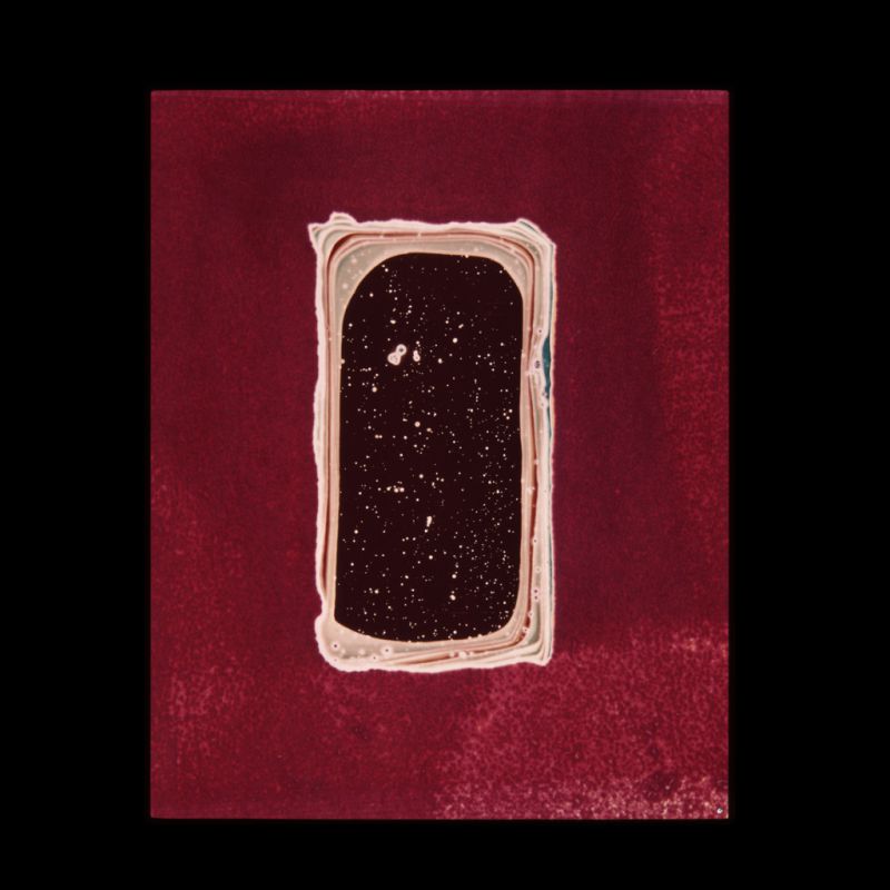
White Spirit
Developer + Stop
When the photo first came out it had bright whites on a dark black/purple background which made the image look very starry and is if it was a photo of lights rather than a chemigram. By not fixing the photo, it will always be changing and the colours will keep changing. That is why now the photo has lost a lot of its brightness and the vibrant whites have dulled out and have a brown/red hint to them. The background also no longer has a purple hue to it and is completely black. This is because I put it in the developer.
|
|
|

EVALUATION .........................
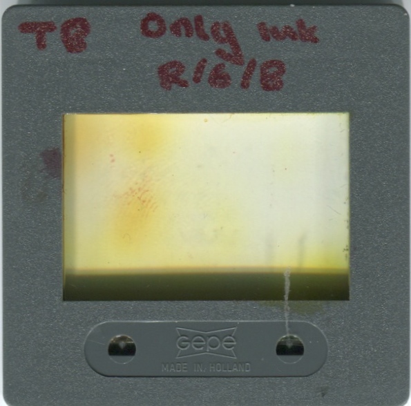
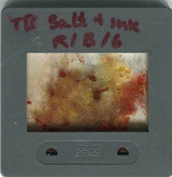
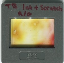
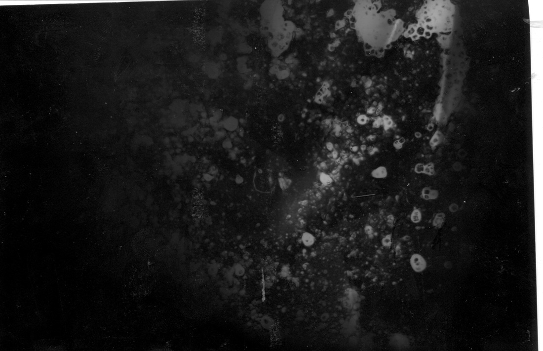
Making our own slides
In my next experiment, I made my own negative slides by putting chemicals between two pieces acetate paper and holding them together in a slide. On each of my slides, I used food colouring and then added salt to one and petroleum jelly. I also scratched marks onto one of the just food colouring slides. We used the petroleum jelly to help stick the salt to the acetate. We did this so that we could clearly see all the textures and tones when we put them in the enlarger. My favourite slide is the first one I did with just food colour. I made this by adding three separate dots of food colouring and dragging them into each other with a paint brush. With the colours were compressed by the acetate, they merged together to create an ombre kind of effect. The purpose of this was to be able to understand how slides work, practice using negatives to prepare for using our own negatives and also experimenting with textures and the focus on the enlarger.
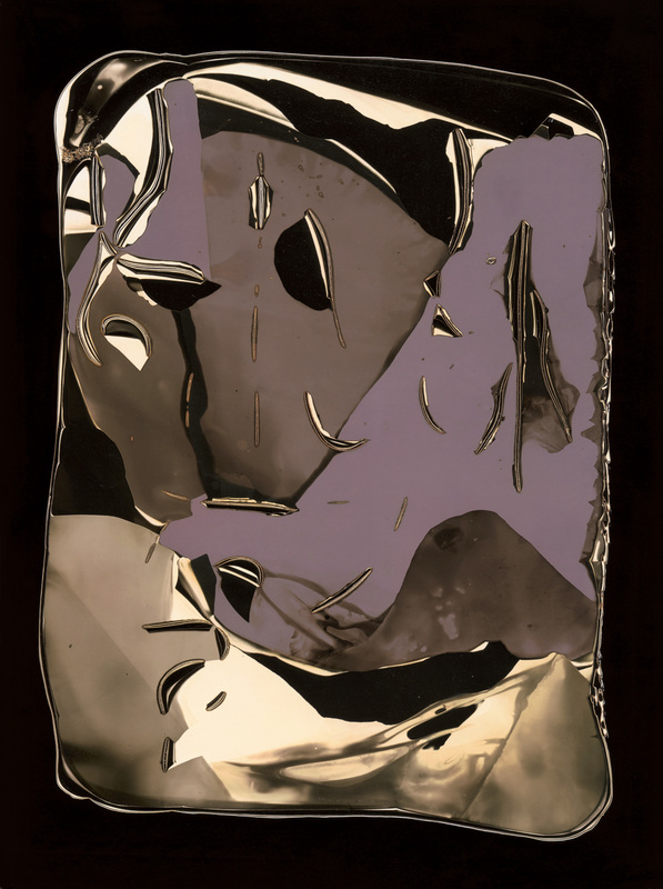
Eileen Quinlan

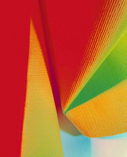
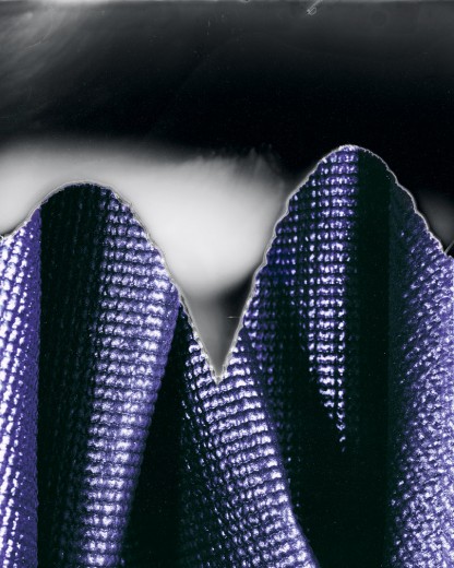

Eileen Quinlan, a still-life photographer, born in 1972. Her work is supposed to be straightforward. She usually uses medium- and large format cameras and studio strobe lights to shoot tabletops. She is fascinated in materials and how mirrors reflect the intensely coloured light, deep shadows, bits of fabric, wisps of smoke, photographs, etc.
In my opinion, I would class her work as photography as it follows most of the threshold concepts and develops on threshold concept #5. She helps us see the world in a different way than how we see them with our eyes by using light and texture to manipulate the image. She makes us only see the object which she has depicted
In my opinion, I would class her work as photography as it follows most of the threshold concepts and develops on threshold concept #5. She helps us see the world in a different way than how we see them with our eyes by using light and texture to manipulate the image. She makes us only see the object which she has depicted
