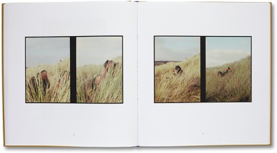
Diptychs
What is a diptych?
Diptychs are an excellent tool for telling a photographic story. They are made by presenting two or three images which can be from the same session or they can be polar opposites to show the oppositions and contrasting opinions and ideas. The follow images are an example of some Diptychs by different artists:
Diptychs are an excellent tool for telling a photographic story. They are made by presenting two or three images which can be from the same session or they can be polar opposites to show the oppositions and contrasting opinions and ideas. The follow images are an example of some Diptychs by different artists:
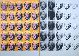
Andy Warhol - Marilyn Monroe Diptych
|
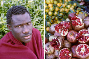
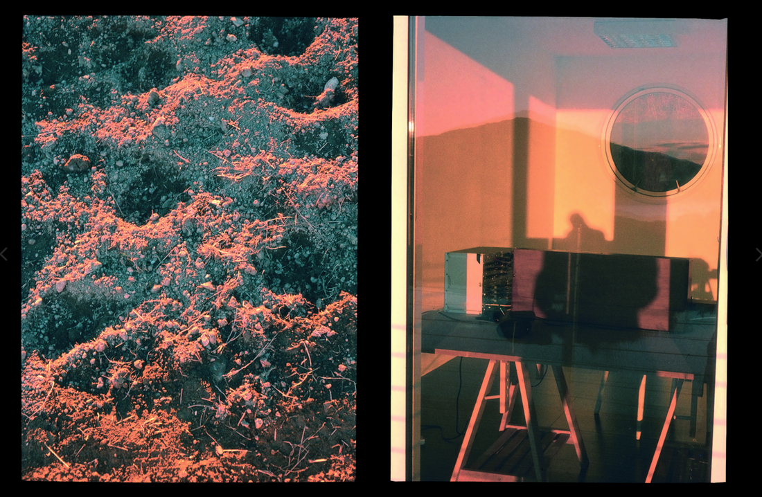
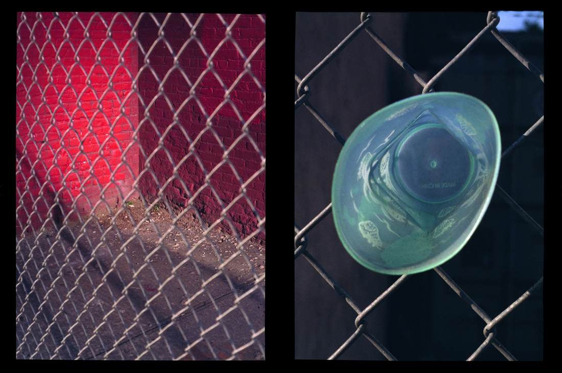
Osma Harvilahti - A trip to Africa
|
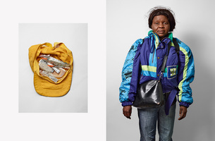
James Mollison - What refugees carry with them
|
|
Andy Warhol. Marilyn Diptych, 1962.
As a painter, Warhol expropriated common media images - comic strips, sheets of stamps, ads for dance classes, photos of wanted criminals, pages from tabloids - and painted them in acrylic on to canvas. Wahol created these diptychs using contrasting colours such as bright, colourful prints on one side in comparison to the monochromic images on the other side. |
Osama Harvilhati is a Finnish Photographer who has created a series of diptychs from a trip to Africa that he went on. Often, his pairings and diptychs tend to use colour, tone and shape to create visual, conceptual links between the images. Most of his pairs consist of street portraits paired with photographs of mundane objects in the local area. In this photograph, he has paired a portrait of an African man against a green, leafy background with a burgundy cover wrapped around him, with a photograph red pomegranate fruit with their brown outer-skin against a background of some sort of fruit with leaves. He used the colours of the man and his clothing to pair it with the photograph of the pomegranates and also the range of tones used.
|
James Mollison is a Kenyan born photographer. Born in the 1970's and raised in England, he studied art and design at oxford brookes university and also studied film and photography at a later stage in his life. Mollison took a series of images of refugees and their possessions. This diptych is extremely powerful as the images have a contrast in subject but there is still a very strong connection between the to images through the power of possessions and personal connection.
|
Why is this an integral part of my project?
Understanding and researching both diptychs and Luke Fowlers Two-frame films is very important to the planning and making of my photobook in this project. It allows me to understand and lay out my book in a way that enables the audience to perceive my book how I would like them to, rather than it being haphazardly organised which may not encourage the audience to see a story or pattern within it.
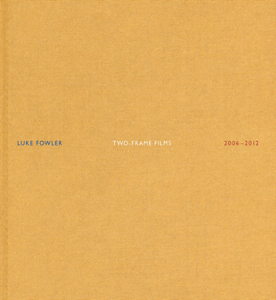
Luke Fowler. Two-Frame Film
"The film tries to engage in a conversation with the audience," says Fowler. "It poses questions. I make films for people who are prepared to enter into a deeper relationship with the film and its subject." - Luke Fowler
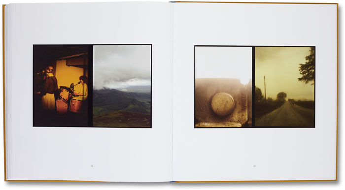
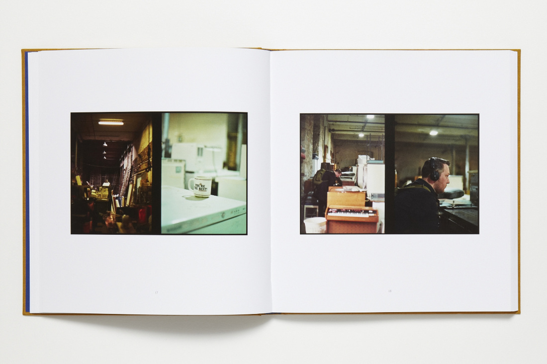
Through the observation of Luke Fowlers Two-framed films, I can see the strong correlation between some images that have been put together and than in others there seems to be no apparent connection at all. Although, one thing that I did notice when looking at Luke Fowlers work was that he focuses on the composition of his images a lot and that seems to be the key to creating the diptychs the way he has.
By looking and analysing Fowlers work, it became very apparent that the consideration of how images are places next to each other and why are very important, similarly for the lack of consideration too as they can both tell a different story; one being more continuos and another being very dissociative yet compatible.
Carefully looking at Fowlers work, I was able to understand the importance of choosing photos carefully when placing them in my book as it may be able to tell a story. Due to how the audience reads and interprets my book, it also become apparent that the layout of my book could potentially tell a story to and portray an underlying meaning.
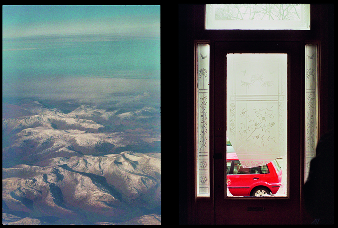
My first diptych
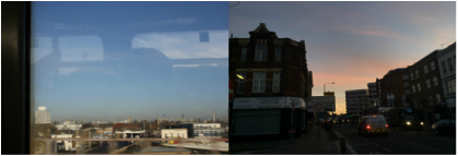
I created this diptych using two images that I took of the city and the sky. I like how it turned out as there is a nice contrast in colour and composition such as the blue sky against the orange sunrise. Additionally, I enjoy the contrast in composition of empty space in one image compared to the busy and full image next to it. By doing this experiment I was able to gain insight on the important of relationship between images when placing them next to each other. This will be useful in how I order the images in my photo book to create powerful and pleasant images and order to my photo book.
