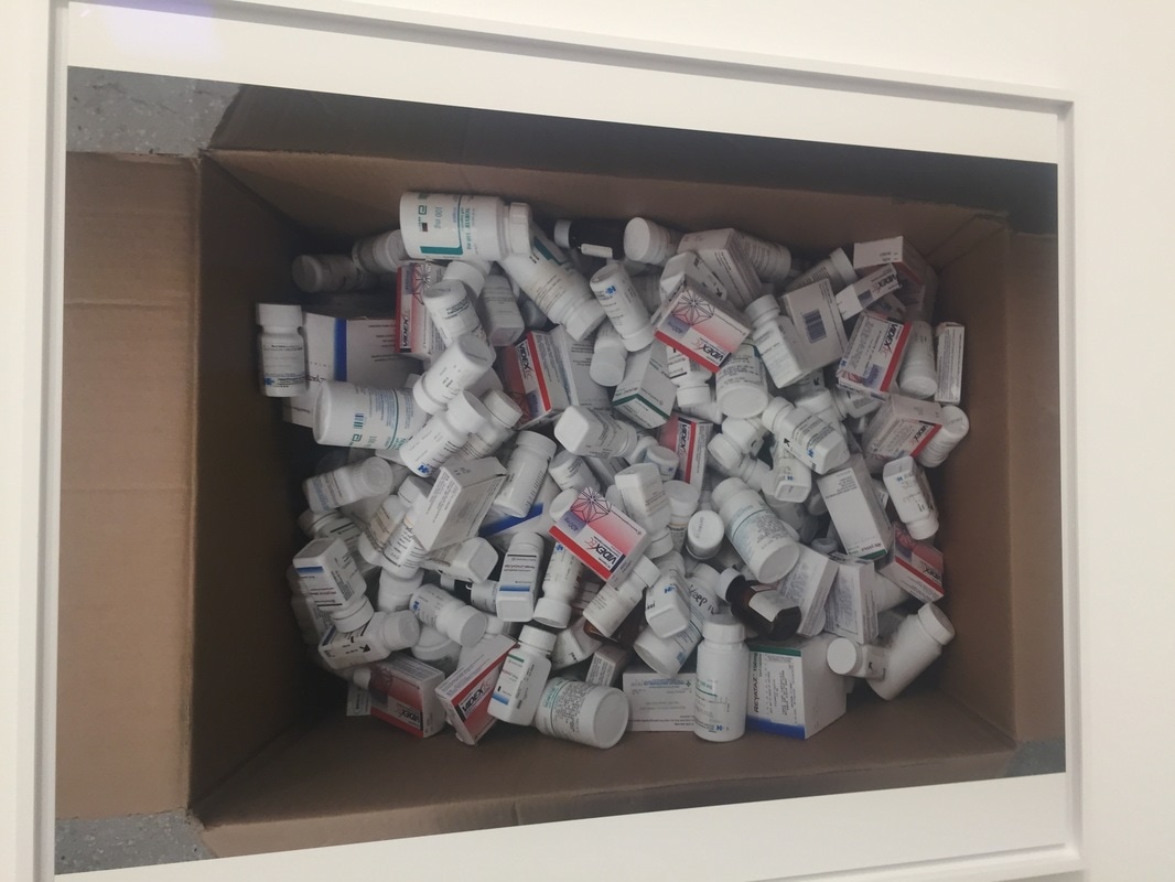
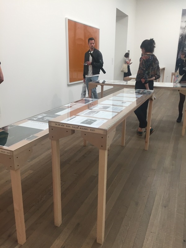
Photography and film are used in advertising campaigns to raise awareness of an issue, to promote a product or to convey information. Photographic images have played a significant part in campaigns such as the UK government’s ‘Visit Britain’ campaign, the Oxfam ‘Grow’ campaign, or the Blue Cross ‘I Will Survive’ campaign. Investigate
appropriate examples and create images for a cause that is of personal interest to you.
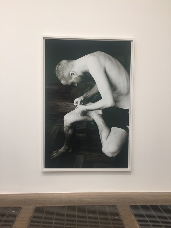
appropriate examples and create images for a cause that is of personal interest to you.
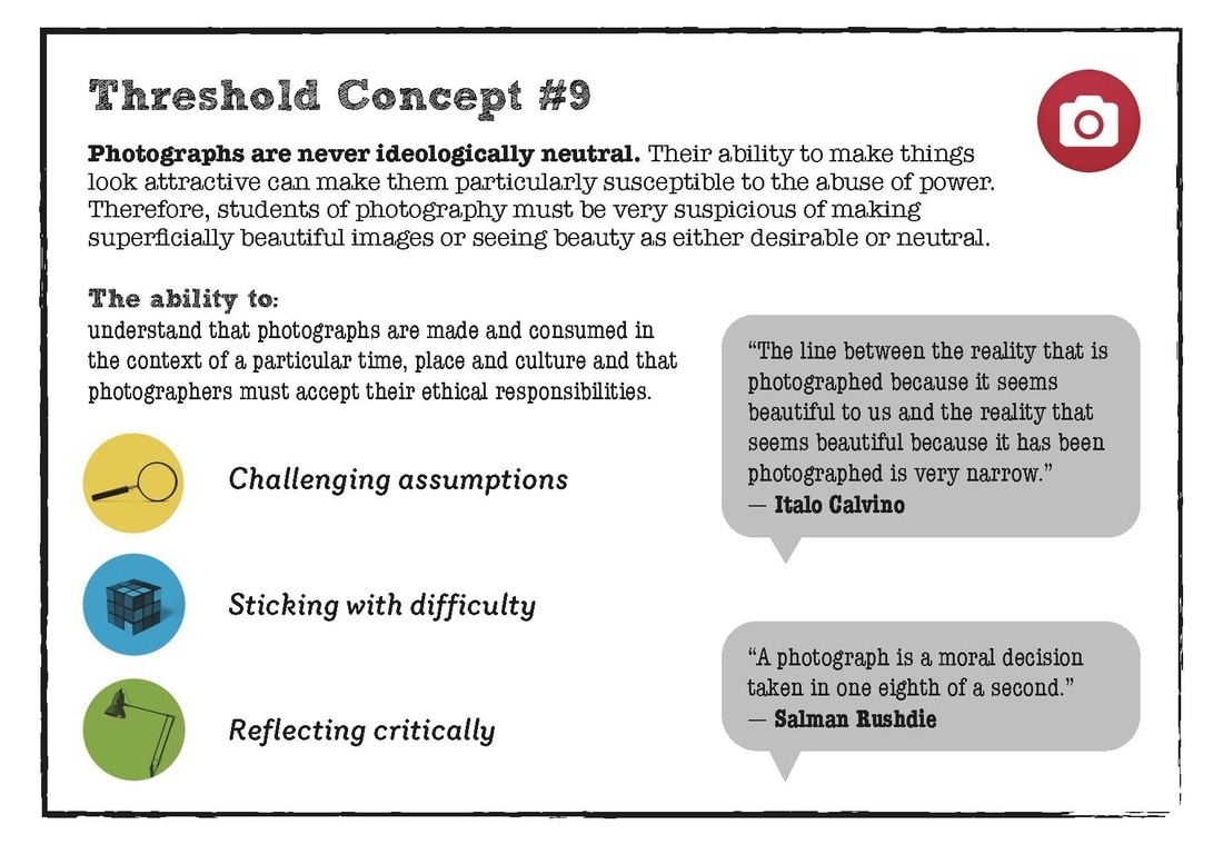
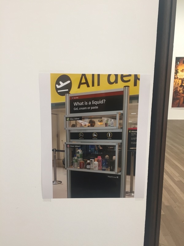
Threshold Concept #9
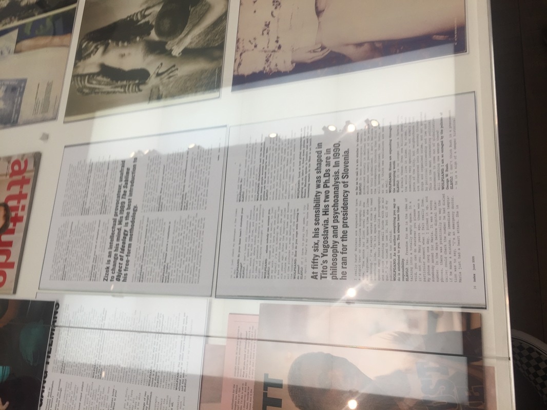
I chose to investigate Campaign Photography as I have a keen interest in social issues and the ways we attempt to resolve those issues as a society, or even as individuals. I decided that I wanted to look at the threshold concepts first before I started my investigation. Campaign Photography closely relates to threshold concept #9; 'Photographs are never ideologically neutral'. Campaign photography relates to the 9th threshold concept because when creating a campaign, you make a conscience decision on what information to show the viewer in your photography or film and also what information to hide from them. In addition, when creating a campaign, the creator takes their subject from their original context, such as being set up in a studio to be photographed or hiring actors to act in the background of a film, they then place a new context and meaning to the images that they present to the audience; this relates to the 9th threshold concept because the meaning of photographs and images are always susceptible to being manipulated and the abuse of power to create a new meaning from something completely isolated.
Roland Barters, Cameria lucida and Semeiotics
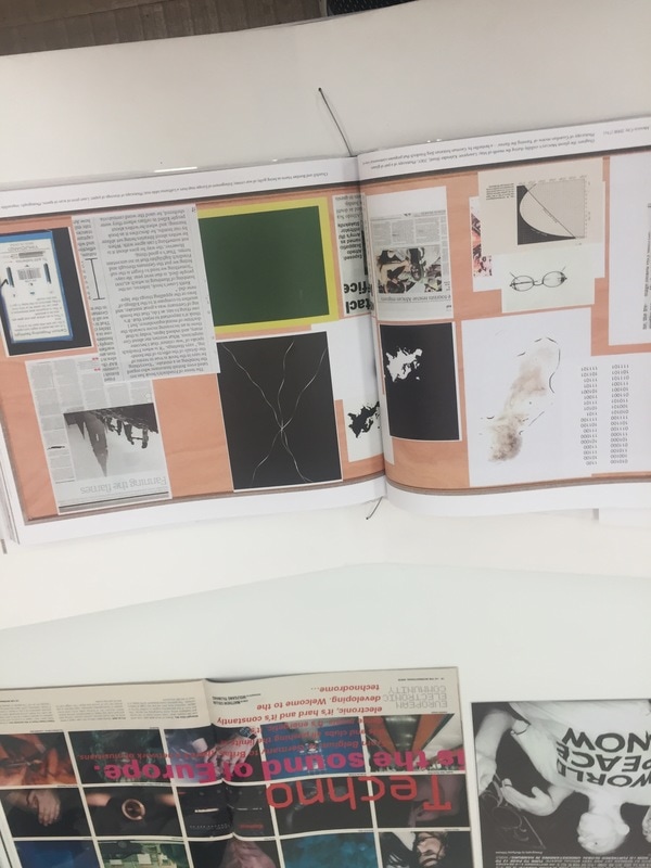
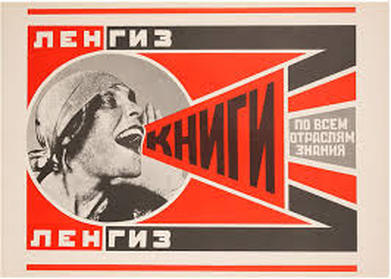 Agitation and Propaganda present reproductions of early Soviet political posters issued in 1967 by the seminal, independent literary publishing house Grove Press.
Photographer and photographs can act as a special kind of sign because we see the referent and forget to see the sign. thus picturing the referent itself, as the distance between the sign and referent, it's hard to distinguish between the two. When shown a powerful sign, the referent creates much stronger imagine over the imagination, selling an idea, this is often used in propaganda. Propaganda is often in the form of photographs as photographs are universal as they are culturally non-specific and they seem to be not made by people, more by machine so they can feel non-bias, playing the illusion that the photograph is telling the truth. The claim to truth, photography, because of machine-made nature, illusion that there's a trace of reality. indexical link, direct, light from the world has made the image. Photographs appear to be directly connected to reality, therefore more truthful and believable. Photographs frame reality, they end whereas the reality is 360 and has context. Abstract because it has an edge, reality doesn't. Photograph removes something from the context.
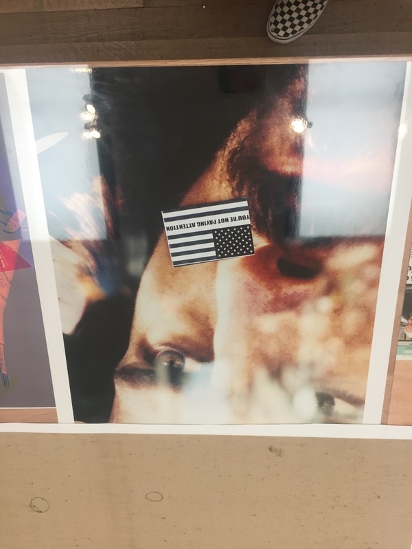
Photographs can usually be understood without context or further explanation needed if the sign (photograph) is powerful enough. An example of this is the propaganda used in the Russian Revolution propaganda. Although it is not in English, from the photograph we can tell that it is some form of a poster that suggests that the woman is calling out, possibly for help in a movement. We know she is shouting from the way the text is positioned and the expression on her face. Her attire suggests that she is of the working force, maybe factory work. All these signs conjure up a powerful referent in our heads and regardless of not knowing much about the photograph or context, the majority of people universally will be able to understand what the photograph is trying to get across.
Photographs can usually be understood without context or further explanation needed if the sign (photograph) is powerful enough. An example of this is the propaganda used in the Russian Revolution propaganda. Although it is not in English, from the photograph we can tell that it is some form of a poster that suggests that the woman is calling out, possibly for help in a movement. We know she is shouting from the way the text is positioned and the expression on her face. Her attire suggests that she is of the working force, maybe factory work. All these signs conjure up a powerful referent in our heads and regardless of not knowing much about the photograph or context, the majority of people universally will be able to understand what the photograph is trying to get across.
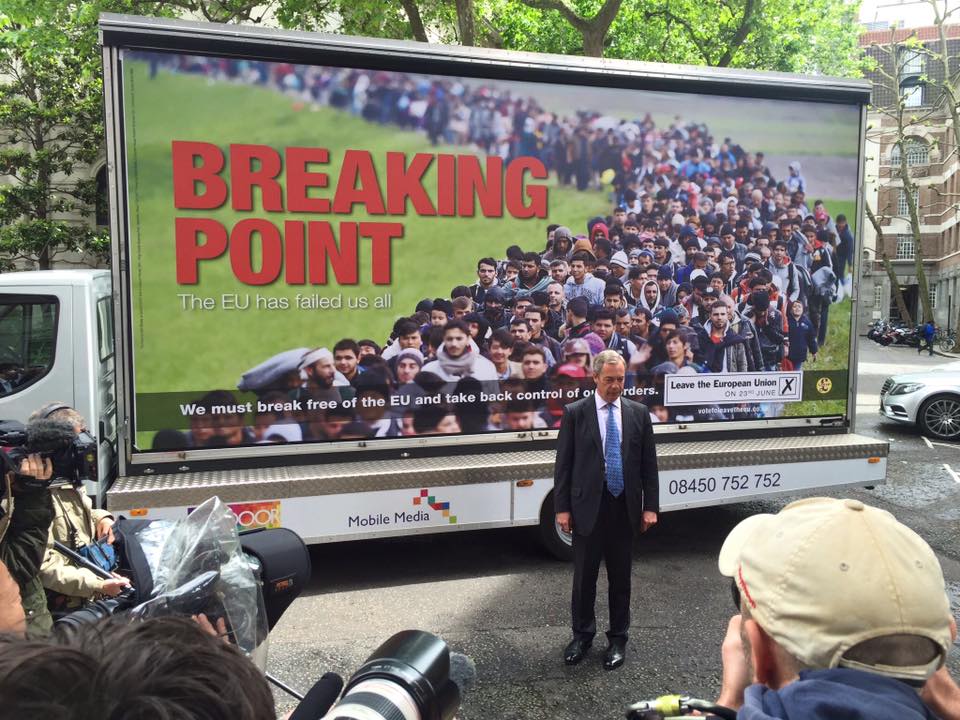
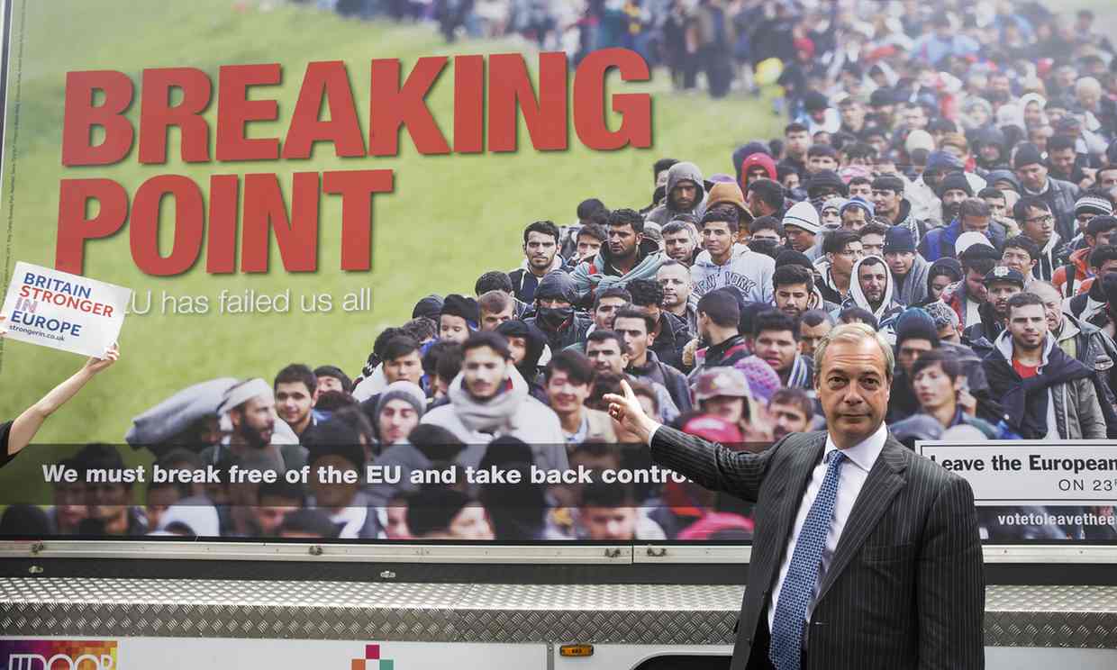
The Breaking Point Campaign
|
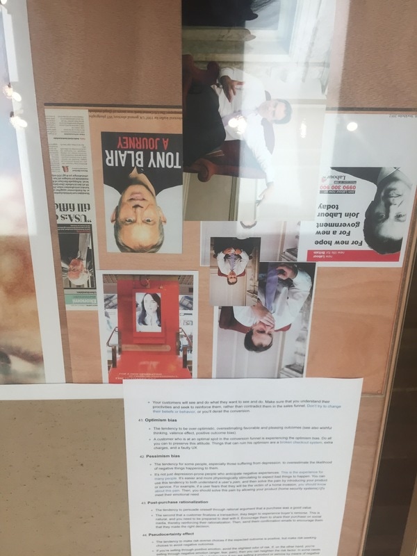
The breaking point poster is a Poster pedalled by Ukip during the Brexit campaign, although Boris Johnson distanced the Brexit campaign from Ukip after this poster. “not our campaign” and “not my politics”. Said Johnson, suggesting the differences between Farage's' ideas and his own.
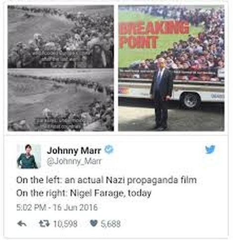
Many people have drawn similarities between Nigel Farage's' poster and Nazi propaganda from a documentary in 2005 on BBC of migrants. Additionally, people have stated that this photograph was taken to incite hate and racism which in some ways that have been shown to be true, especially from the Brexit results. |
|
The spoken image, Clive Scott
The Behaviour of Captions in the Press
The Spoken Image is a book created by Clive Scott to address how photography can convey a message. I found it interesting to read this book as it helped me gain insight on how important text can be in adding context and meaning to a photograph. I also learnt that strong campaigns and press often include text for a variety of different reasons, such as a photograph in itself may not be photojournalistic but by adding text and meaning, the very nature of the photograph changes. I will what I have learnt from reading this book in my experiments by making careful decisions on what type of message I want to convey and how I will effectively convey it, whether I am using text or not.
The Spoken Image is a book created by Clive Scott to address how photography can convey a message. I found it interesting to read this book as it helped me gain insight on how important text can be in adding context and meaning to a photograph. I also learnt that strong campaigns and press often include text for a variety of different reasons, such as a photograph in itself may not be photojournalistic but by adding text and meaning, the very nature of the photograph changes. I will what I have learnt from reading this book in my experiments by making careful decisions on what type of message I want to convey and how I will effectively convey it, whether I am using text or not.
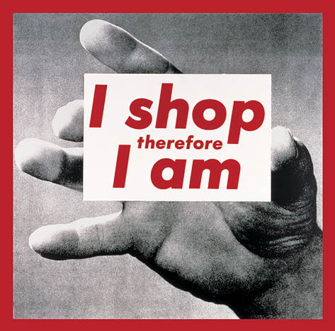
Barbara Kruger
|
|
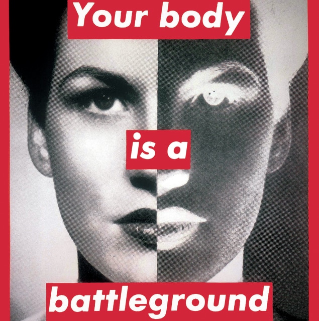
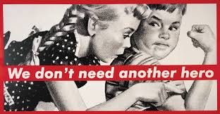
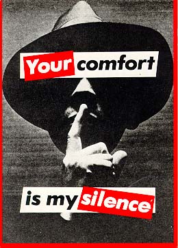
Barbara Kruger is well known for her use of silkscreen printing and using captions and text across the surface of found images to promote an idea or issue. Kruger's early work of the 1980's used a lot of satire such as her work 'Untitled' I shop therefore I am (1987) which ironically was adopted by shoppers alike.
Kruger is very involved in social, political and cultural critique and that is where the majority of her art focus is. Kruger merges the principle of graphic design with an unexpected phrase to draw the viewers attention through the language of contemporary publications and magazines. Kruger is not trying to sell a product to the consumers, more she is aiming to sell an idea to the viewers that start a conversation about their actions. Kruger uses an interesting relationship and unusual combination of text and images to start these conversations, often exploring key issues such and feminism and how commercial culture affects the consumer. Each element of Kruger's photographs are significant to the effectiveness of her expressions and stand against postmodern life, including the use of her juxtaposition of the bold red colours, the clear white font and the muted black and white images. Kruger uses photographs which she appropriated from magazines and new papers, taking them out of context and setting them as background which she then overlays her confrontational and assertive captions over. |
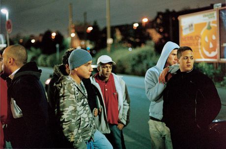
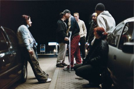
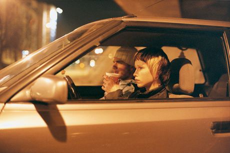
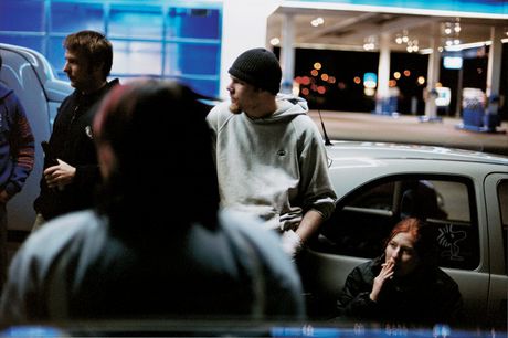
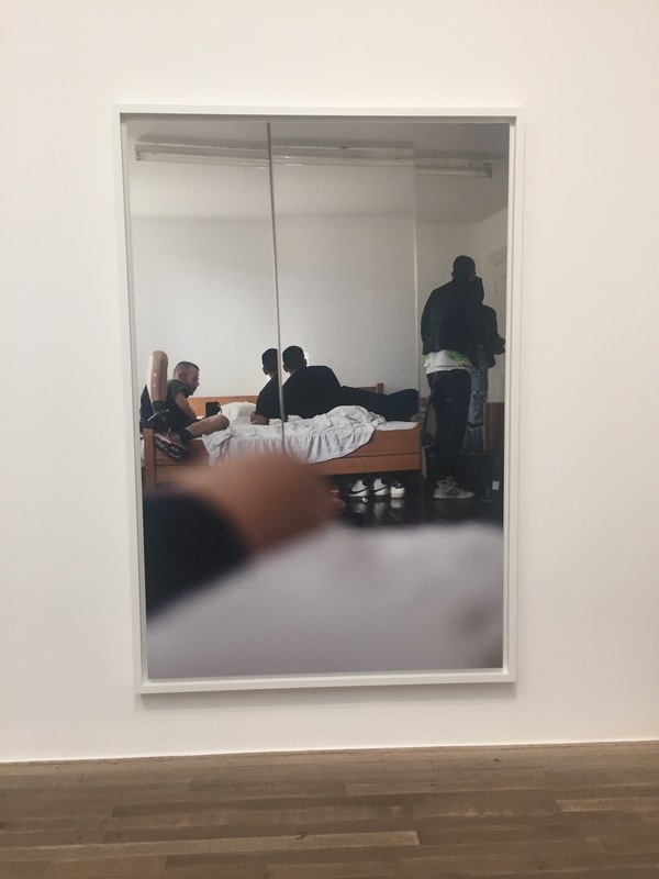
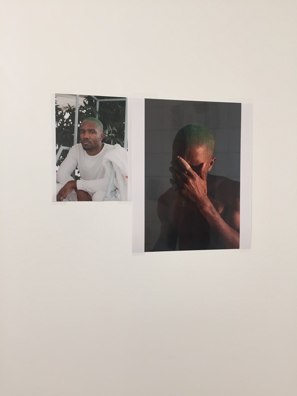
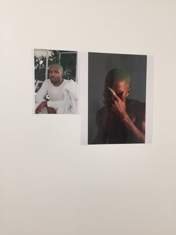
Tobias Zielony - Stereotypes
|
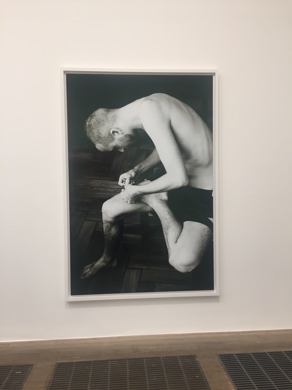
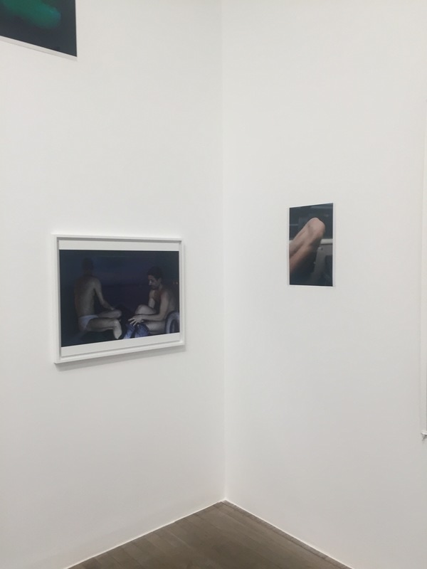
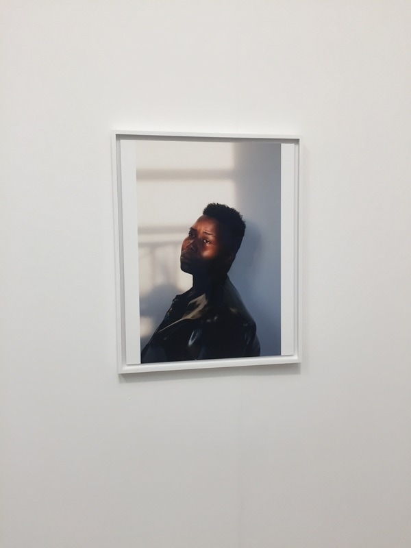
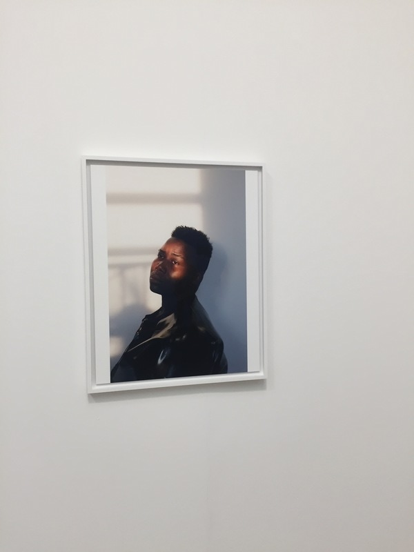
Zielony documents and photographs images that represent socially unacceptable behaviour and groups, often "hoodies", "chavs", and social labels from societies different categories and classification of people. Zielony is one of the most discussed artists in contemporary german photography, he is a useful photographer to research as looking at his photographs I am able to see how powerful and striking it can be to capture a 12-15 second golden moment such as the ones that Tobias captures. I like Zielony's photographs because they are not originally meant to be campaigns, however, is you extract them from their original context and purpose, they can create a drastic effect on an audience because of how strong the photographs are by themselves. Zielony has mastered the perfect balance between light and contrast to create beautiful digital images that speak to the viewer without the need for added context and messages. From researching Tobias Zielony, I would like to bring influences of his balance of light, contrast, depth and saturation into my own images and experiments to create photographs that have a sleek, professional feeling to them. Additionally, by researching Zielony, I am able to understand the importance of photography to convey a message that many are afraid to explore. Zielony is not afraid to photograph topics and themes that are outcasted from society and deemed as unacceptable.
|
|
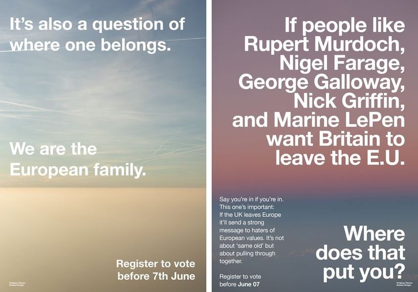
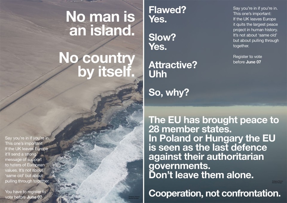
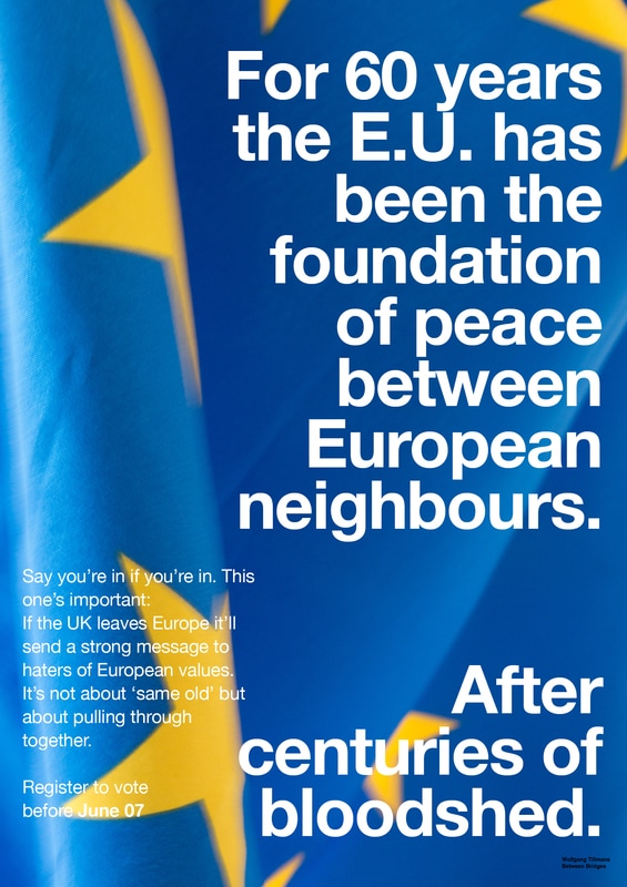
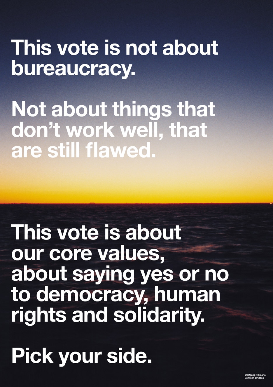
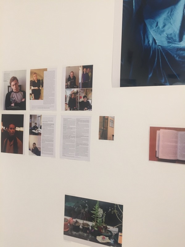
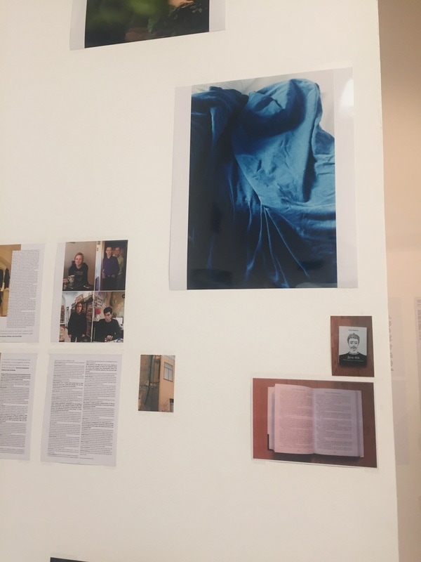
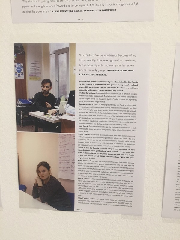
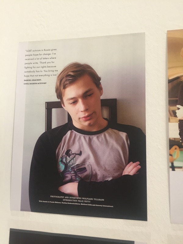
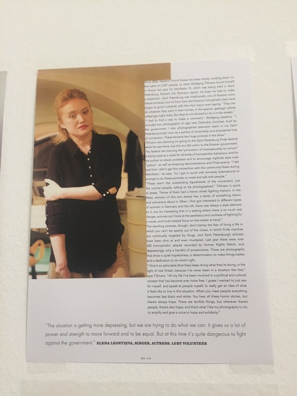
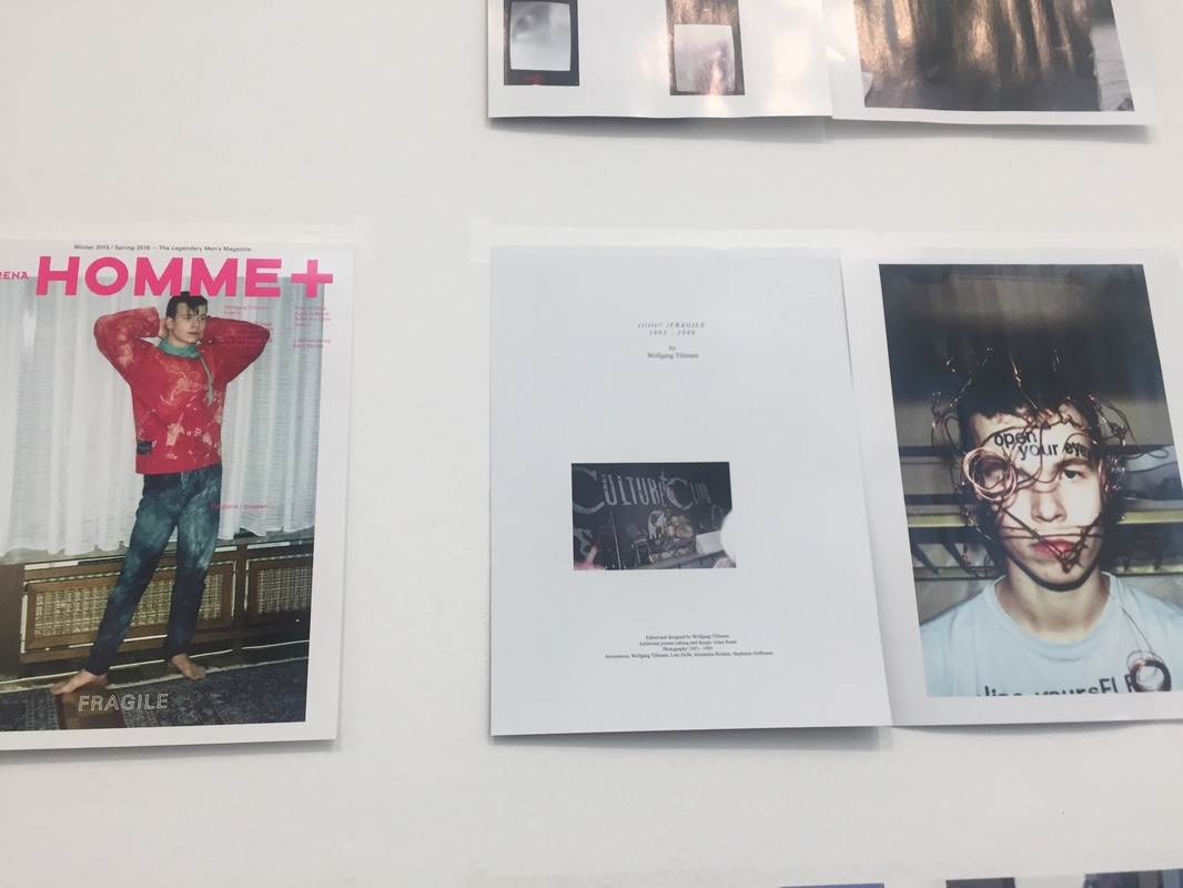
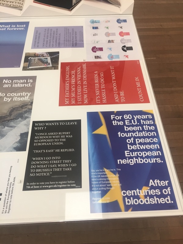
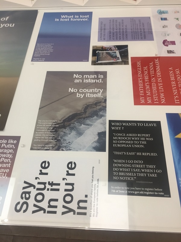
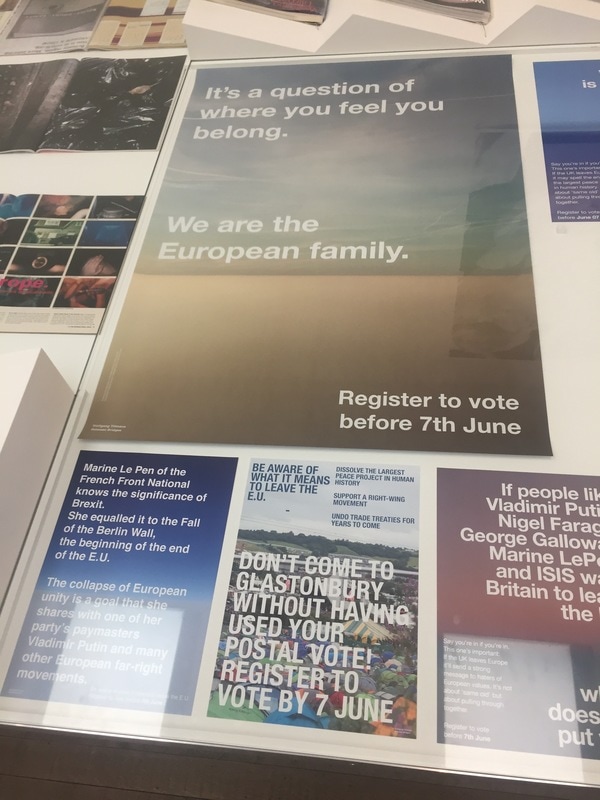
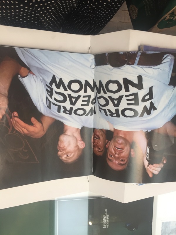
Wolfgang Tillmans: The Anit-Brexit Campaign.
|
|
Wolfgang Tillmans sees himself as a European artist as he was born in West Germany and studied in Britain. This may be why Tillmans chose to participate in endorsing the 'remain' campaign during Brexit. I found this interesting as Tillmans is known for being a reserved artist, not central in the public eye, however Tillmans was keen on encouraging youths to register and vote in the Brexit campaign so that they could have their say and made very bold statements about the choice to register or not “I want to work towards maximizing turnout among younger voters by focusing on the first, crucial step: voter registration – the deadline for which is June 7," and “anyone who hasn’t registered before this date has no chance of having a say, no matter how strongly they feel about the issue." suggesting that it is key that to have an opinion then you need to register to vote and to vote otherwise it is pointless. Tillmans also targets students by conveying a message on how Brexit will change the way they can study abroad.
|
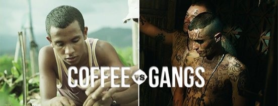
Kenco: Coffee Vs Gangs
|
|
|
"We offer young people a chance of a better life, by training them to be independent coffee farmers with the skills to grow great quality beans. The first students have completed their year-long course. They’re now building businesses of their own, backed by funding from Kenco."
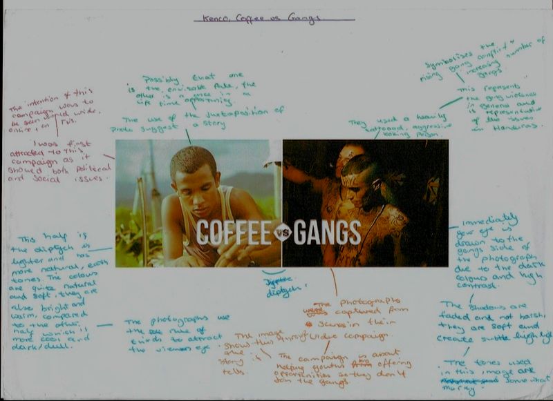
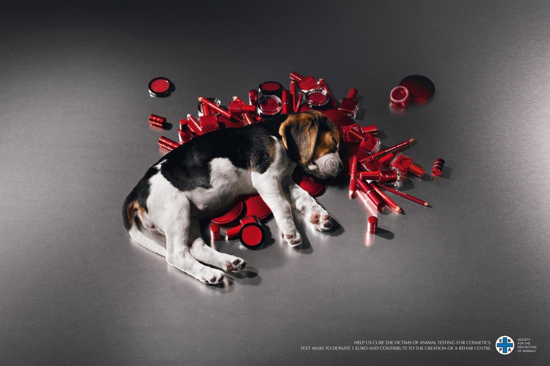
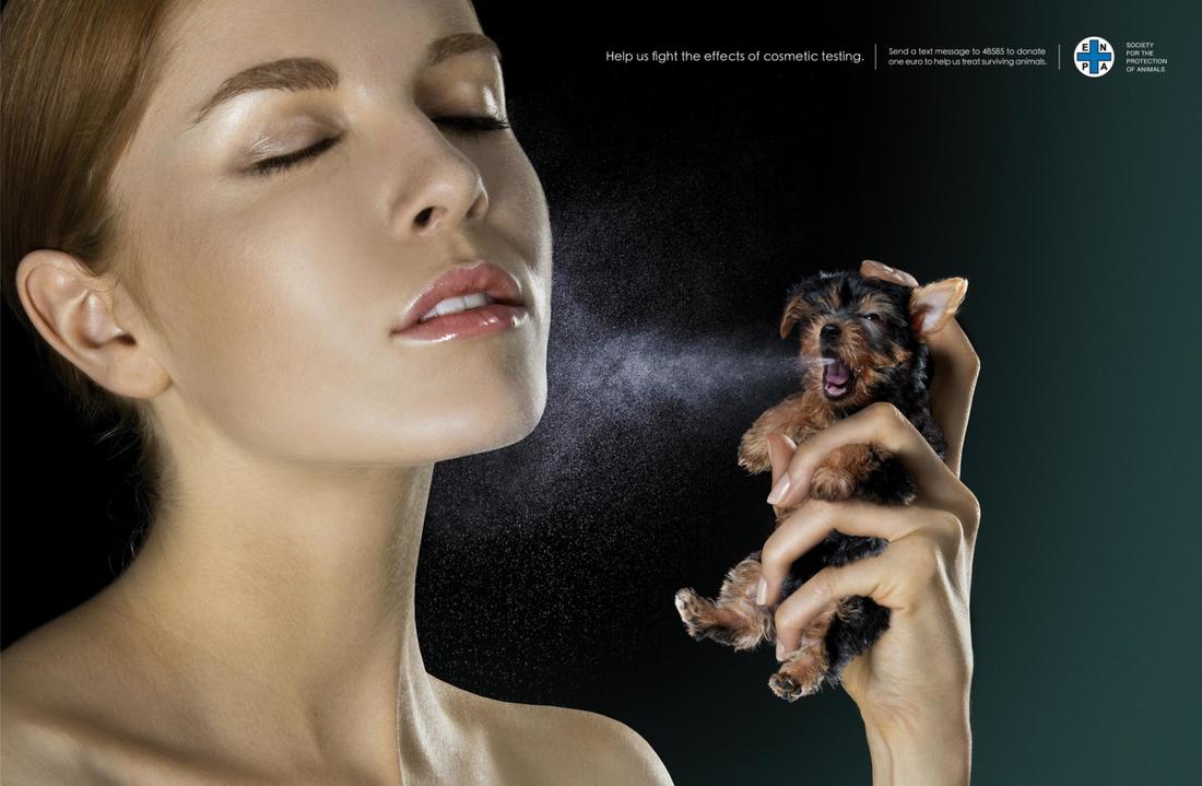
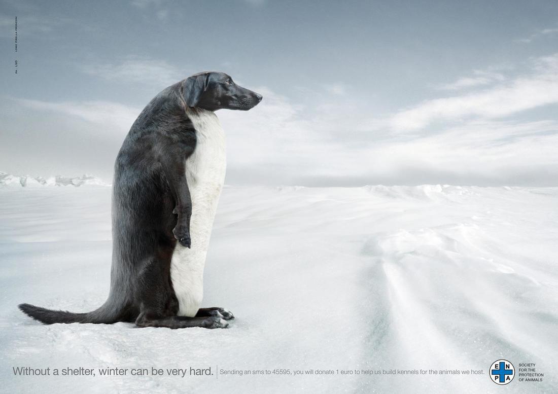
Lowe Pirella Fronzoni: ENPA
|
|
Lowe Pirella Fronzoni is an advertising agency in Italy who often do campaigns about social issues. The ENPA campaign is an advertising campaign that Lowe Pirella did with the organisation ENPA (Ente Nazionale Protezione Animali). The artist who created the photographs is an Italian Illustrators from LSD.eu, Marco Casale and Paolo Dall’Ara
The campaign emphasises the importance of animal cruelty awareness and makeup without animal testing. Their use of graphic design and illustration in this campaign was something that really caught my eye as it combines many techniques together which I believe to be important in a successful campaign. I think this is a successful campaign as even without the use of words, the visual images that they use are strong enough to evoke a reaction from the viewer. The message is also easy to understand, although the concept behind the images is quite elaborate, the message is put across very well with the need for little to no explanation. |
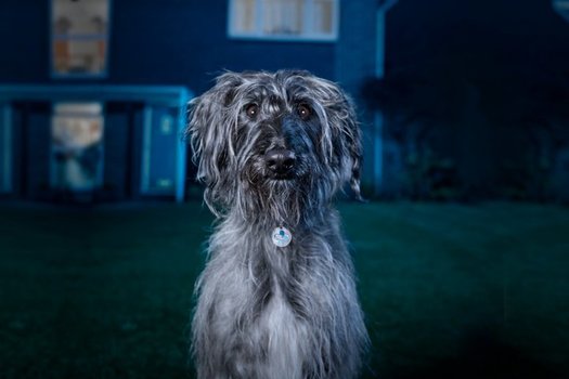
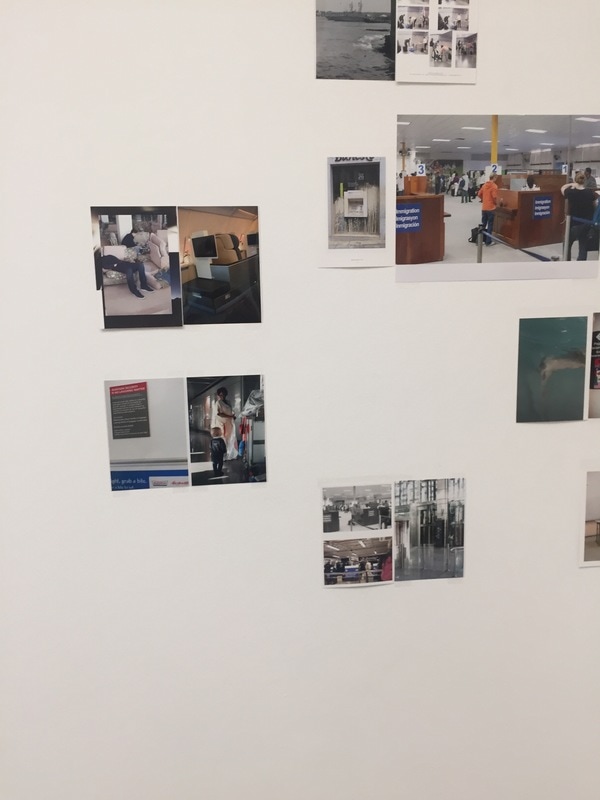
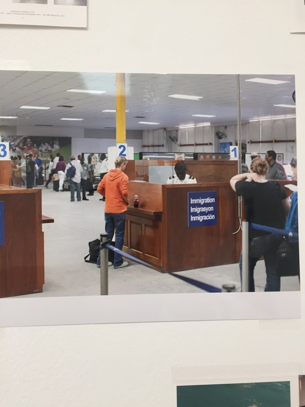
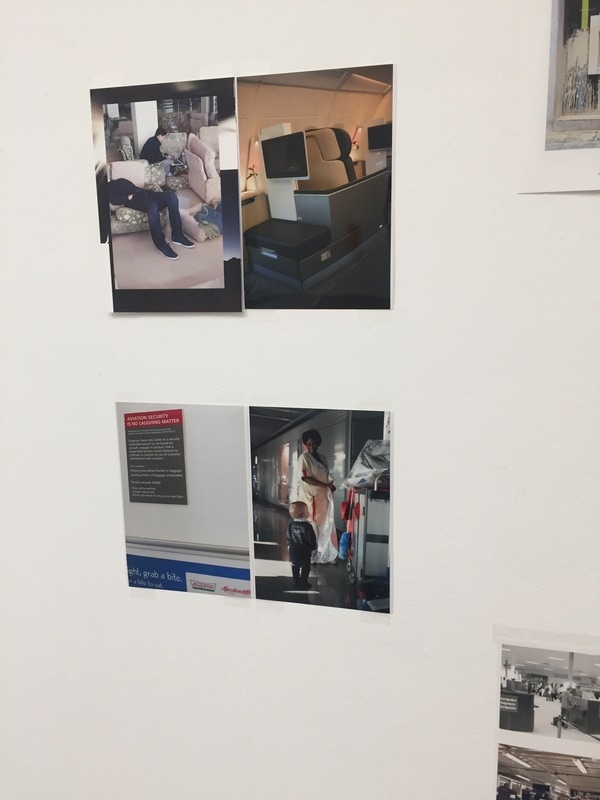
Blue Cross: 'I Will Survive'
|
|
|
When researching the blue cross I will survive tv advert, I did not find it effective at creating a strong message to the viewer. I also found that although it is a very interesting advert to watch with a great concept, the message isn't very clear until nearer the end of the advert. Also, without the added audio to add context and meaning to the advert, the message of it being about animal abuse is very limited unless you already have a previous knowledge of Blue Cross and what their campaigns are typically about. Despite this, looking at the still image from the campaign, shown on the right, it is a very well composed and thought out image. The composition of the photograph is very effortless by using the rule of thirds and it is a very striking image due to the heavy contrast and vignette adding darkness around the whole image, drawing the viewers eyes into the centre of the image where the highlights and contrast are strongest.
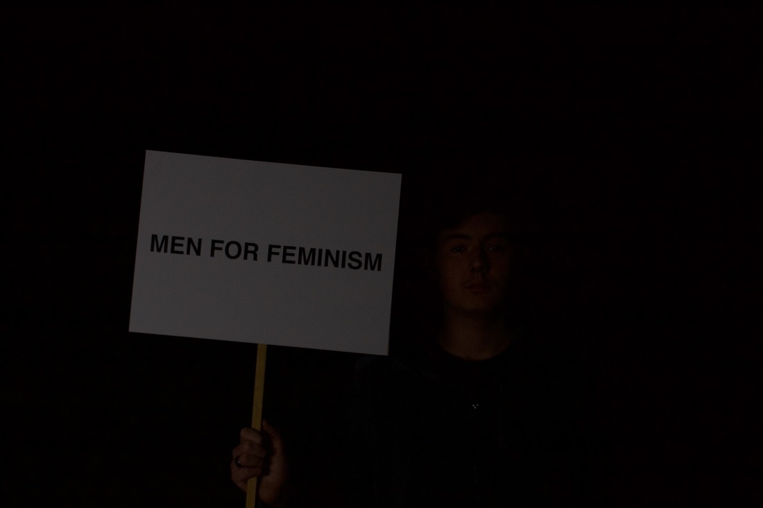
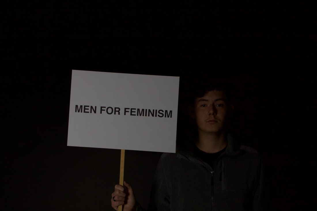
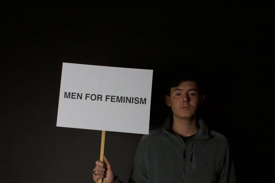
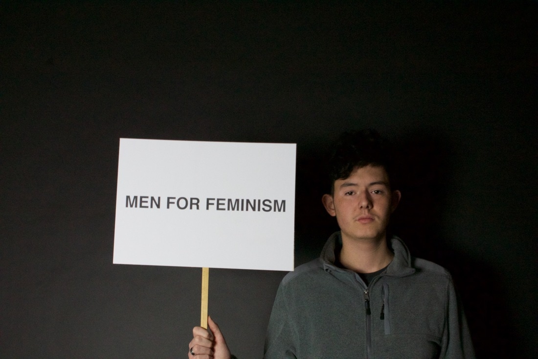
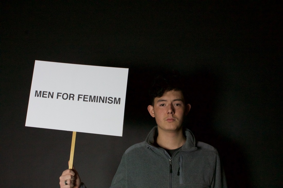
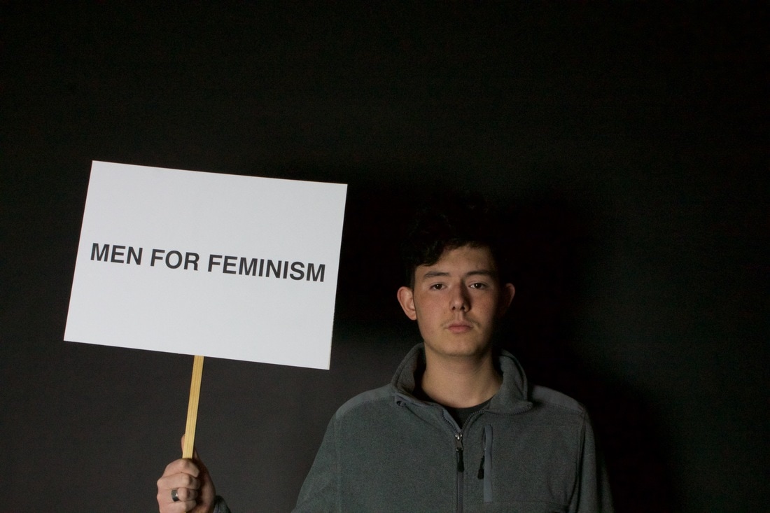
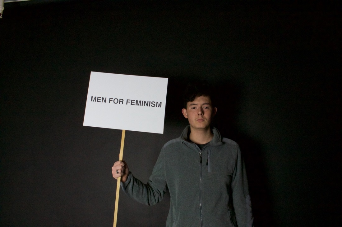
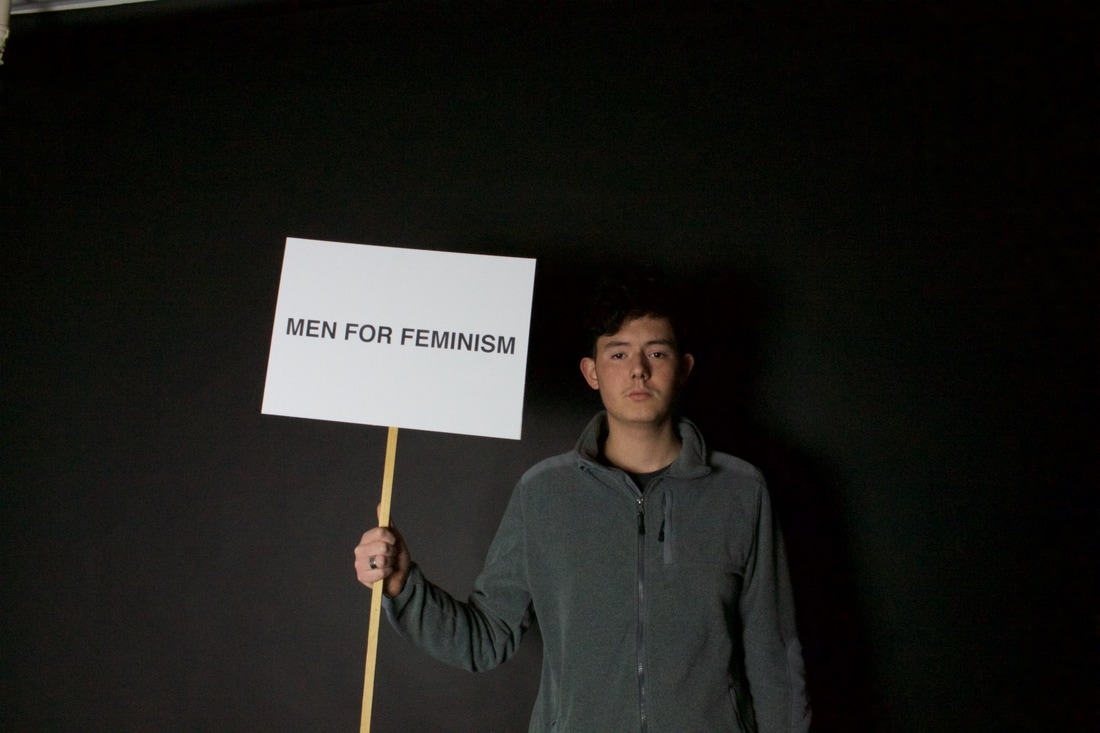
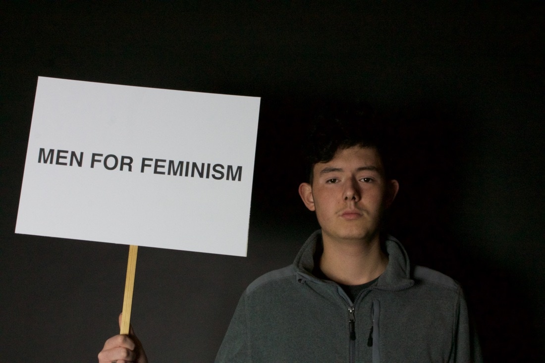
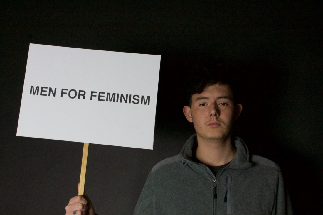
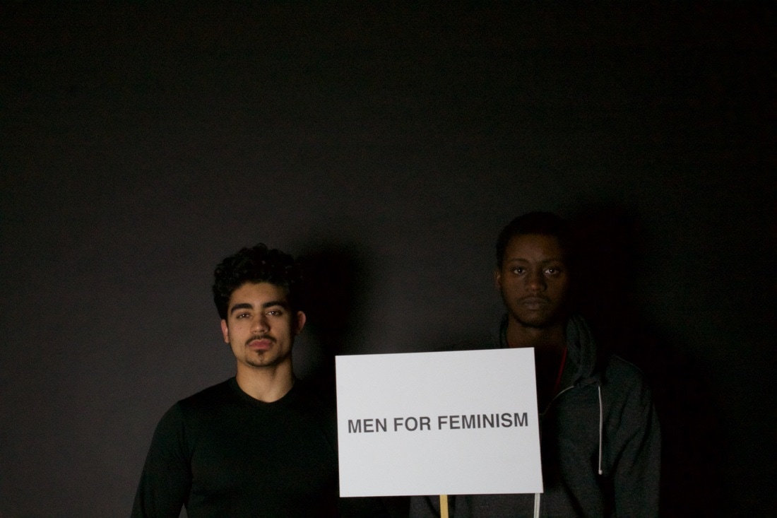
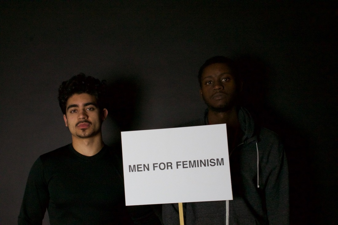
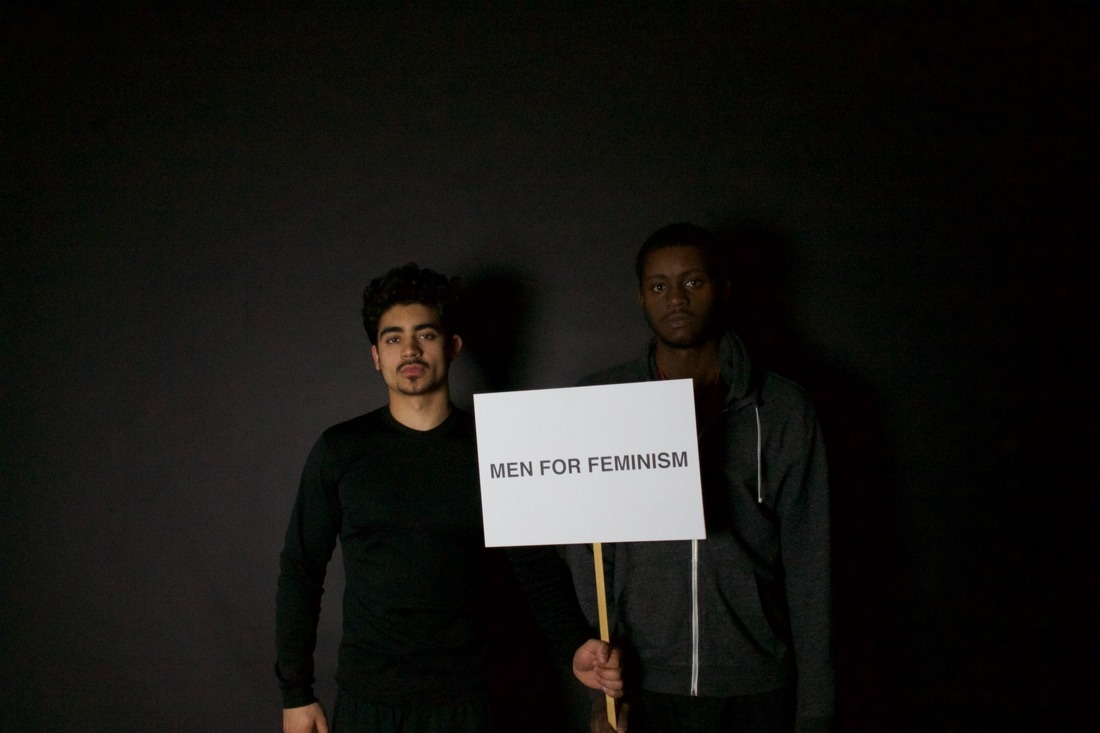
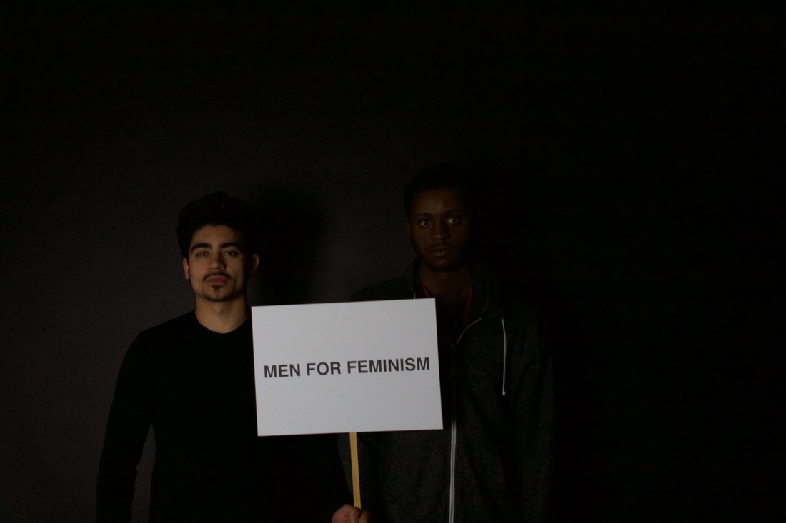
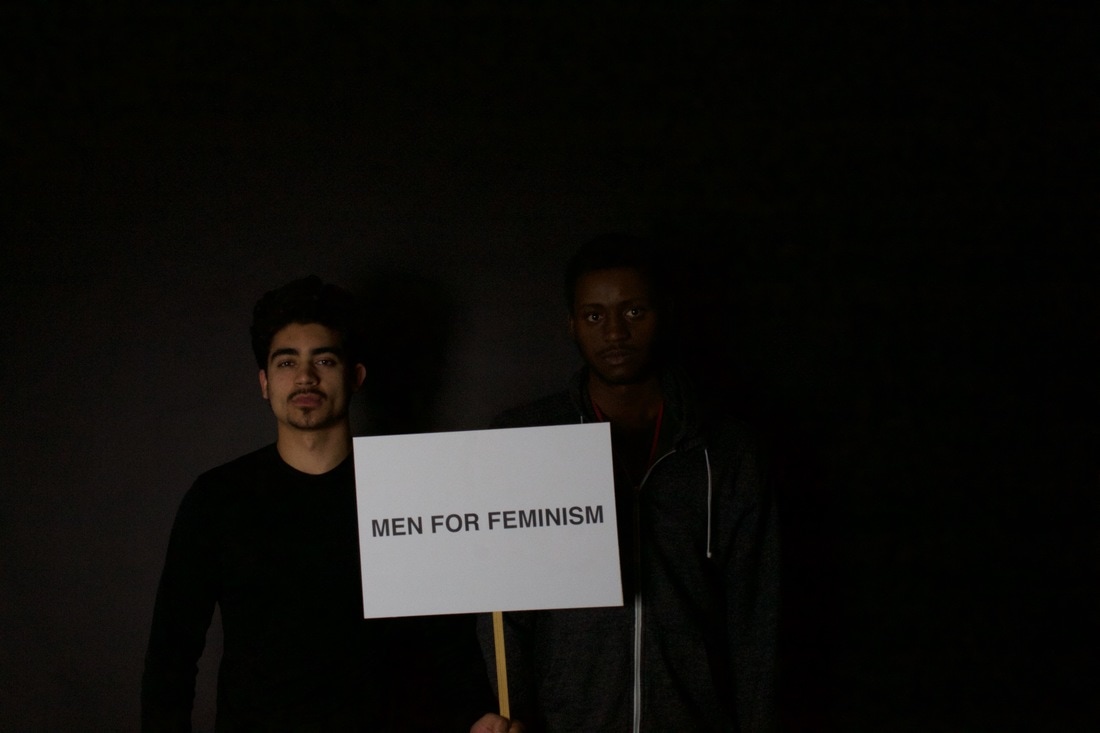
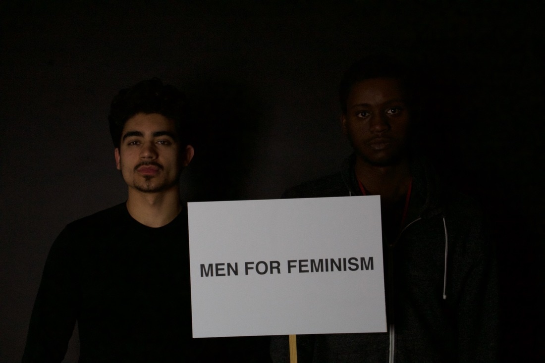
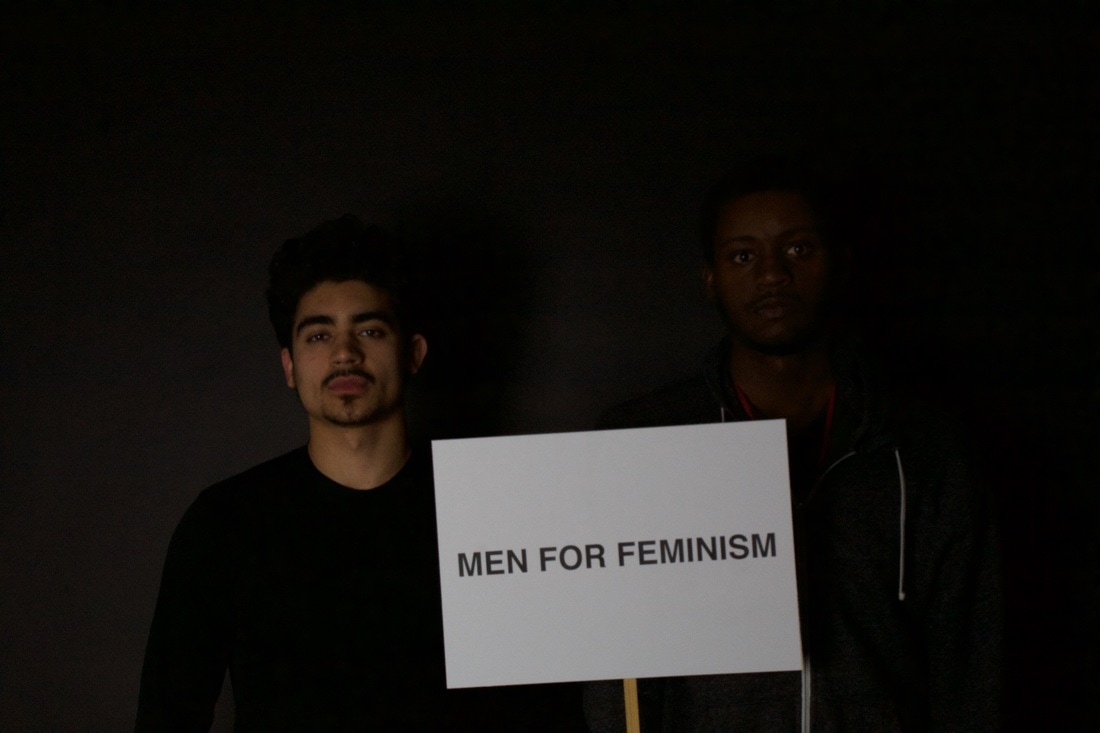
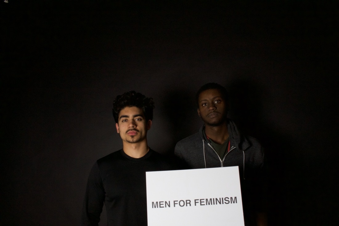
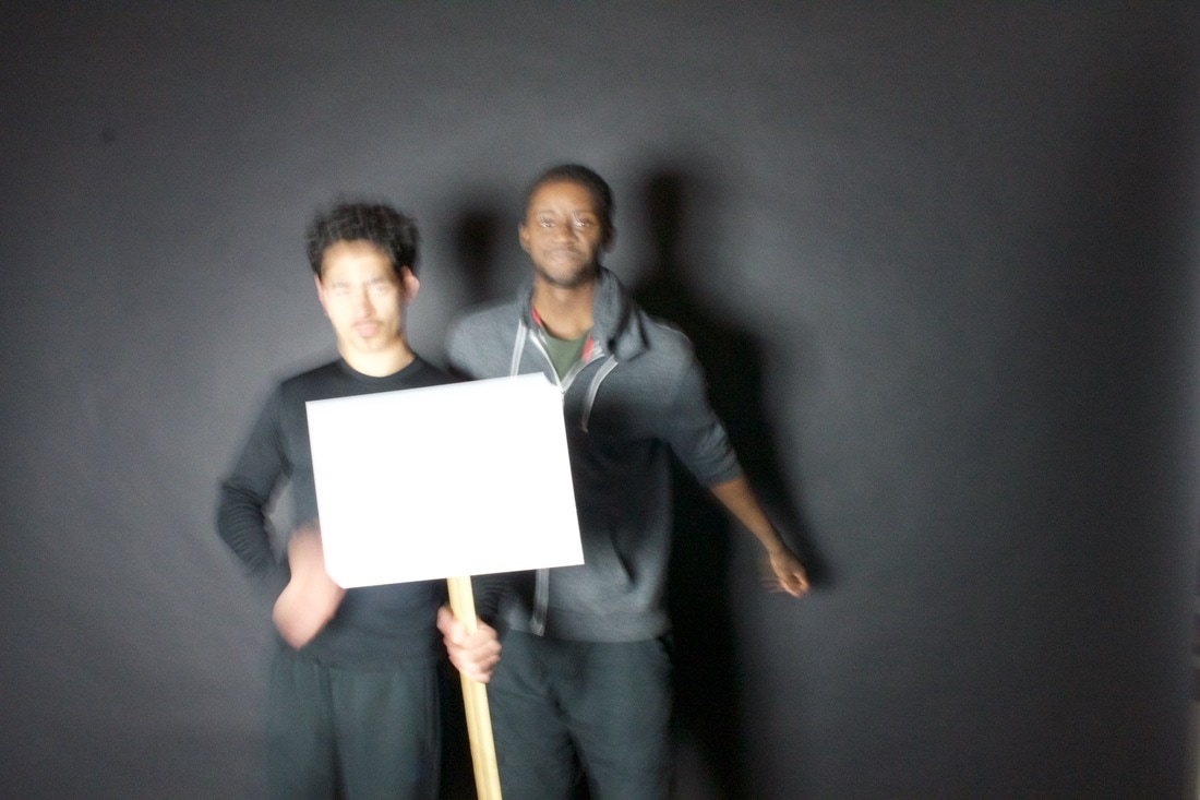
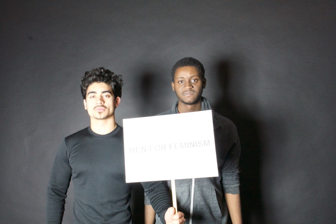
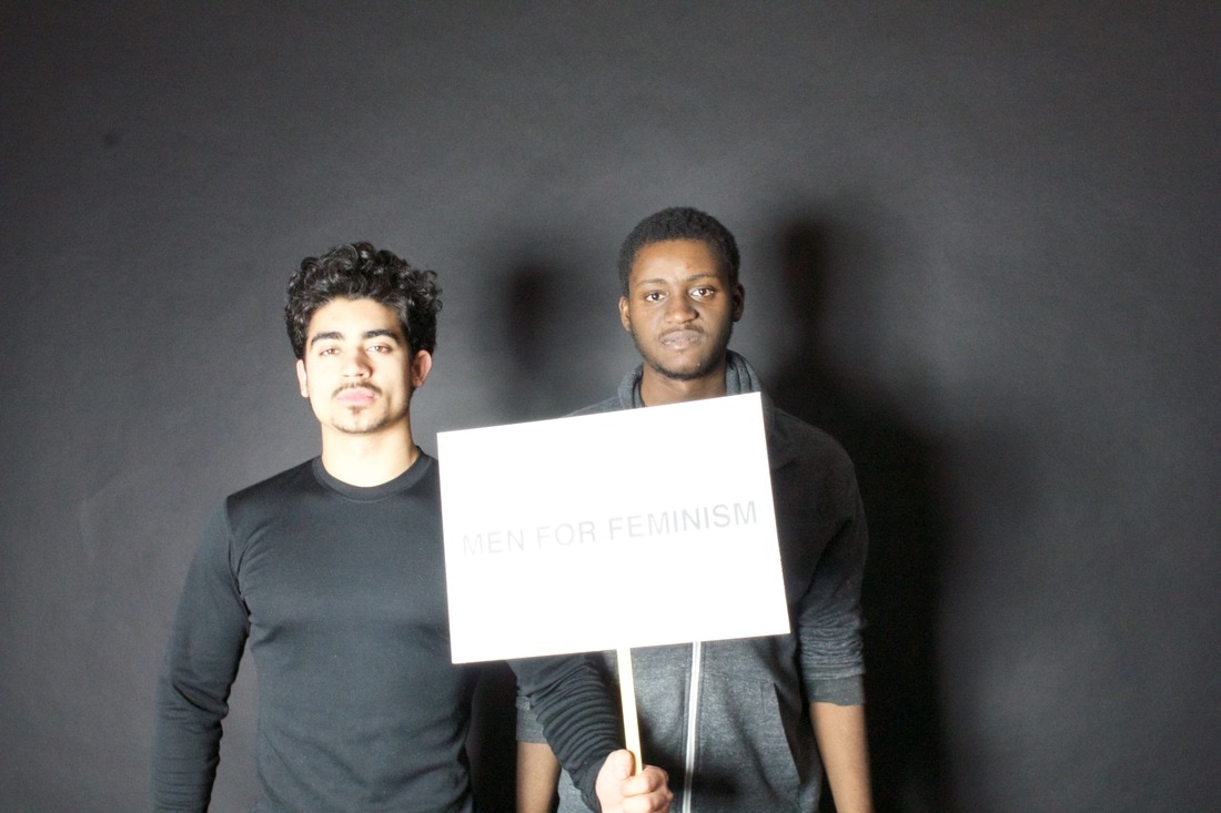
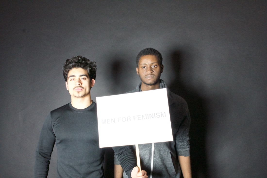
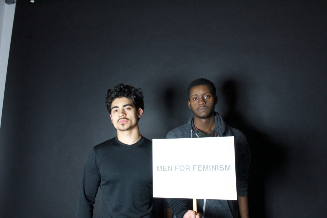
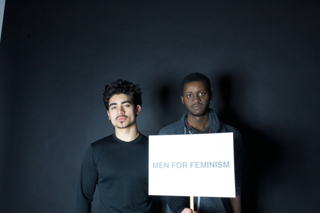
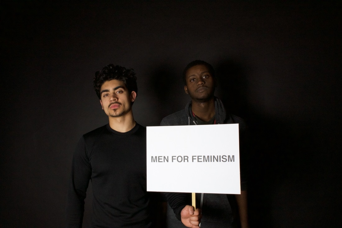
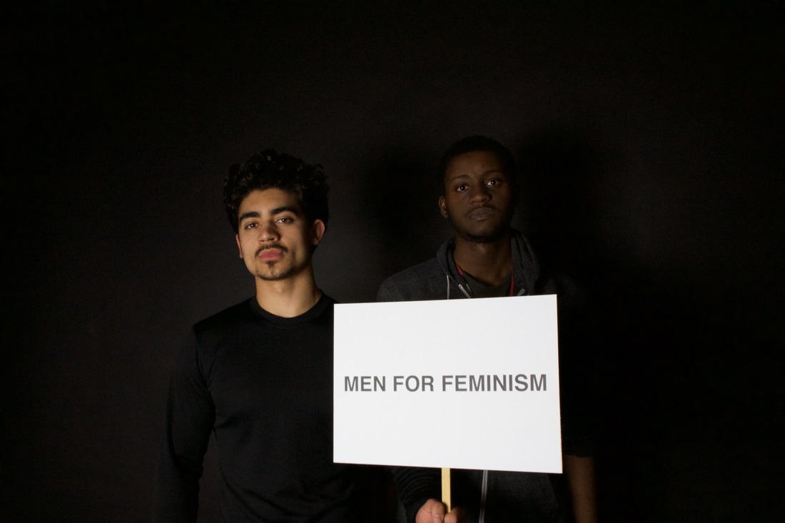
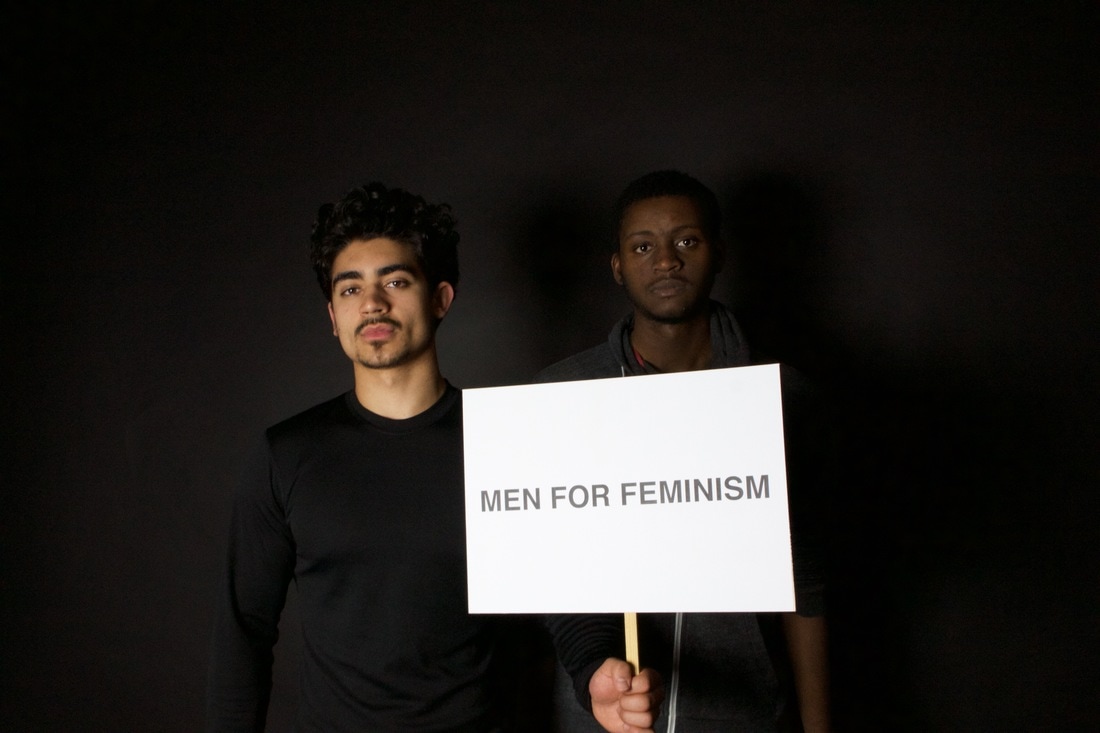
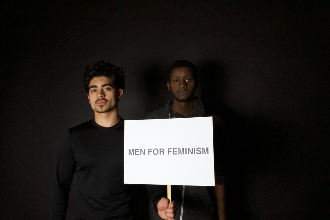
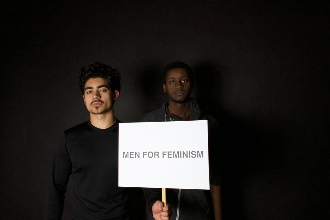
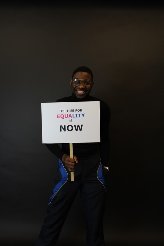
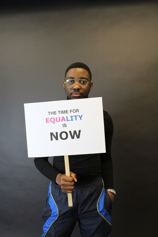
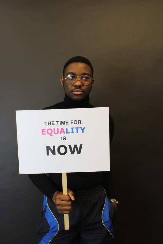
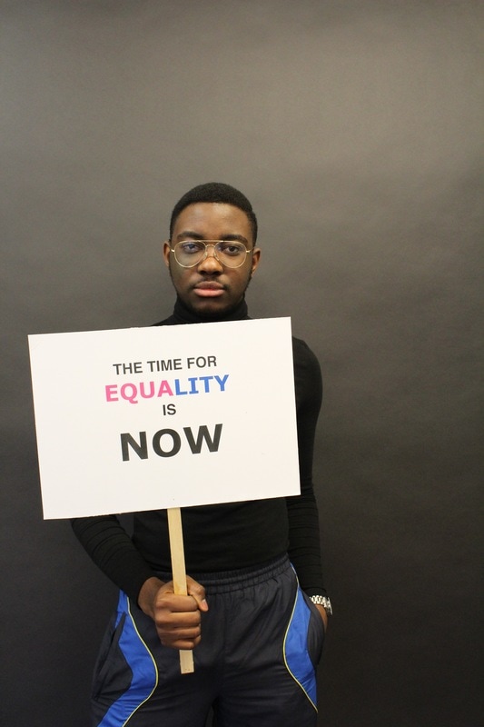
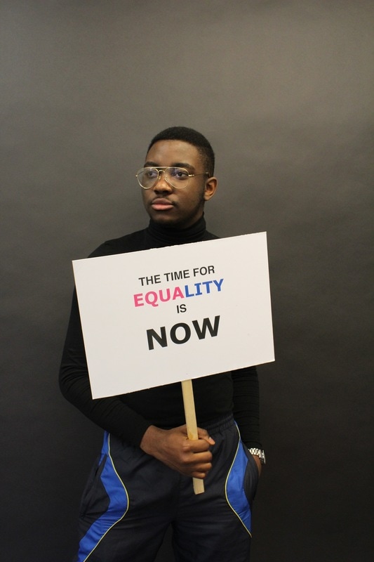
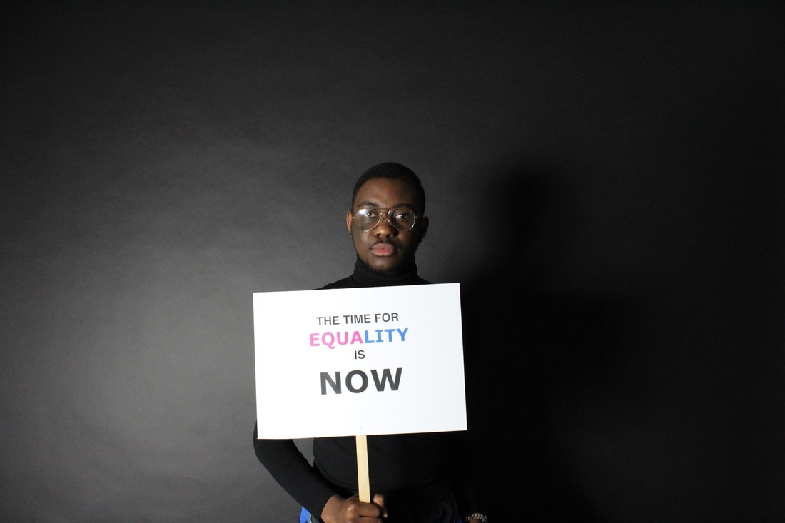
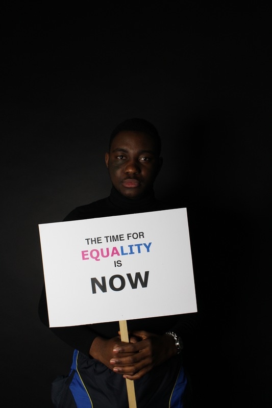
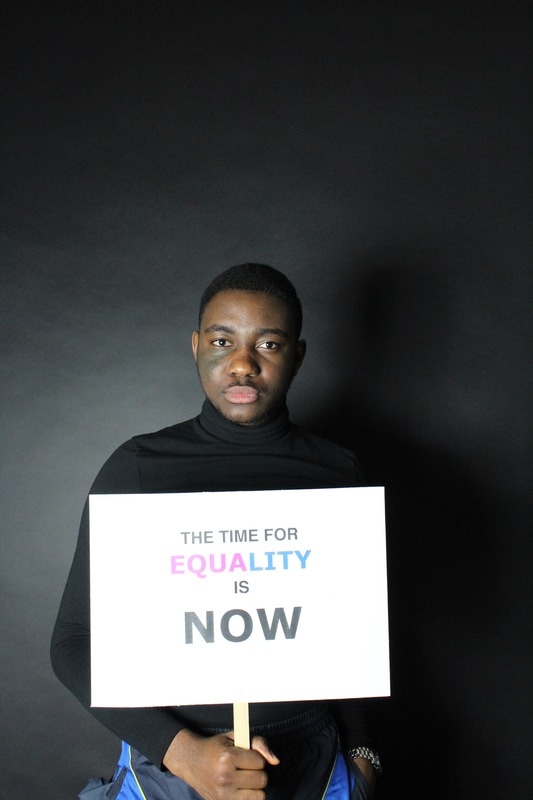
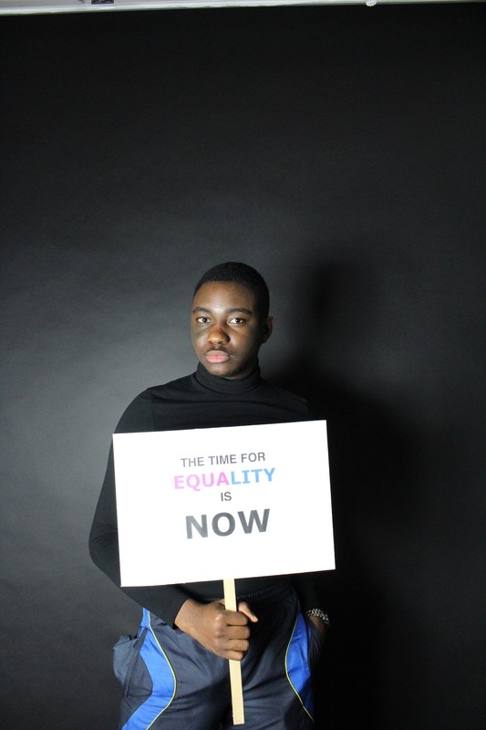
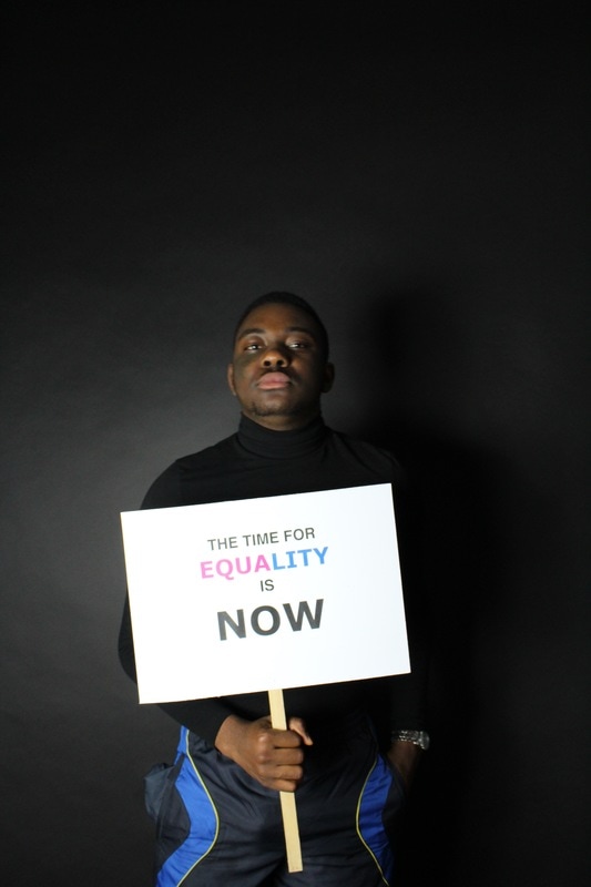
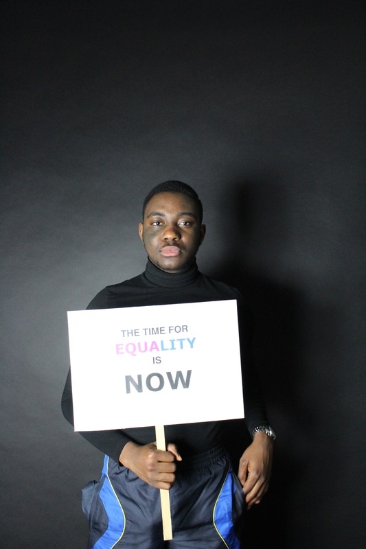
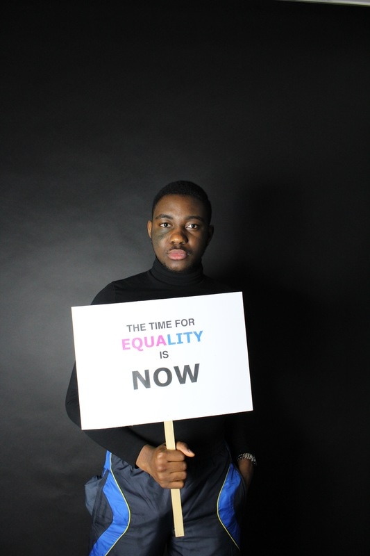
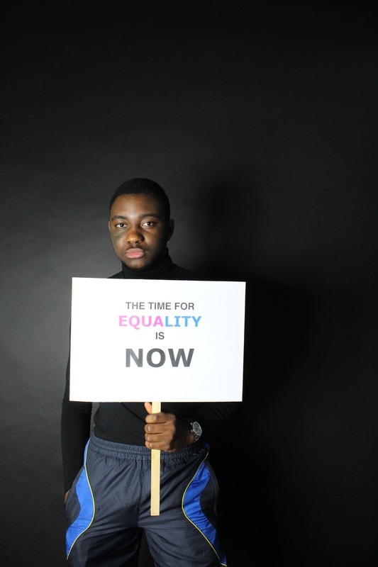
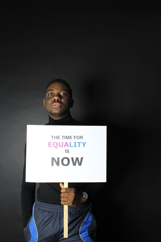
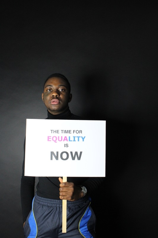
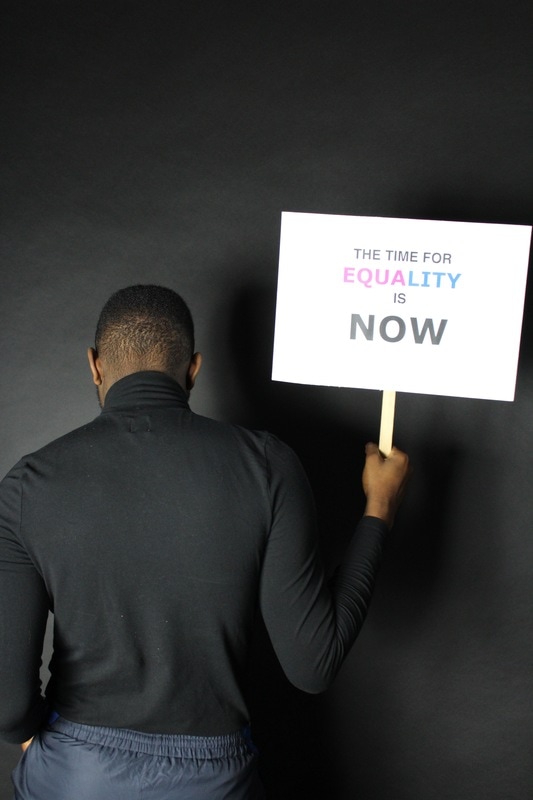
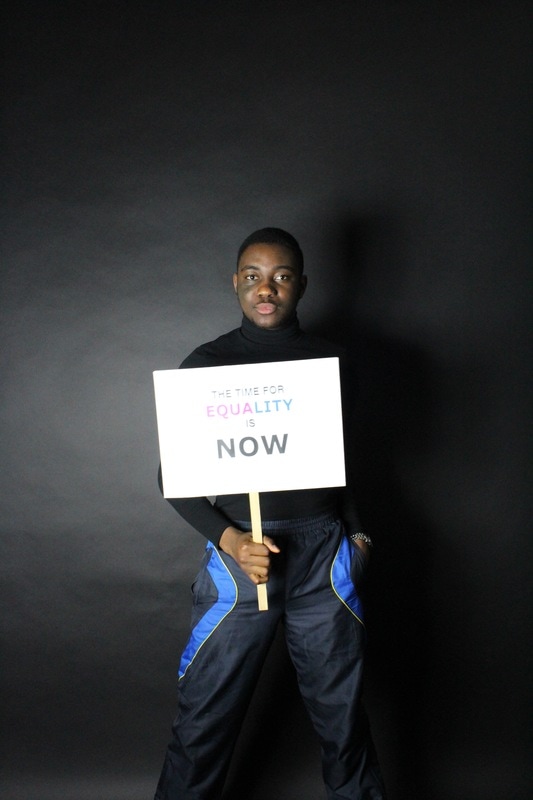
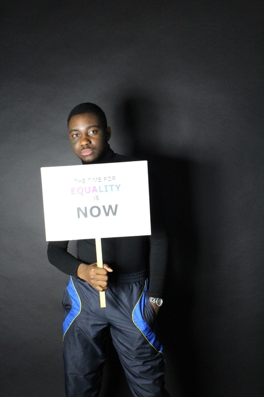
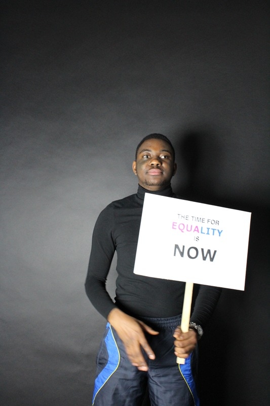
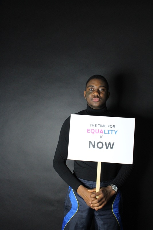
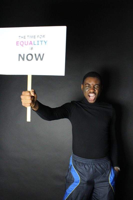
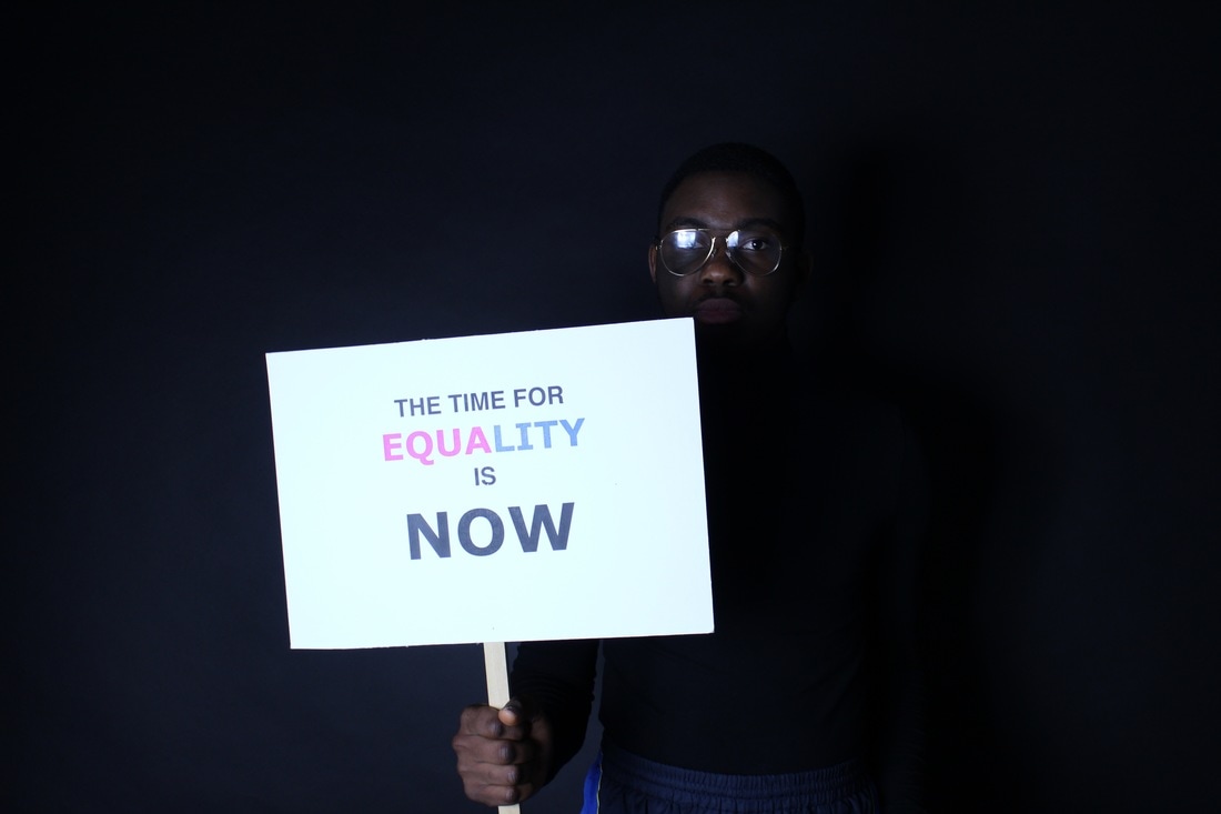
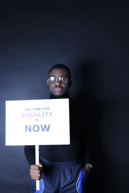
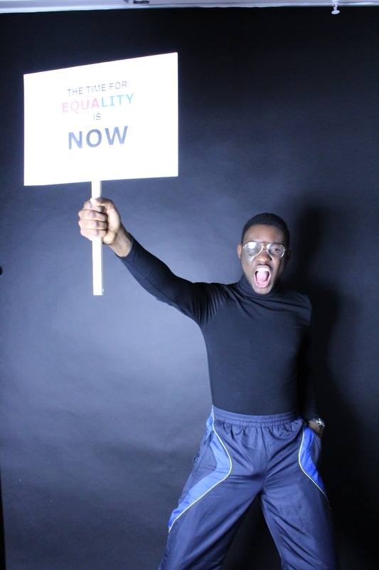
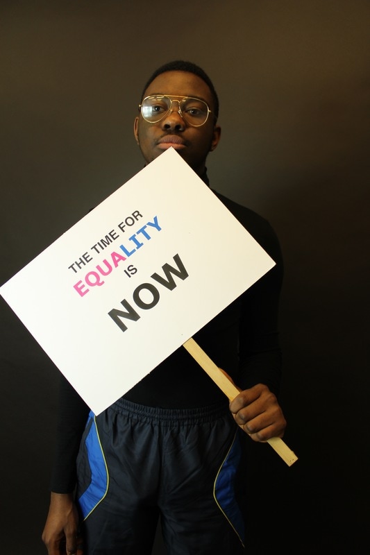
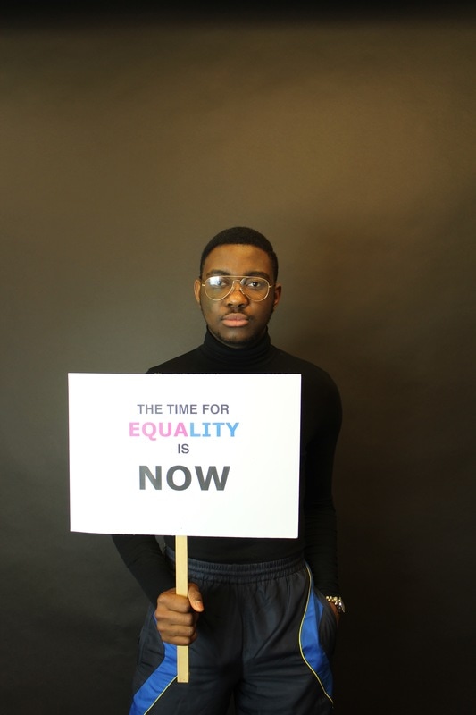
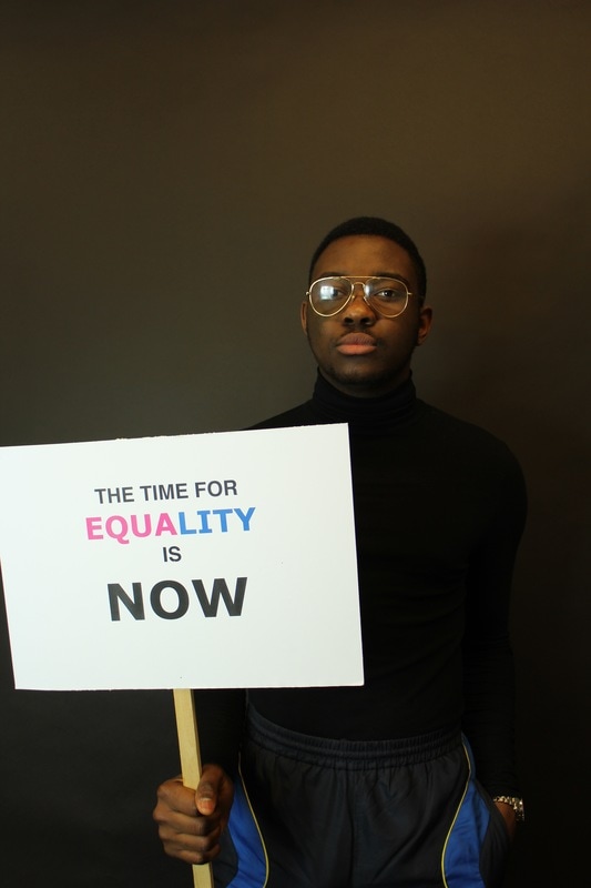
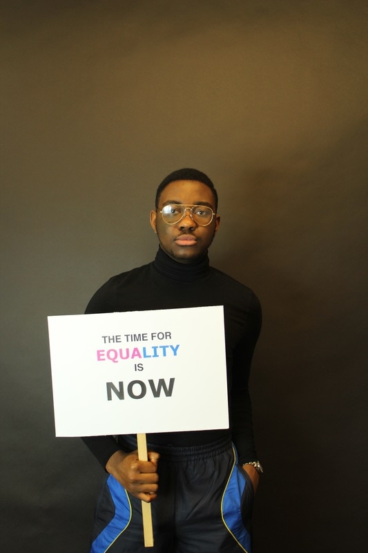
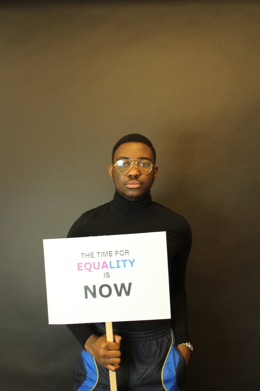
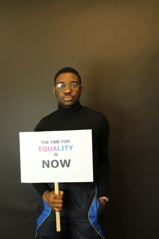
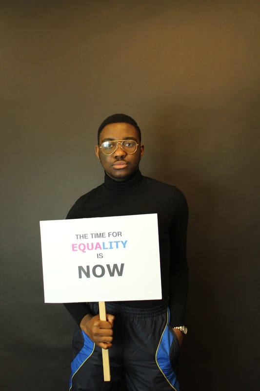
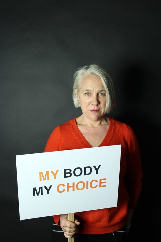
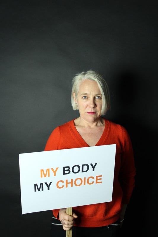
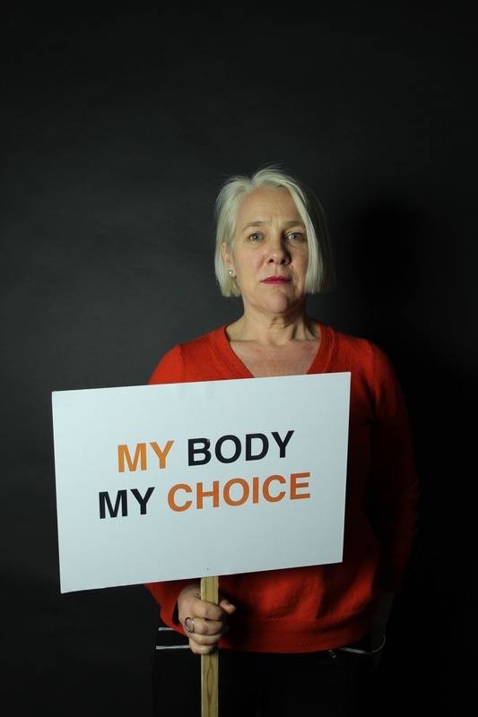
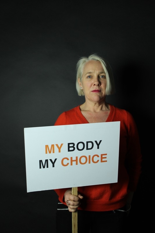
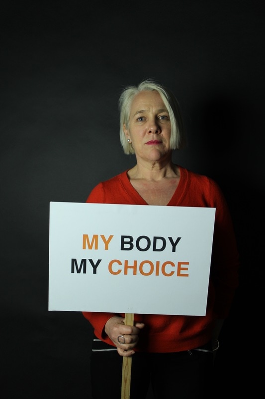
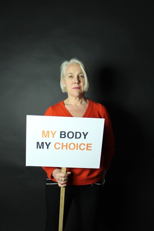
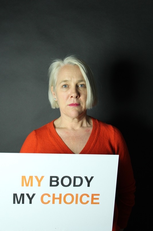
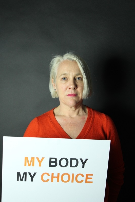
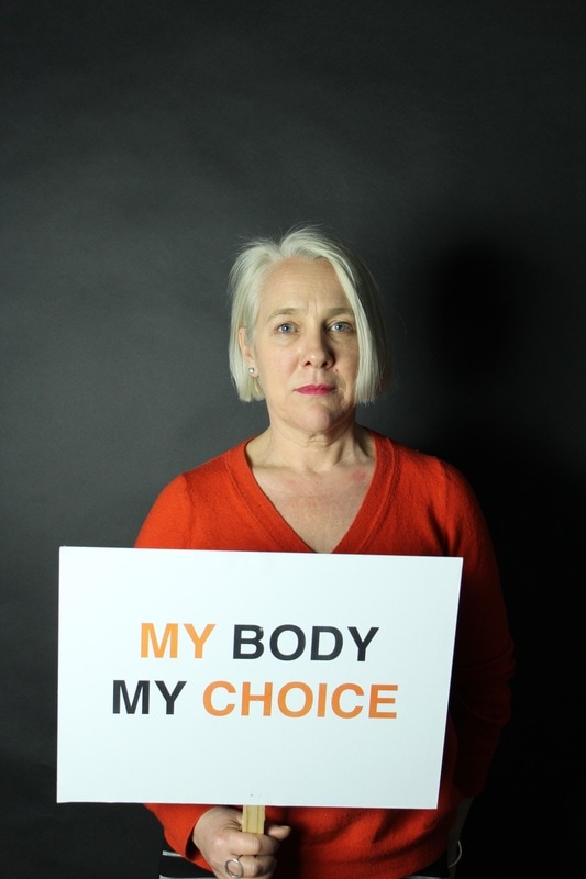
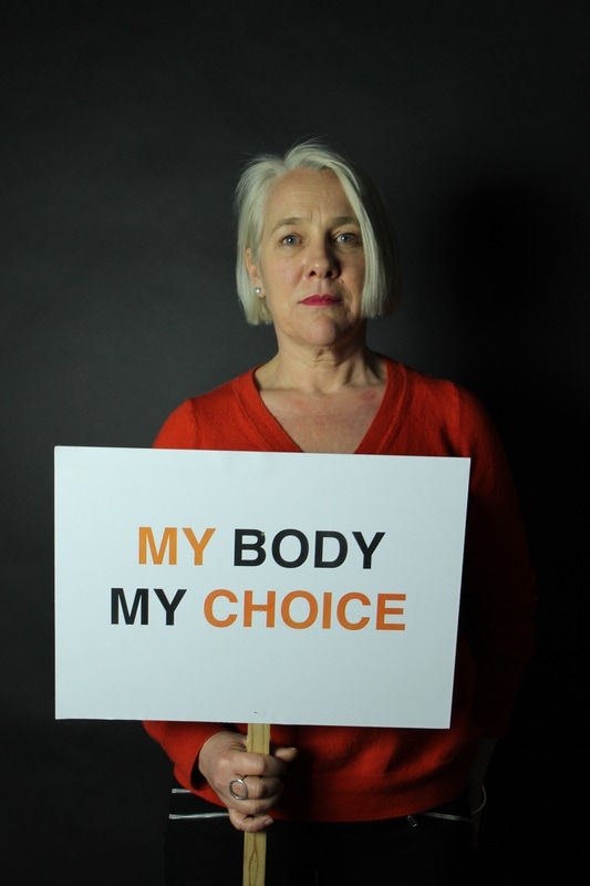
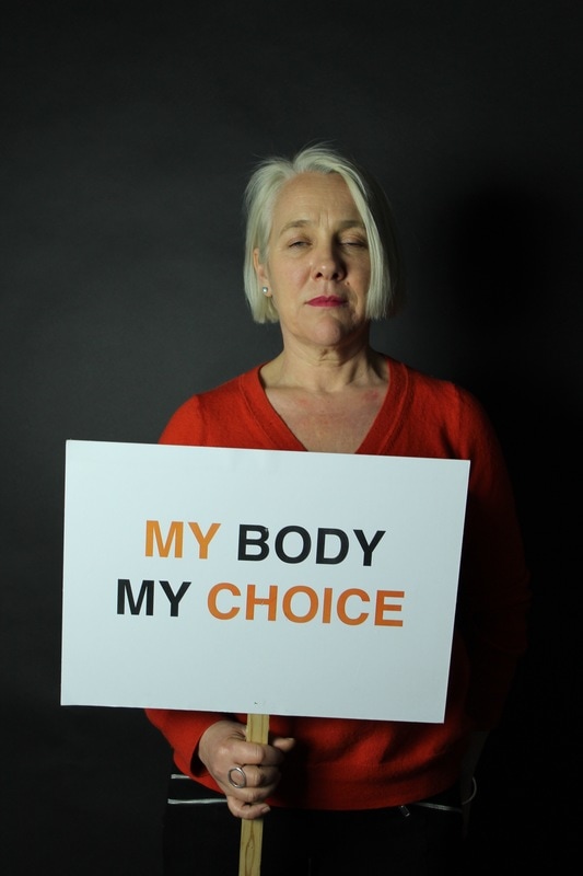
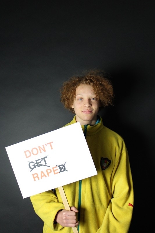
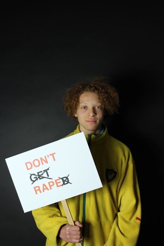
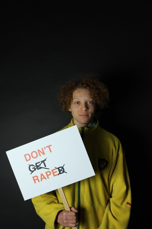
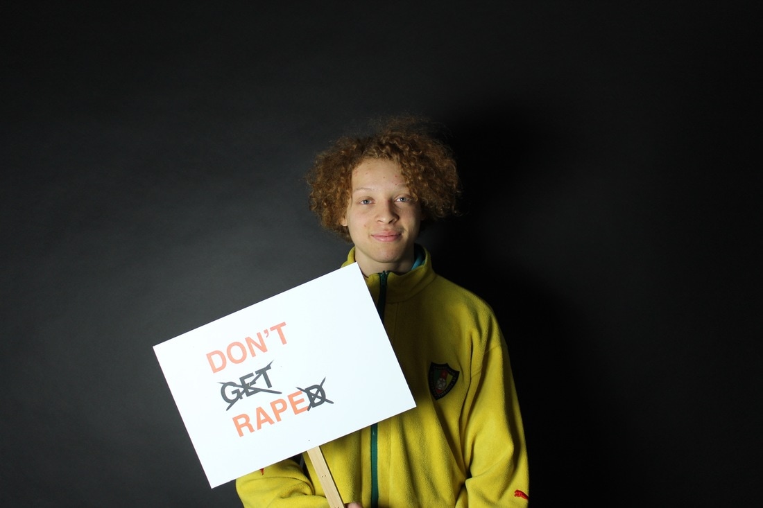
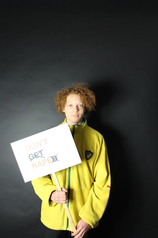
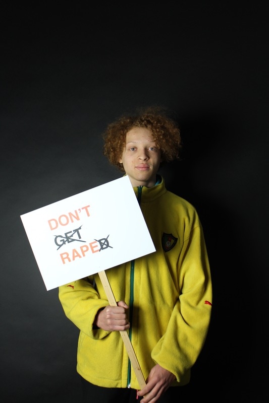
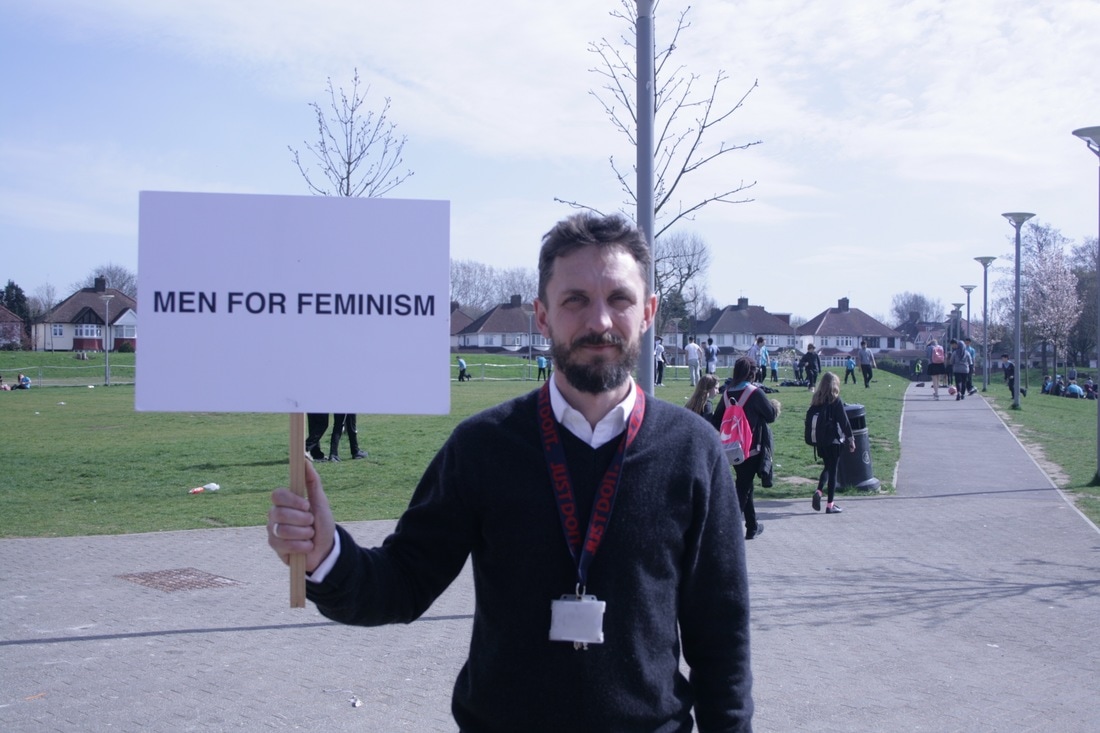
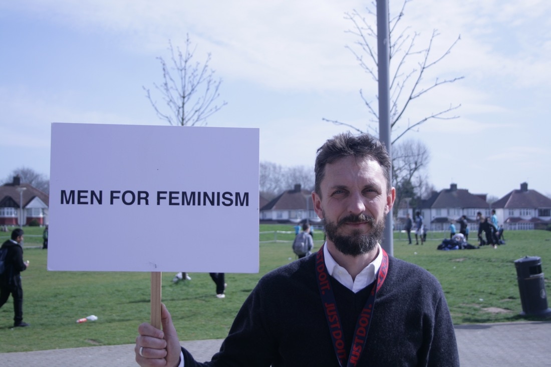
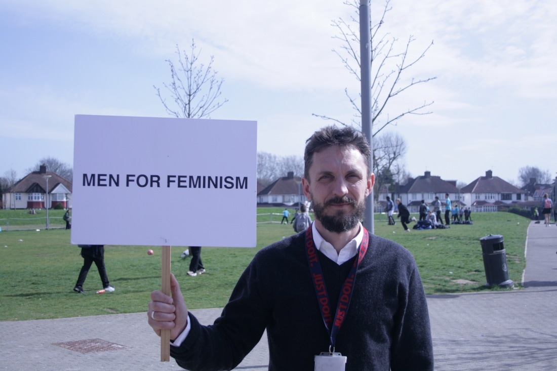
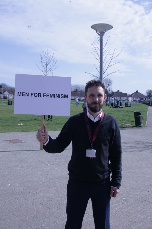
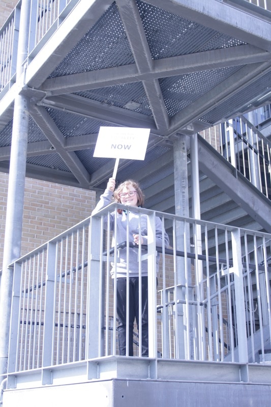
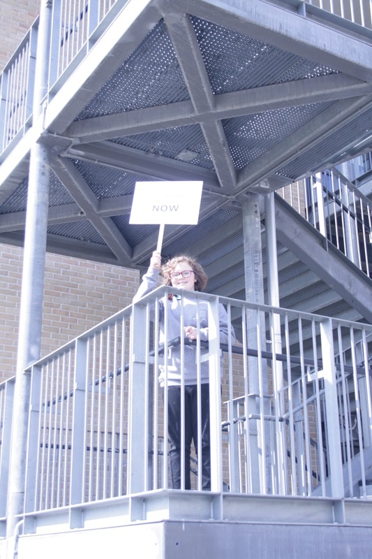
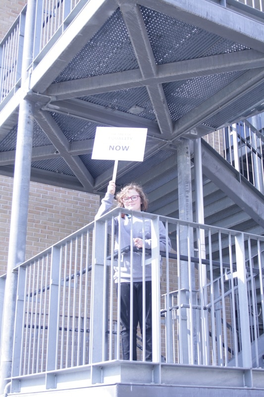
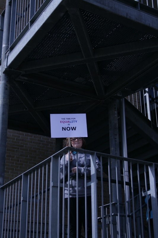
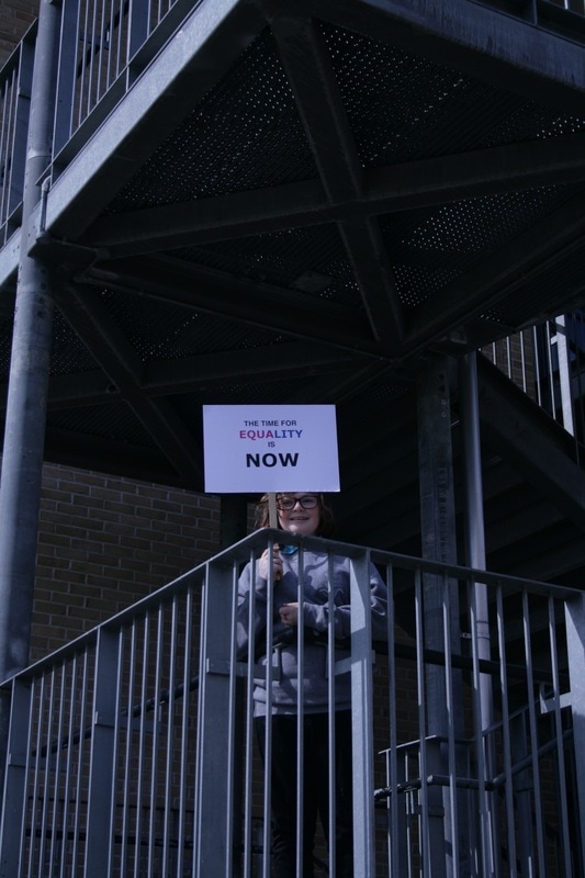
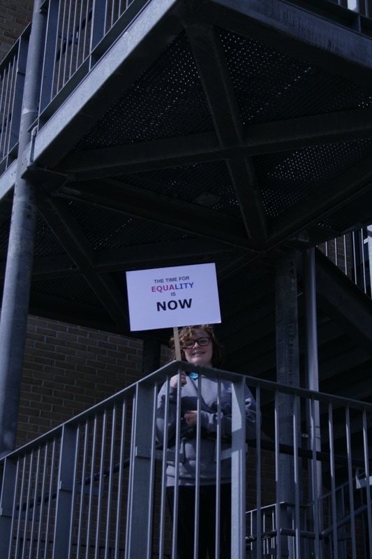
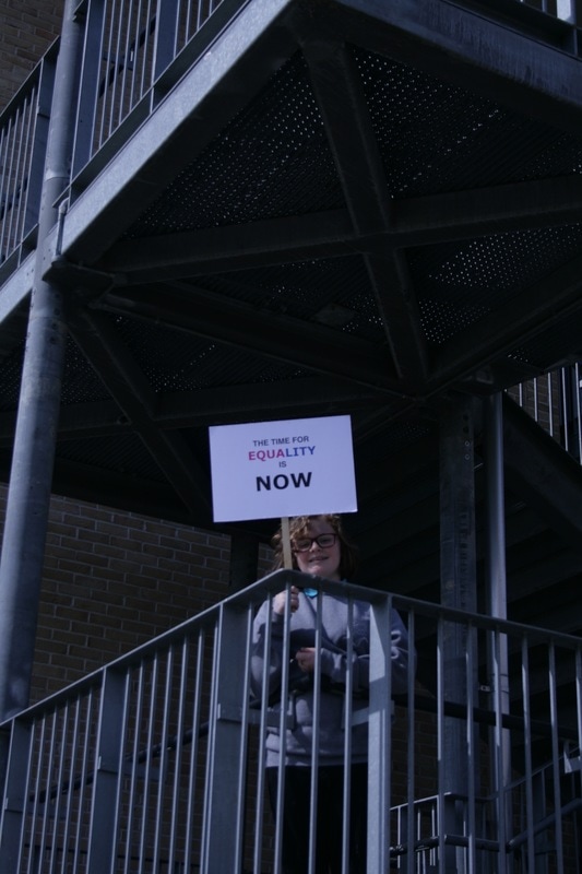
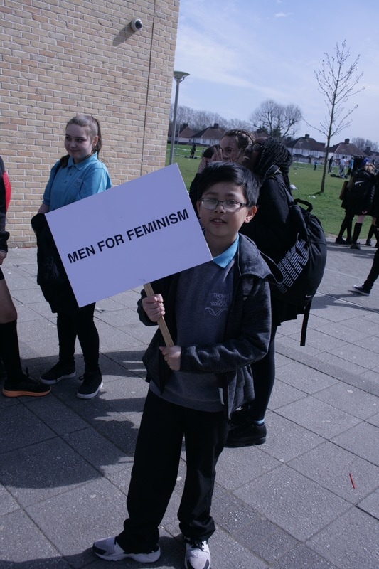
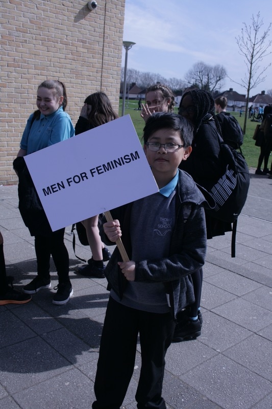
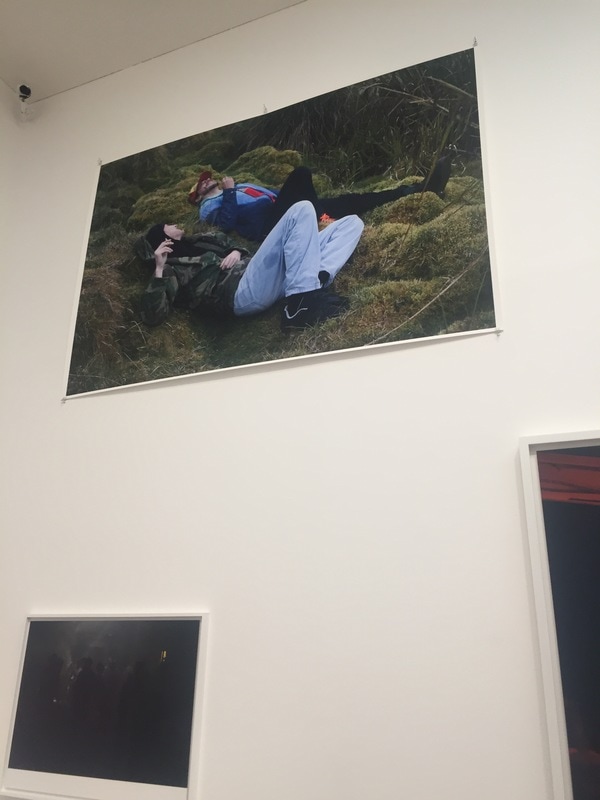
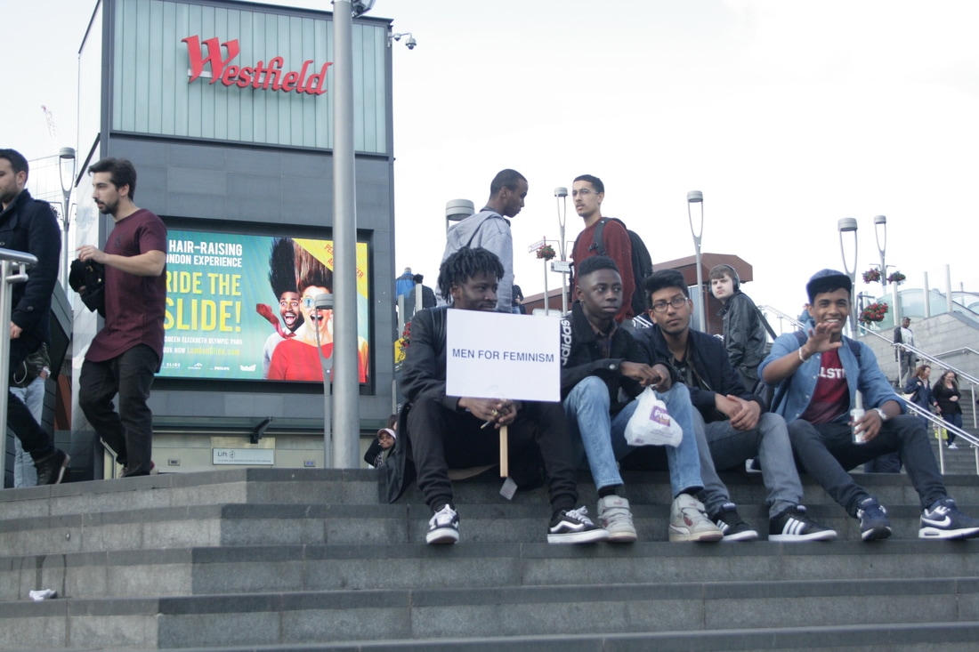
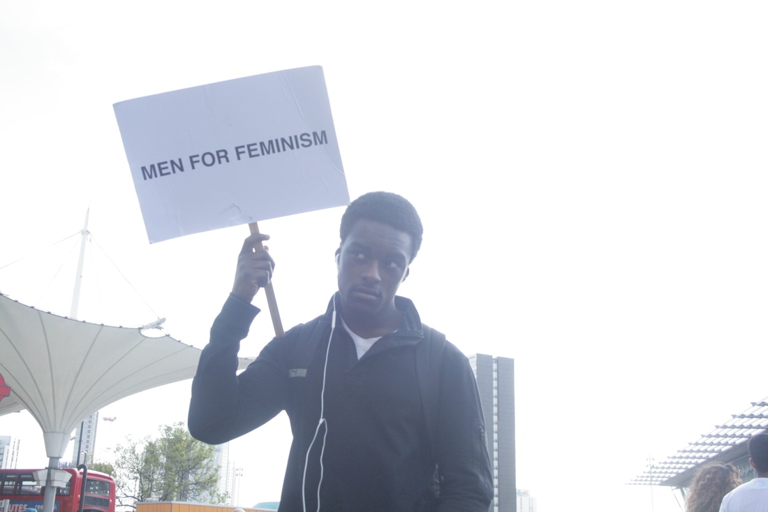
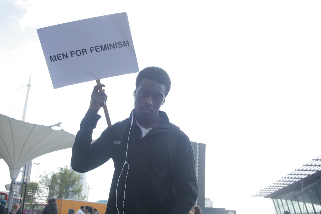
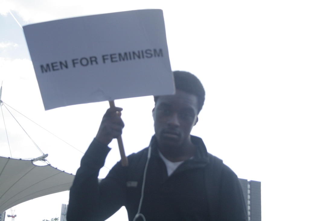
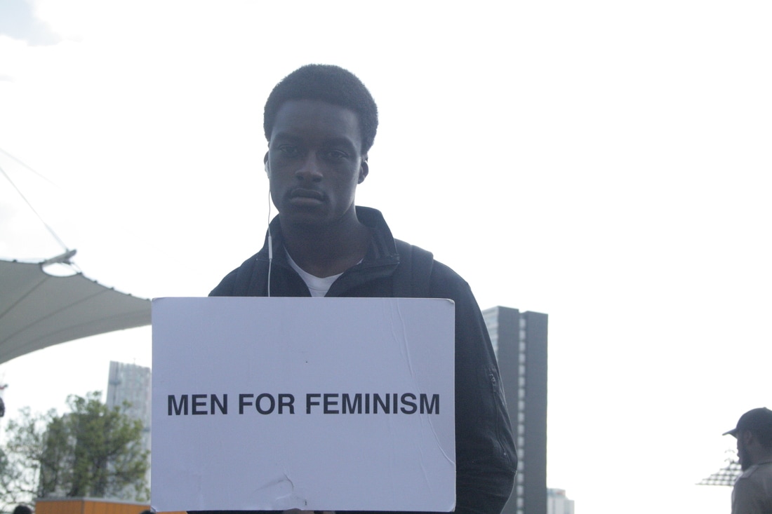
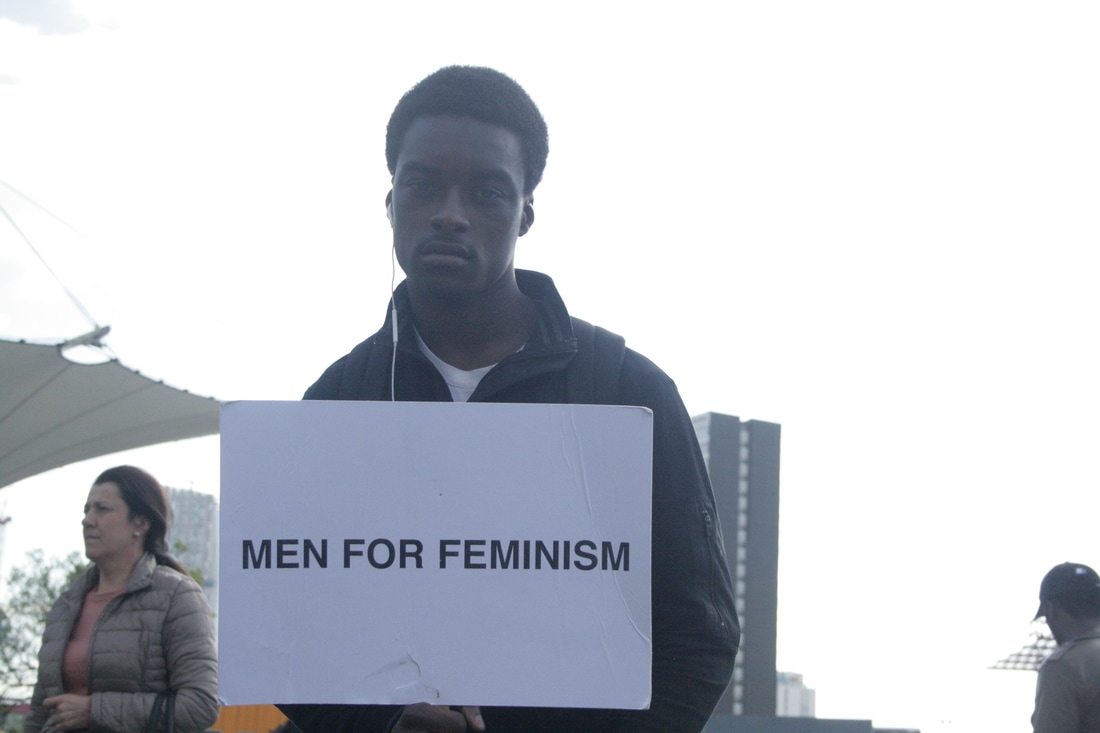
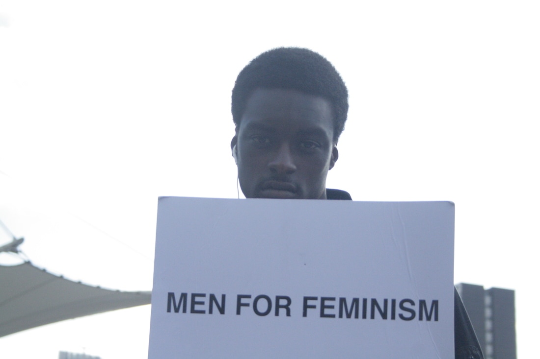
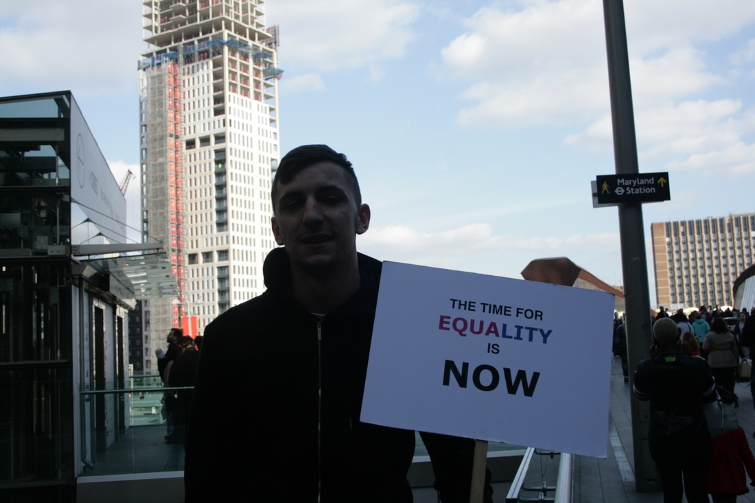
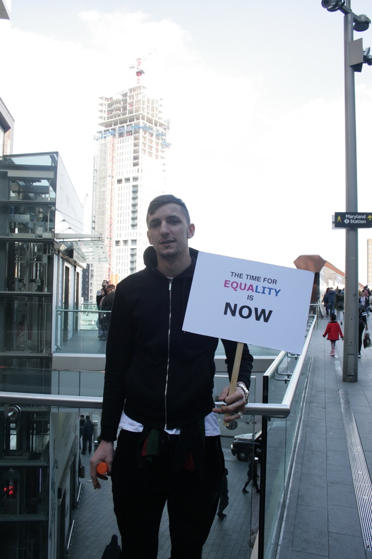
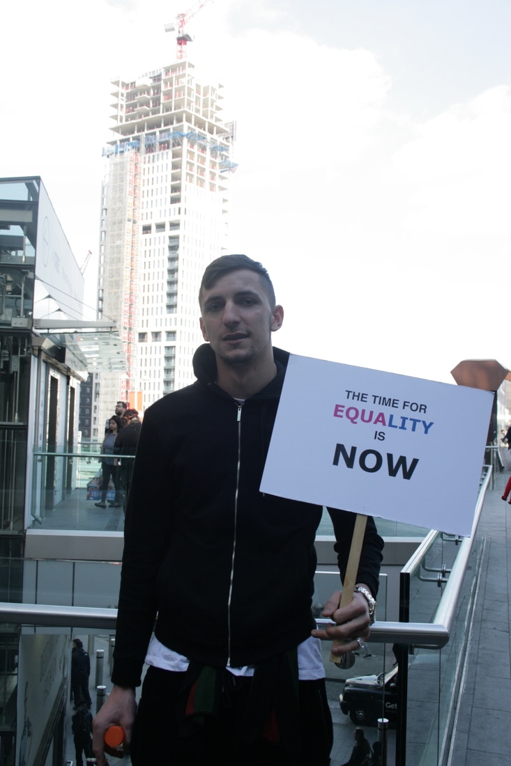
This series of images are from my first response focusing on feminist issues and protests. The main influencer for this campaign was real feminist protests, such as the woman's liberation protests in the 1960's. I experimented with different types of lighting such as natural or artificial lighting and also different types of artificial lighting. When deciding on how I wanted these images to be, I had a mental picture of very plain backgrounds and limited facial expressions as I wanted the signs and the words to be the main focal point of this campaign, although my different use of people and their different styles and personalities is also a noteworthy element; I wanted to use subjects that told their own story, for example using men who are quite masculine, I wanted them to show the side of feminism that most people ridicule, feminism isn't just for women, a lot of men also believe in equal rights for both men and women. To develop this, I want to shoot some photographs outside with more people in the background to see the difference in settings. I believe that will give me an idea of how to further develop this campaign into something more than a staged shoot.
Gillian Wearing
|
|
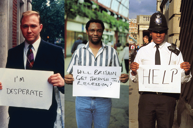
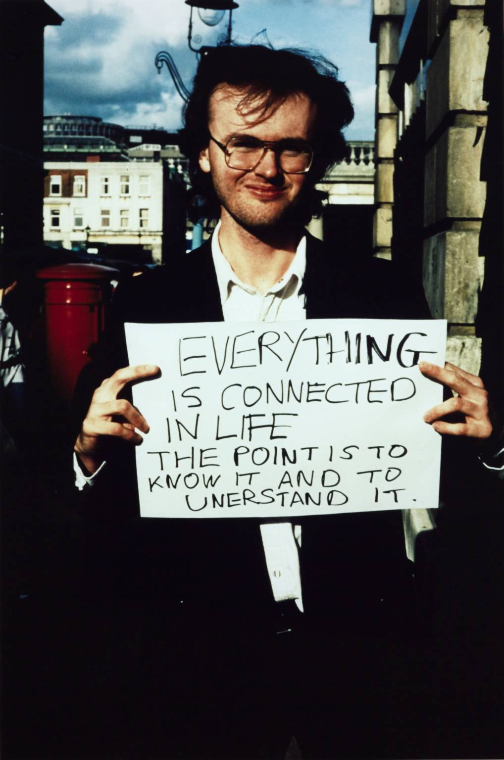
Gillian Wearing is a well-known documentary photographer who uses methods such as photography and film to document the everyday life. Wearing's work often consists of addressing individual identity within the private and the public spaces while blurring the lines between reality and fiction. Wearing's photographs are extremely powerful as they have a very personal element as she got her subjects to write their own thoughts, so each photograph is personal to each subject.
Although I do not particularly like Wearings photographs, I believe that it has been useful to look at her work and take some helpful knowledge from about the power that a written message can have when executed properly. Furthermore, by looking at Wearings photographs, I think it will help me understand how to take photographs in public spaces better and places other than a studio where there are a lot more elements that you have to factor in to achieve a good image. |
Experimentation portraits
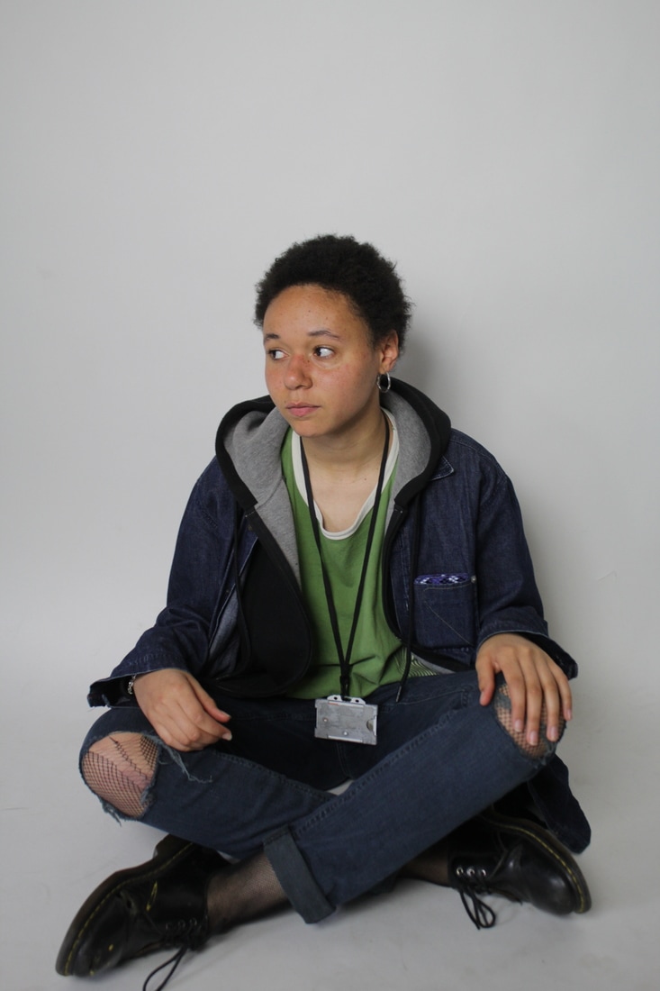
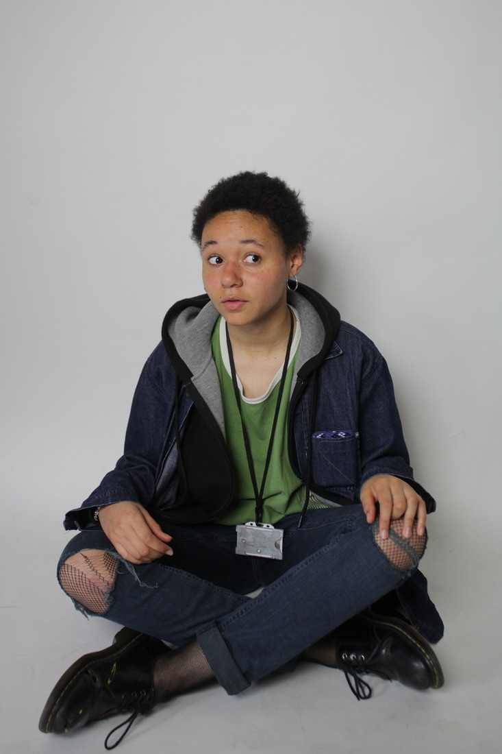
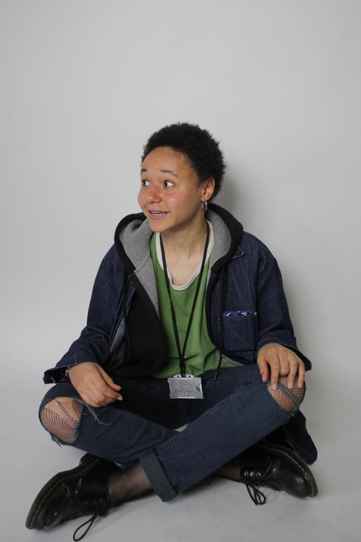
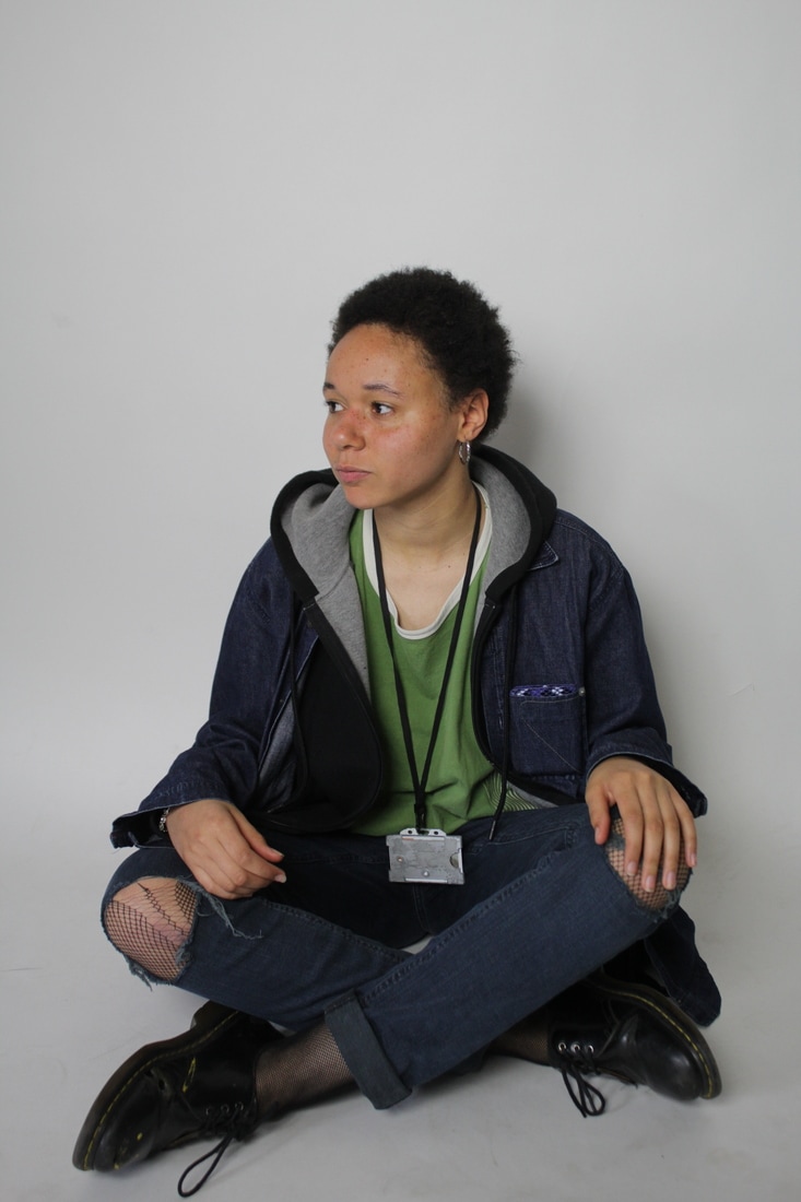
I took this series of images experimenting with different lighting and using a green screen for the first time. My original intention was to use these photographs to create a campaign about self-expression and identity. Overall, I am satisfied with the quality of these photographs and enjoyed experimenting with different equipment to gain a wider knowledge of photography equipment and how campaign photographs are taken, however, I do not wish to use these images in an outcome as I do not feel that the message is strong enough in them and do not believe that they would make a strong, personal and meaningful campaign.
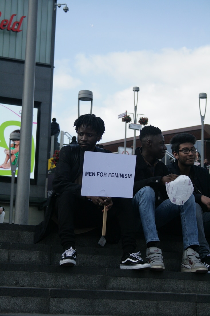
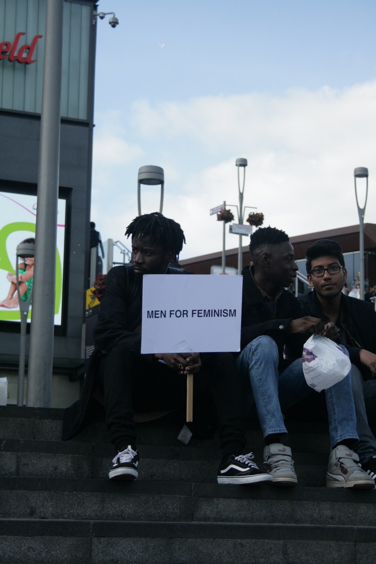
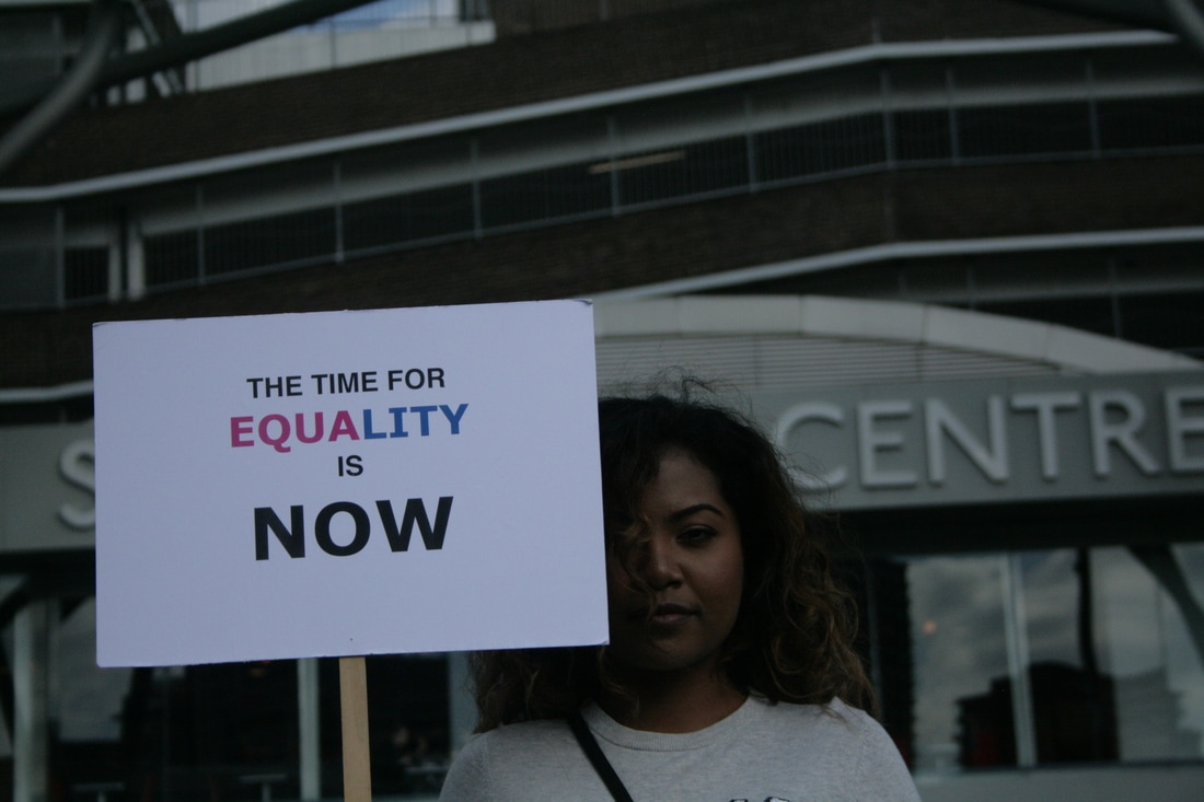
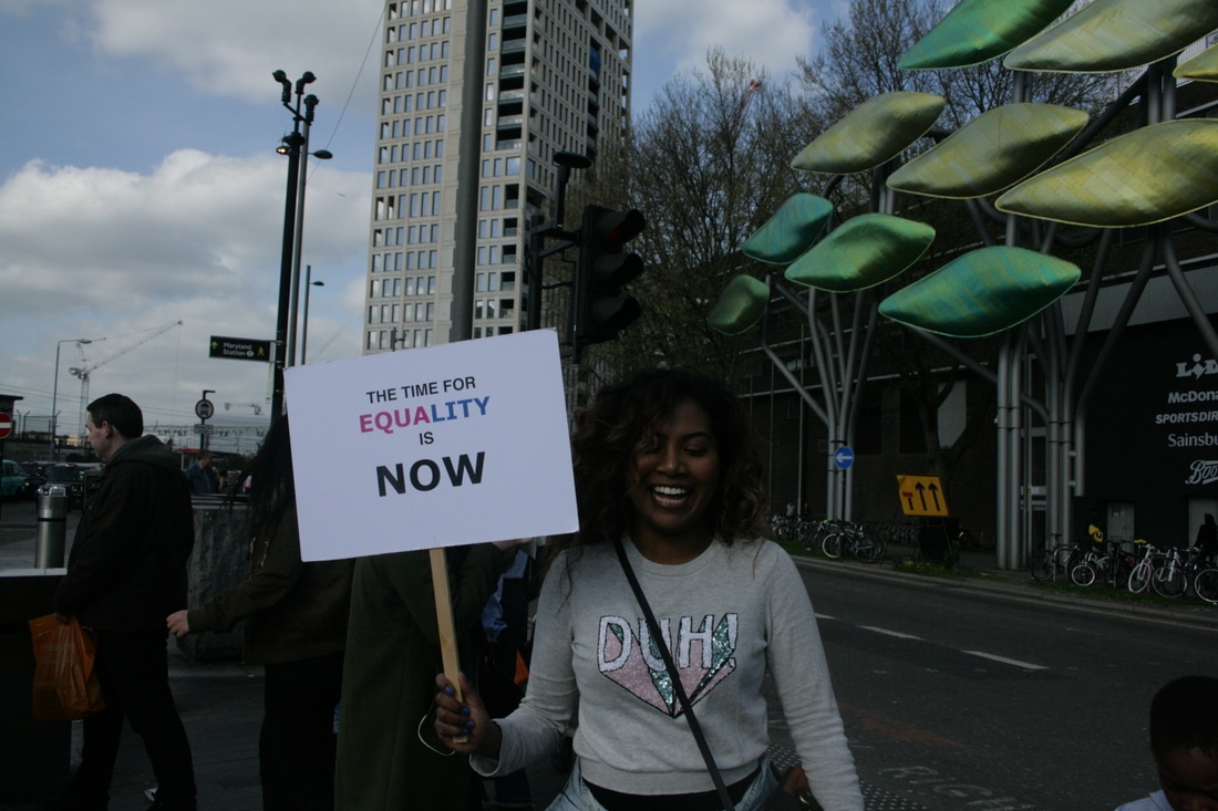
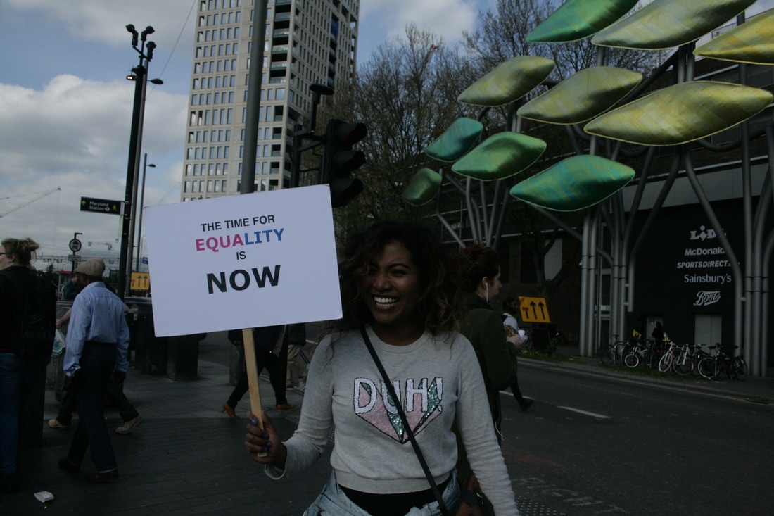
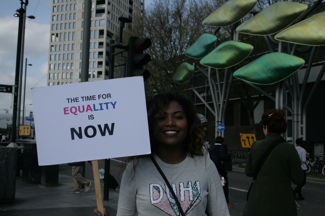
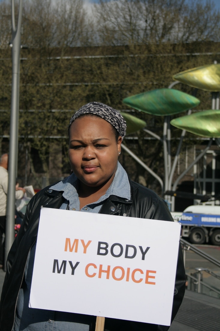
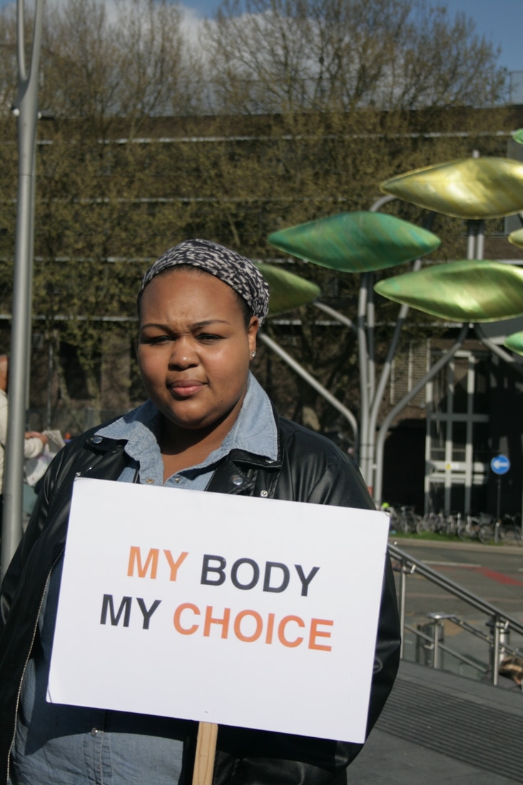
Feminist Protest Campaigns development #1
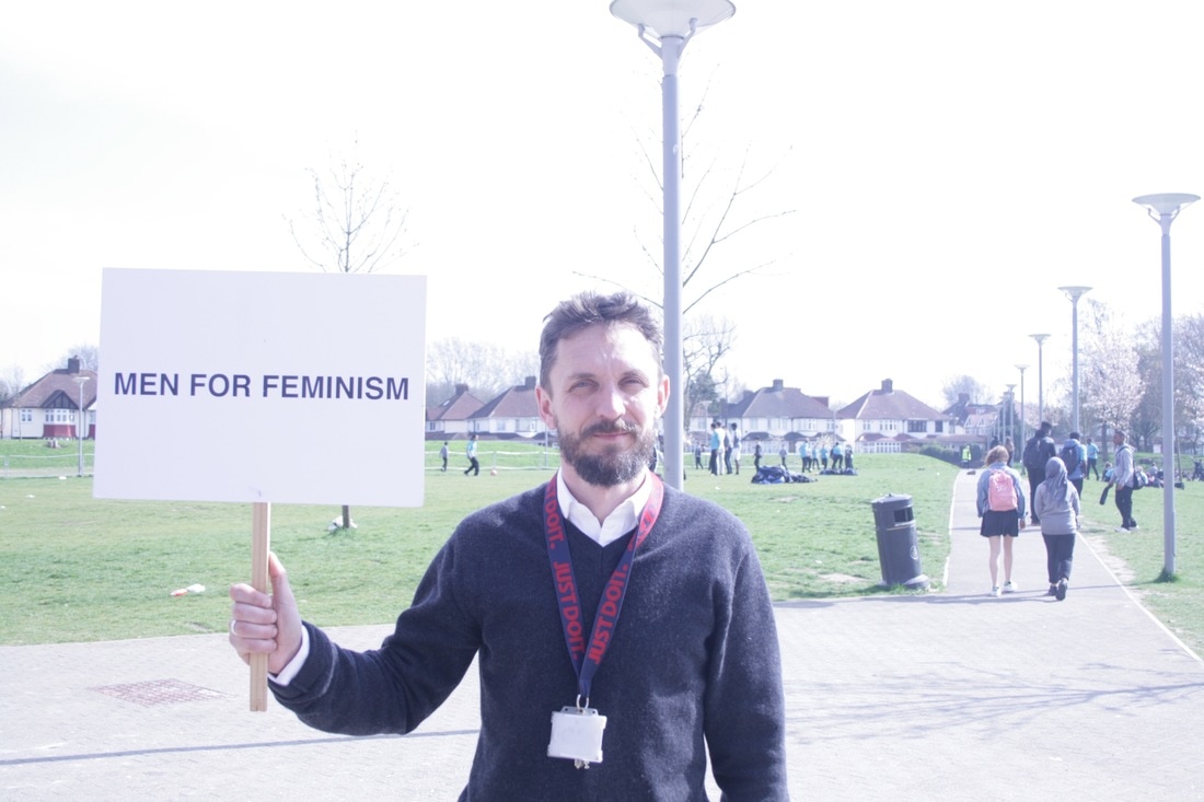
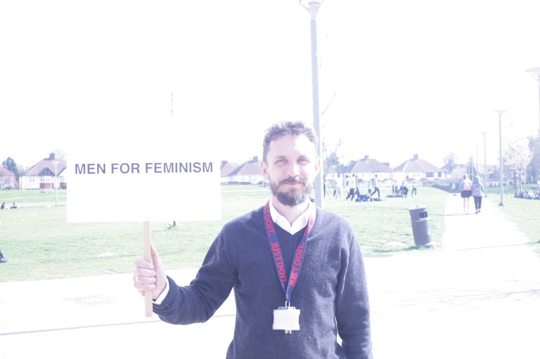
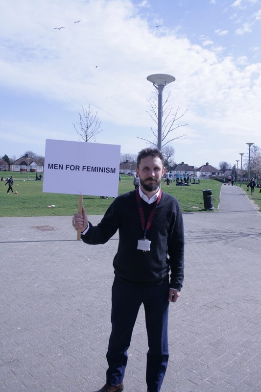
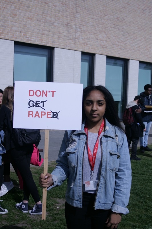
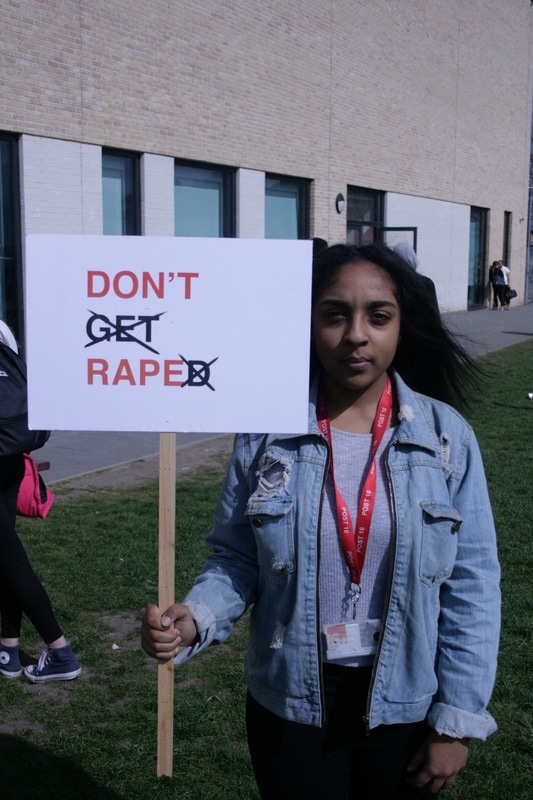
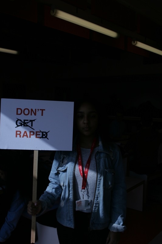
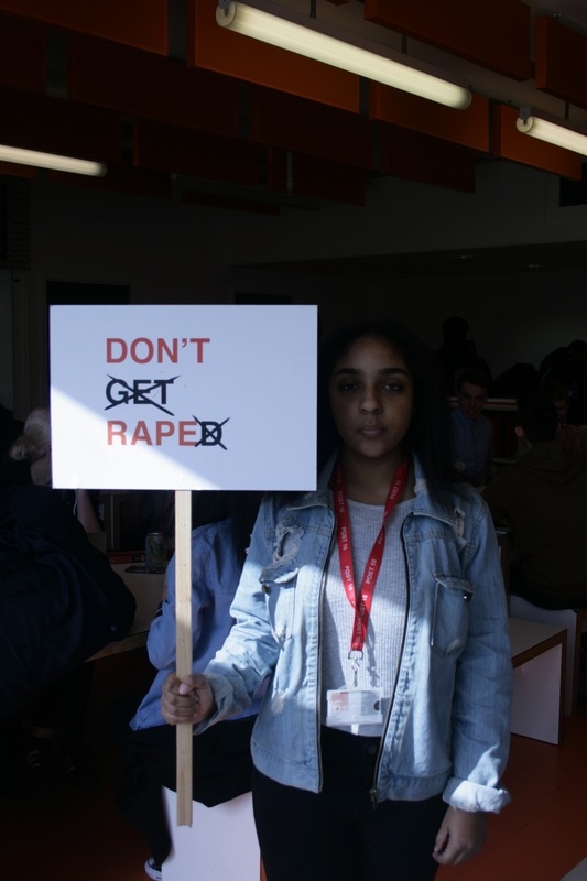
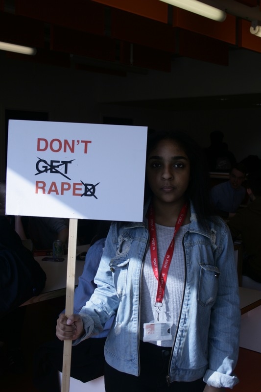
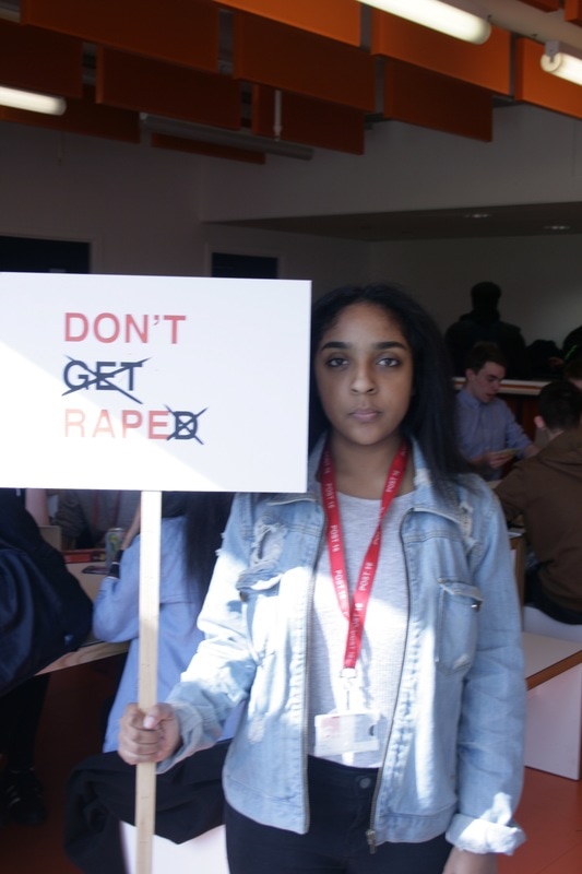
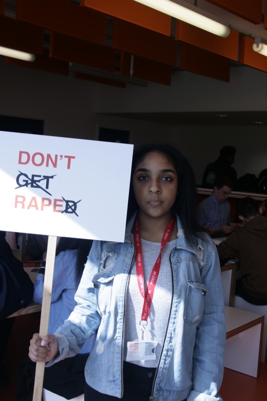
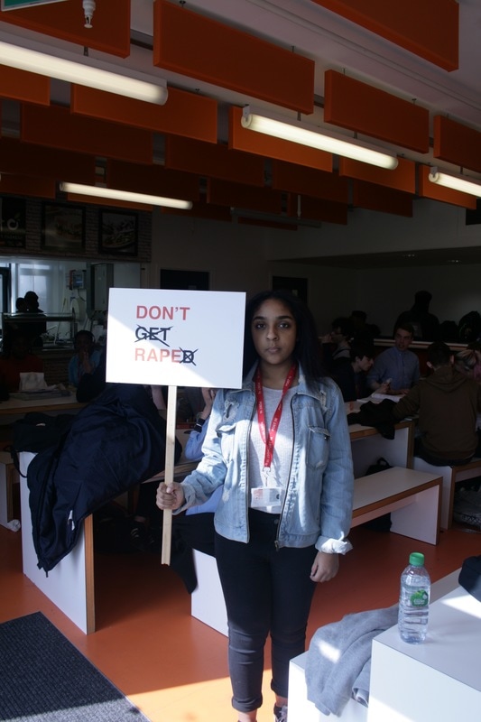
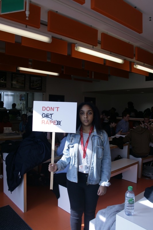
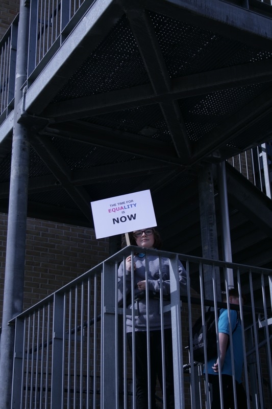
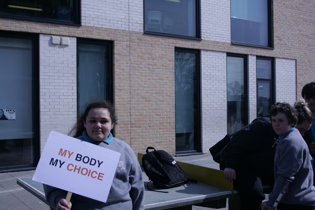
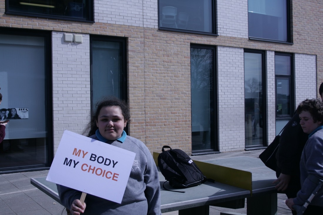
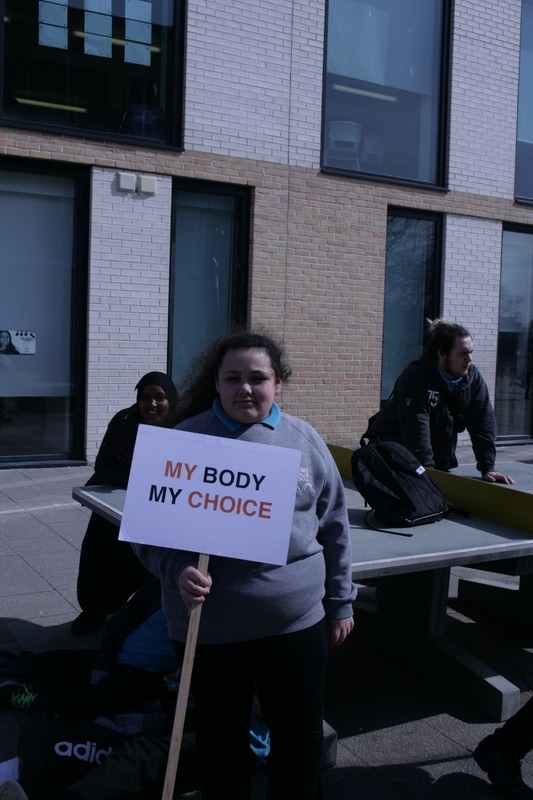
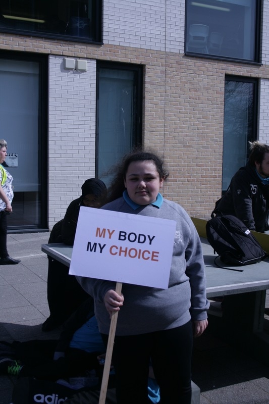
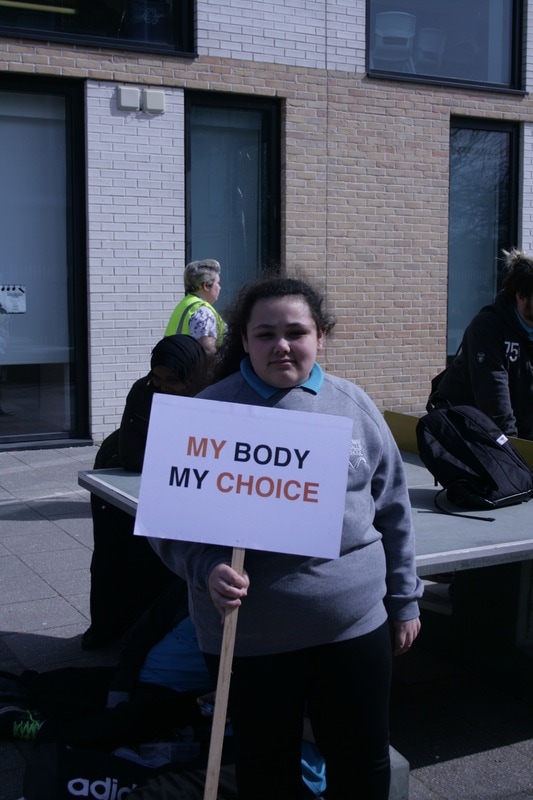
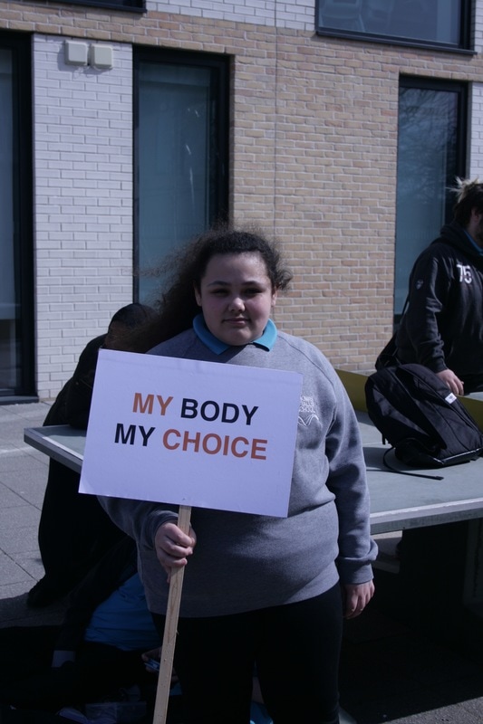
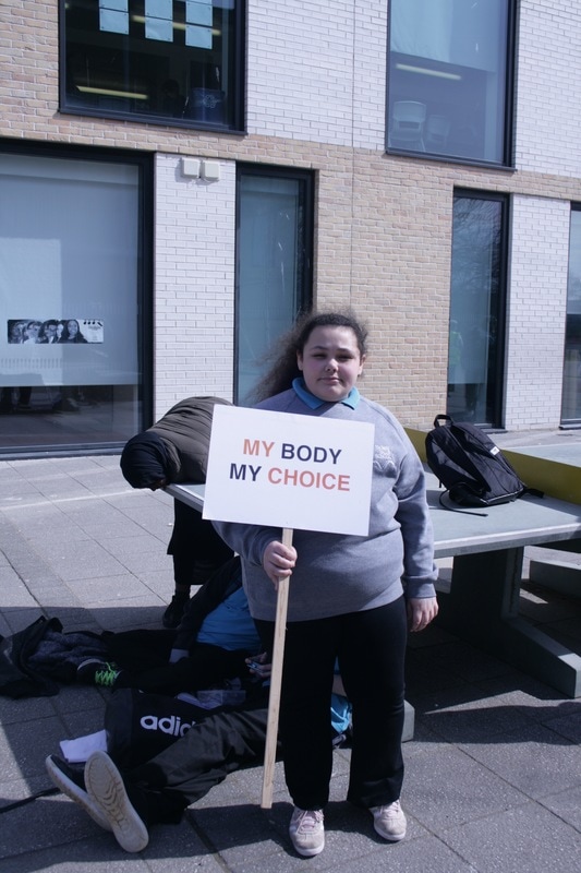
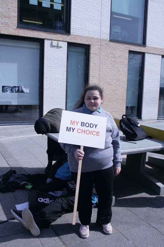
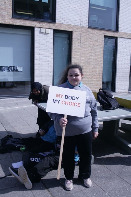
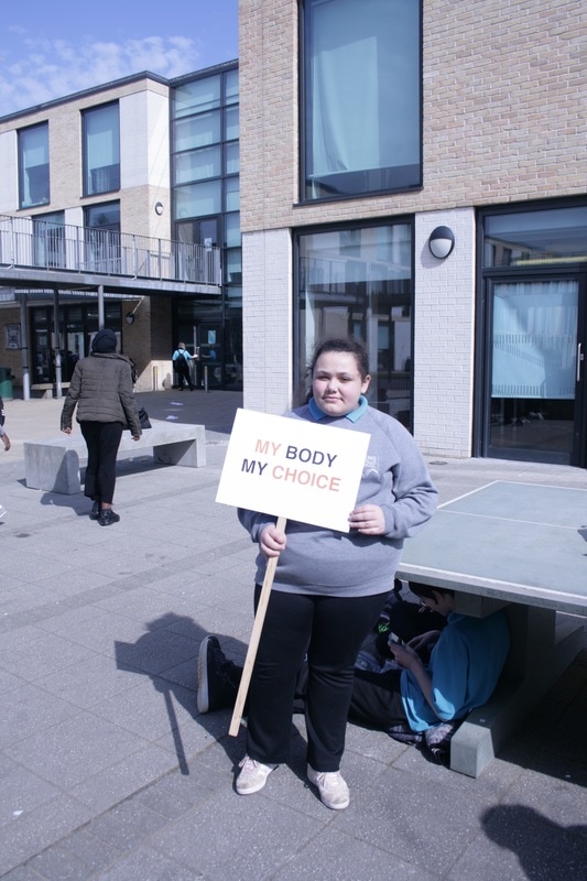
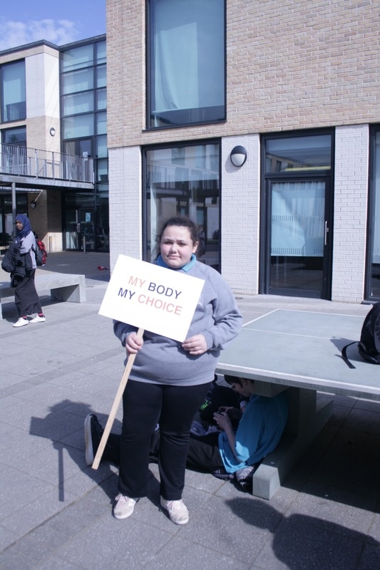
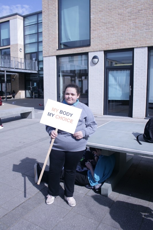
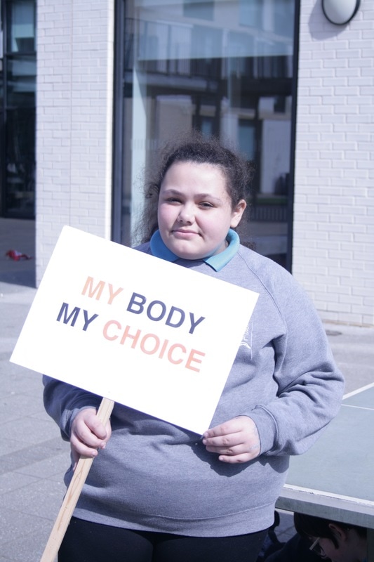
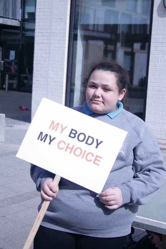
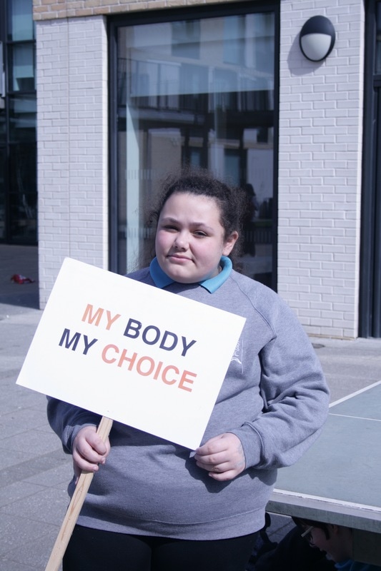
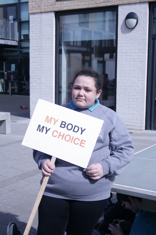
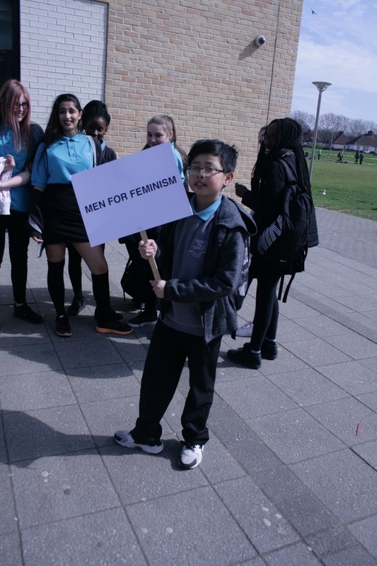
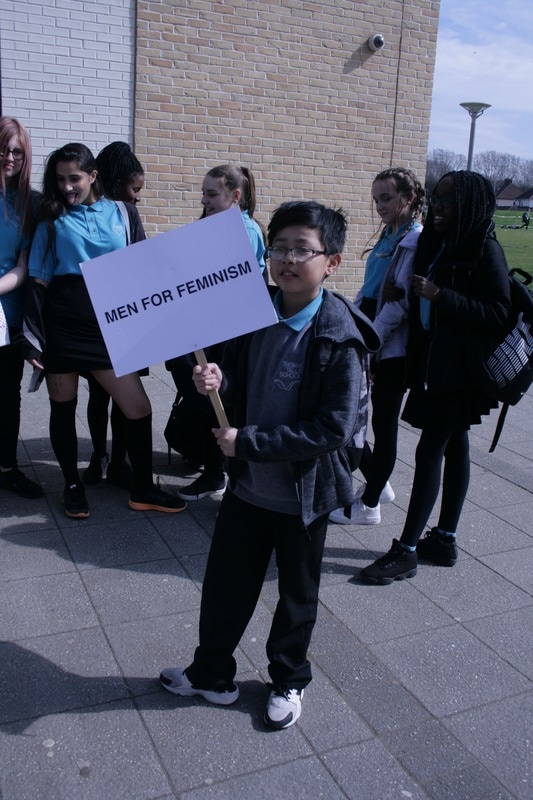
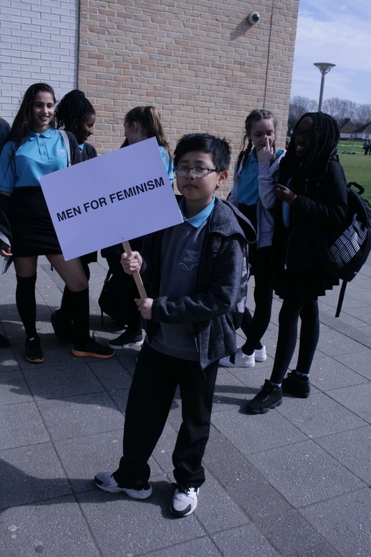
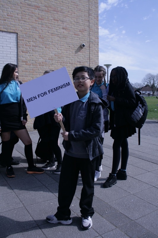
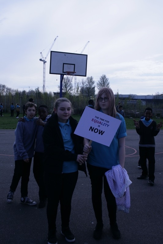
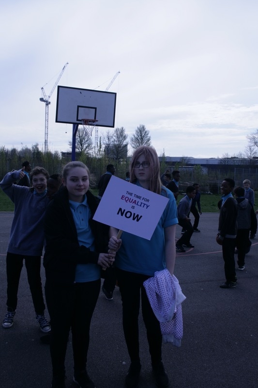
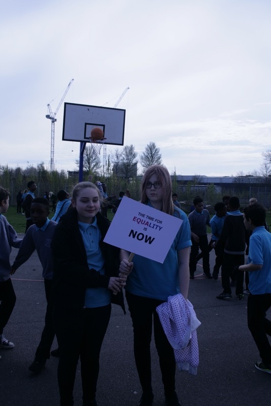
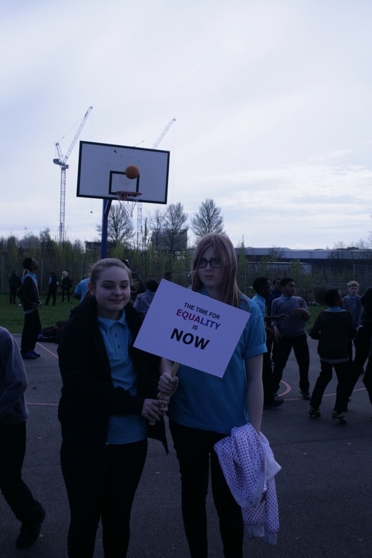
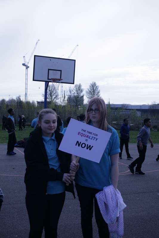
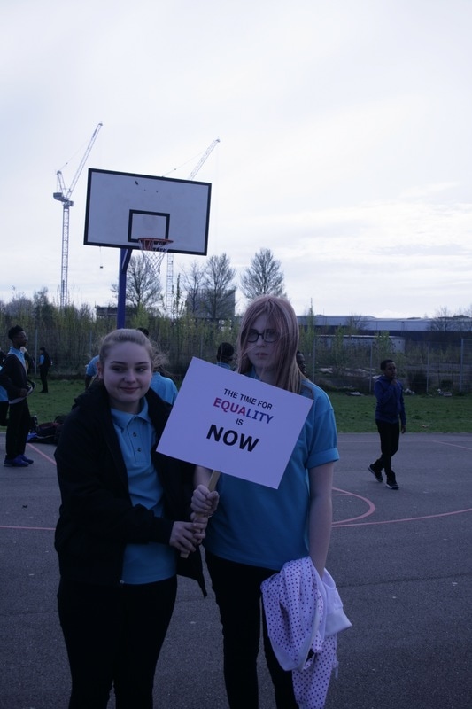
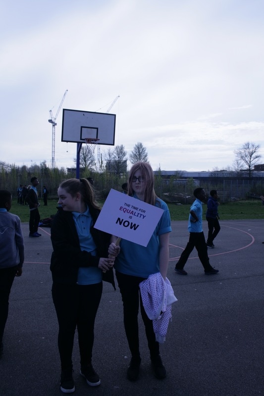
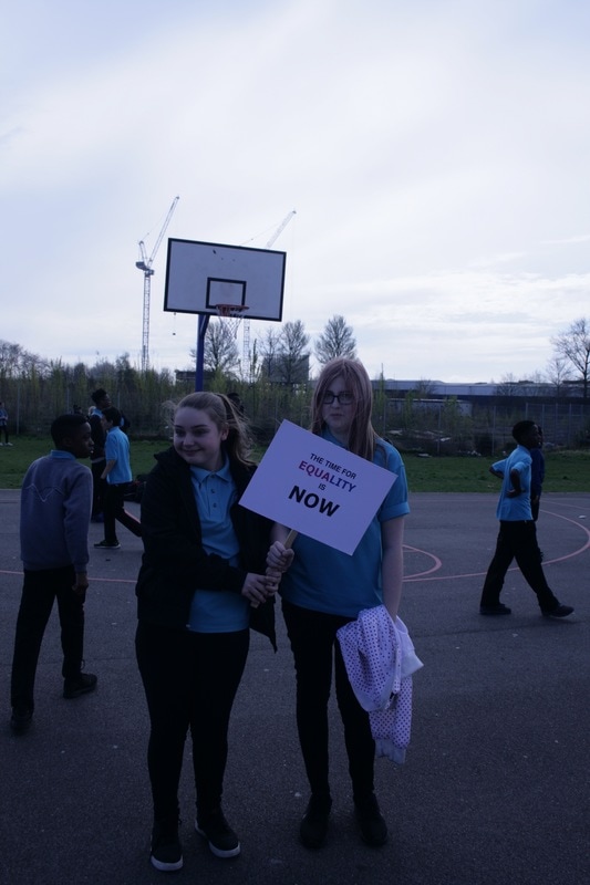
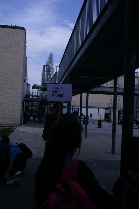
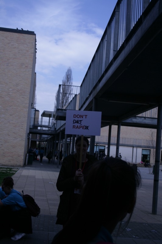
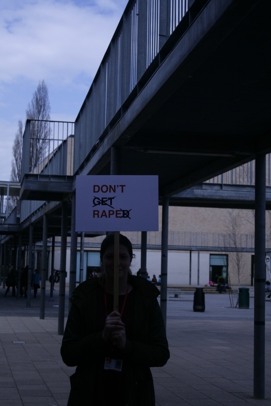
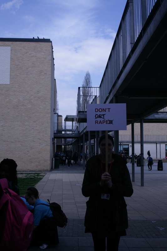
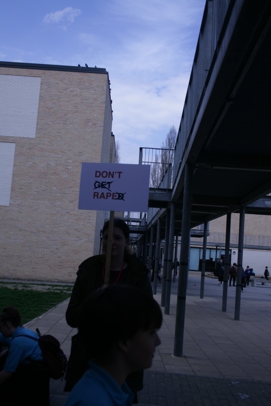
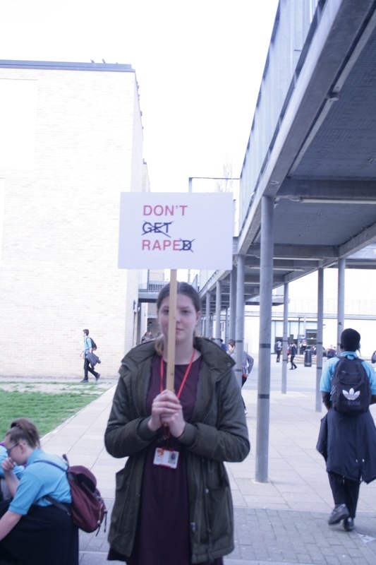
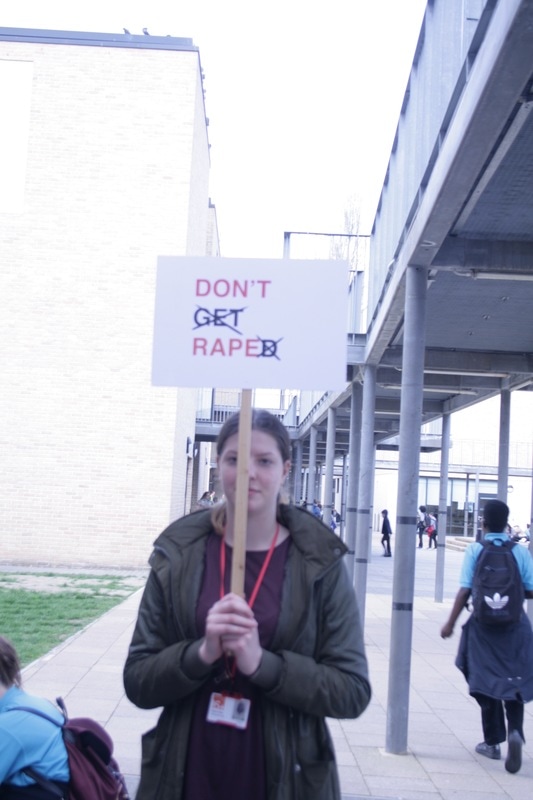
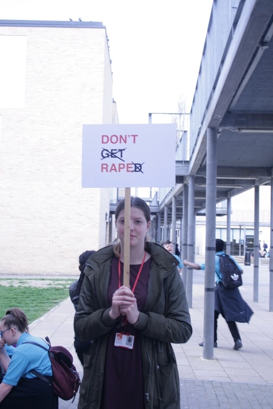
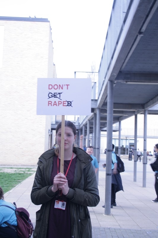
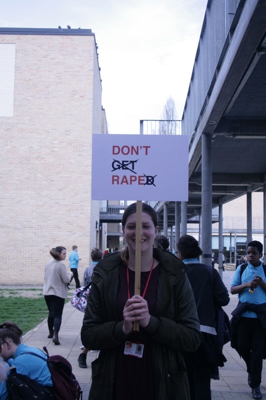
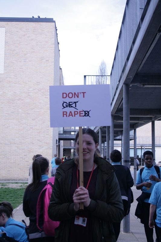
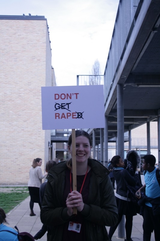
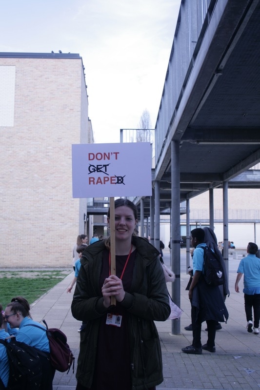
After my first experiment in the studio using a plain black backdrop, I decided that my next shoot should be in a familiar setting such as my school with people who offer to participate. Not only did this allow me to get a more natural and unforced representation of a feminist protest or campaign, it allowed me to explore people's reactions to protests and campaigns of this nature. I found this shoot a lot more challenging than the staged shoot as I had to factor in the surrounding people and changes in natural light. Another difficulty with this is that because of it being in a school, a lot of the viewers in the background didn't understand the topic as they were quite young. If I were to do this again in a school setting, I would possibly film the experience too as the reactions of some of the people were very interesting and could possibly have been made into a film campaign.
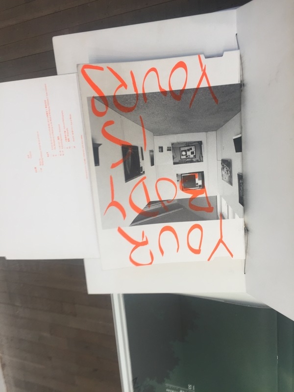
Wolfgang Tillmans: Tate Modern
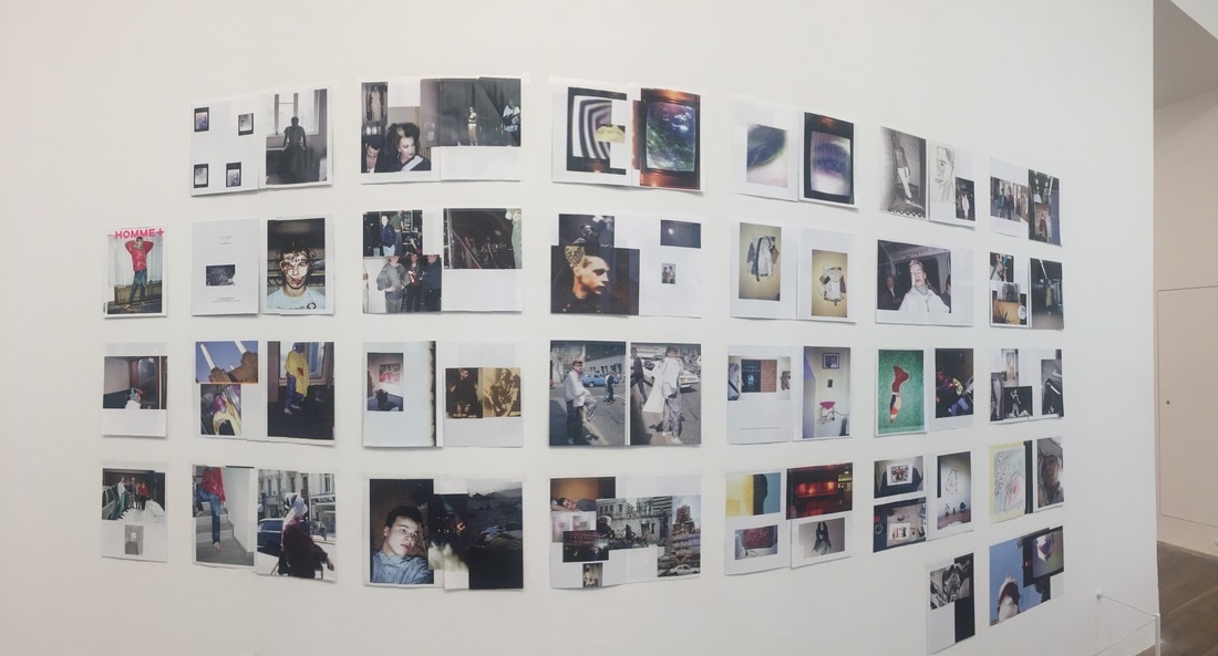
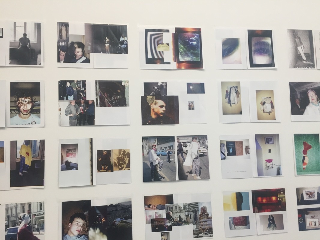
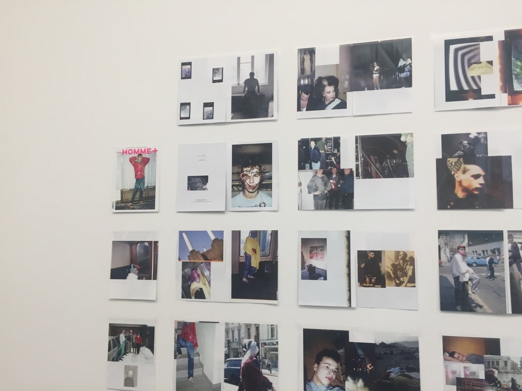
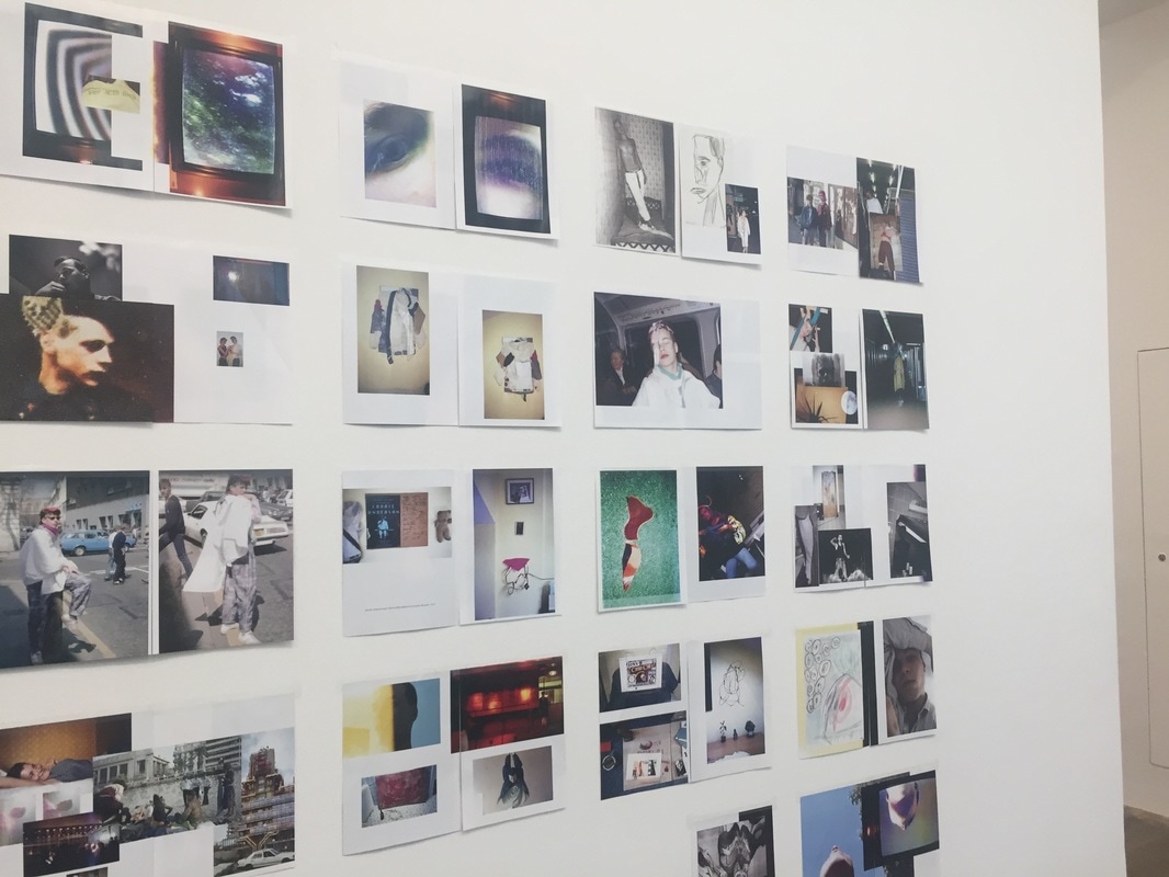
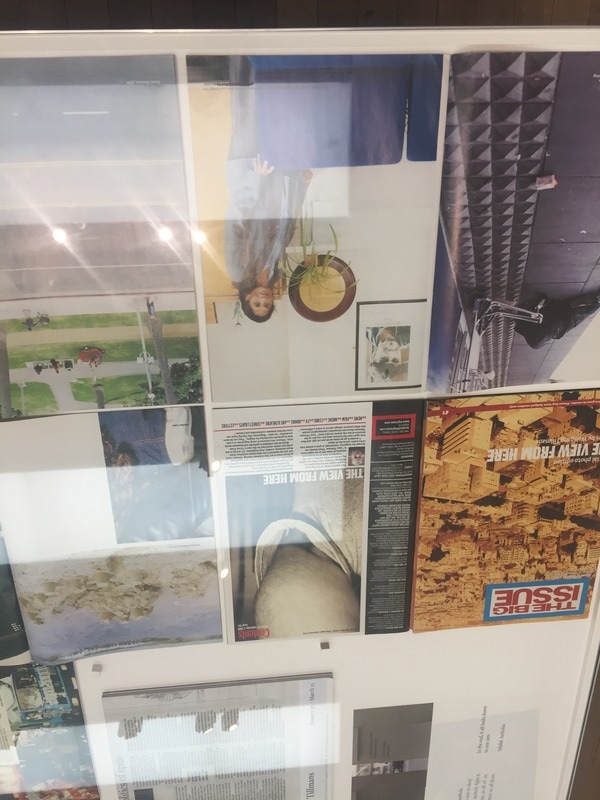
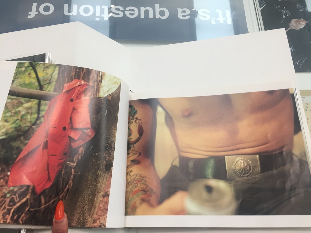
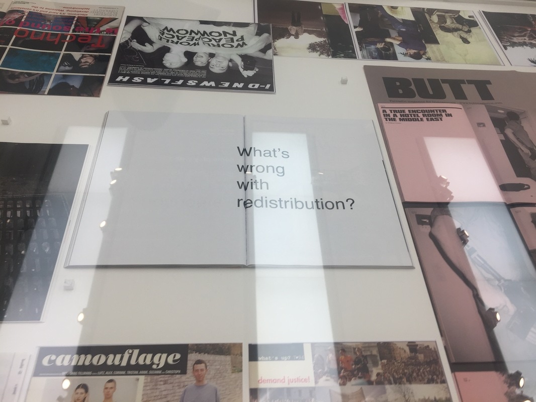
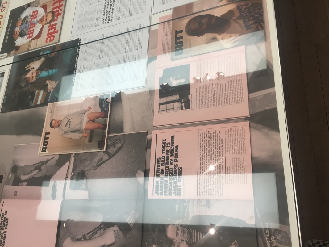
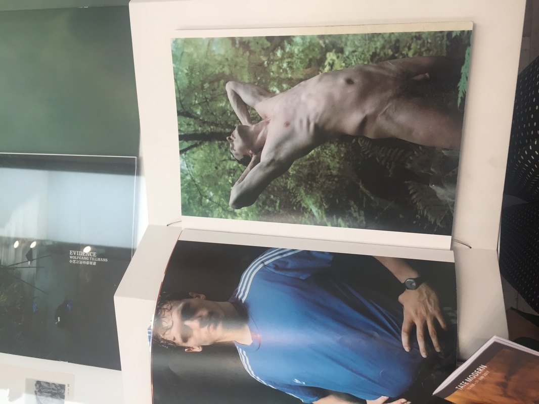

All of Tillmans' exhibitions are thoughtfully placed, he curated all of the rooms
Each photograph is mindful of having a purpose and is well constructed, including ones which he has purposefully brought the quality down on.
Tillmans has created photographs that are accessible for everyone and made a point of showing that everyone can have a say and campaign for what they believe in by any means necessary, whether it be by photocopying articles or going out to take photographs.
Tillmans used exhibition as a whole is a campaign, each room's selection of images are connected in some type of way
Tillmans thoughtfully included a large selections of his work, often originally unrelated to show that everything has the possibility of becoming a campaign if you take your time to curate it in a delicate manner, also Tillmans uses this exhibition to get us to make many different kinds of connections amongst photographs, eg political,
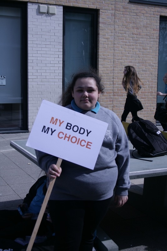
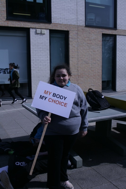
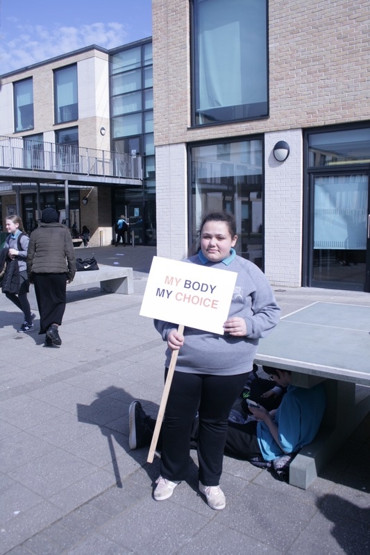
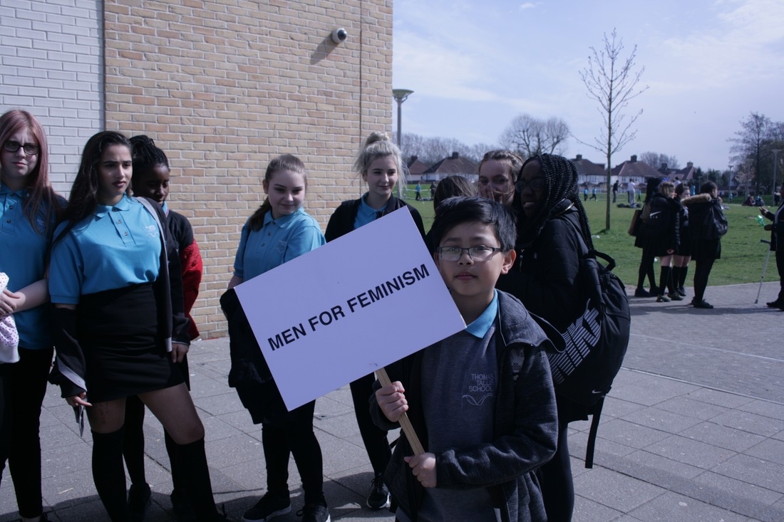
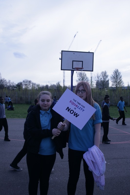
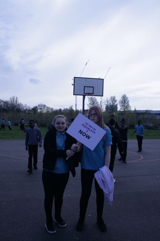
Feminist Protest Campaigns development #2
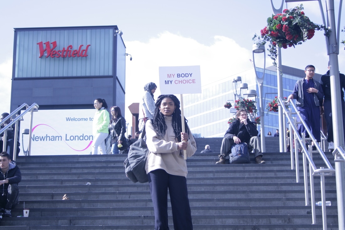
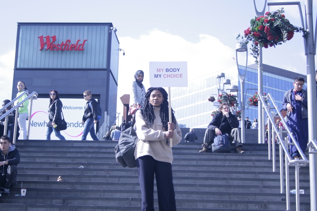
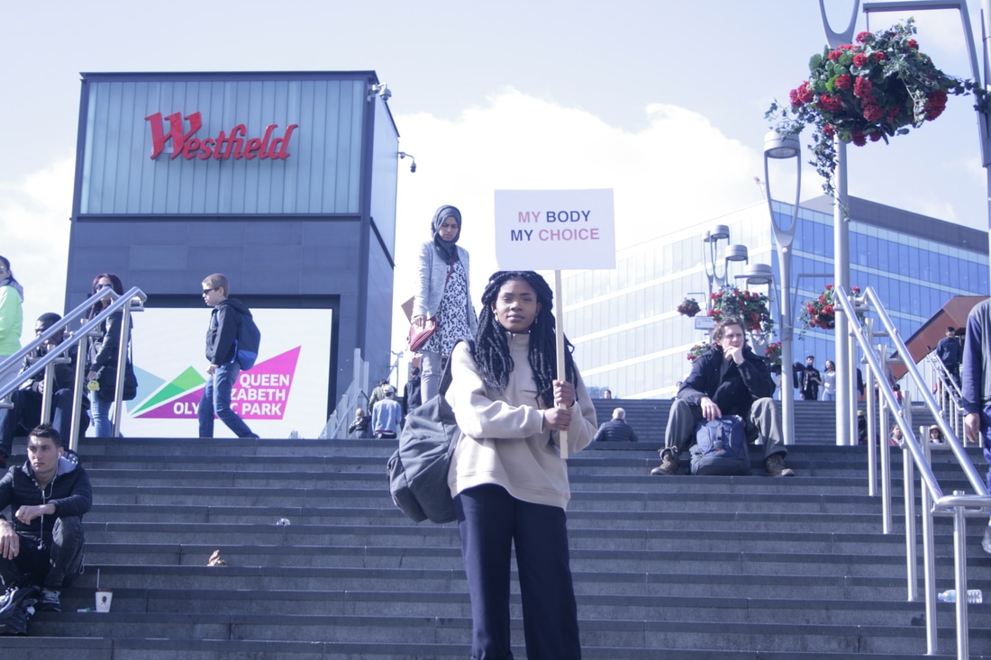
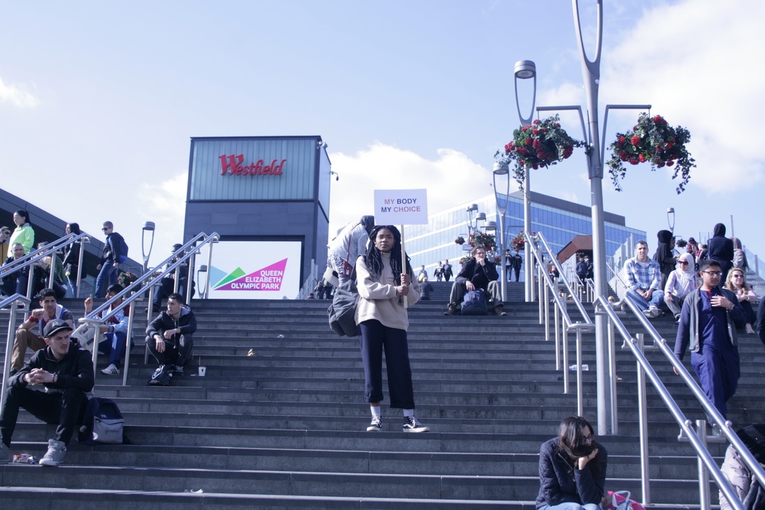
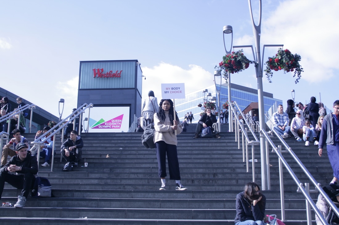
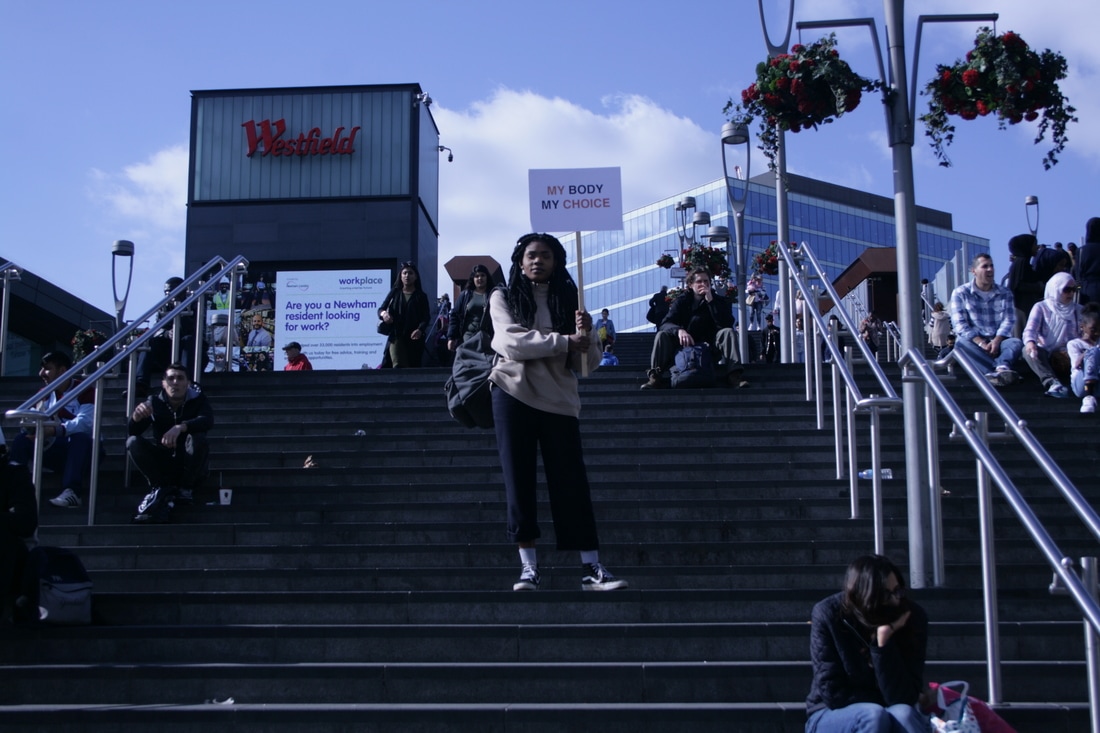
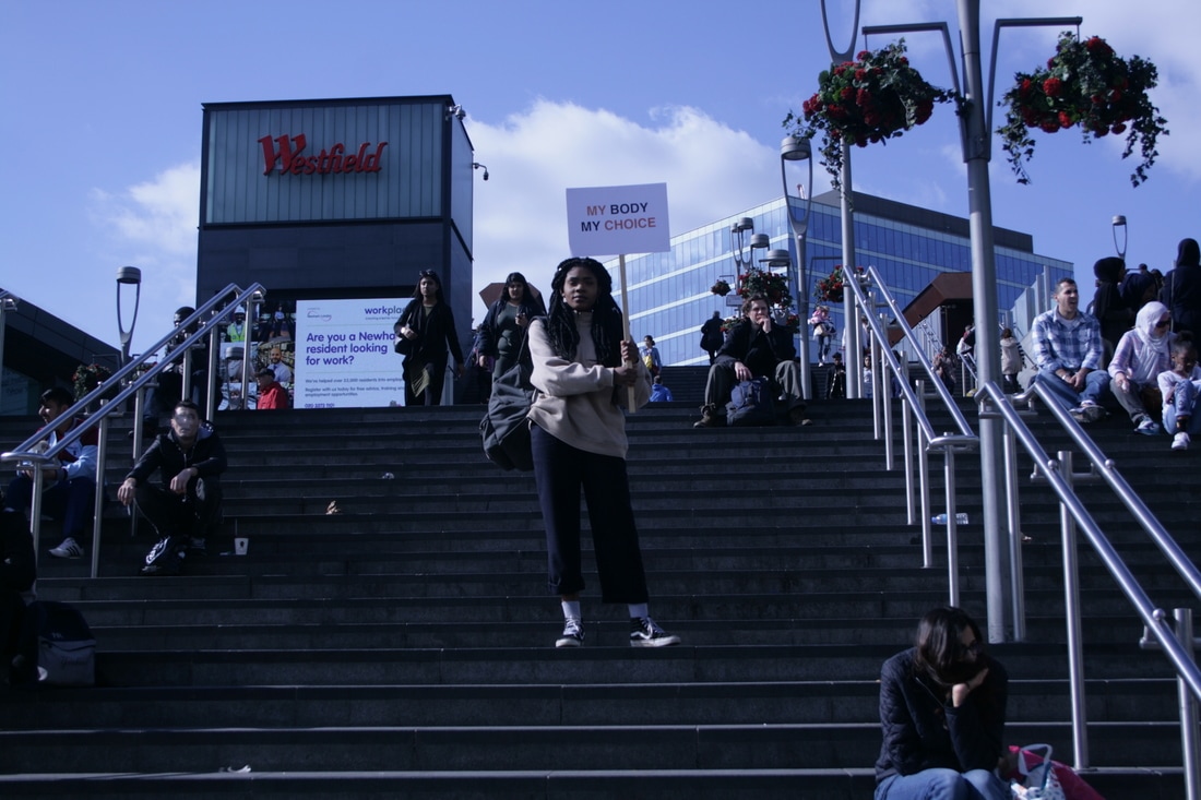
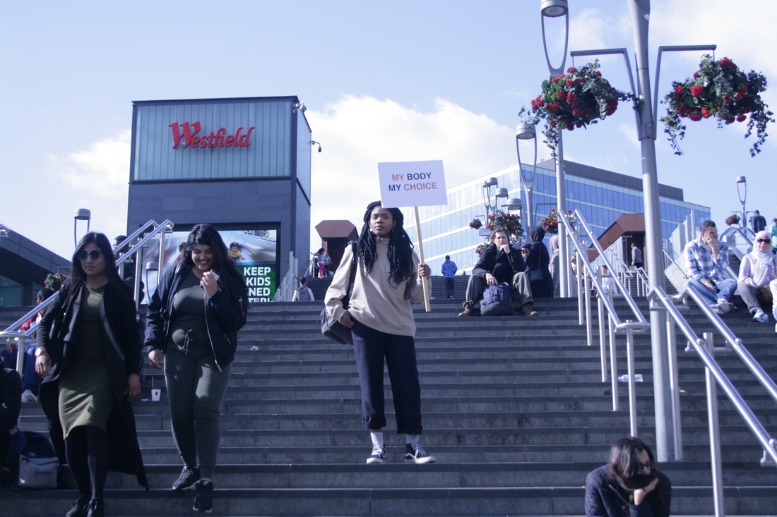
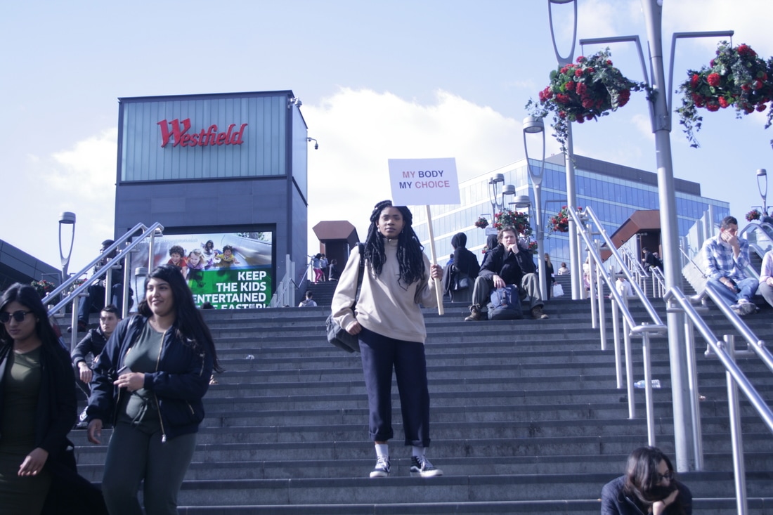
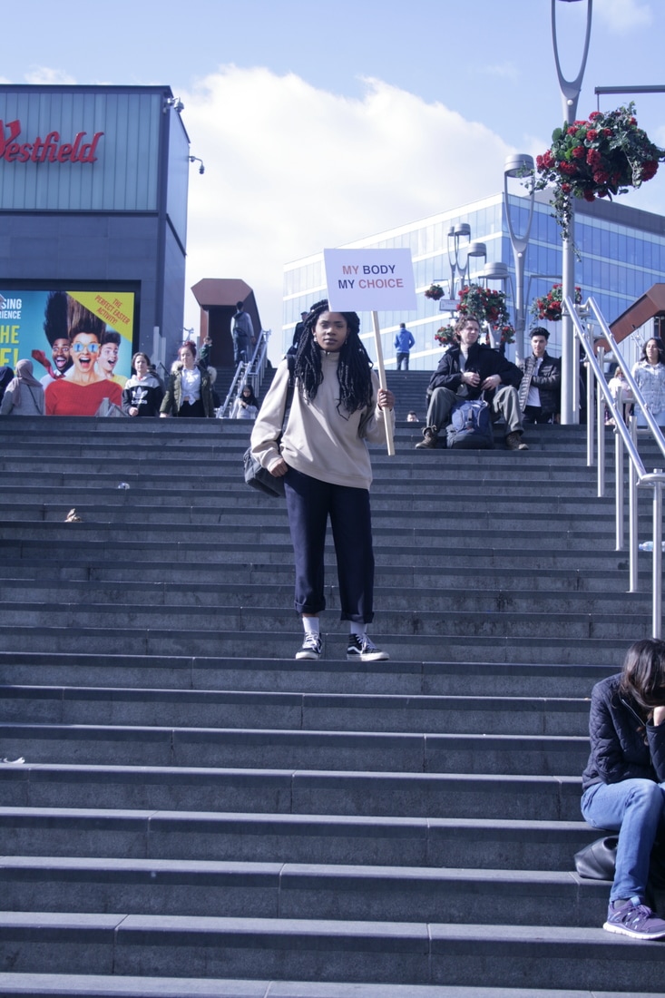
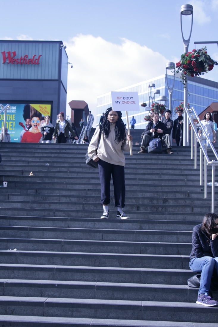
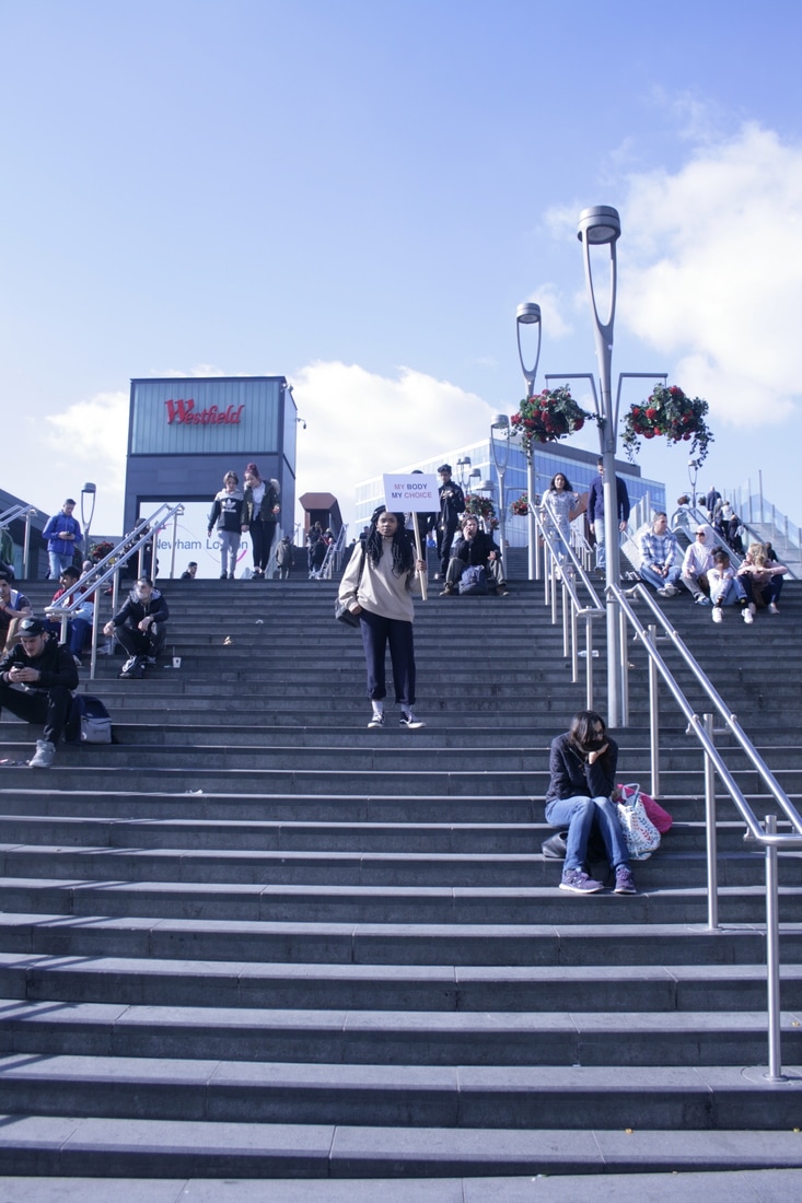
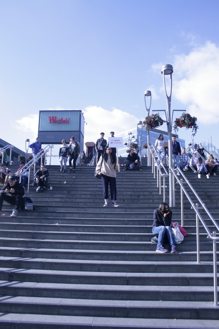
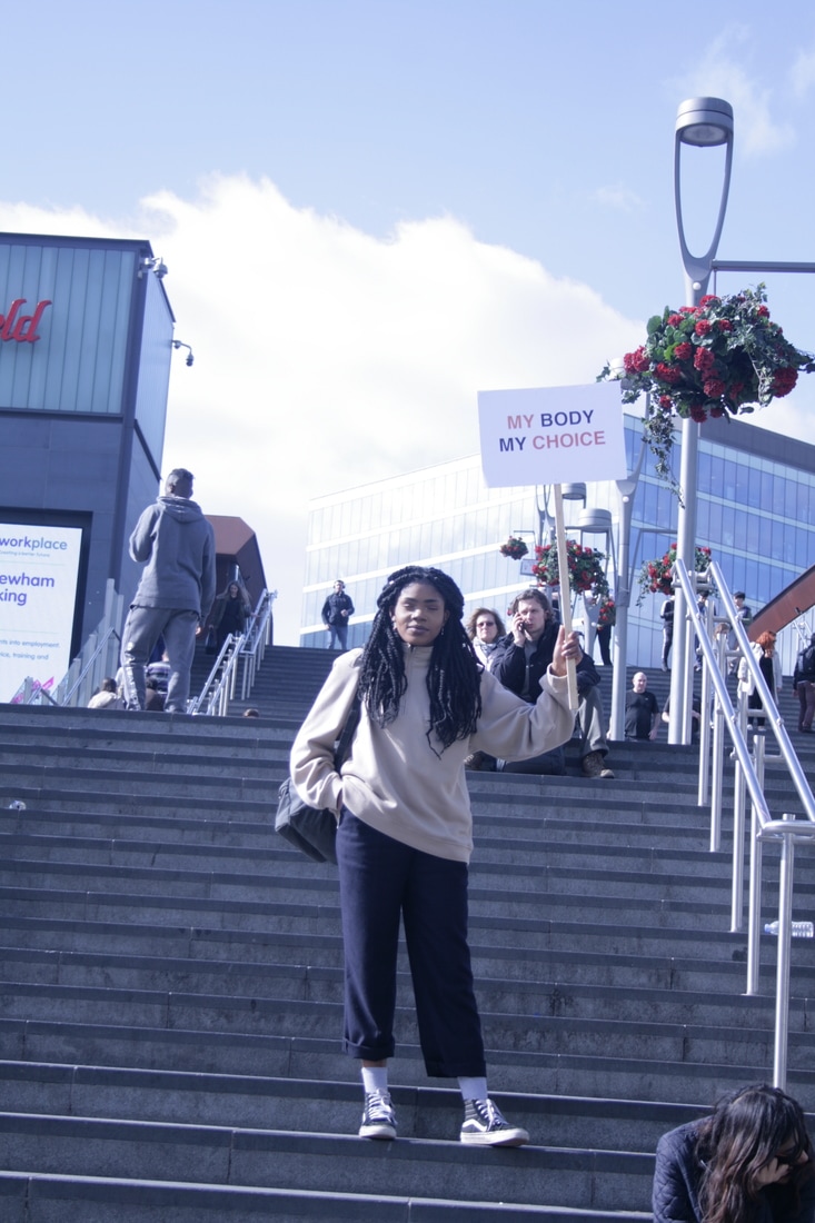
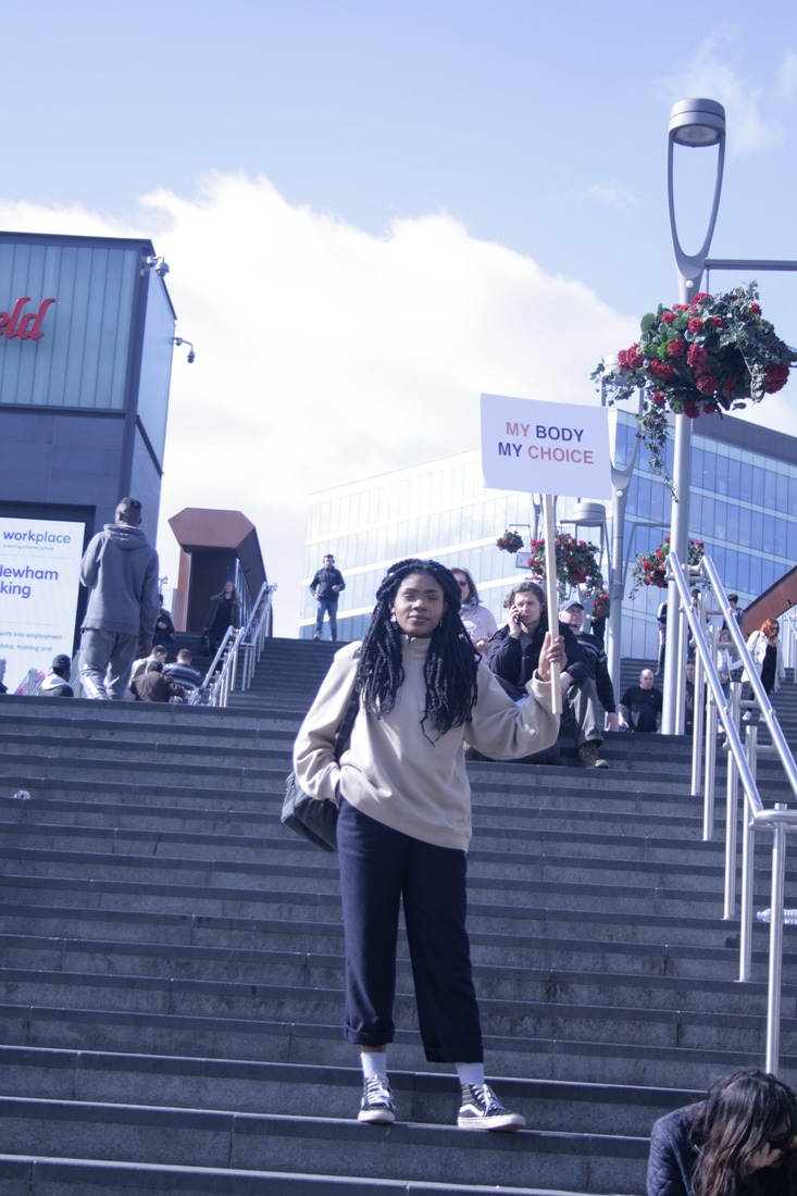
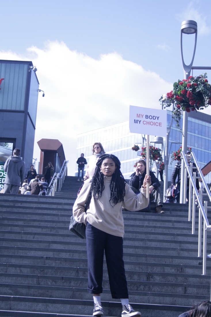
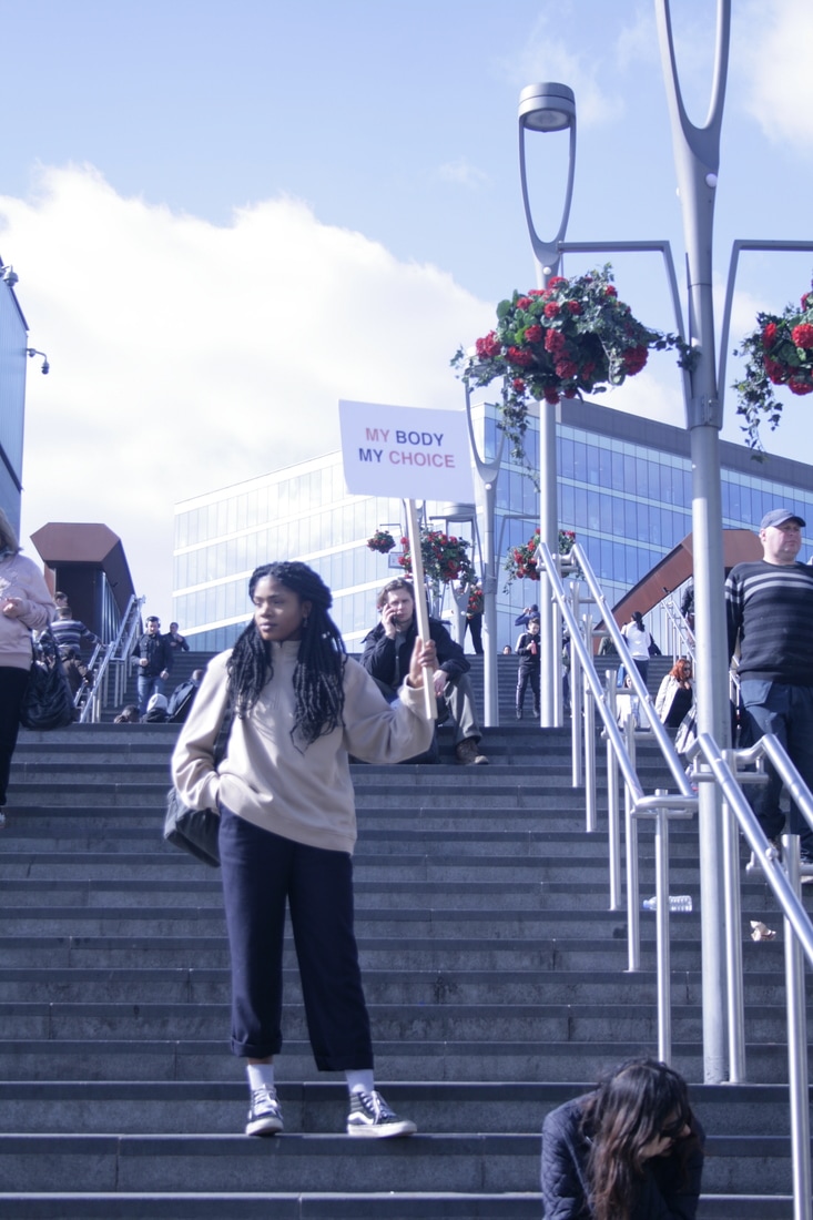
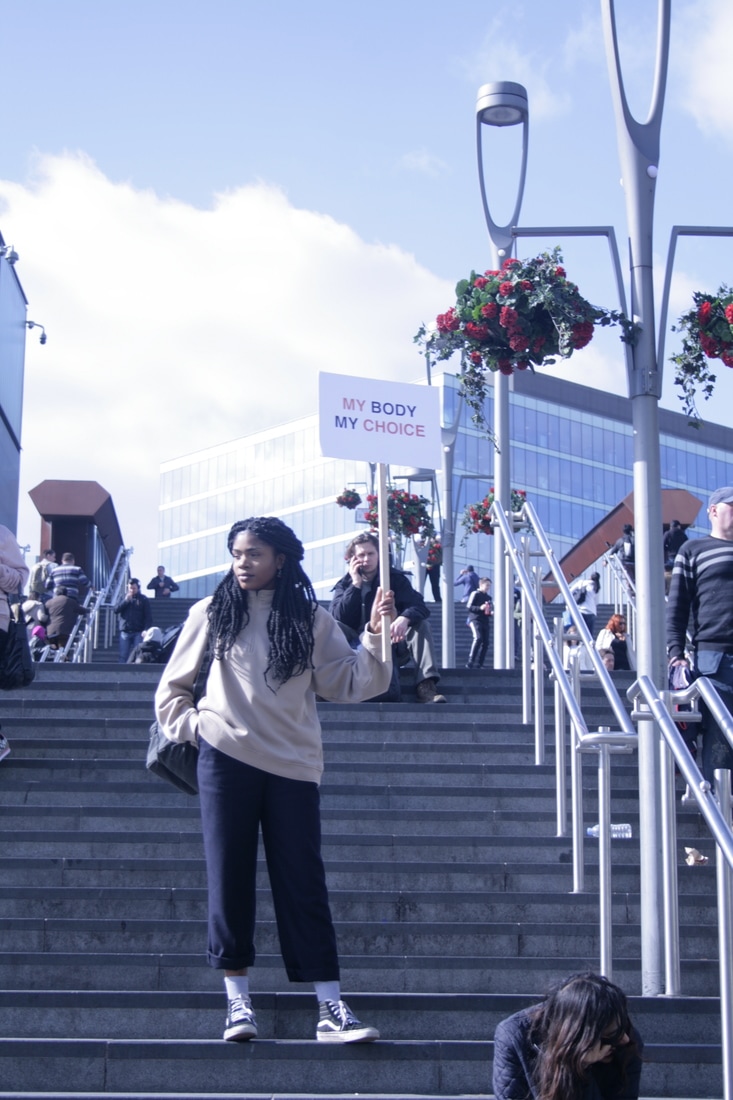
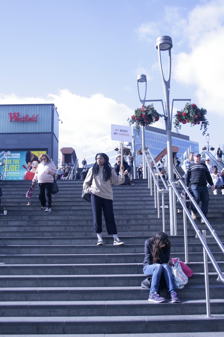
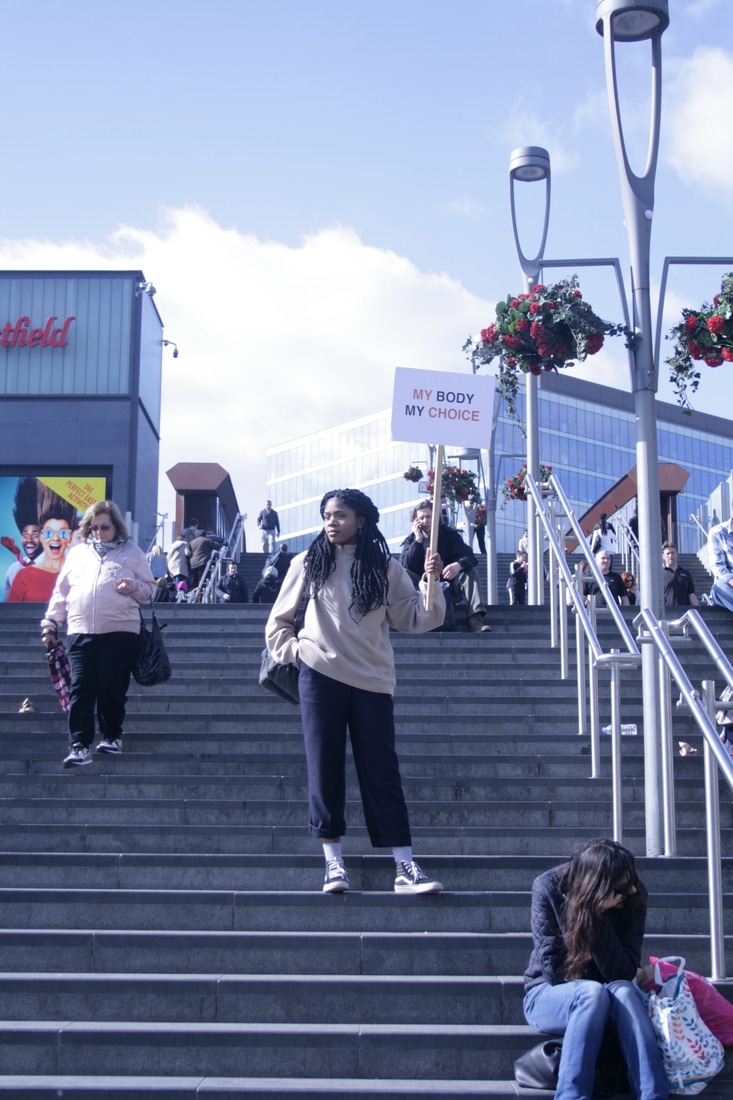
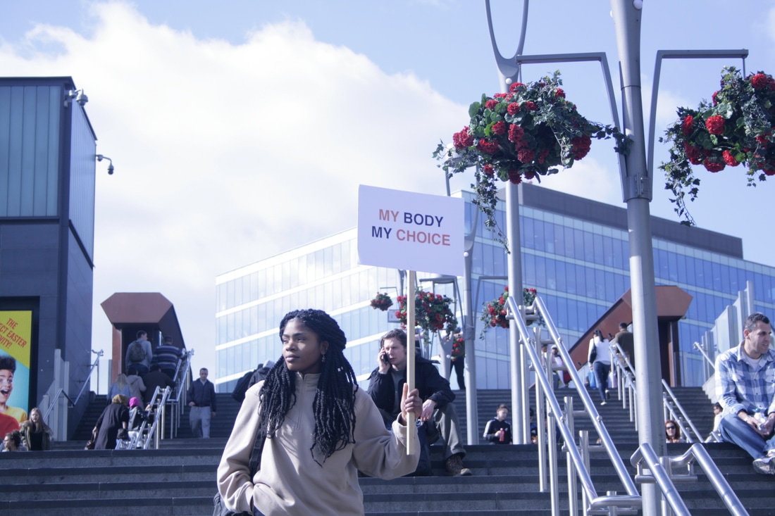
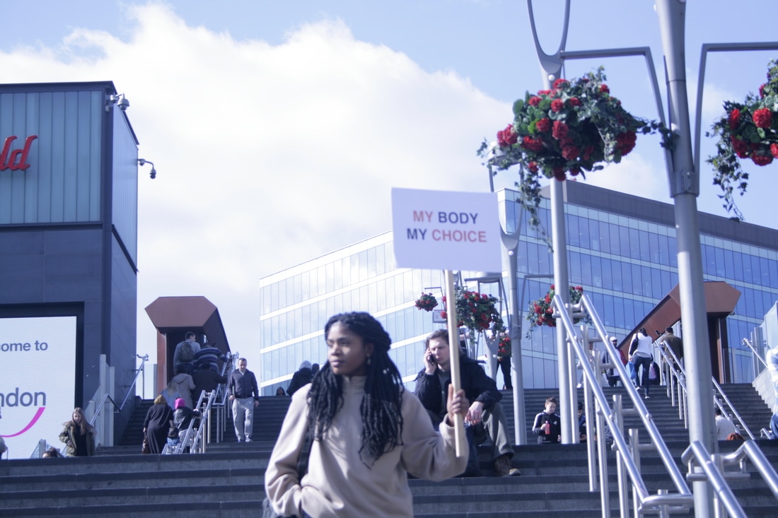
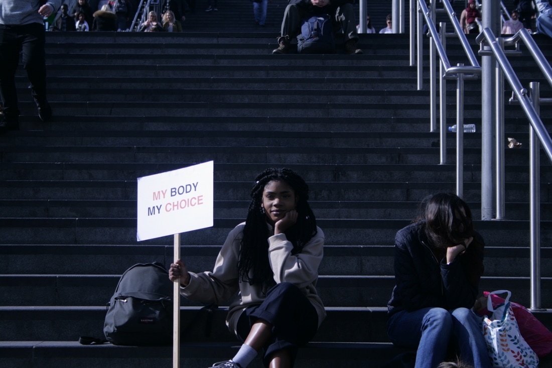
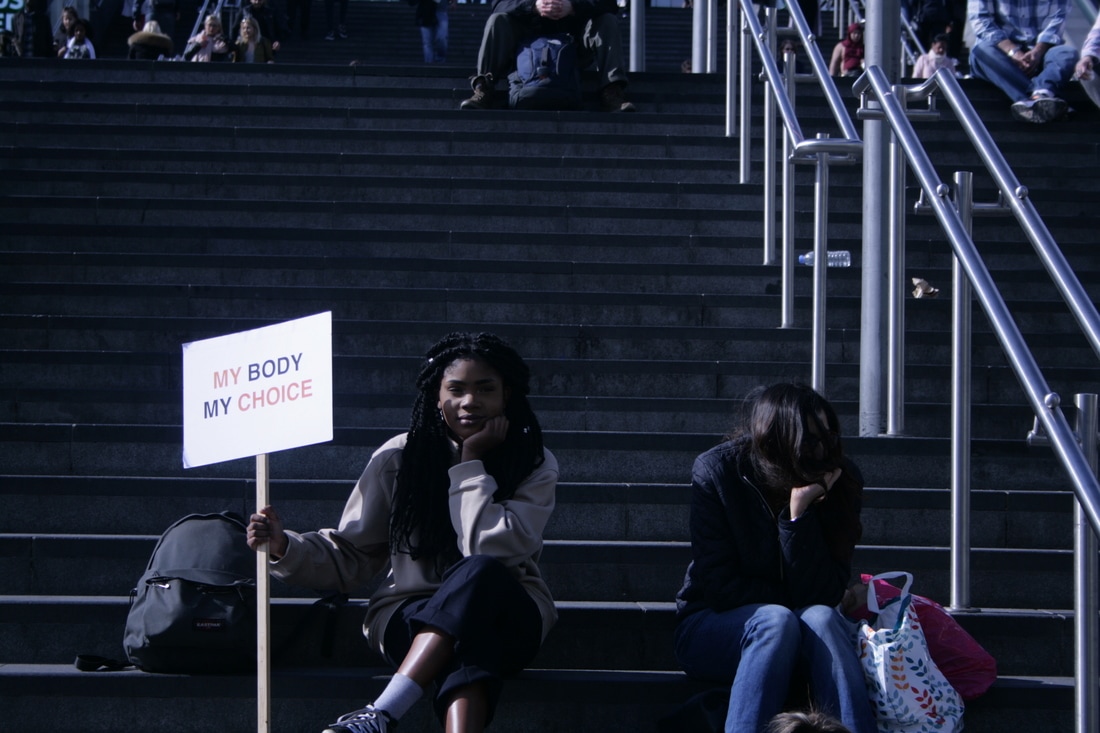
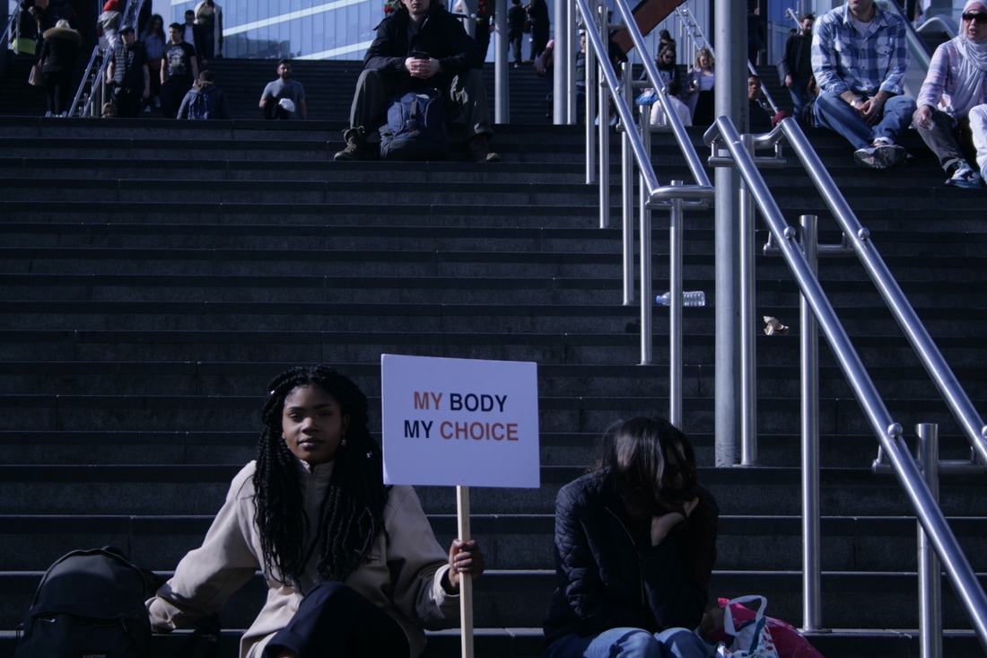
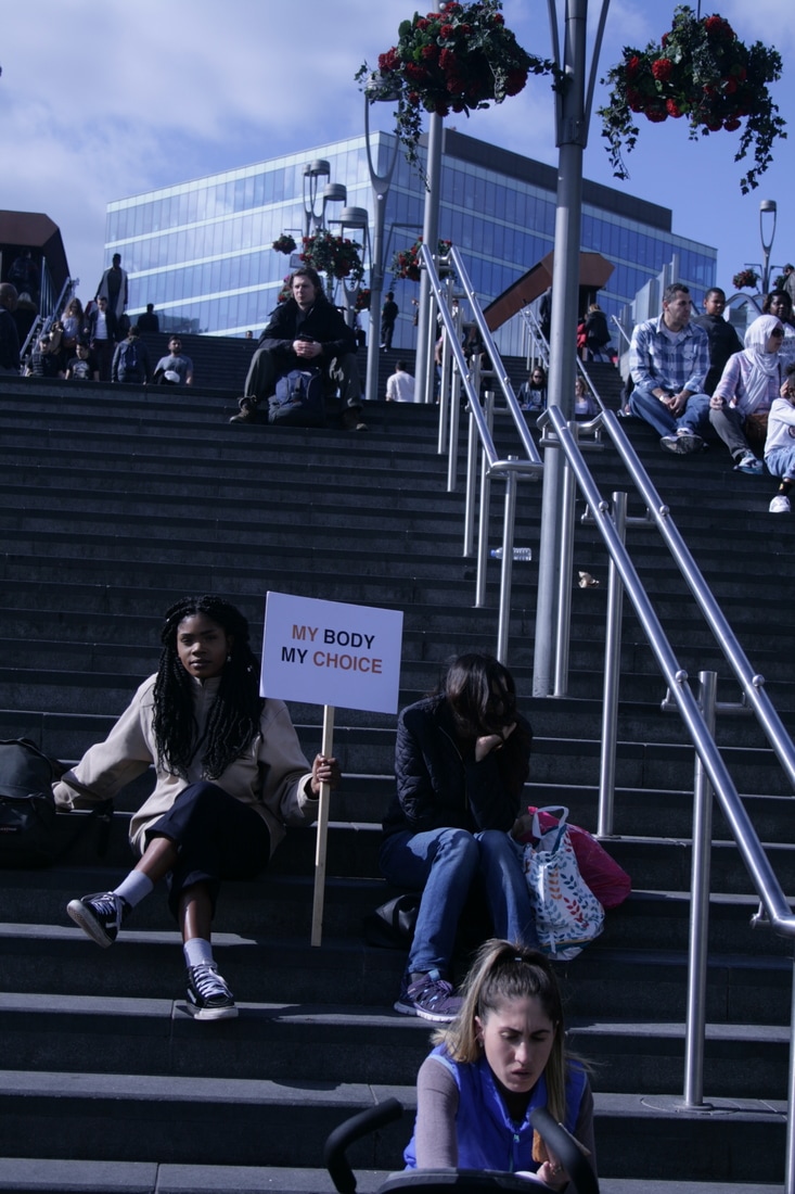
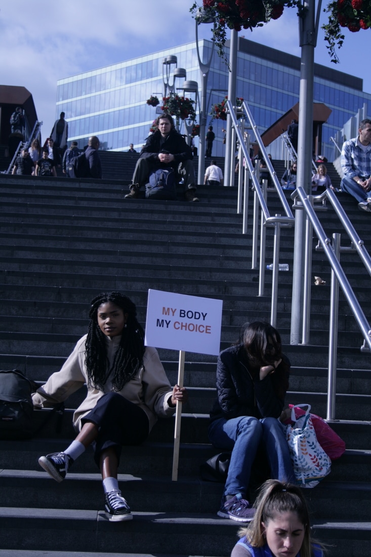
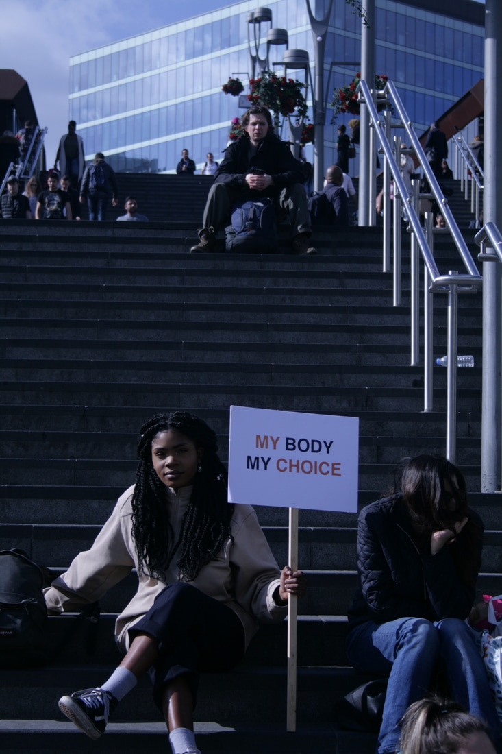
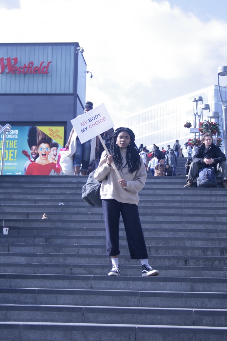
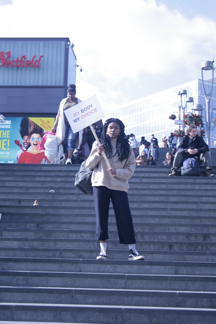
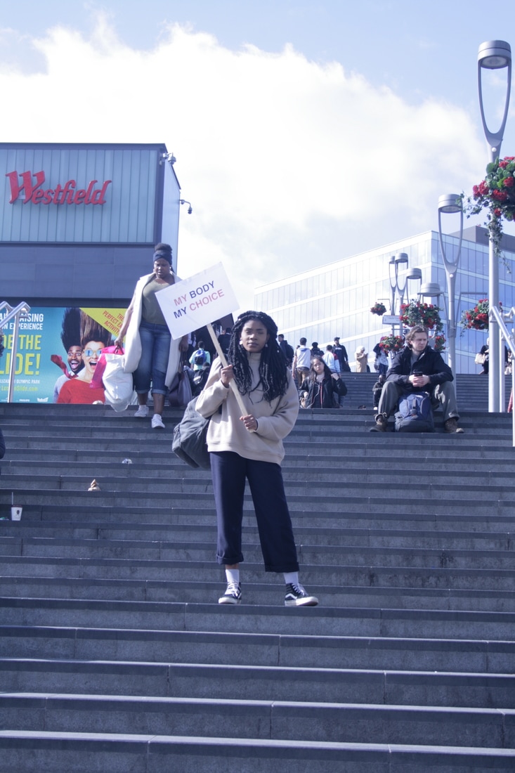
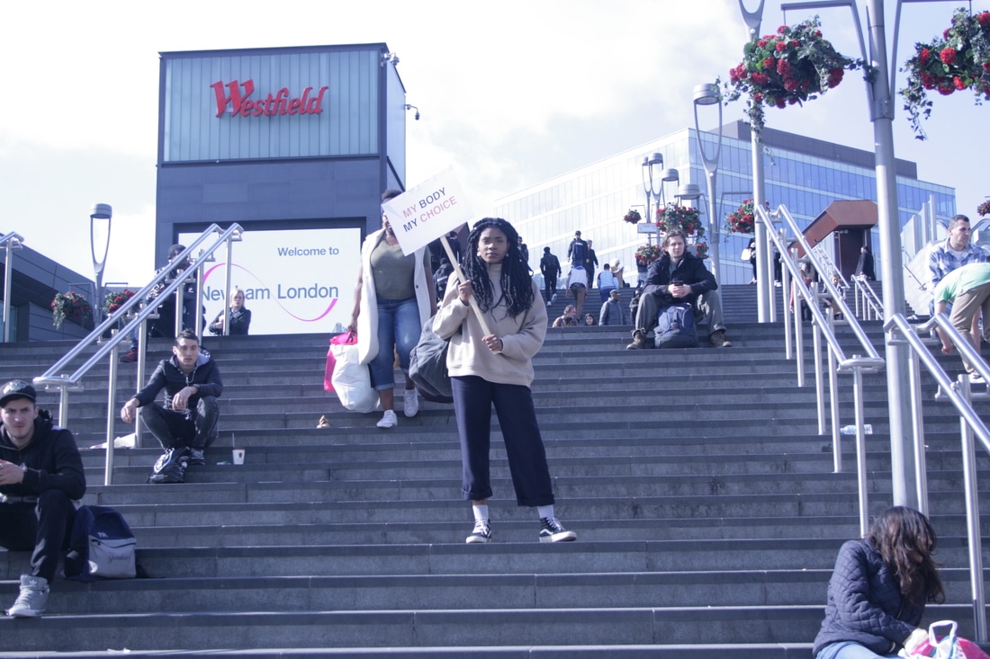
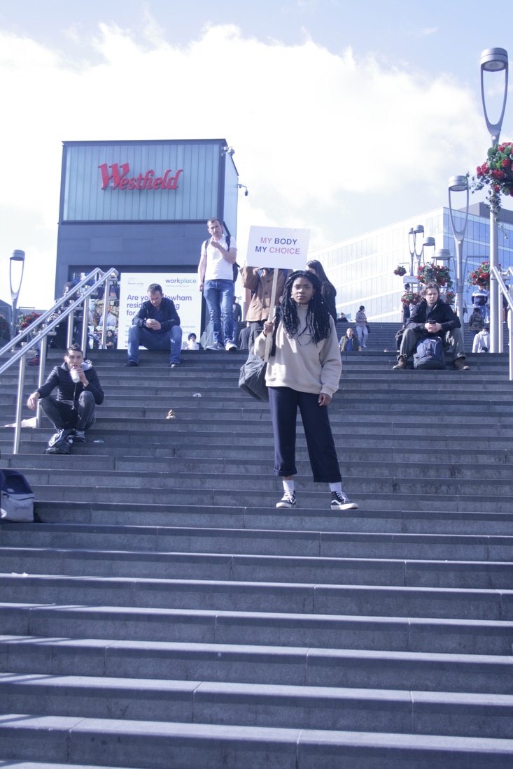
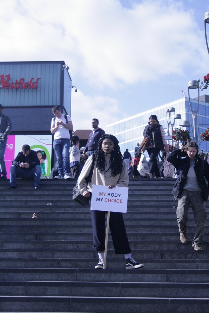
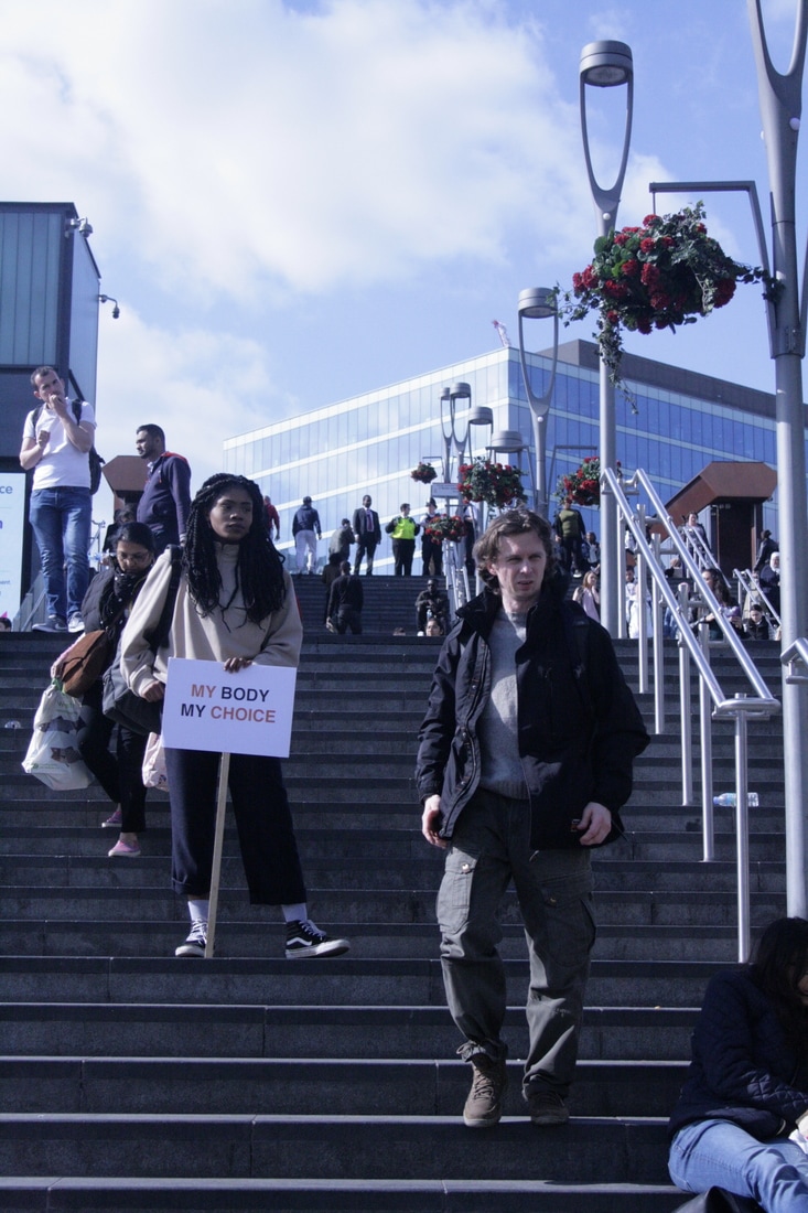
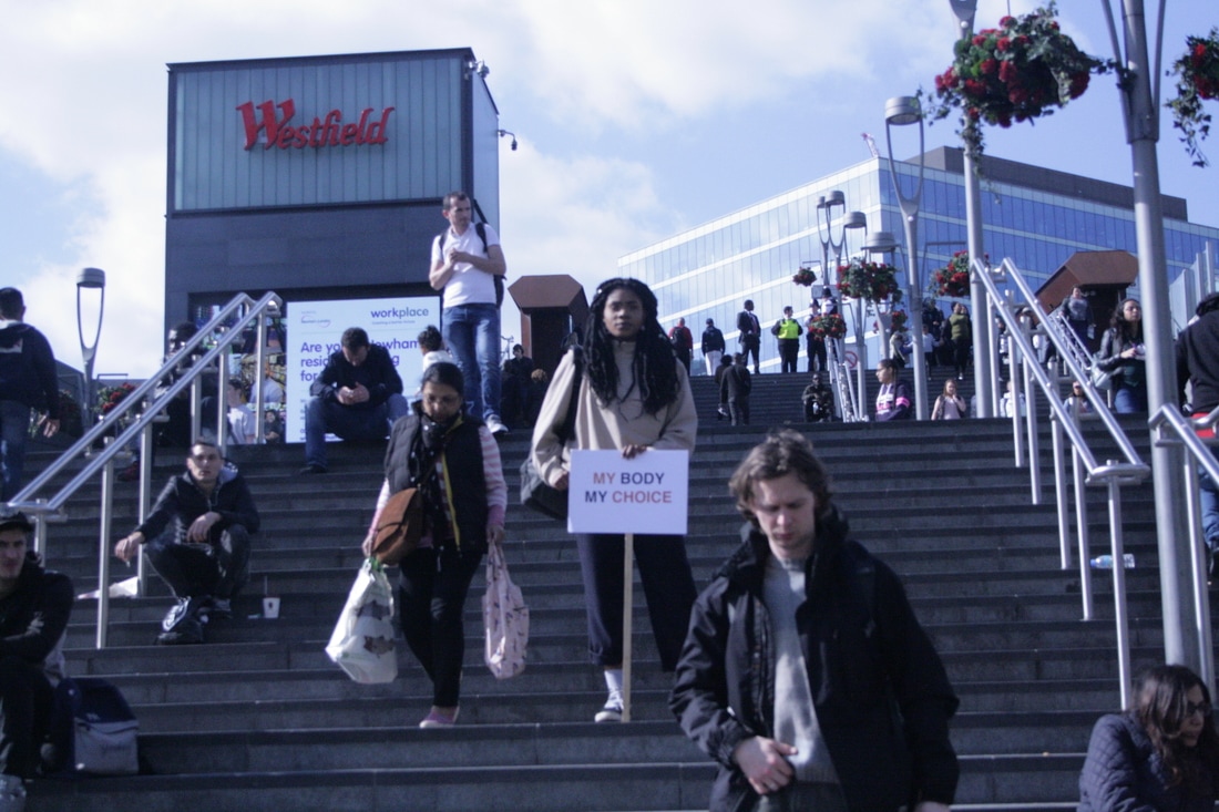
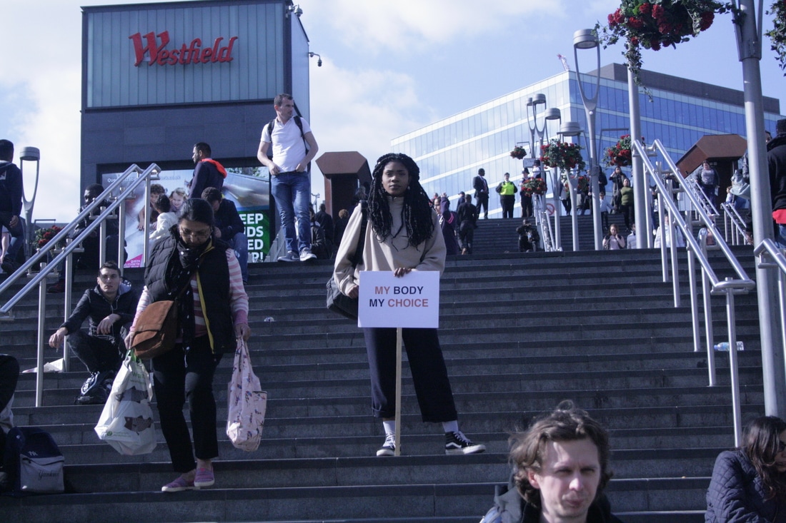
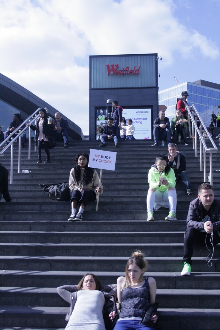
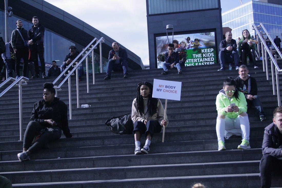
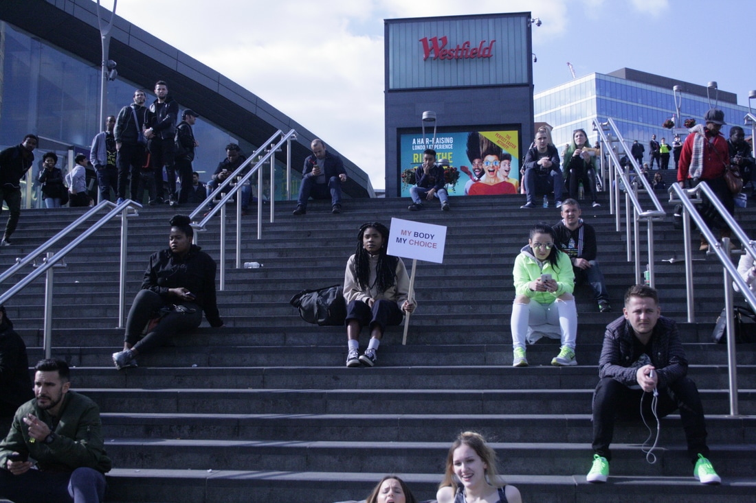
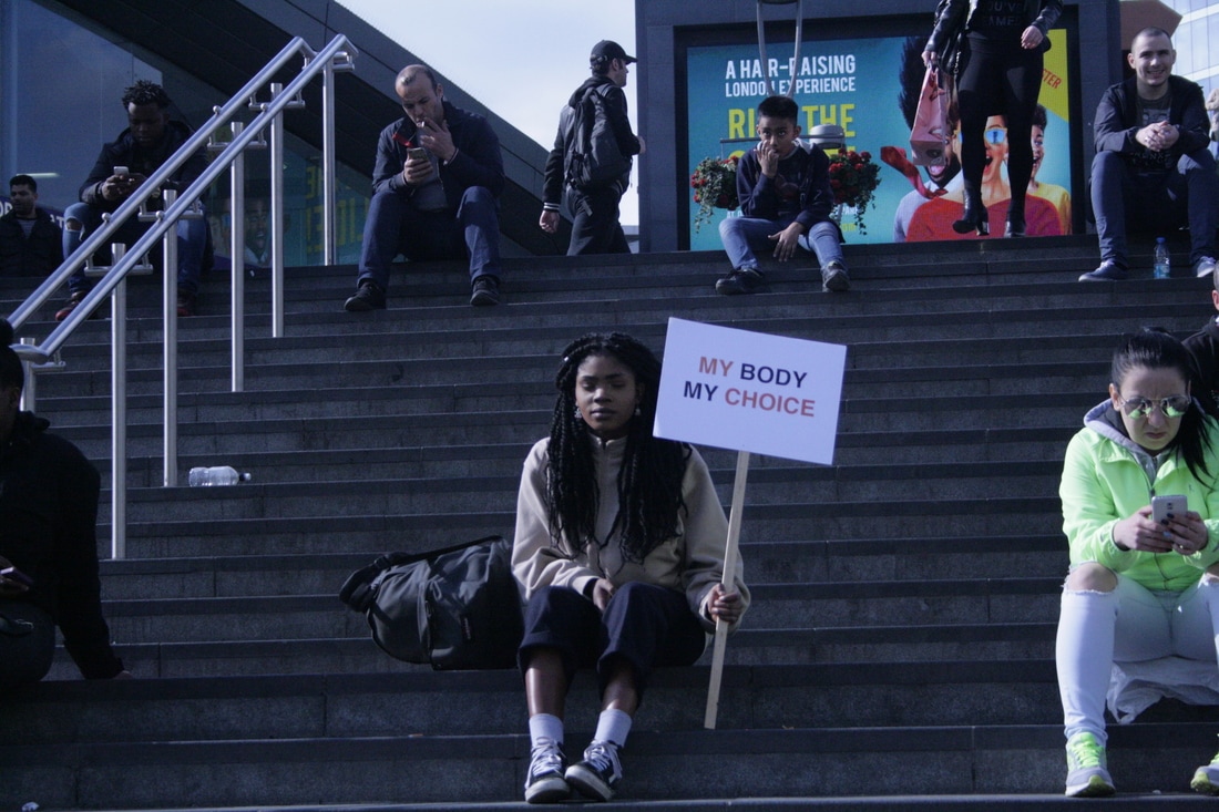
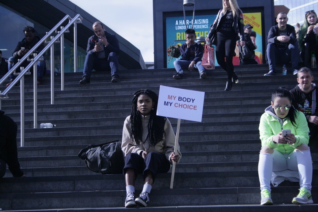
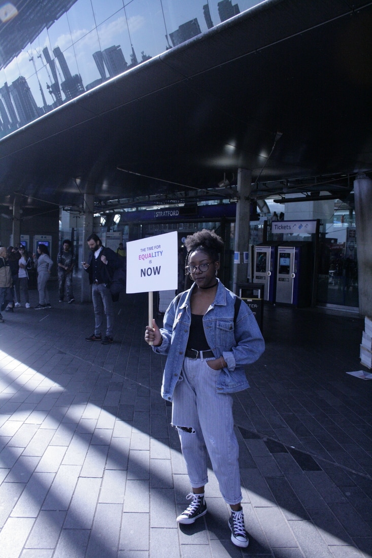
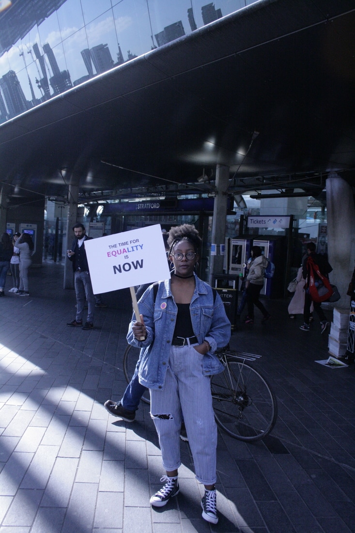
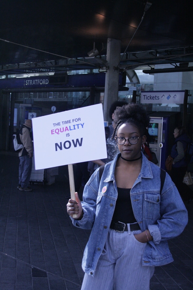
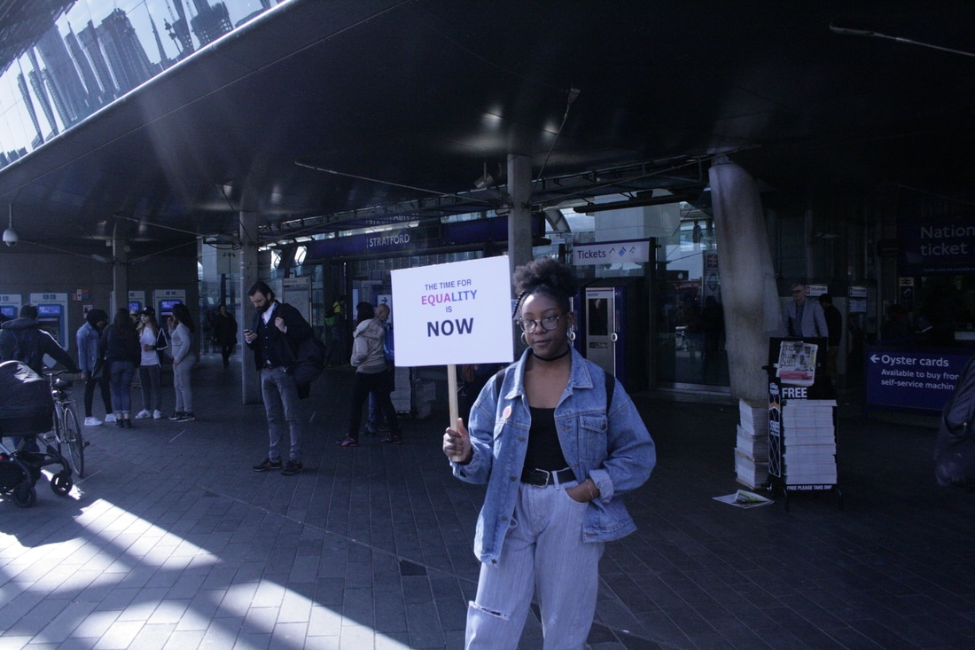
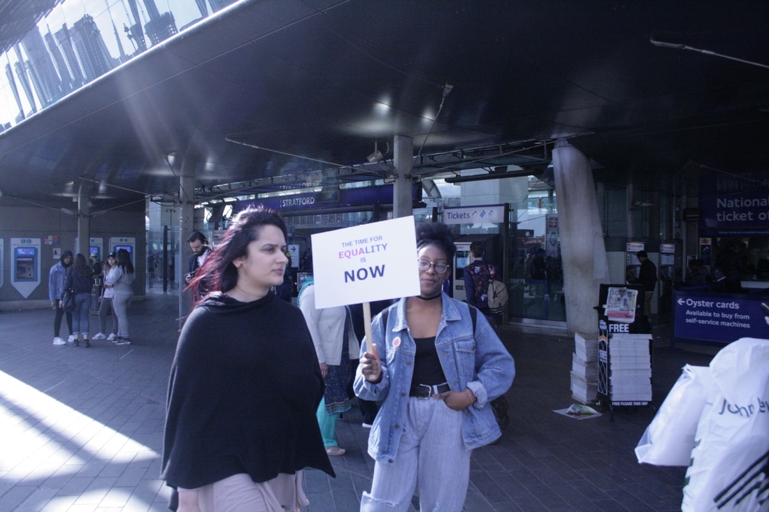
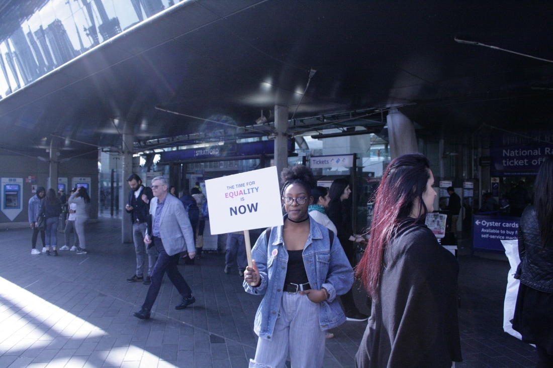
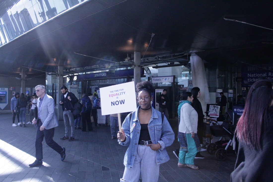
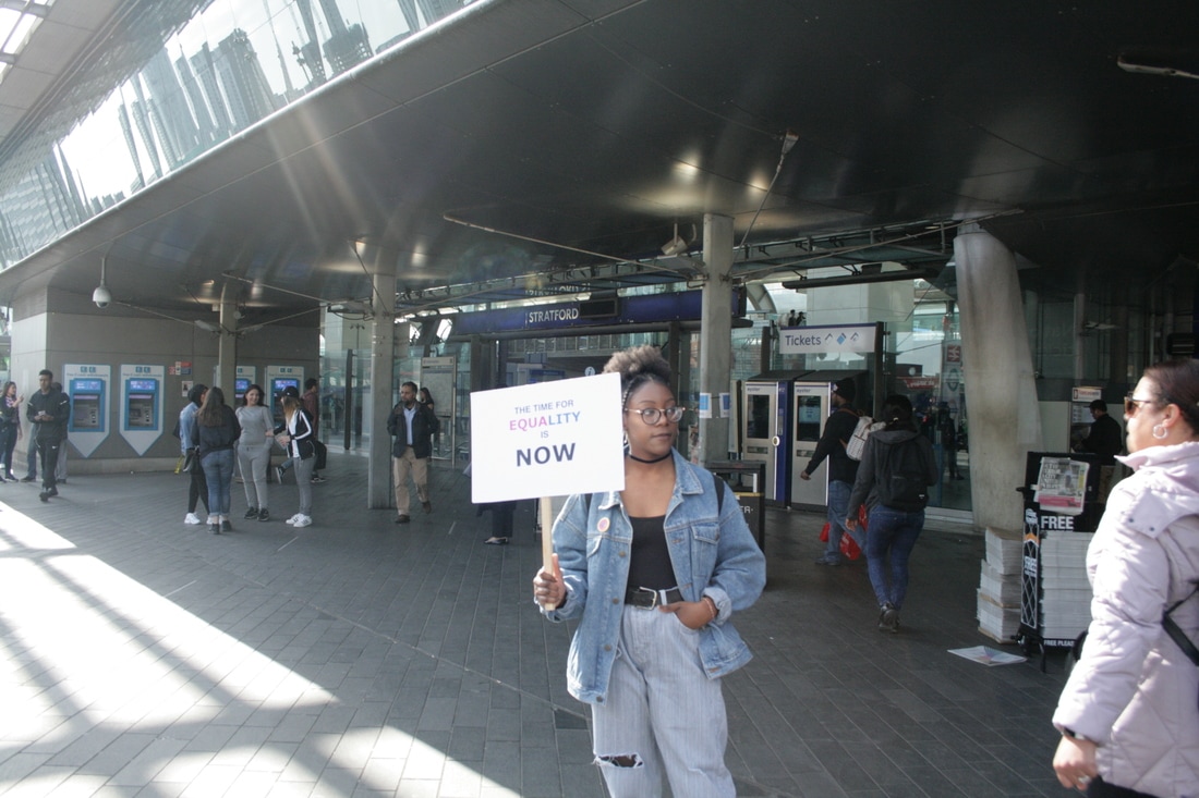
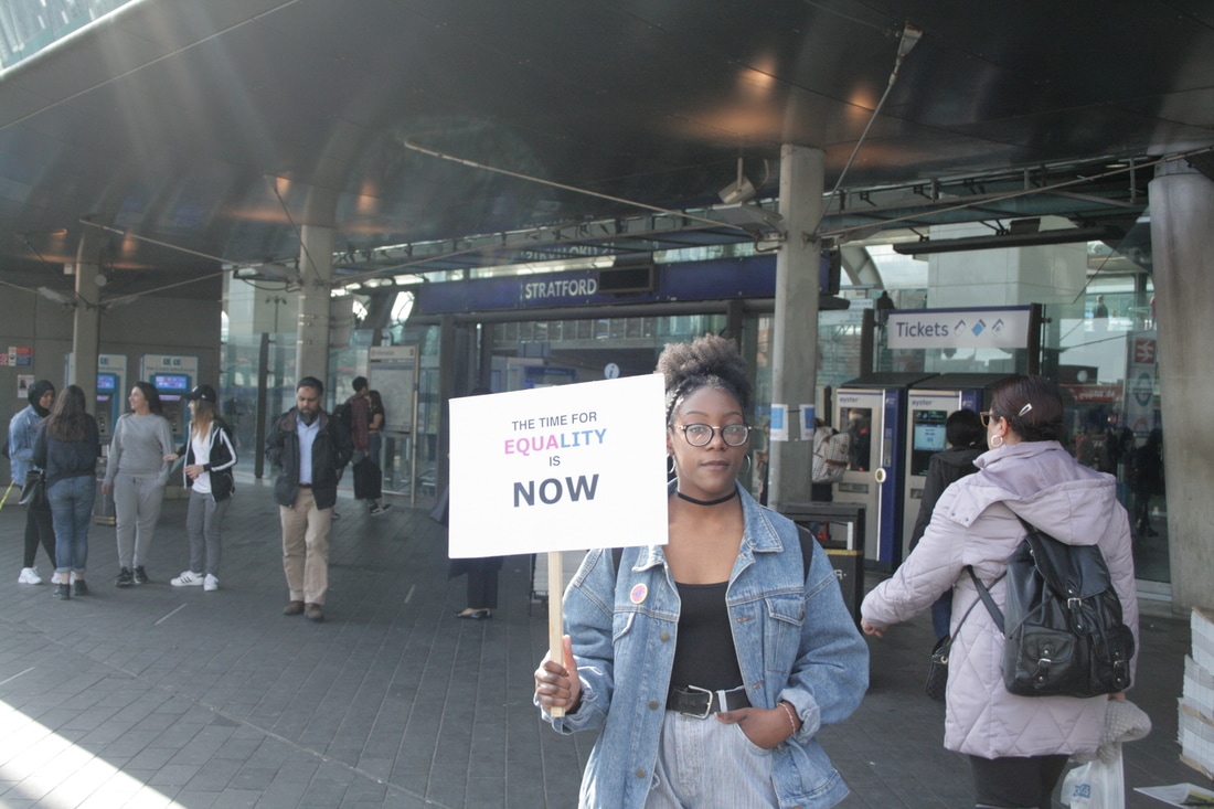
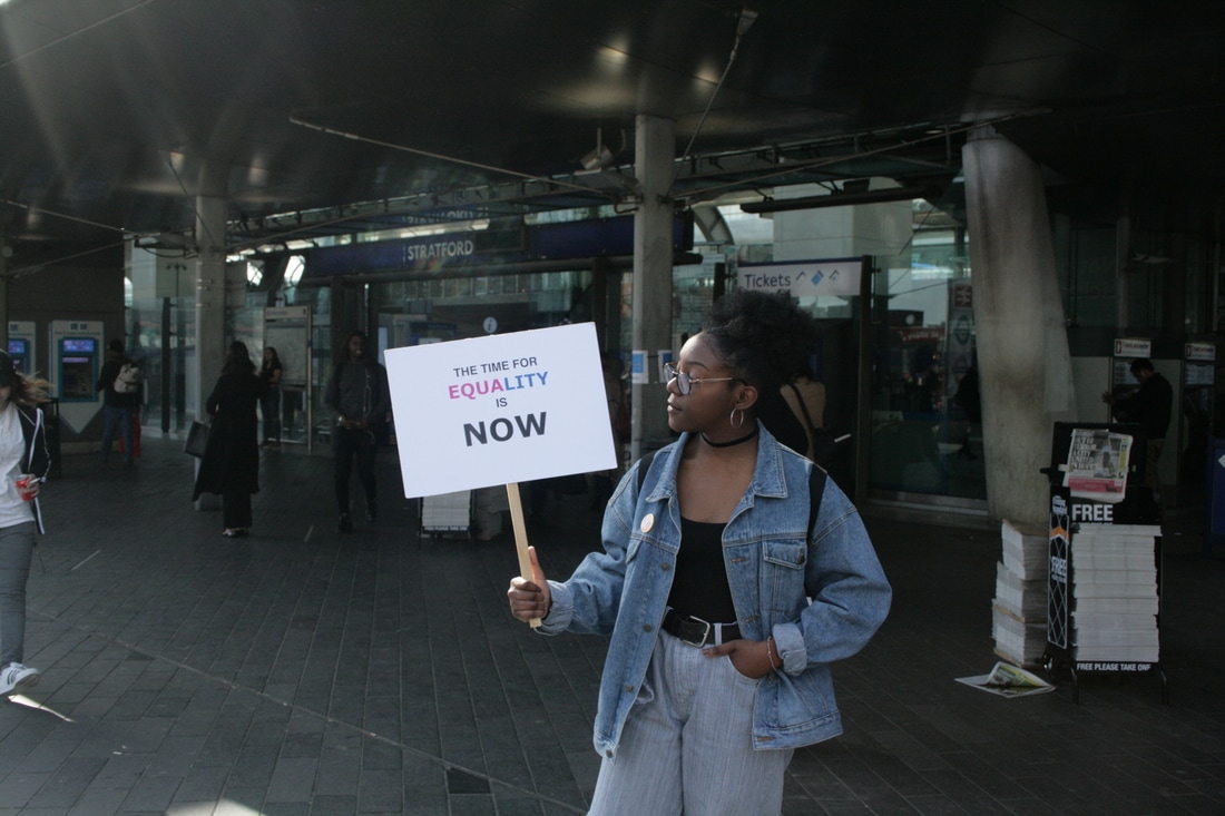
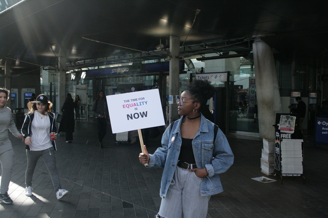
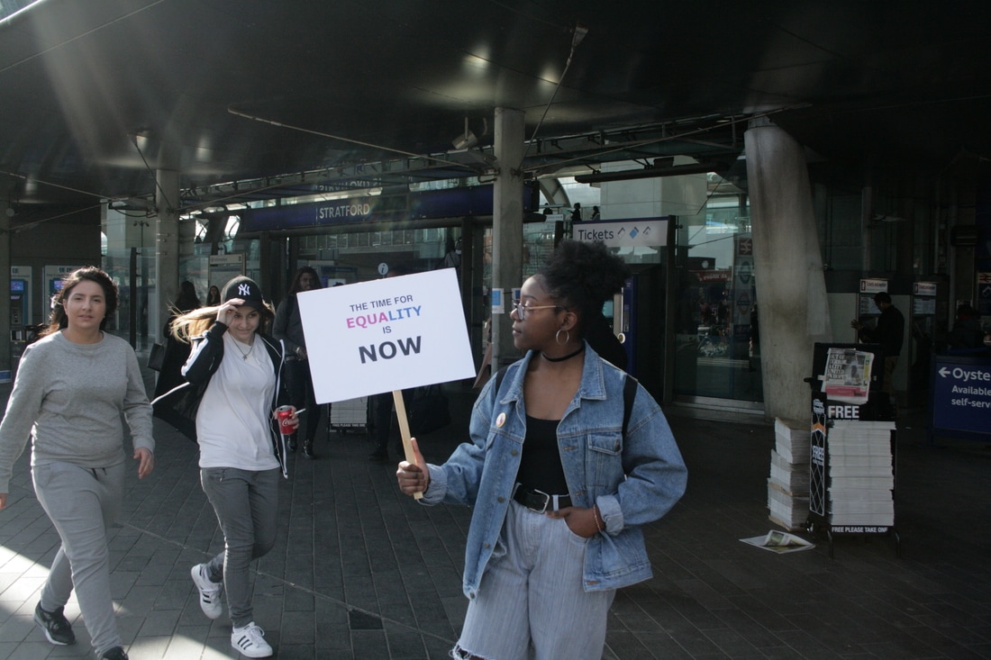
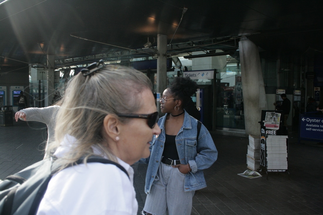
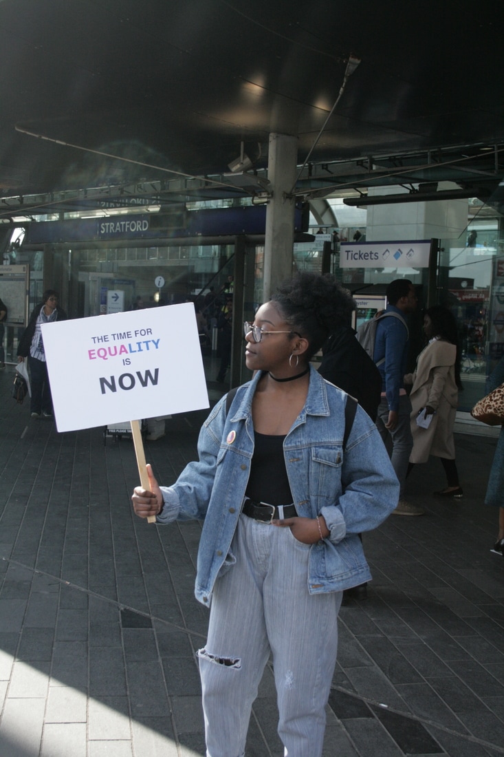
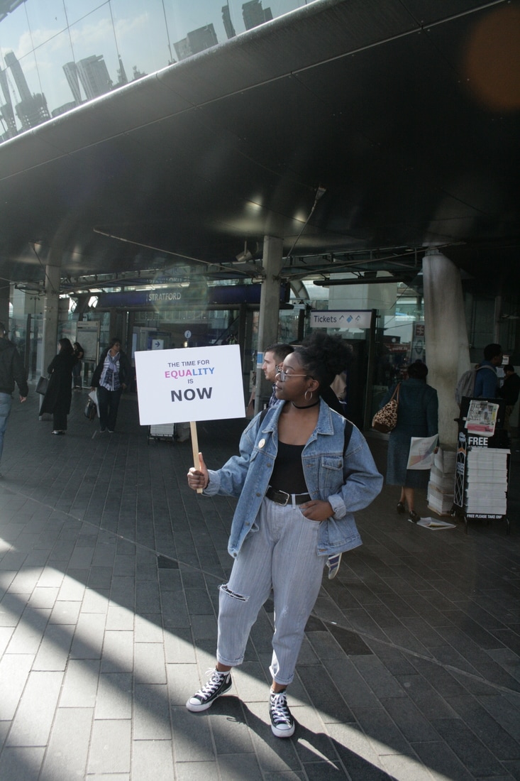
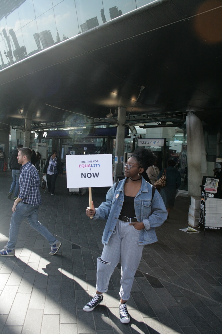
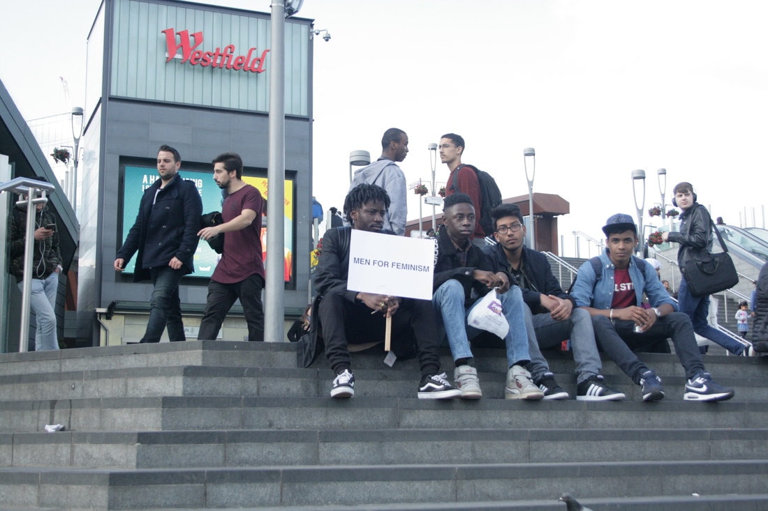
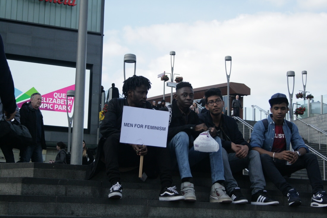
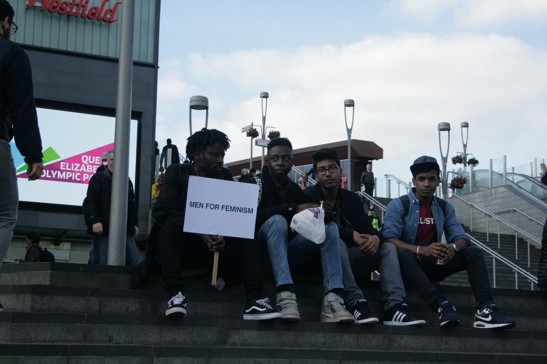
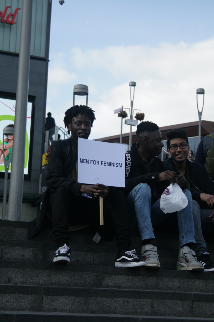
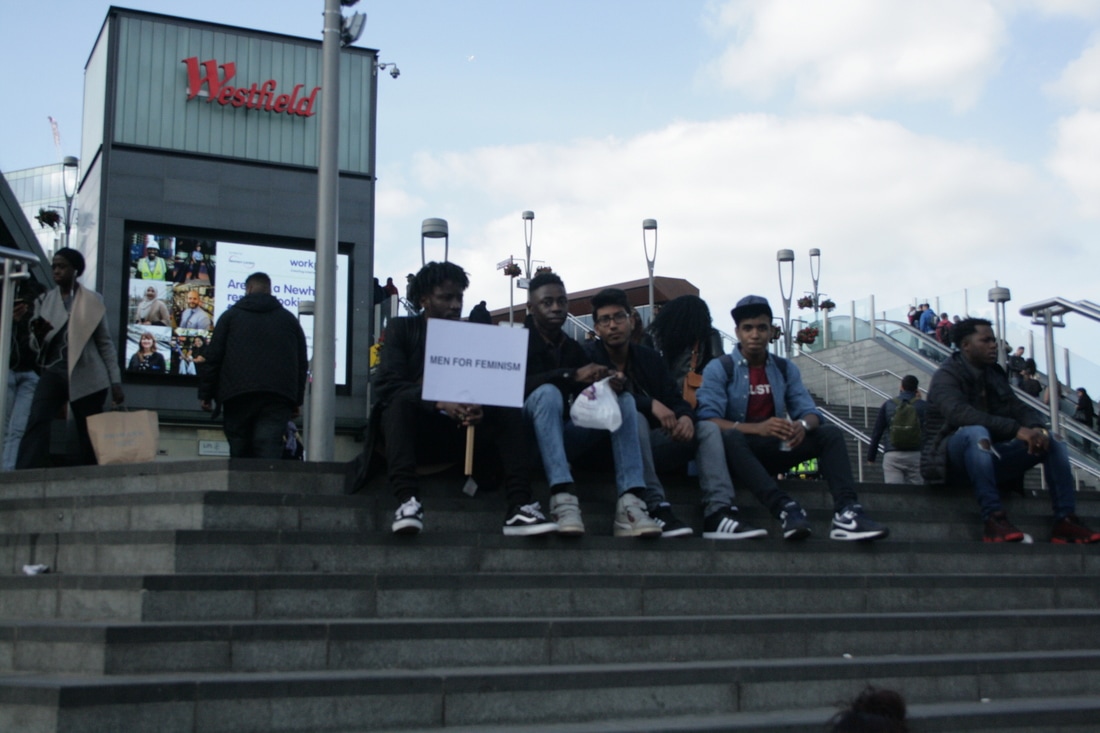
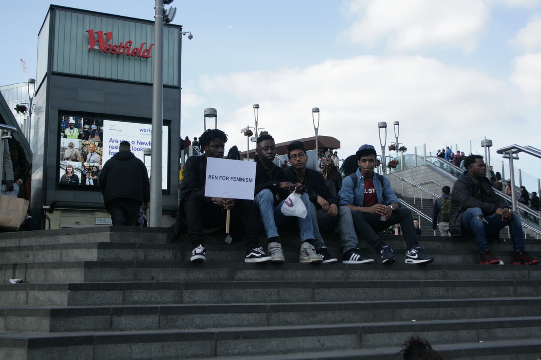
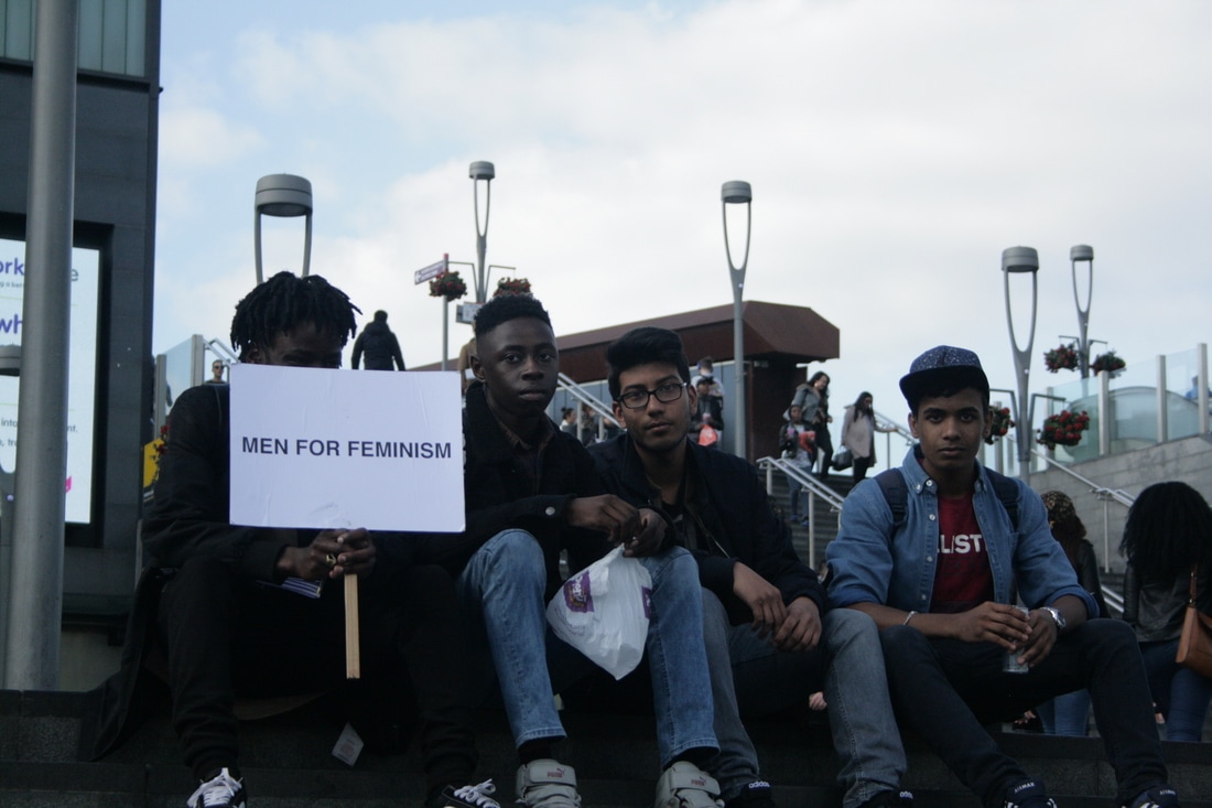
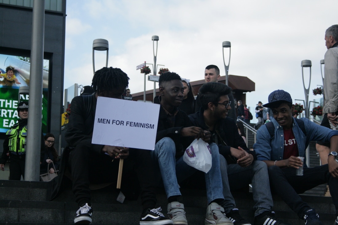
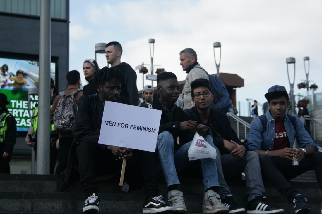
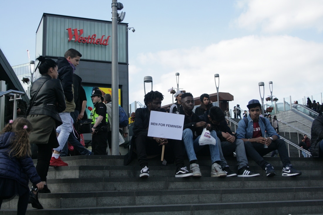
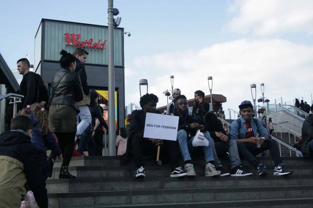
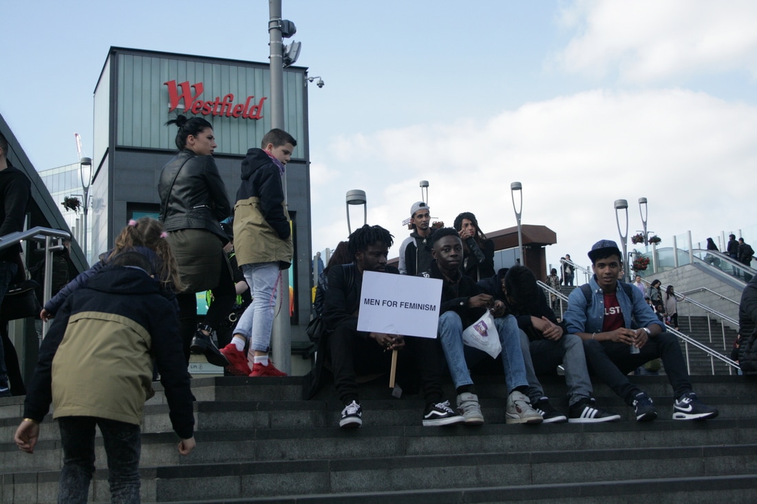
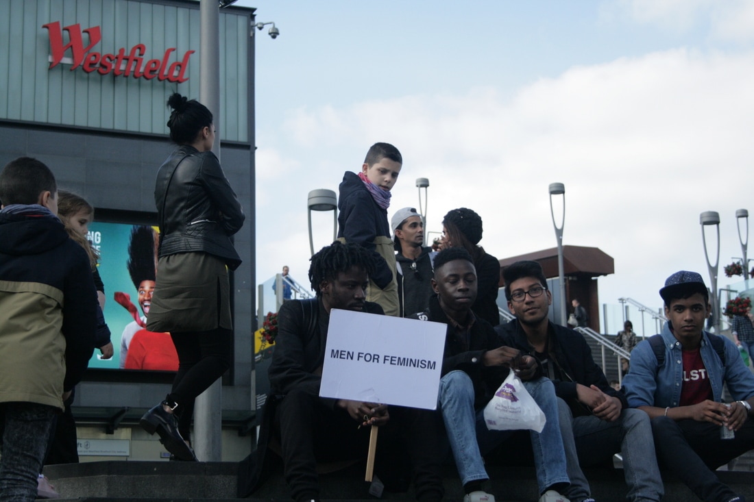
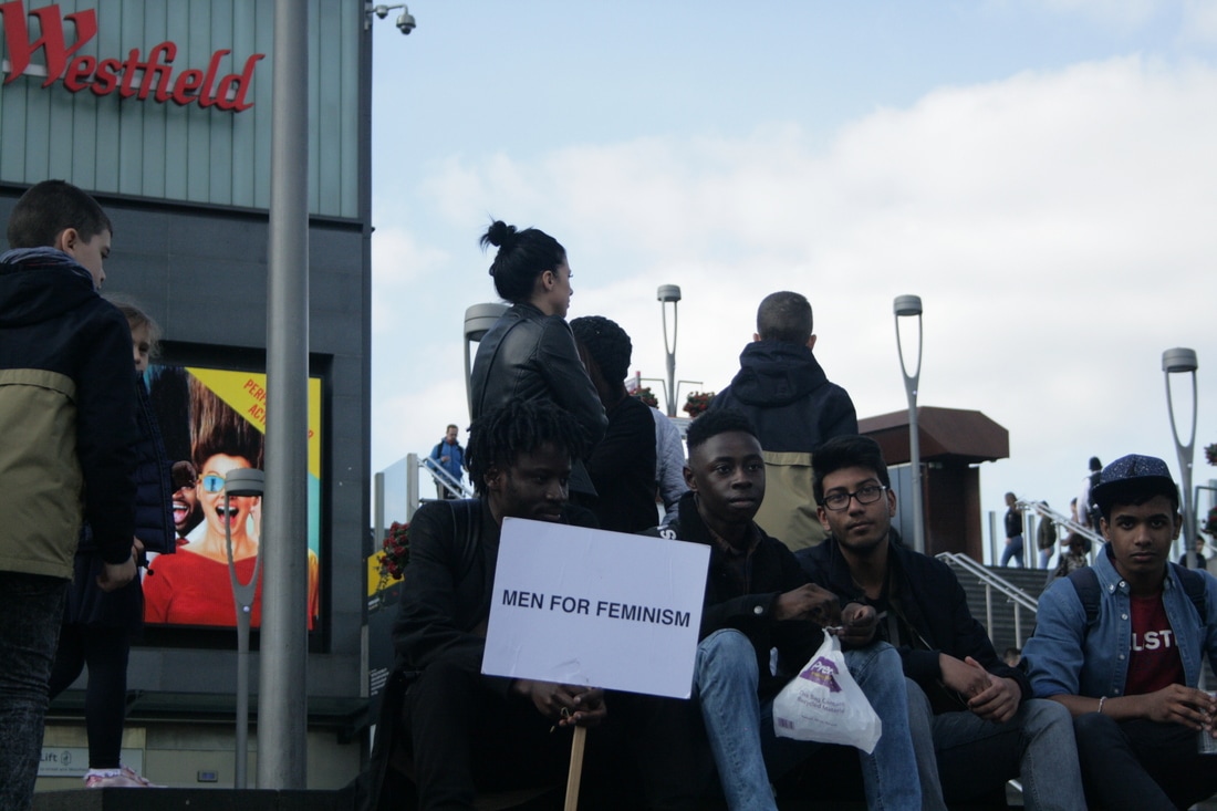
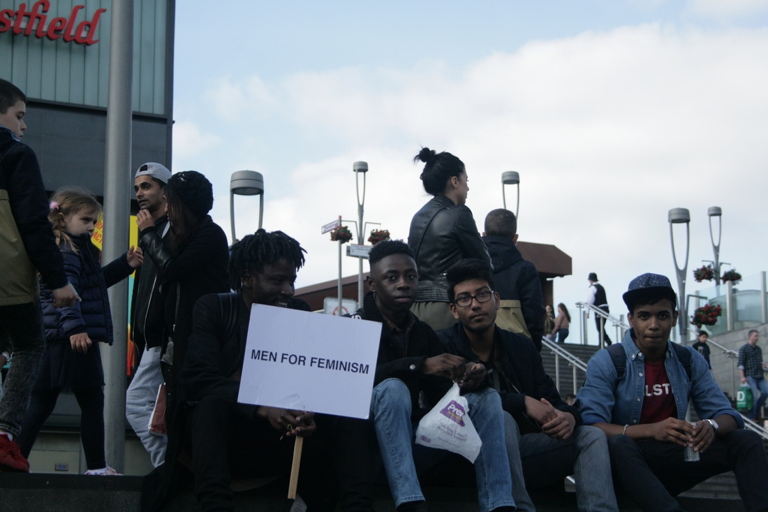
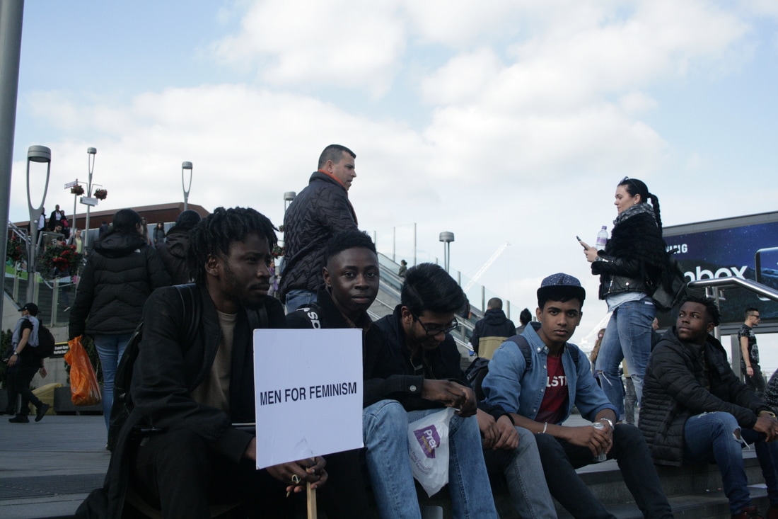
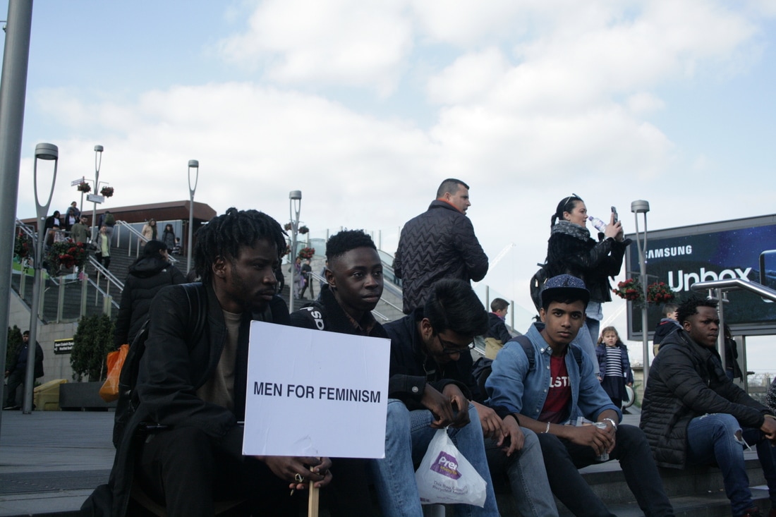
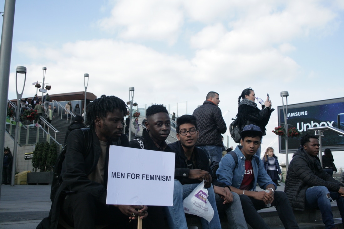
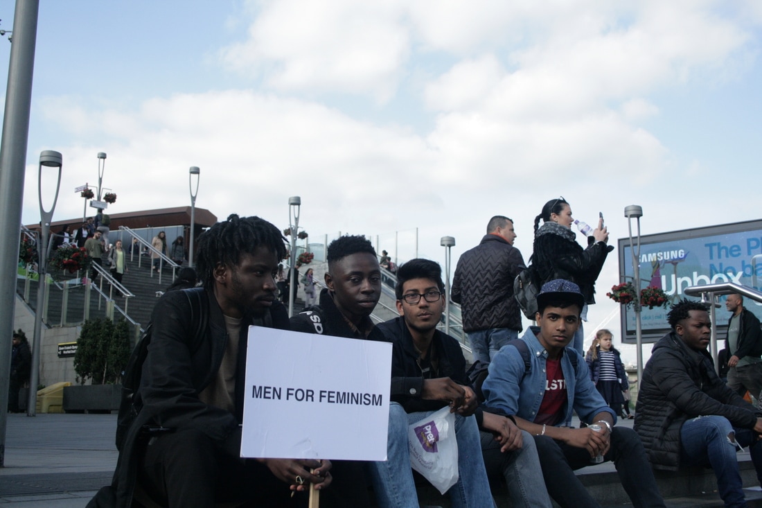
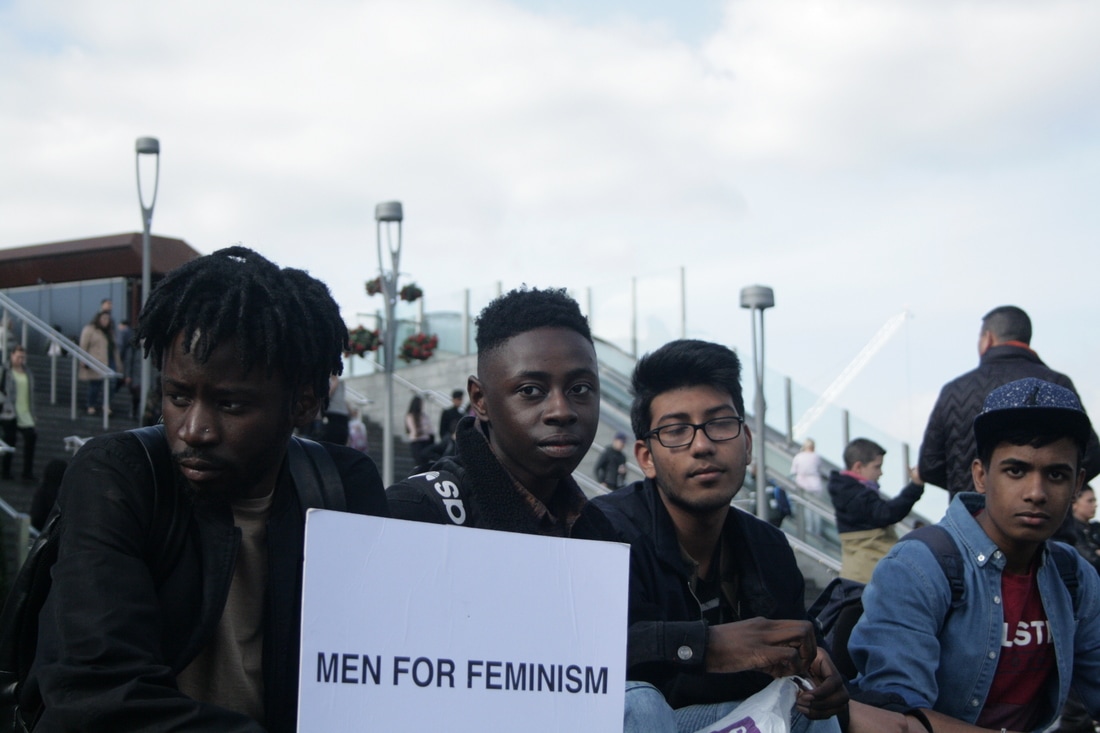
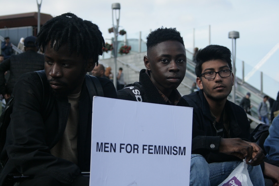
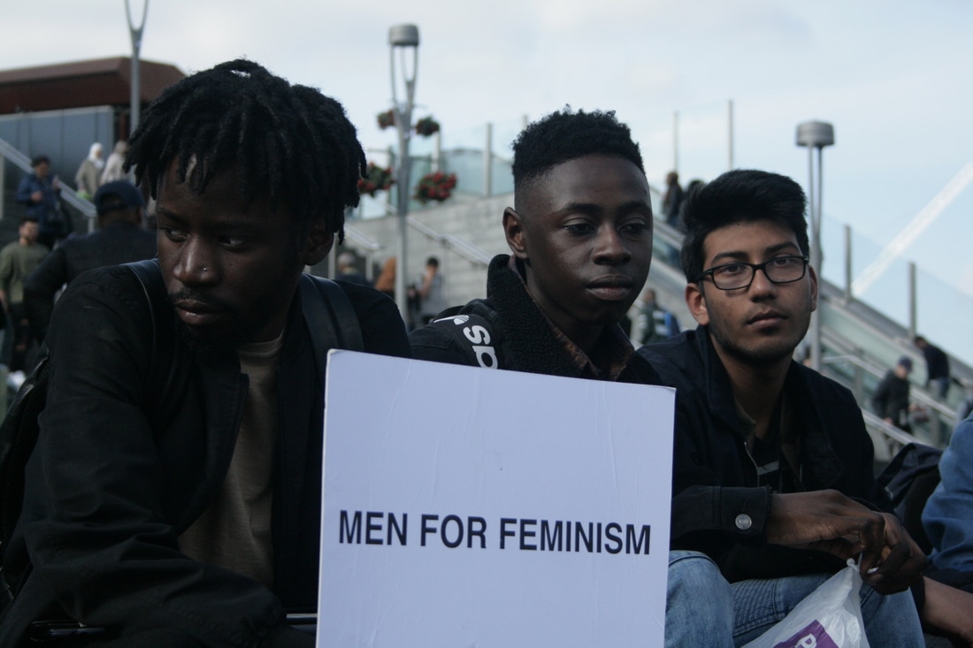
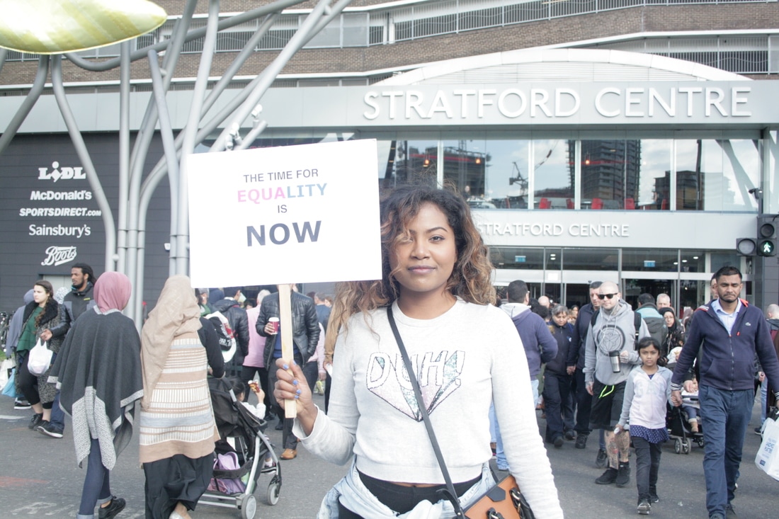
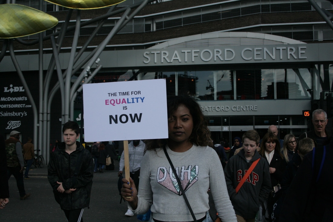
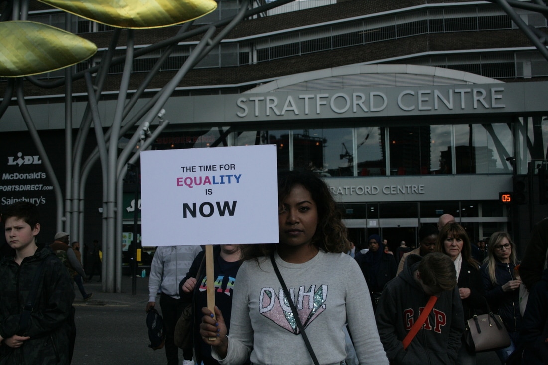
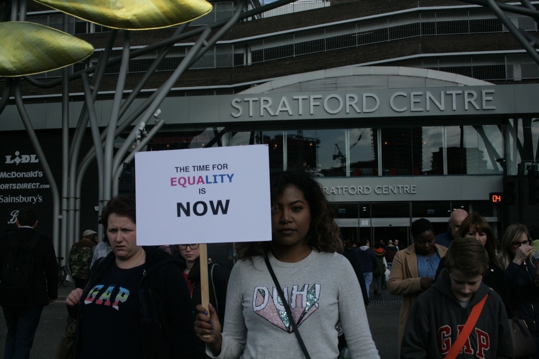
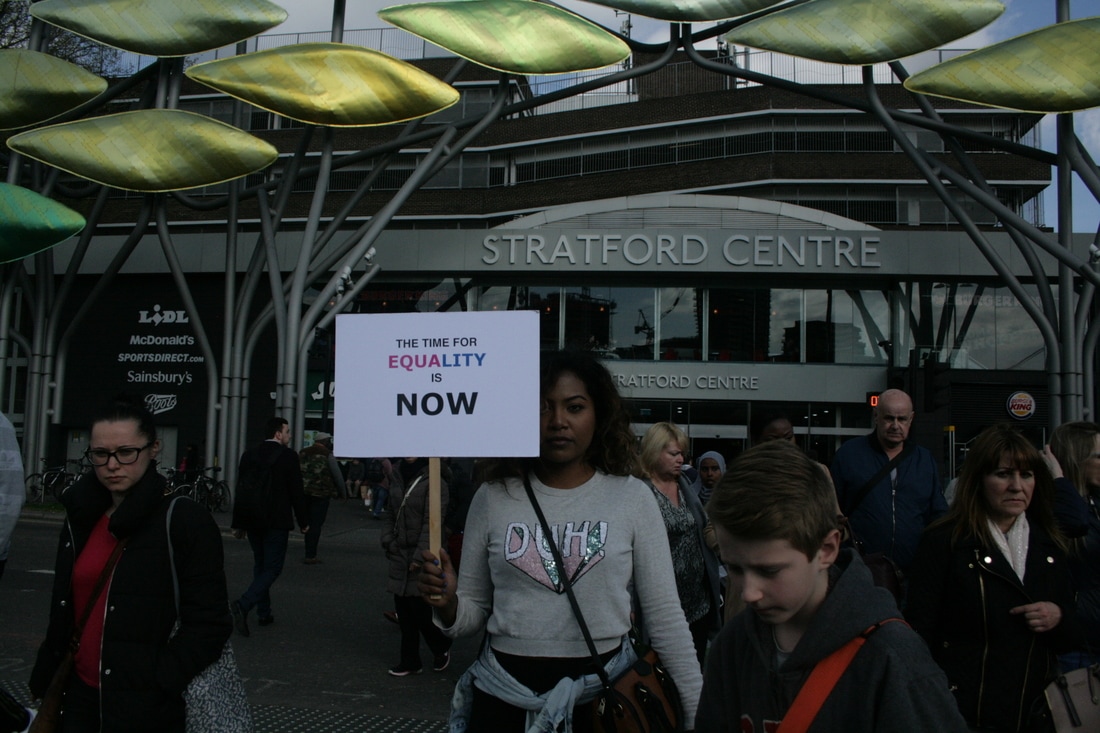
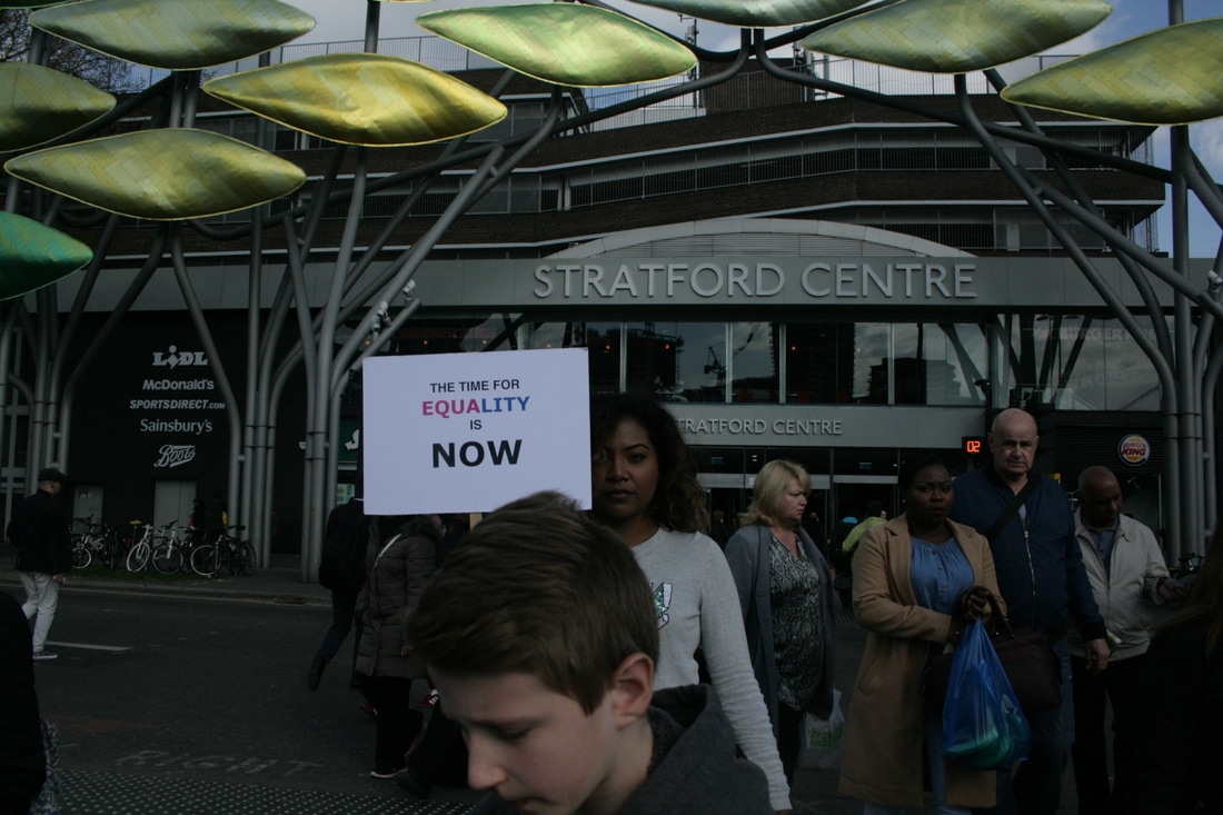
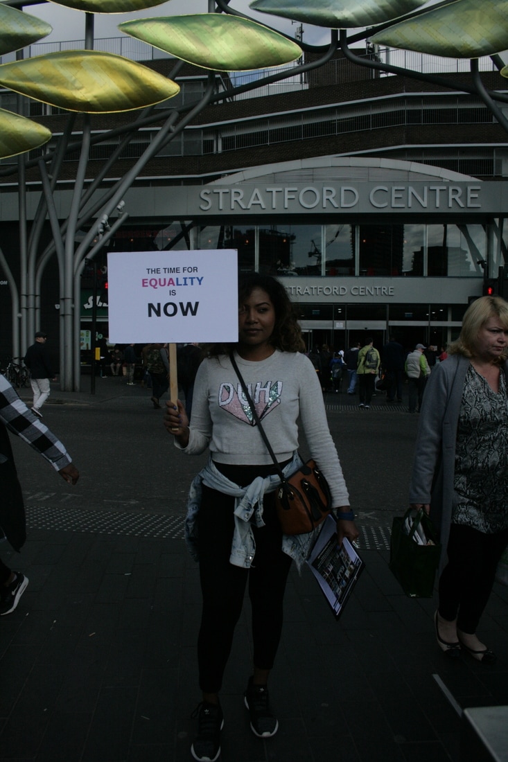
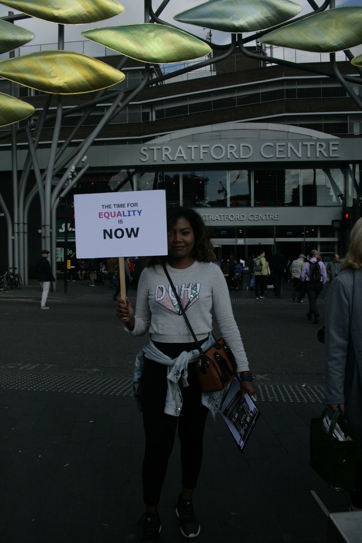
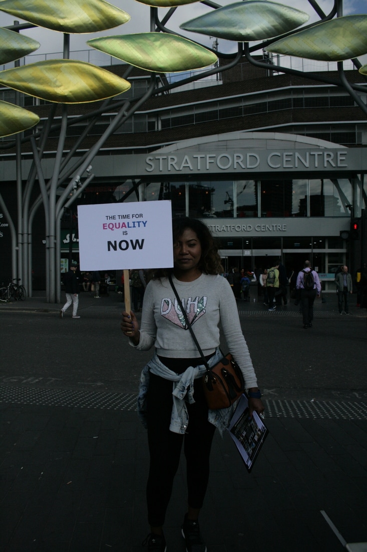
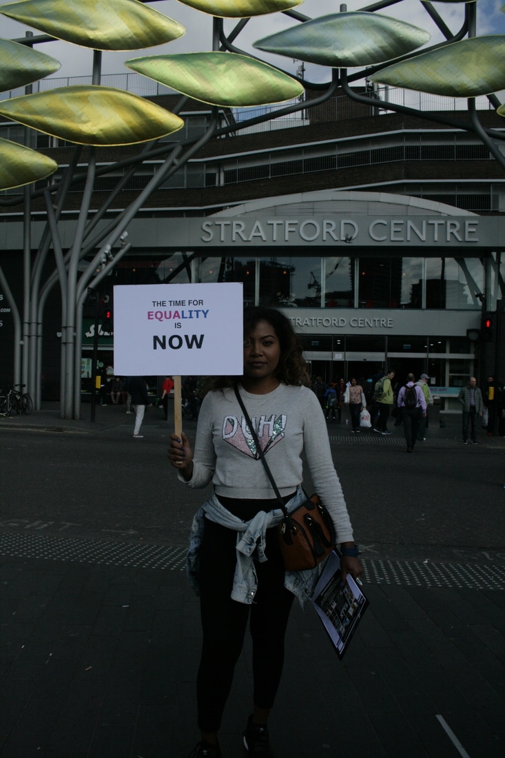
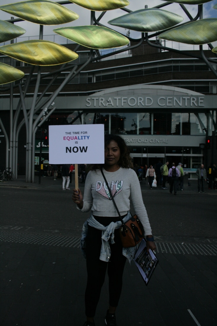
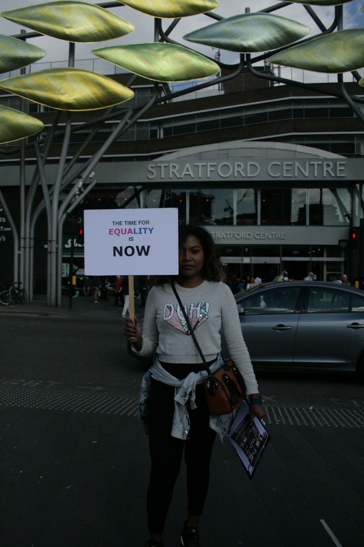
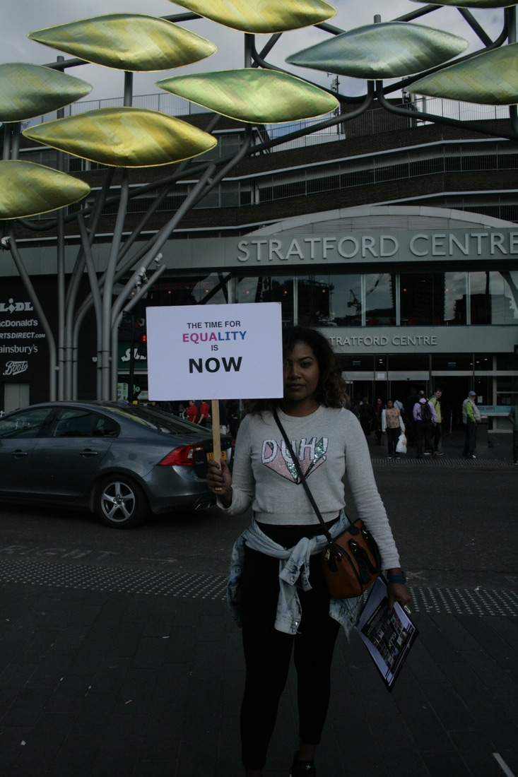
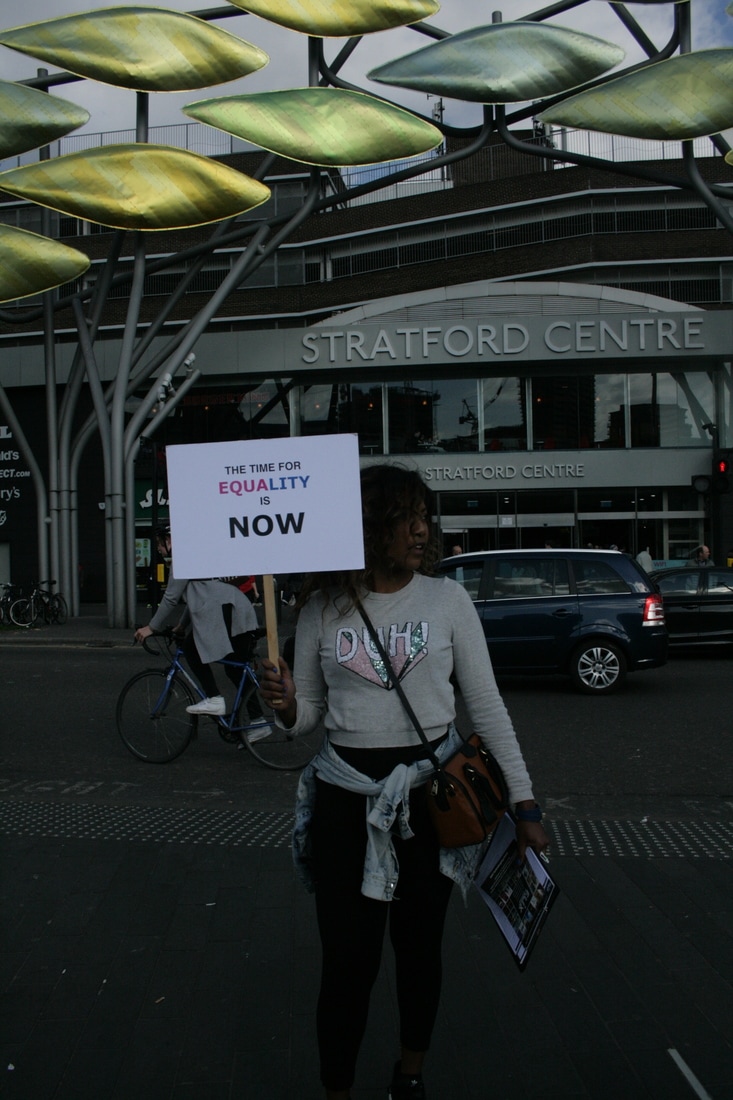
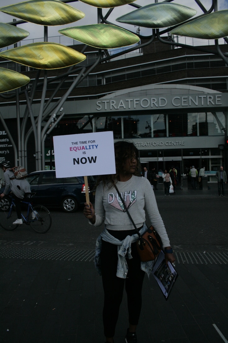
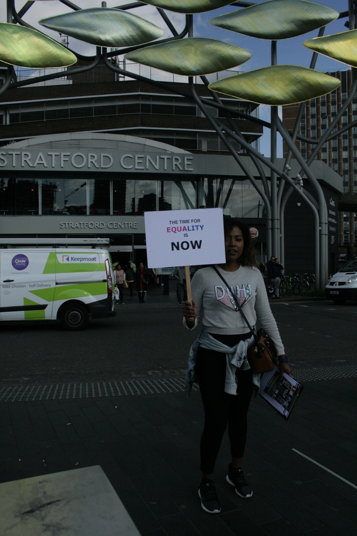
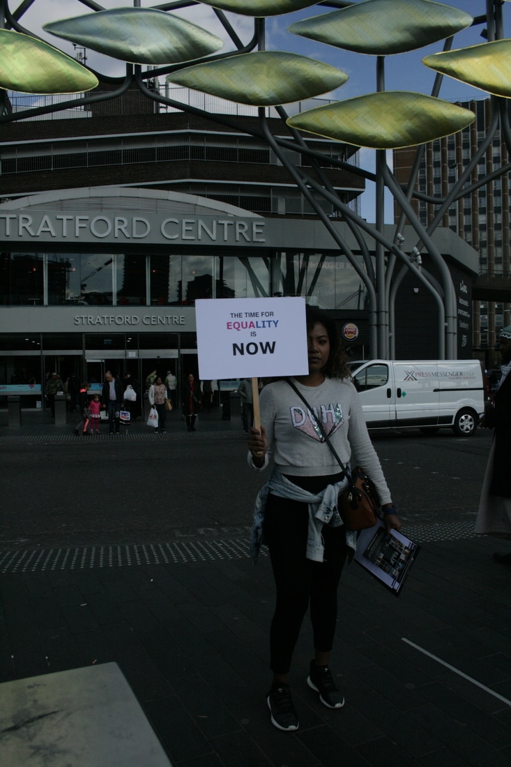
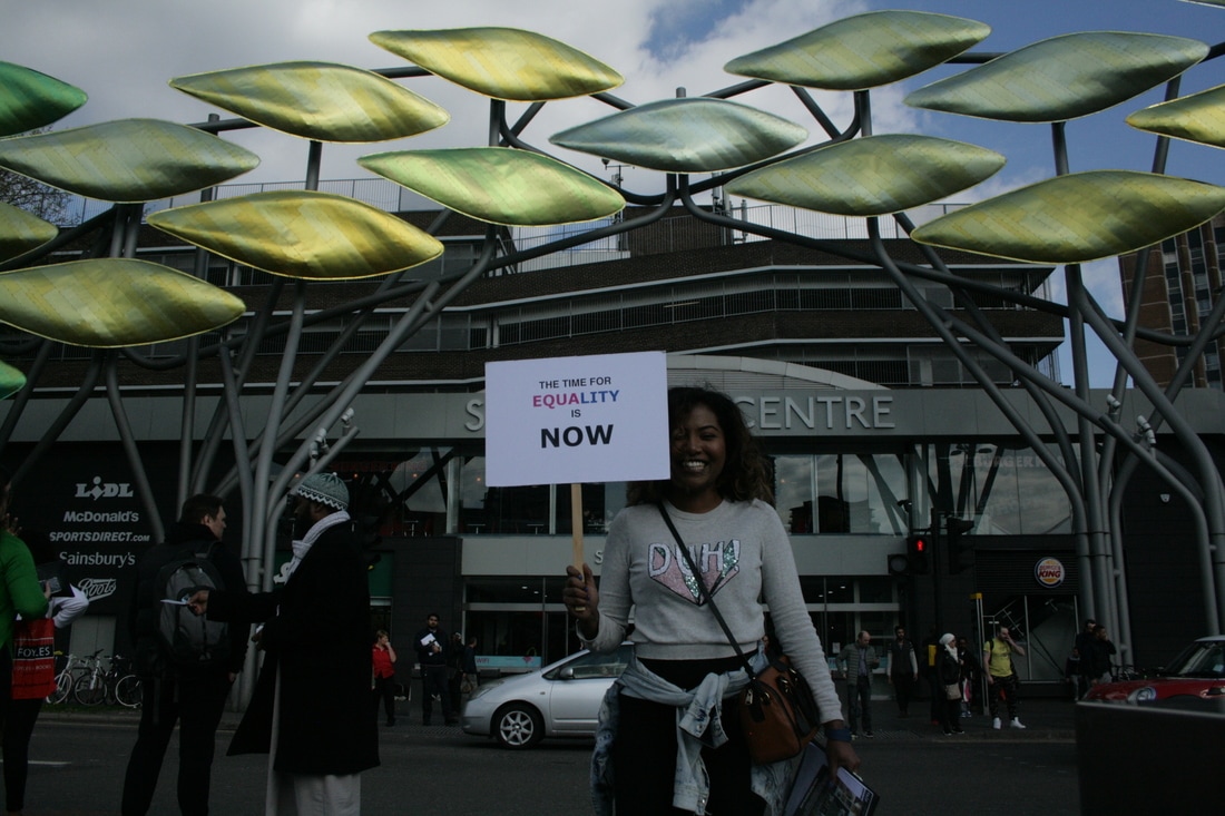
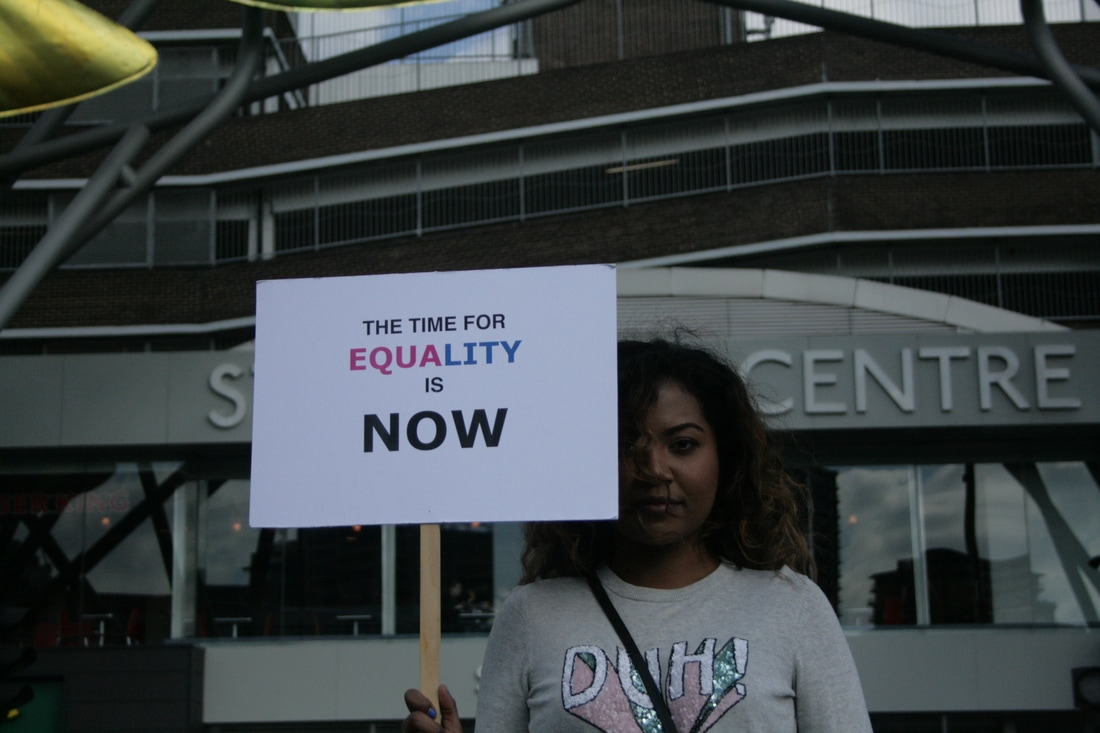
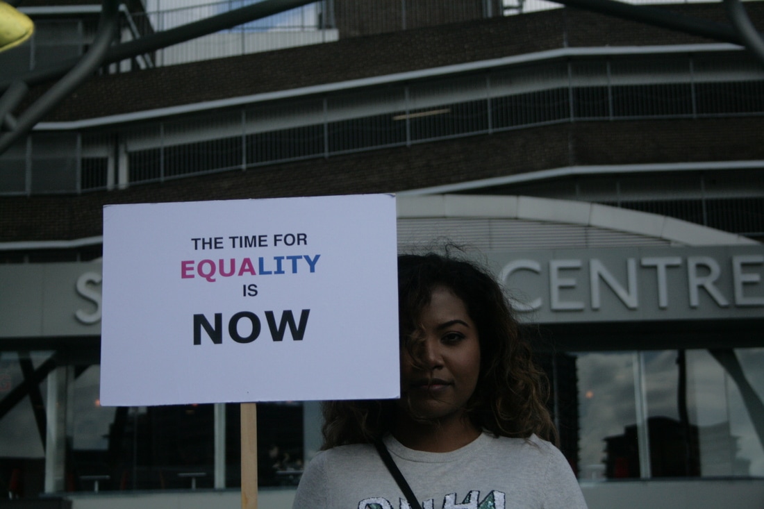
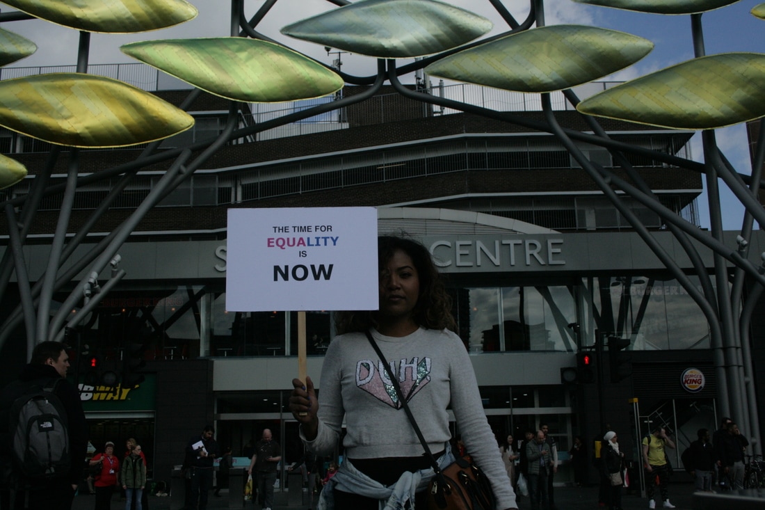
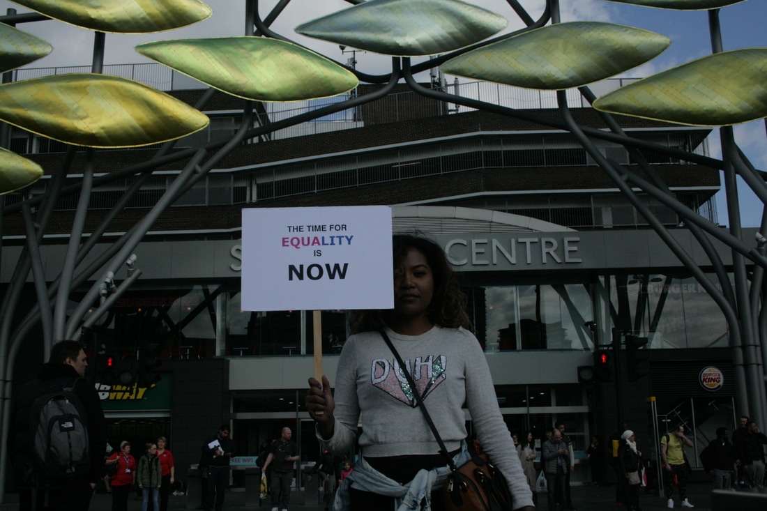
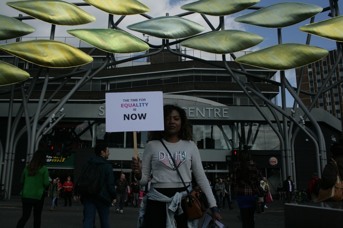
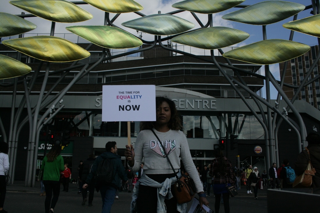
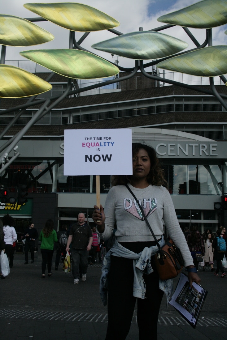
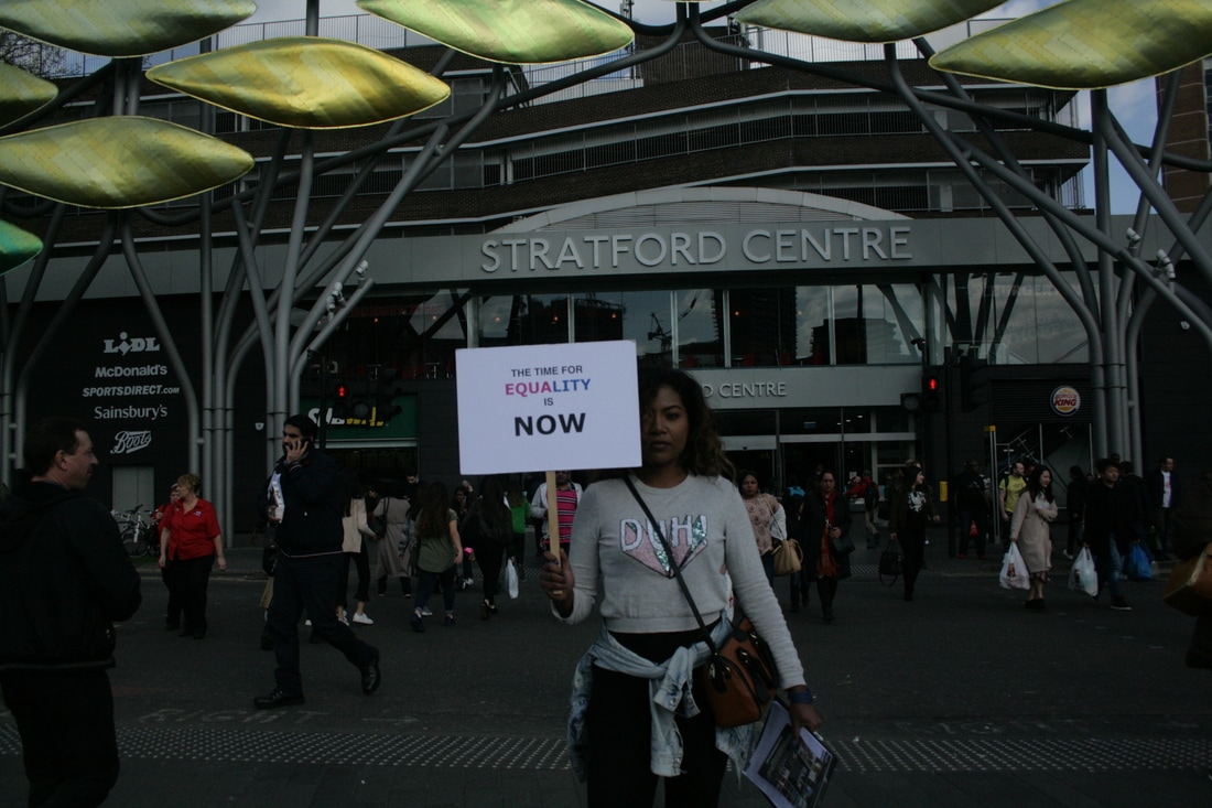
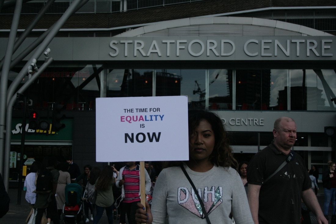
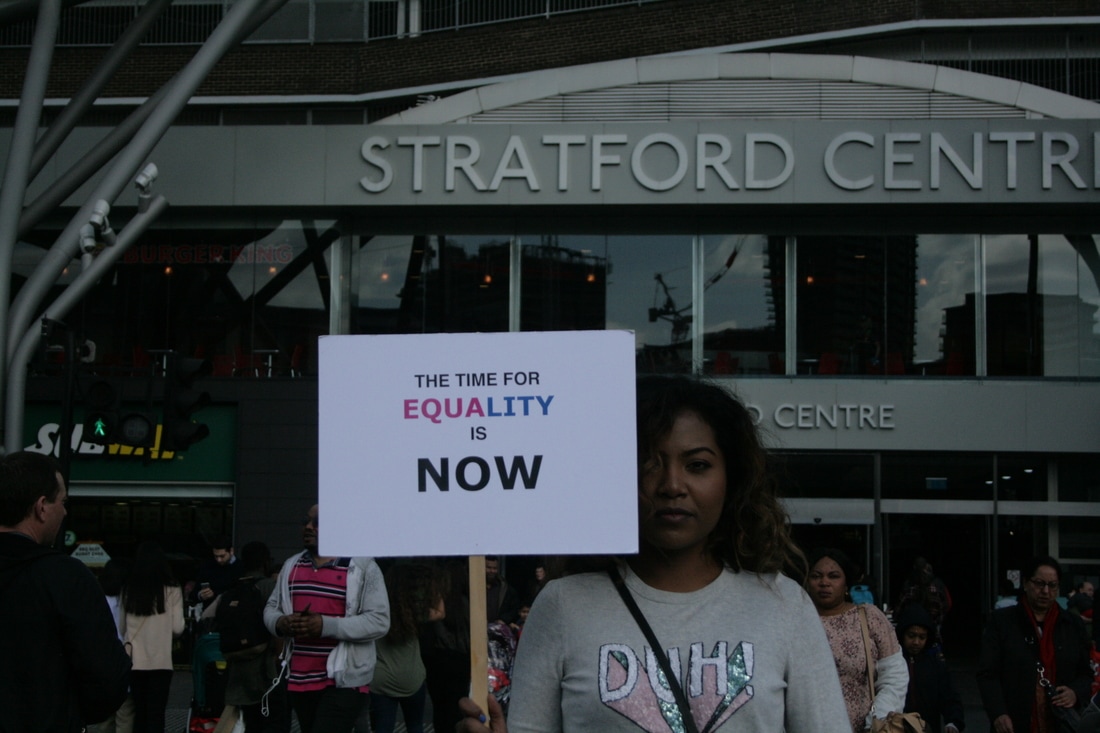
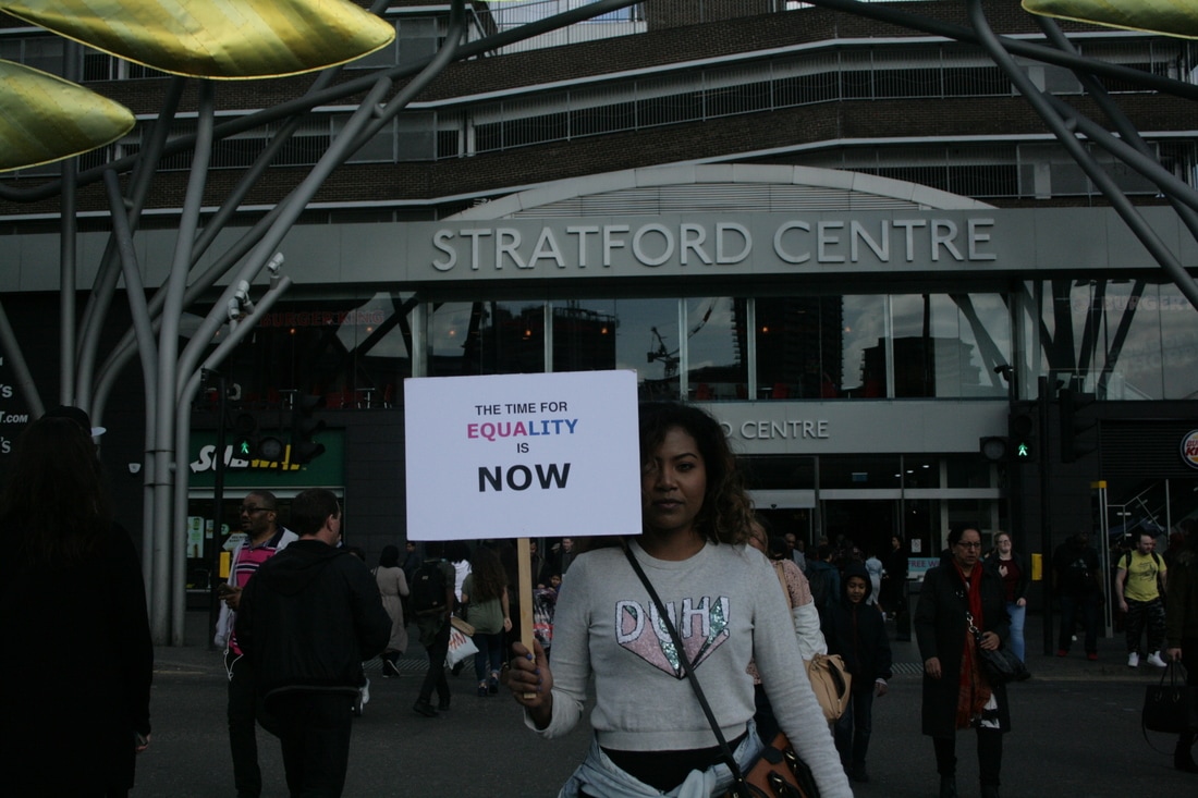
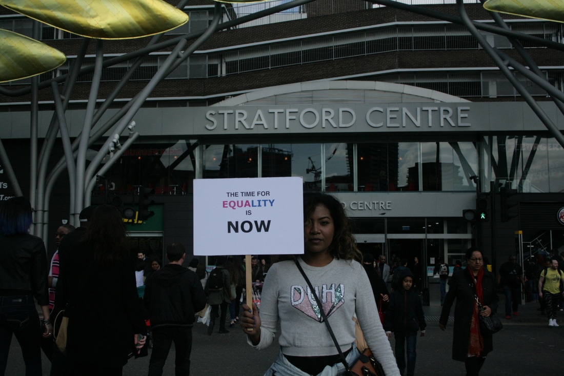
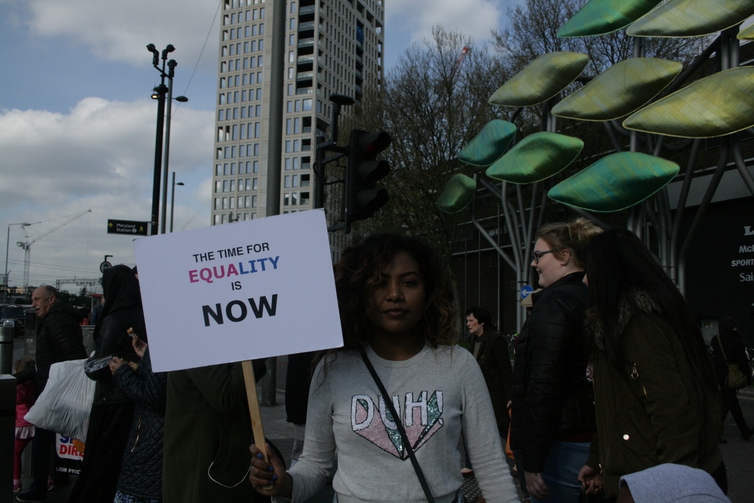
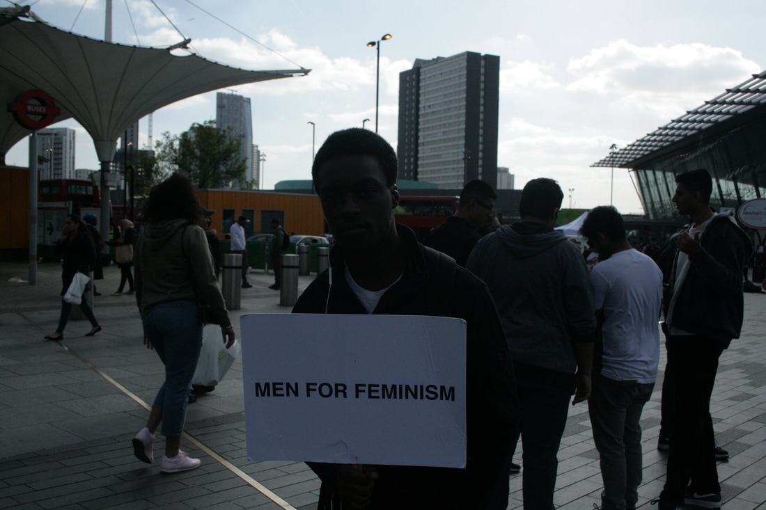
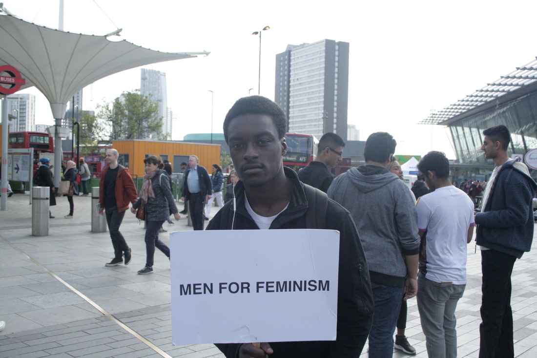
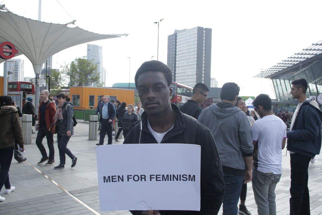
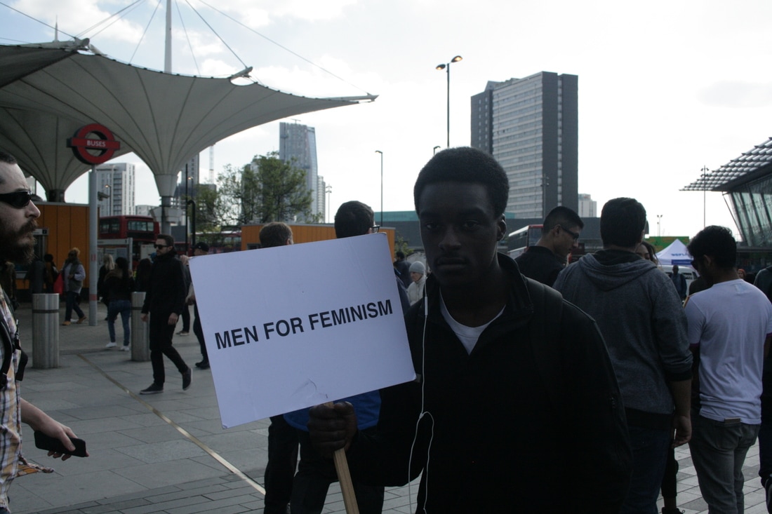
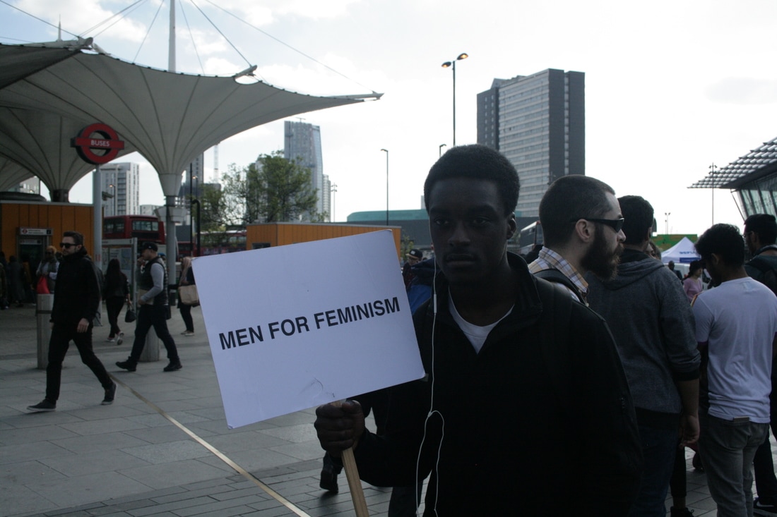
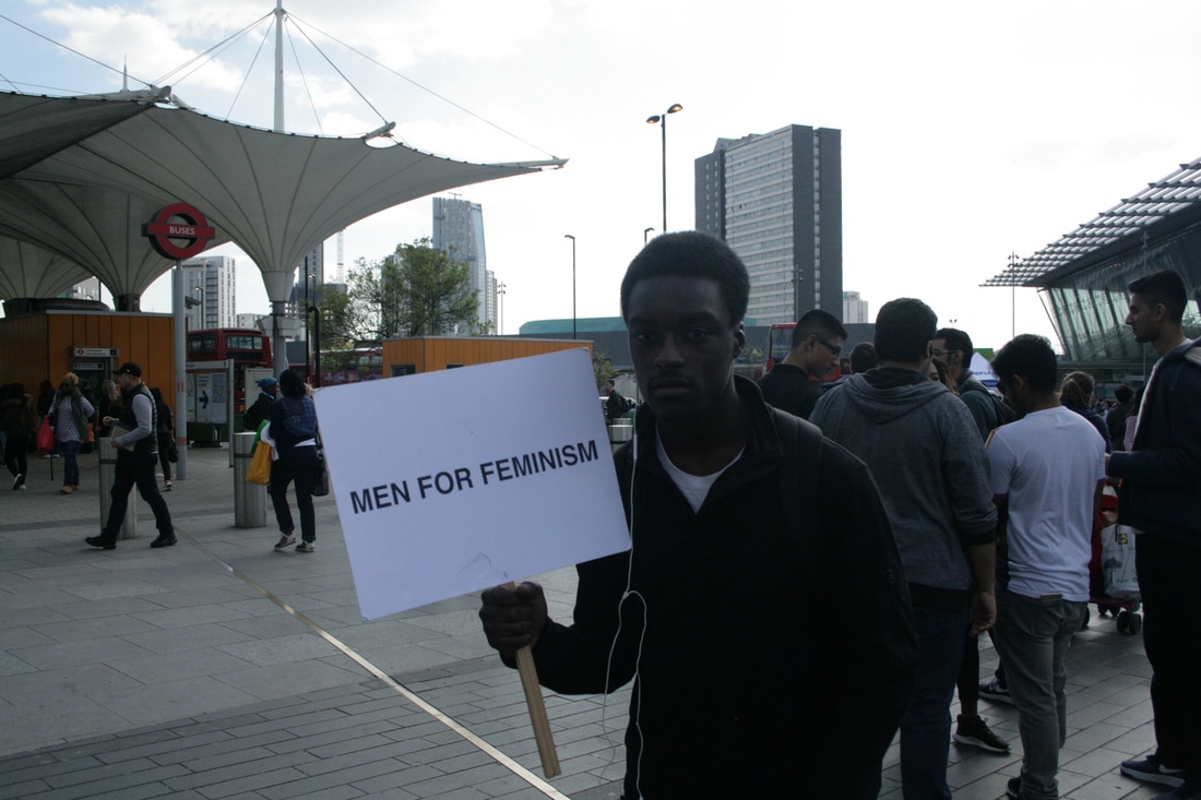
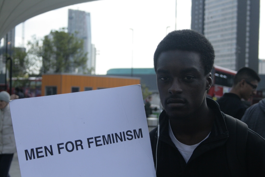
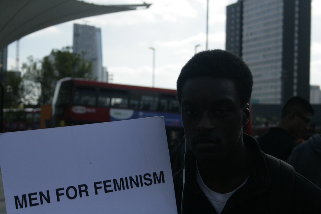
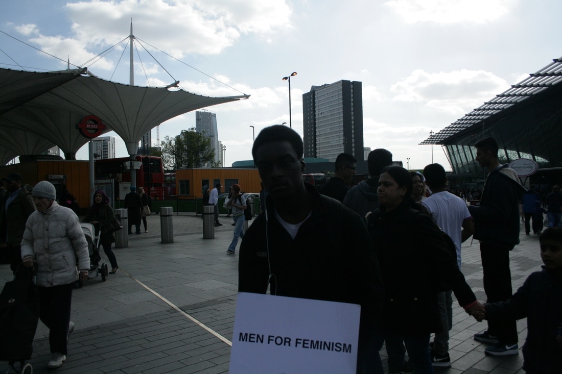
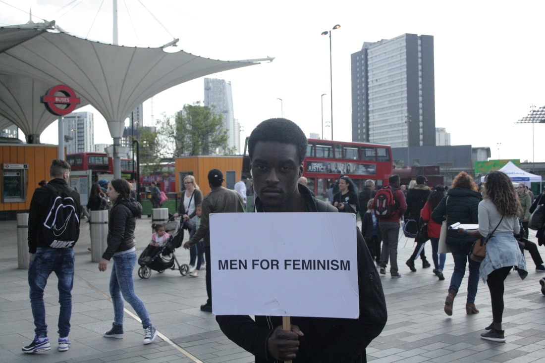
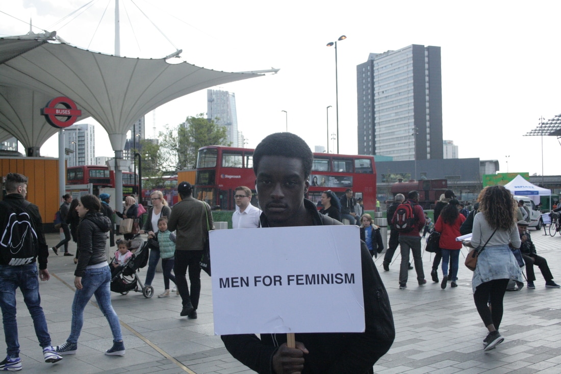
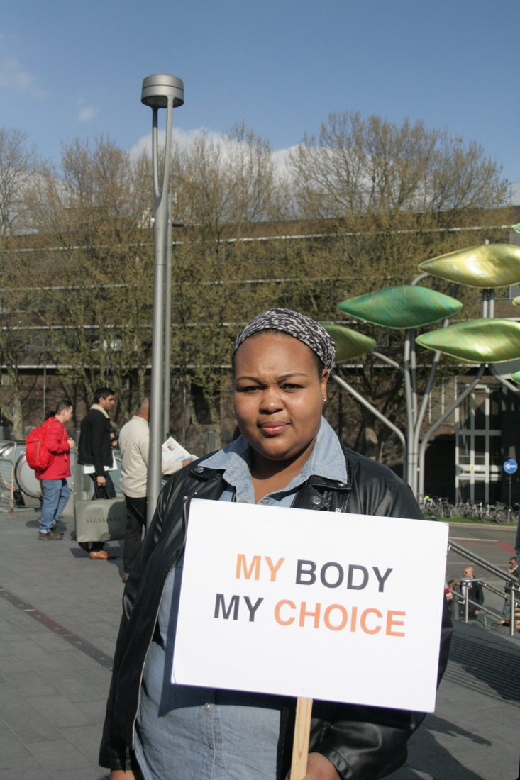
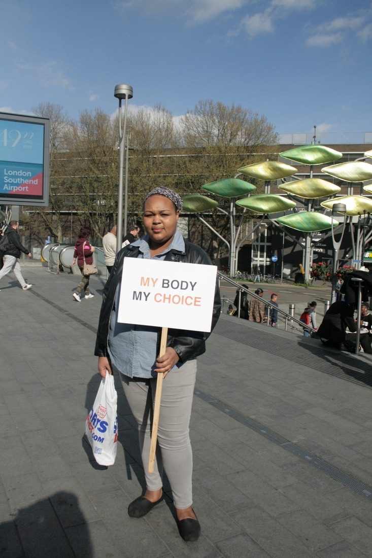
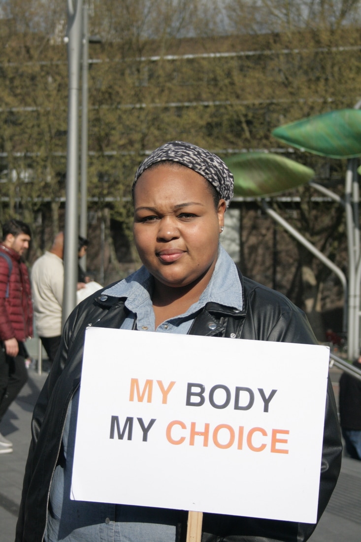
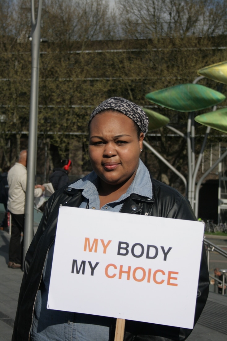
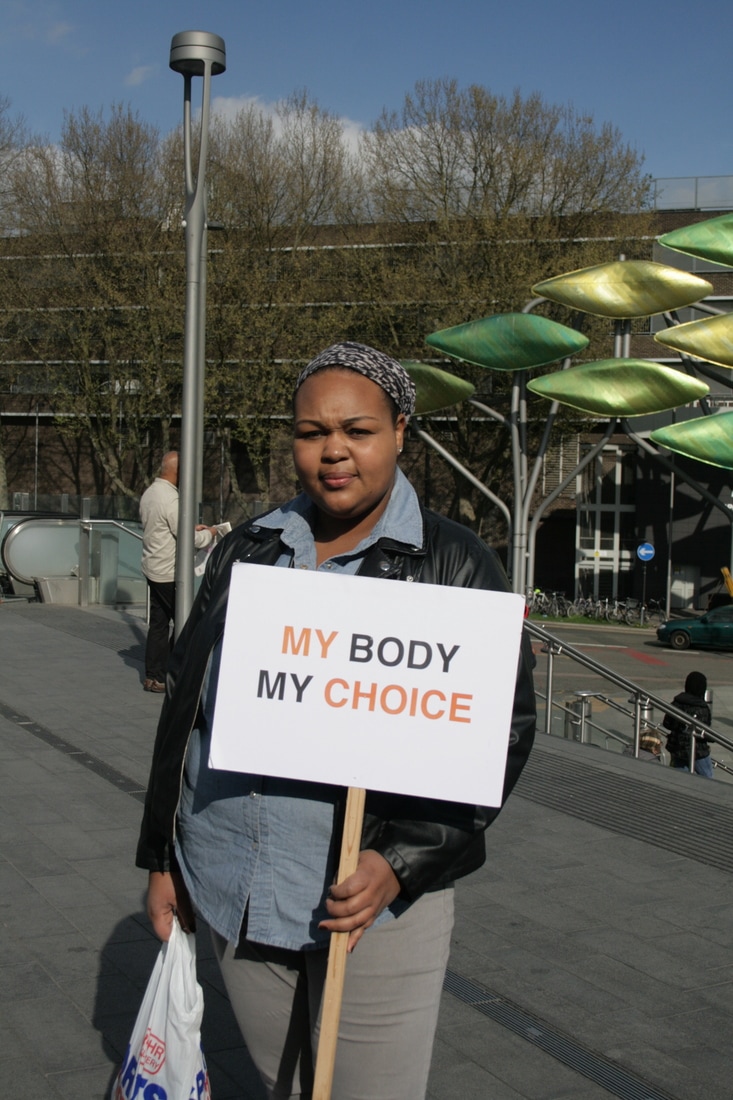
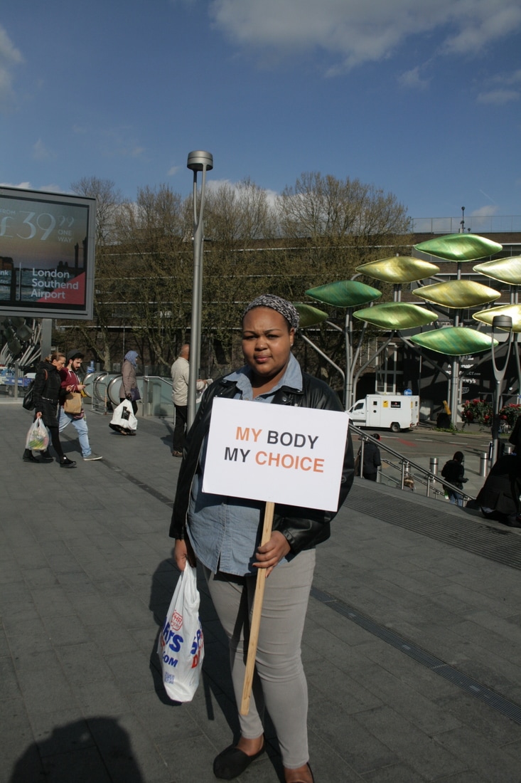
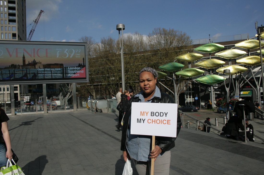
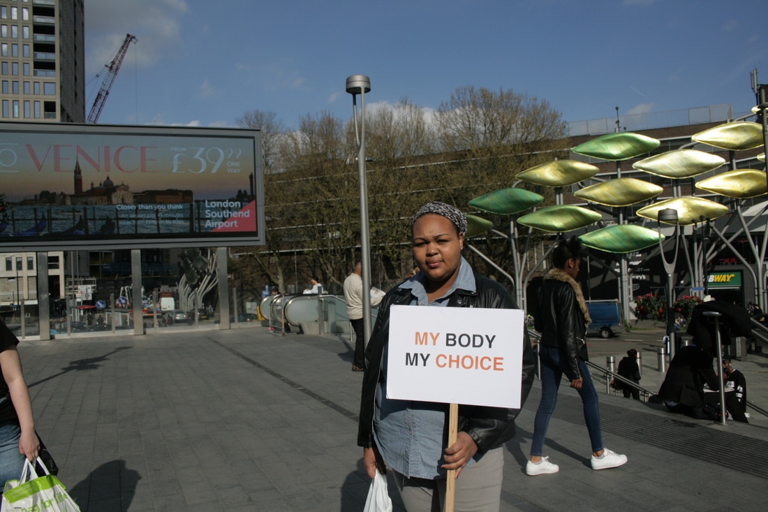
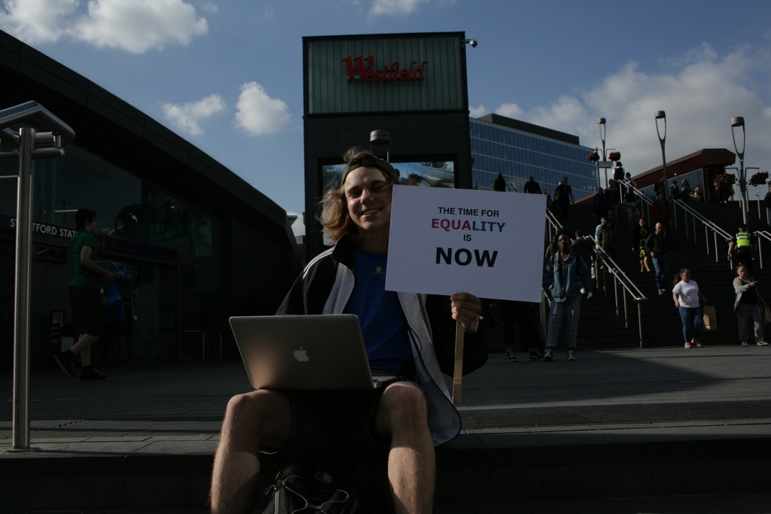
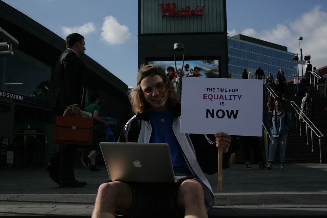
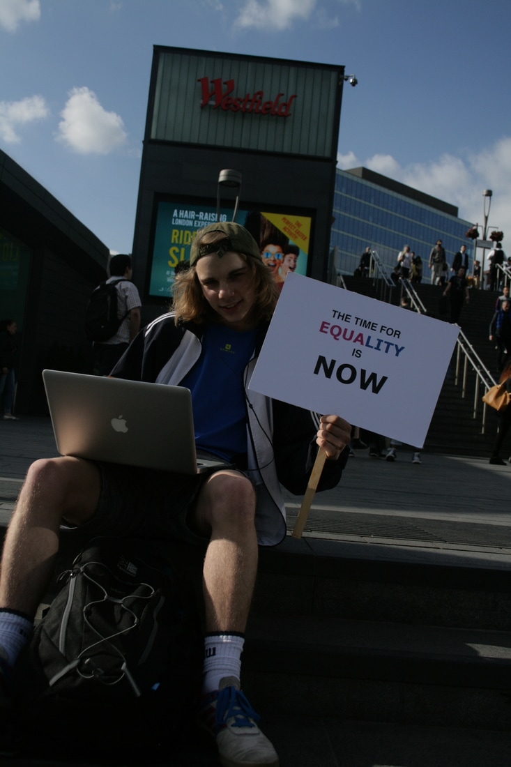
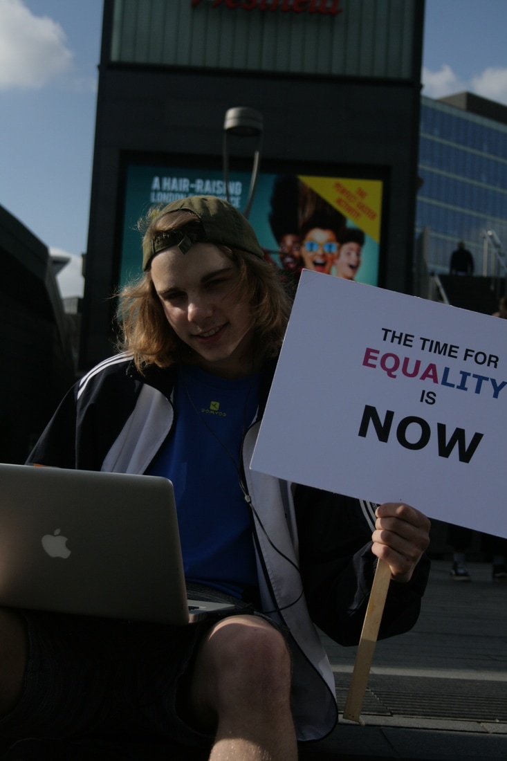
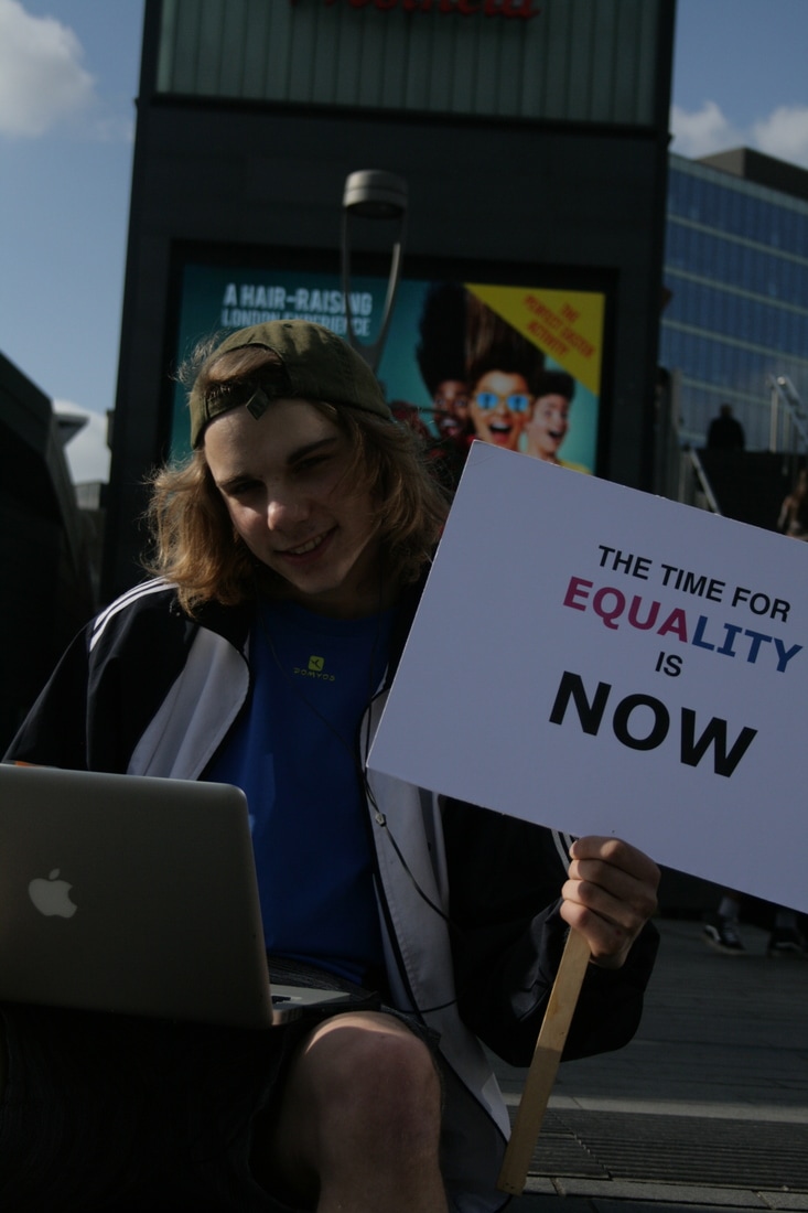
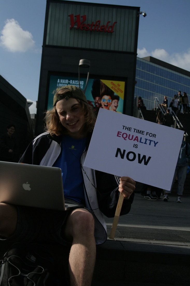
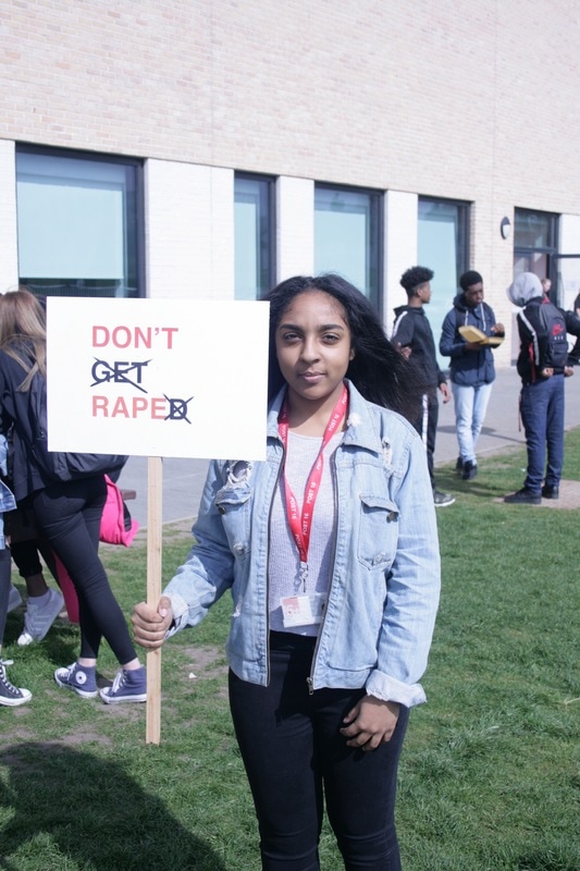
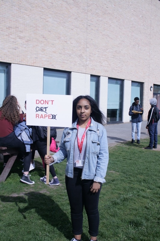
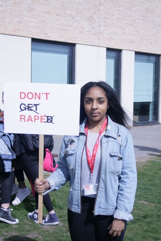
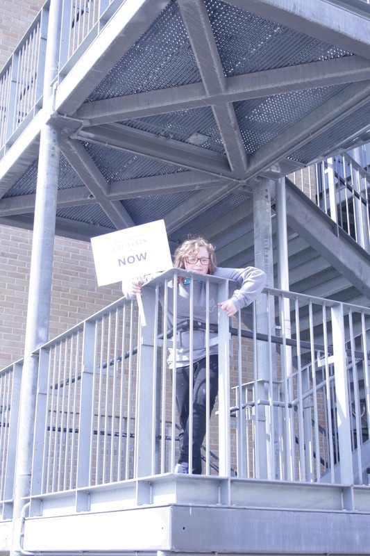
My further development of this campaign, I decided to do in a public busy place such as Stratford which had a diverse audience and a constant flow of new viewers. I decided to do this shoot in a busy diverse area as I wanted to impact a wider audience, similar to larger protests and campaigns; however I also wanted to show the real side of campaigns that a lot of people will go about their everyday life regardless, emphasising how important it is to make your voice as a feminist heard. I felt that this went well overall as a lot of people did engage with my campaign and did ask to be in the photographs because they wanted their voice to be heard on the matter and also wanted to know more, on the other hand, a large proportion of people did not care and that is evident in some of the photographs, which is what I really wanted to capture in this.
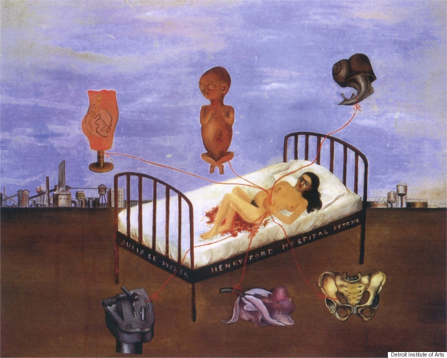
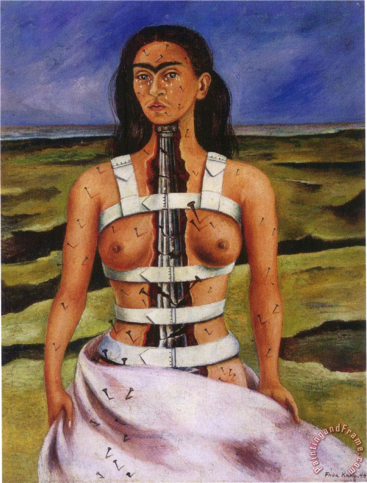
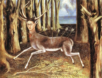
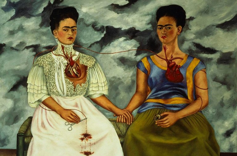
Frida Kahlo
|
|
Frida Kahlo is a renowned feminist painter who is well known for deviating from traditional beauty in art depictions, instead painted raw and unapologetic and honest experiences which many women have to face. Many of the subject matters in her paintings were of abortion, miscarriage, abuse, birth and breast feedings, along with many other fundamental issues that woman face day to day. Frida can be quoted saying that “they are the frankest expression of myself” when talking about her self-portraits, and in turn shed light on the experiences shared by womankind as a whole.
I am inspired by Kahlo's work as it is very honest and captures a moment, just a photograph would. Although Kahlo is not a campaigning photographer, the principle behind her work is still the same; she was keen on expressing real experiences and informing people of issues that many women have to face and go through. |
Final Piece
Edited selection
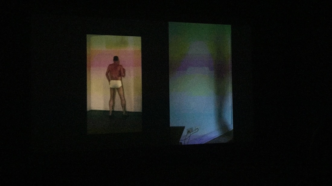
Experimentation using a projector
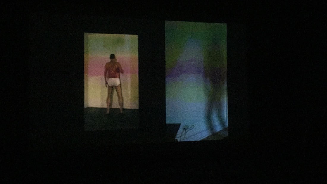
I took these images by projecting the edited pictures I had taken before of my model onto a white background, I then got her to apply lots of makeup and asked her to dress more 'feminine'. Overall, I like these pictures, however, I decided not to use them in my project as I did not feel that they came out exactly how I wanted and did not convey the message I was trying to get across properly. My intentions for this experiment was for the projection to act as the real self, the self she is most comfortable and happy as, being ever present while society tries to make her conform by wearing makeup and dressing differently. I am most pleased with the pictures of her cover her eyes and mouth as I believe this is the closest these images came to bringing my intentions to life, despite this, I did not feel that these were good enough to use in my work.
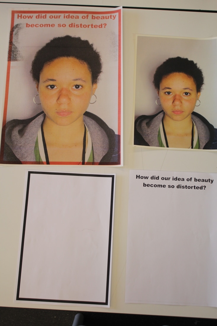
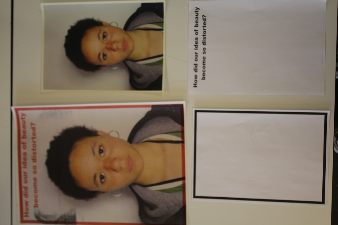
I started this experimentation by taking portraits in the studio of a model who wore no makeup, had her hair natural and dressed casually. I chose a model who looked this way as I want to experiment with the idea of beauty representations in the media. I chose to create Barbara Kruger inspired posters using a make-shift screen printing method using the photocopier. I started by editing the pictures by making my selection then edited the selection in photoshop so that they had a higher contrast and so that they were slightly more exposed to bring out the highlights and shadows more. I created documents with different layers so that each page was a new screen essentially so that I could layer the different components and experiment with different layouts etc.
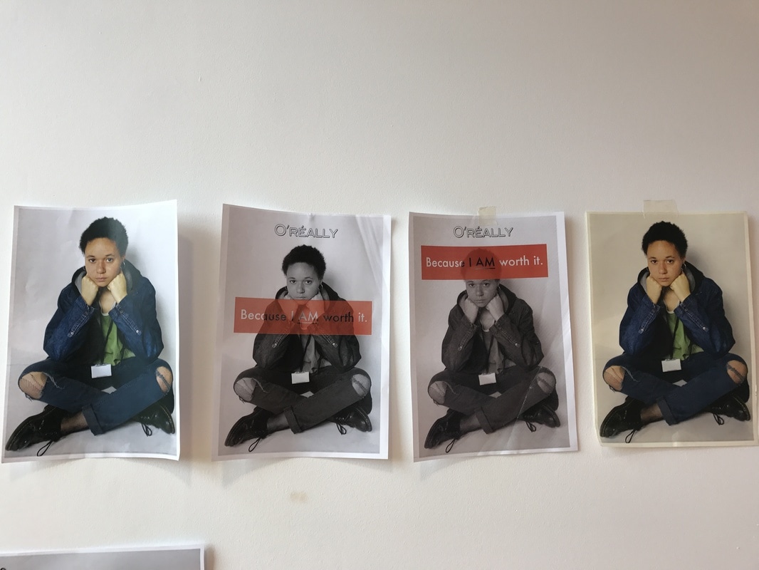
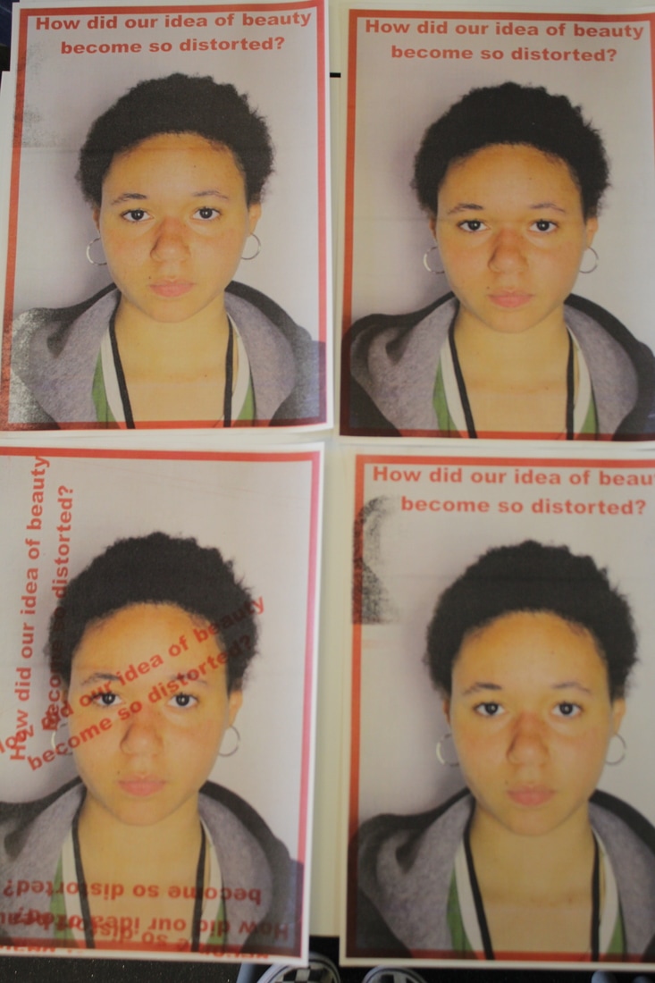
When I started scanning the photographs, I had difficulties making sure each page lined up correctly so that the text was where I intended it to be. In the first series that I tried, I was extremely pleased with how they turned out but would like to take it further and play around with different fonts, colours and possibly try the image in black and white. I really liked how the images that I had printed in black and white came out, I found that this made them feel more like posters that I had seen and highlighted the text more. Additionally, I used cartridge paper so it added more texture to the images. I like that when using the cartridge paper, the printer rollers picked up the ink and created smudges and different prints on the paper, although this was an accident, I like how it changes the aesthetic of the images by making them look more handmade and personal. This also made them seem as if they were part of a protest. linking back to my experiment using plaques and protest style photos. Another accident was in the second series of images, I couldn't get the red box to match up with where I had originally intended it to be, the middle of the page, however, I think that the placement of it over her face makes it more empowering and stands out more as it's the first thing you see because it is eye level so I actually prefer how these came out than how I originally planned.
To develop these images I will create a digital version of photoshop, using different tools to create the screen printed effect. I like the idea of creating a digital version as it makes it seem more realistic for a campaign as a campaign would be mass produced so screen printing each poster would not be practical.
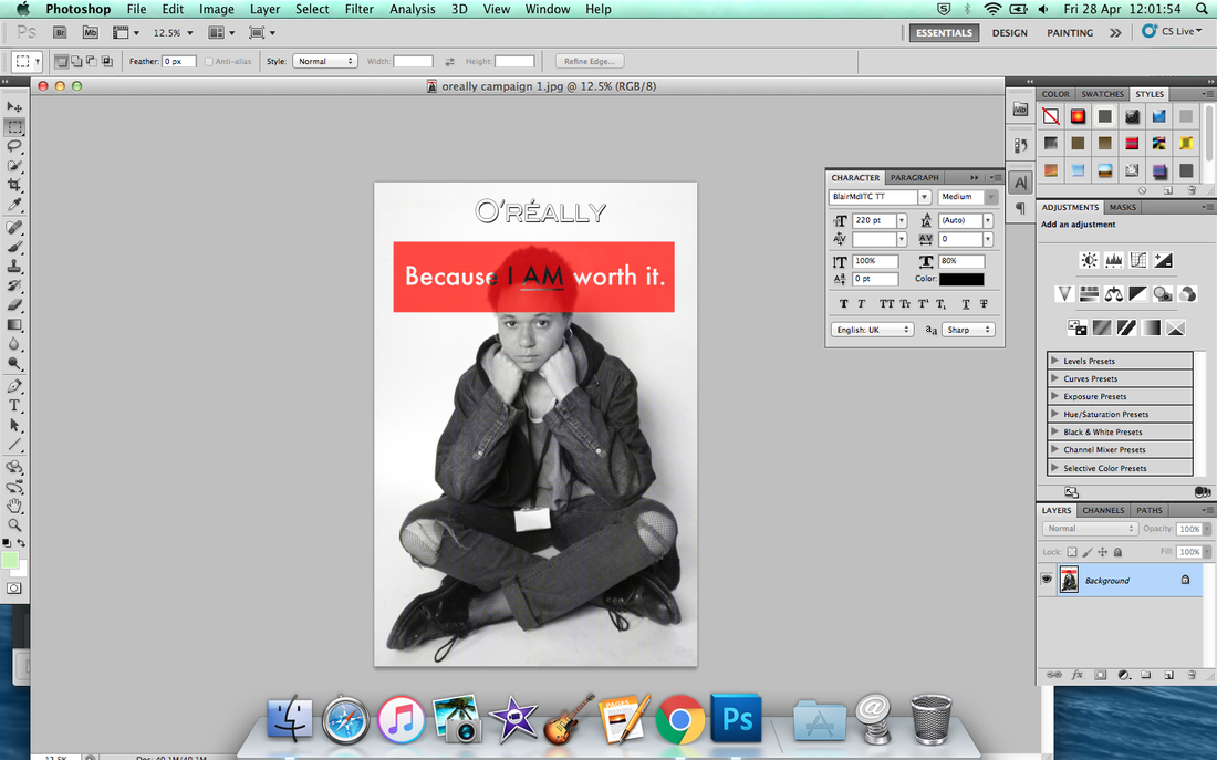
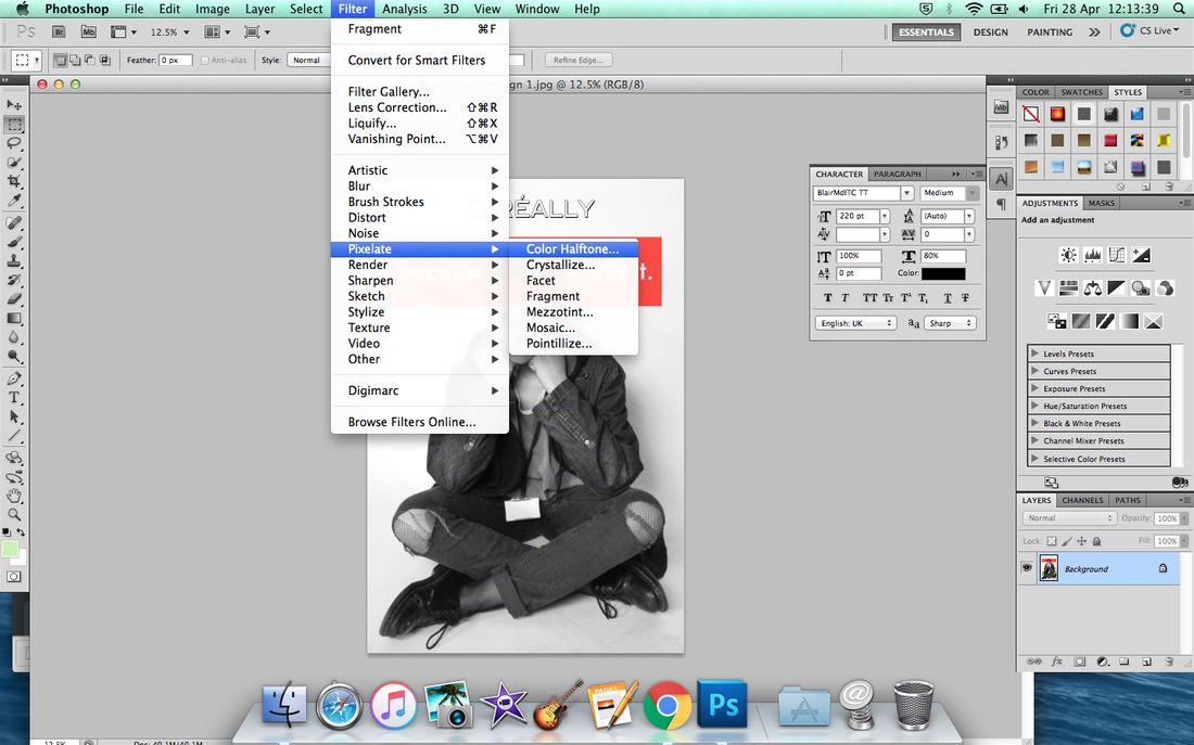

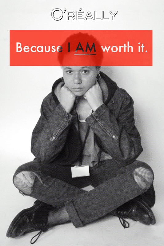
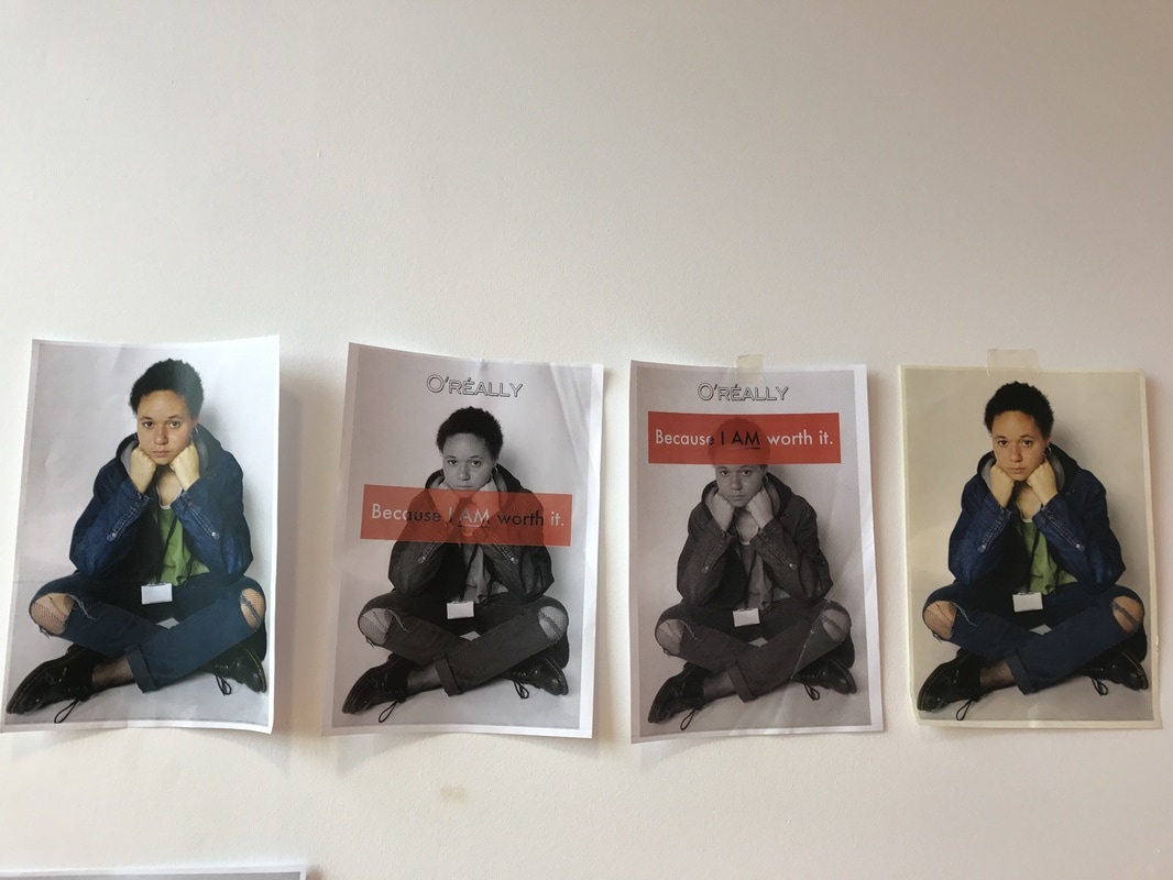
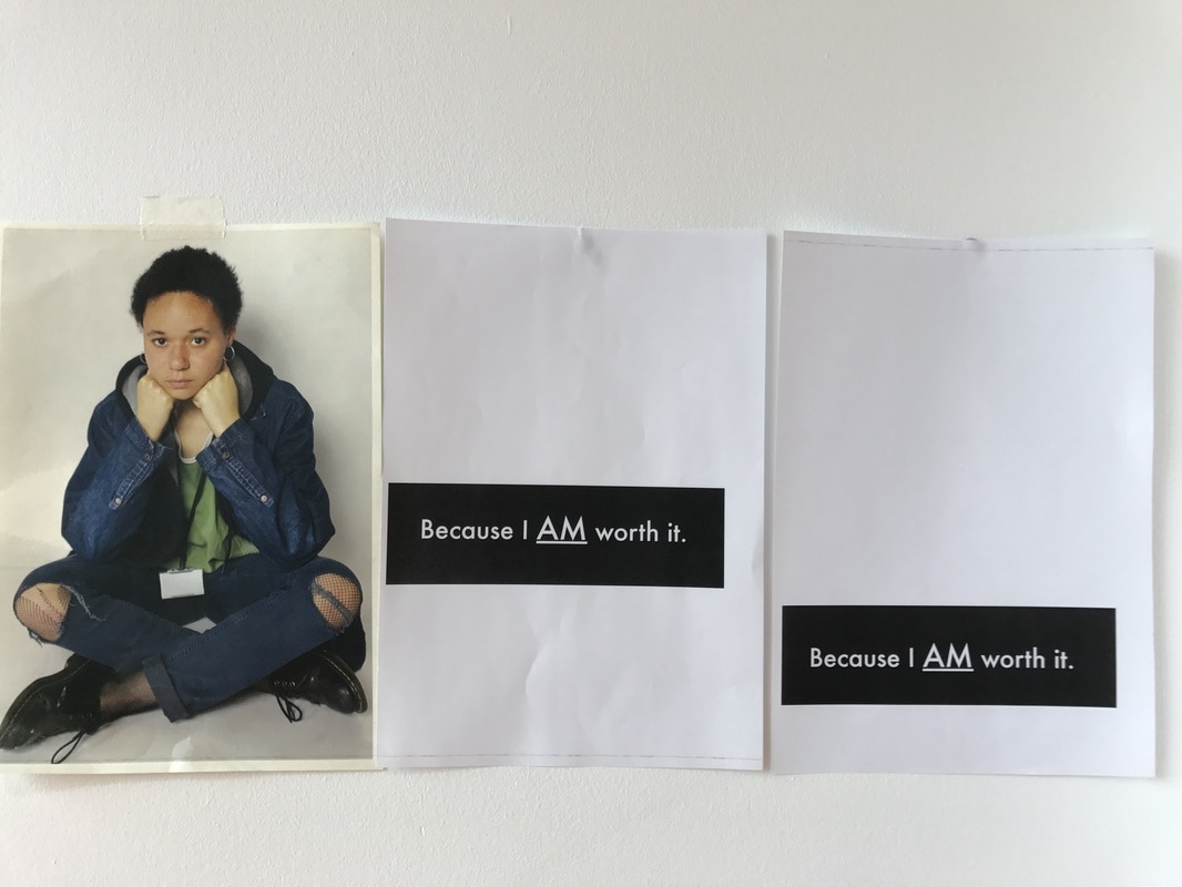
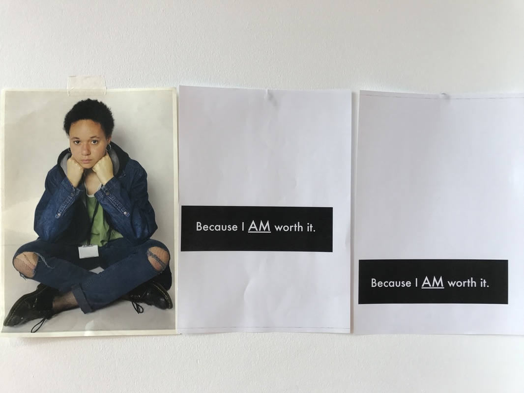
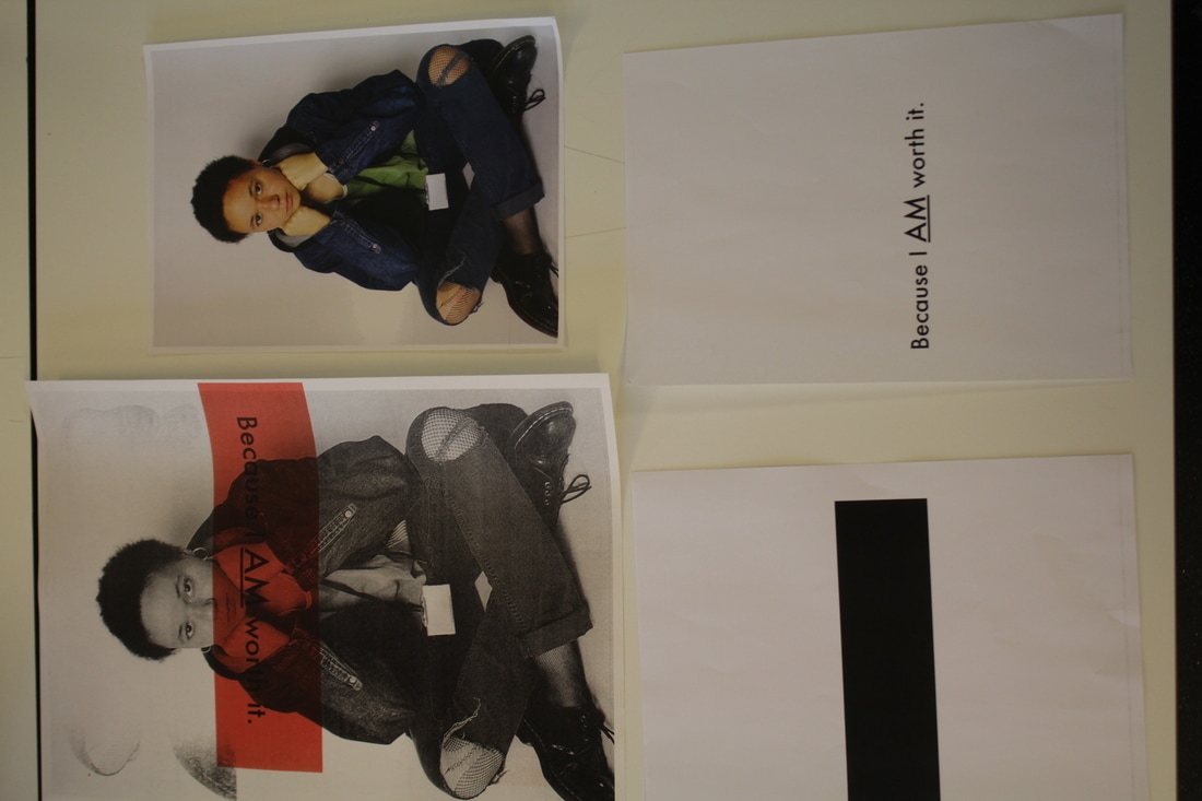
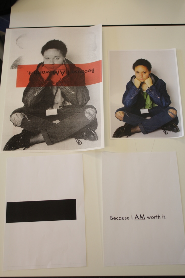
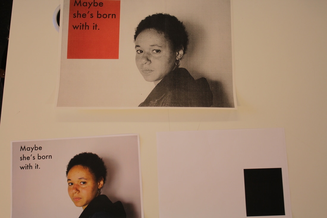
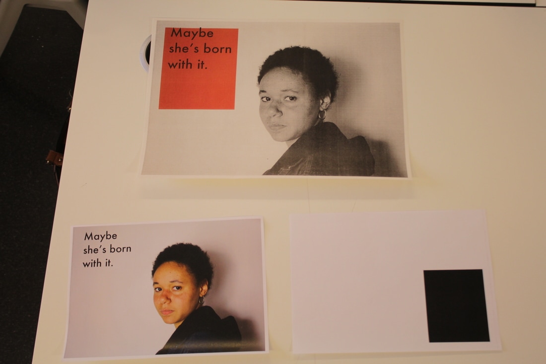
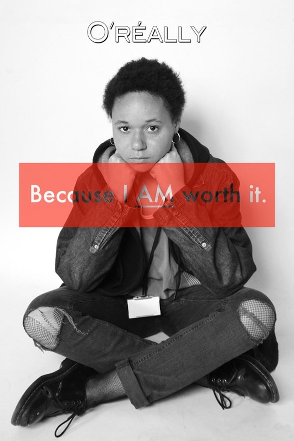
These are the two versions of my digital photoshop campaign. They are slightly different for a few reasons, the red box in the first one is a lot more transparent and is placed over her hands, heart and slightly over her chin; I chose to place it there as I think it draws more attention to the message without distracting from the image itself. Additionally, in the second image, I added a colour halftone to create a pixelated texture as if it had been printed. I chose to move the position of the red box from on the head to the centre as I found that having it at the top of the print, it became distracting and rather than looking at the image as a whole, the viewer had to look at the text then the image, also I felt that it created a metaphorical block on her thoughts and words, contradicting the concept that women need their voices and beauty heard. At the top of both images, it has the 'O'really' logo which is satirical of the L'Oreal logo. The slogan "Because I AM worth it" is also satirical as it is mocking the L'Oreal slogan "Because You're worth it", which in my opinion belittles woman of their actual worth and creates a notion that they are only worth something if they alter their natural beauty by using a mixture of different products, or at least L'oreals own products.
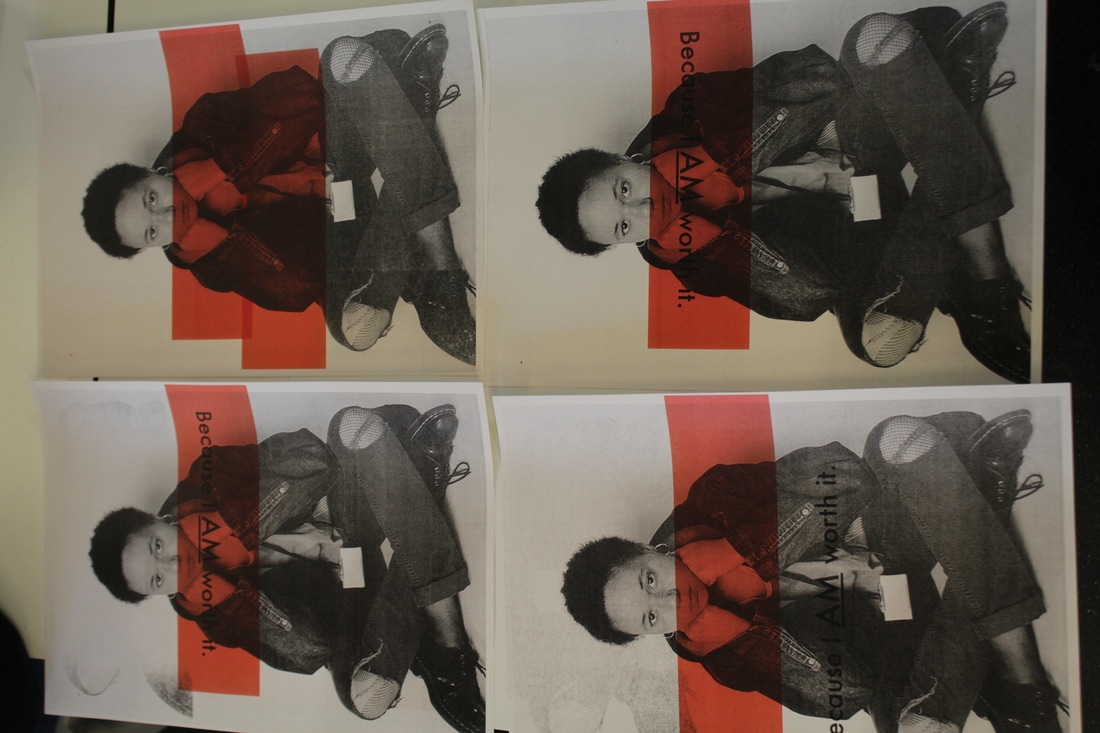
I prefer the print that has the text through the centre as the tones come out a lot softer when printed in the other image due to the pixelation. Having more contrast in the photograph makes it stand out more and makes it more striking for the viewer. Also, I chose to have the text stamped through the box logo as I felt that allowing the viewer to see through the texts, it acts as a metaphor for those people in the cosmetic industry overlook the real self-worth of a woman for their own gain, making their words and opinions transparent. I chose to use black, white and red as it is simple and to the point, much like Kruger who only used these colour pallets. I was inspired to use such a simple pallet like Kruger as it removes all the noise that magazines and other campaigns usually have when they include backgrounds and other colours. By doing my campaign this way, I find that it makes the photographs extremely powerful due to their simplicity.
I prefer the print that has the text through the centre as the tones come out a lot softer when printed in the other image due to the pixelation. Having more contrast in the photograph makes it stand out more and makes it more striking for the viewer. Also, I chose to have the text stamped through the box logo as I felt that allowing the viewer to see through the texts, it acts as a metaphor for those people in the cosmetic industry overlook the real self-worth of a woman for their own gain, making their words and opinions transparent. I chose to use black, white and red as it is simple and to the point, much like Kruger who only used these colour pallets. I was inspired to use such a simple pallet like Kruger as it removes all the noise that magazines and other campaigns usually have when they include backgrounds and other colours. By doing my campaign this way, I find that it makes the photographs extremely powerful due to their simplicity.
Evaluation
During this project I researched a range of artists, I started with Roland Barters and semiotics, the study of signs and symbols and their interpretations. I found this interesting as it helped me understand the importance a photograph can have for a campaign. The study of signs was useful as it helped me realise that creating something more simple was going to be more effect than an elaborate plan which may be interpreted differently than how I want my viewers to see my images and my campaigns. I then researched the Brexit Breaking Point campaign and Barabara Kruger, although I found both very fascinating, I was drawn to Kruger's work instantly and knew that she would influence my work at some point. I chose to do campaigning photography as I am passionate about current issues and the effect campaigns can have to change or resolve these matters. I started to investigate social campaigns and photographers who look at political campaigns too such as Wolfgang Tillmans.
I have always been interested in feminist campaigns and the women's movement, so this was the perfect opportunity for me explore these movements and ideas in a deeper, personal way. However, initially, I was unsure if I would focus on the feminist movement side of campaigning or animal rights and animal activist movements. While exploring the question of campaign photography and feminist campaigns, I explored the threshold concept #9. The threshold concept #9 is that the due to the nature of photographs, they are susceptible to the abuse of power. I think that this concept applies very well to my question as the whole idea of campaigning and campaign photography is to take an image out of its context and sell it to a market audience. I believe that the 9th threshold concept also encourages photographers to send powerful messages and ideas through their images. Additionally, I believe that by removing the photographs or images from their original context, eg a set created for an advert, and placing them in the real world creates a curiosity for the viewers encouraging them to buy into your product.
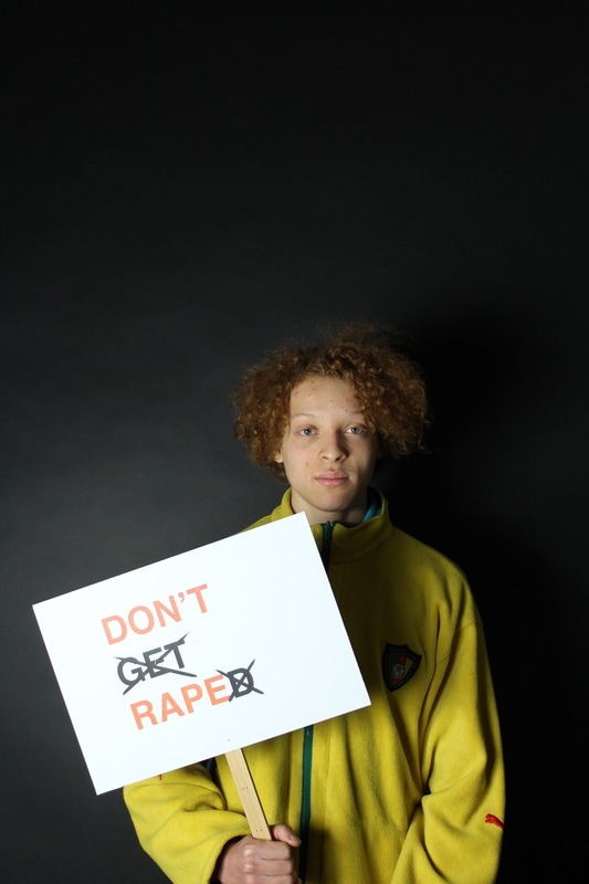
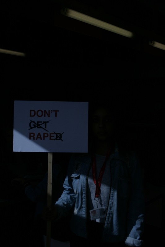
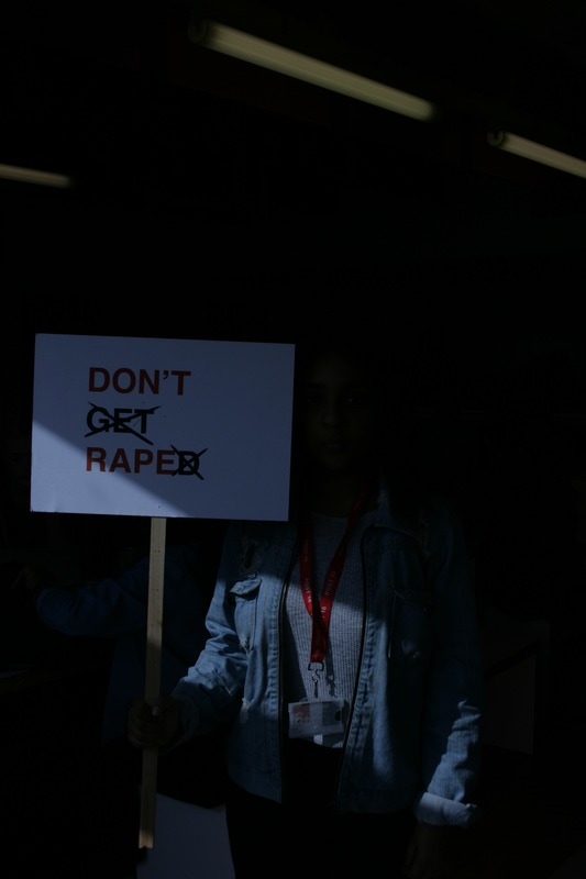
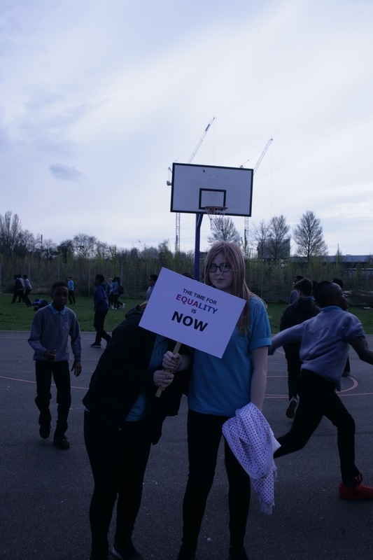
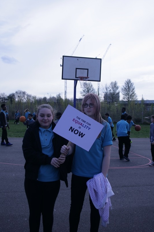
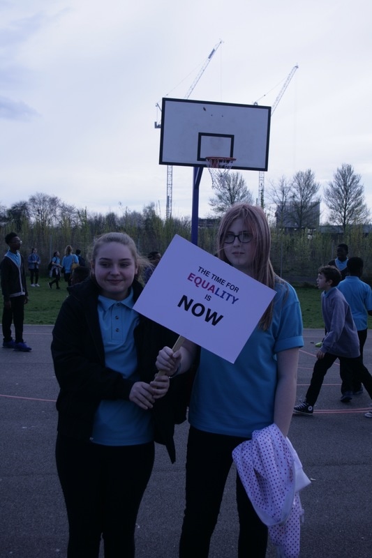
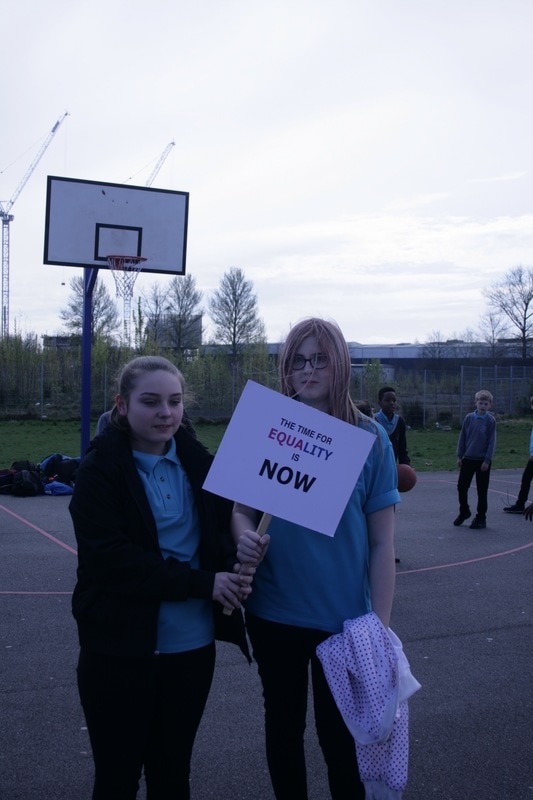
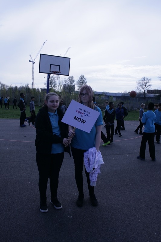
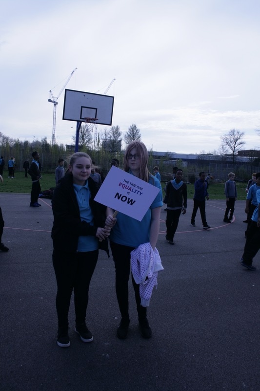
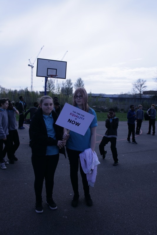
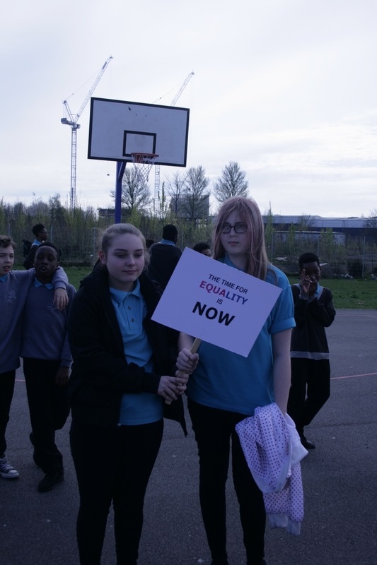
I carried out several experiments playing with different materials, techniques and process. The first experiment I did was an experiment playing with plaques. I watched online demos on how to make an easy protest plaque and found quotes from different feminist campaigns/protests to use for my plaques. I then took a series of images in the studio using both artificial light and natural light. I learned how to properly use the artificial lights and the box lights to perfectly light my images. I believe that I have developed my skills in taking studio photographs as in the first few images, it is clear that I was unsure on what settings to use and where to place the lighting, however by the end, I drastically improved and so did the quality of the photographs. I refined these images by taking another series of images using my plaques but outside on the school concourse and on the basketball courts. I chose to go outside and use the lower school pupils, teachers and sixth formers to see the difference in attitudes towards the plaques along with helping me understand how plaques can work in a campaign. I found that the lower school pupils were more excited to be in my pictures, however very few understood the topics and had little to say about them, but word spread very quickly amongst them that I was asking for people to be involved so I ended up with a large selection of participants. With the sixth formers, there was more of a consensus that these issues were important and needed to be discussed and campaigned for, however, very few wanted to be in the pictures due to the fear of being ridiculed or told that they were being "too opinionated". I did get some amazing photographs with one sixth former inside the cafeteria where the natural lighting was perfect and created shadows that really highlighted the messages on the plaques. It was one of those 12-15 second golden moments that I happened to catch. The teachers that I asked were even more reluctant to participate for many reasons however this helped me develop my skills in talking to people about my campaign and explaining why it was important that they did participate. I then revised these images and thought that it would be a good idea to go into a public, crowded area and ask strangers on the street to participate and talk to them about my campaign. I found this quite challenging for many reasons, some being that many people did not want to stop to even hear what I was saying while other would listen then just walk off because they did not want to be photographed, even though they wanted to support the cause. Another problem I had was the changing lighting and adapting my settings and positioning to suit the lighting. I learned how to effectively match my aperture and shutter speed to match the changing lighting to get striking images. These changes in location had a great impact in the overall turn out of my images and helped me decide which I liked the most. I feel that the quality of my response was best in the studio images, however, the striking nature of the pictures in public with strangers is dramatic and closer relates to a feminist protest/march such as those in the 1970's.
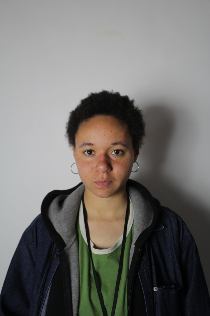
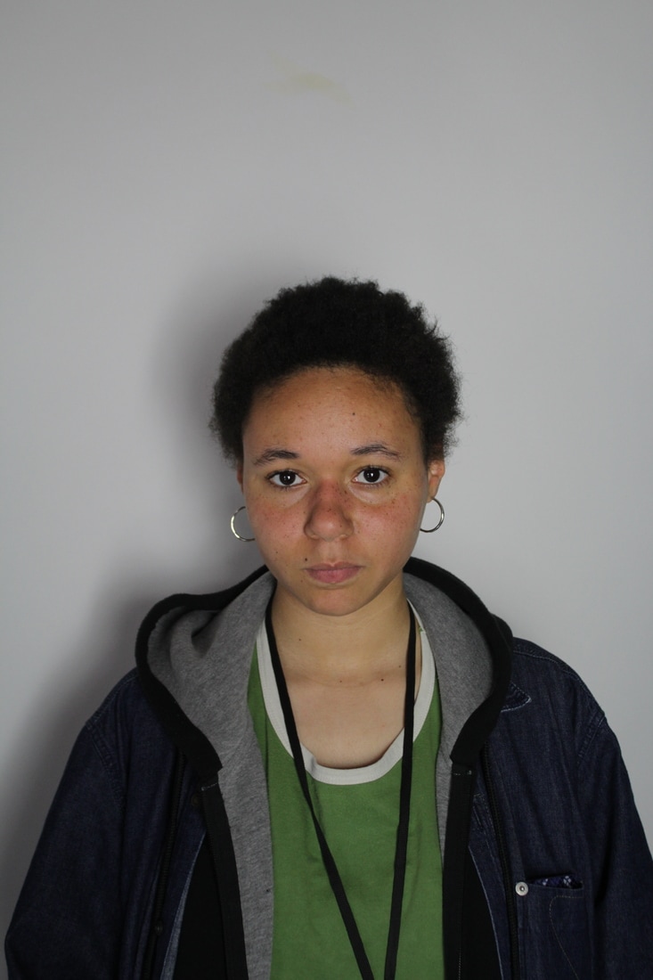
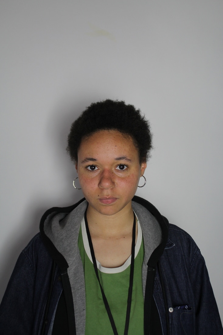
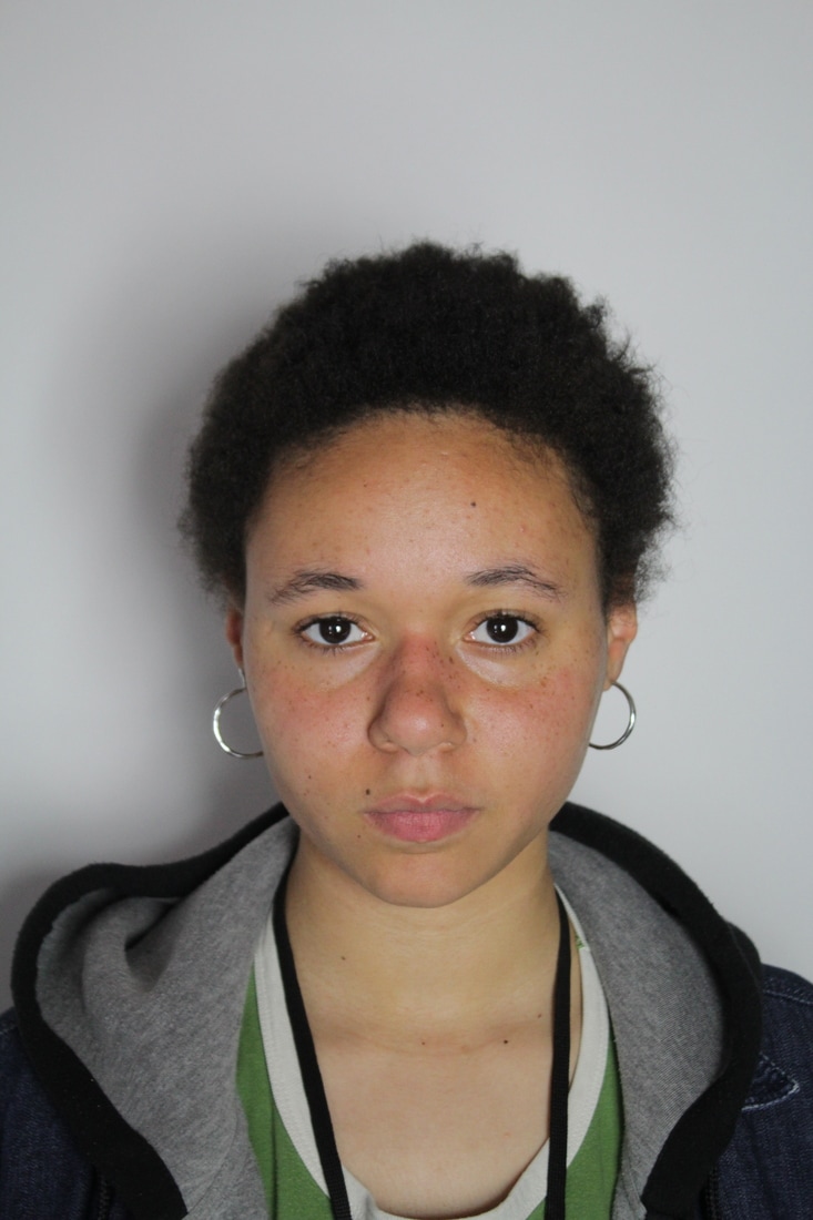
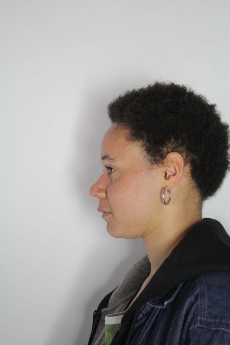
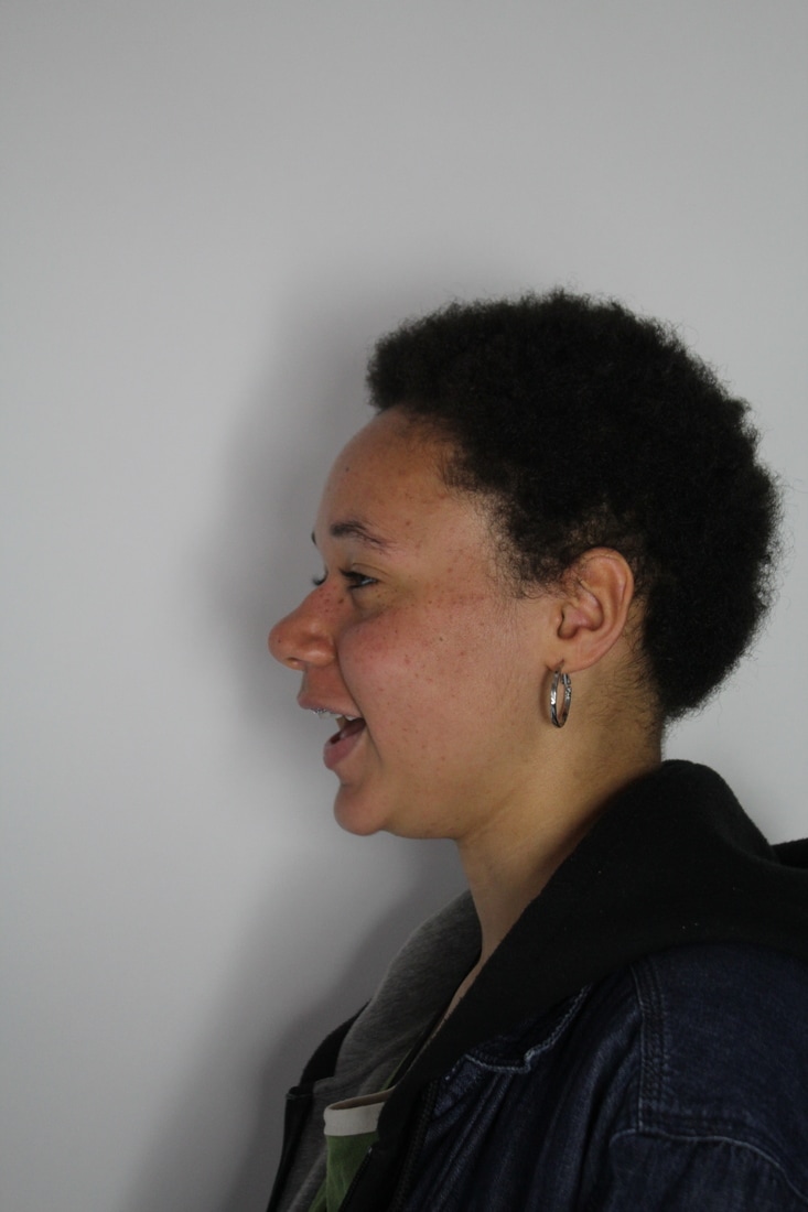
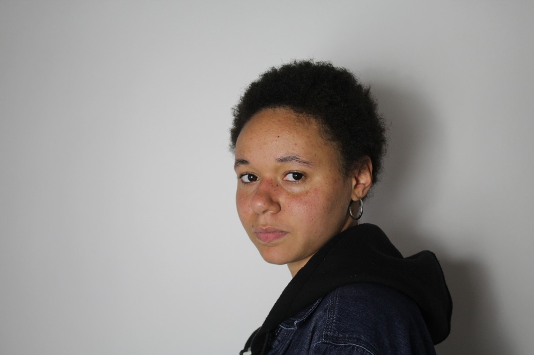
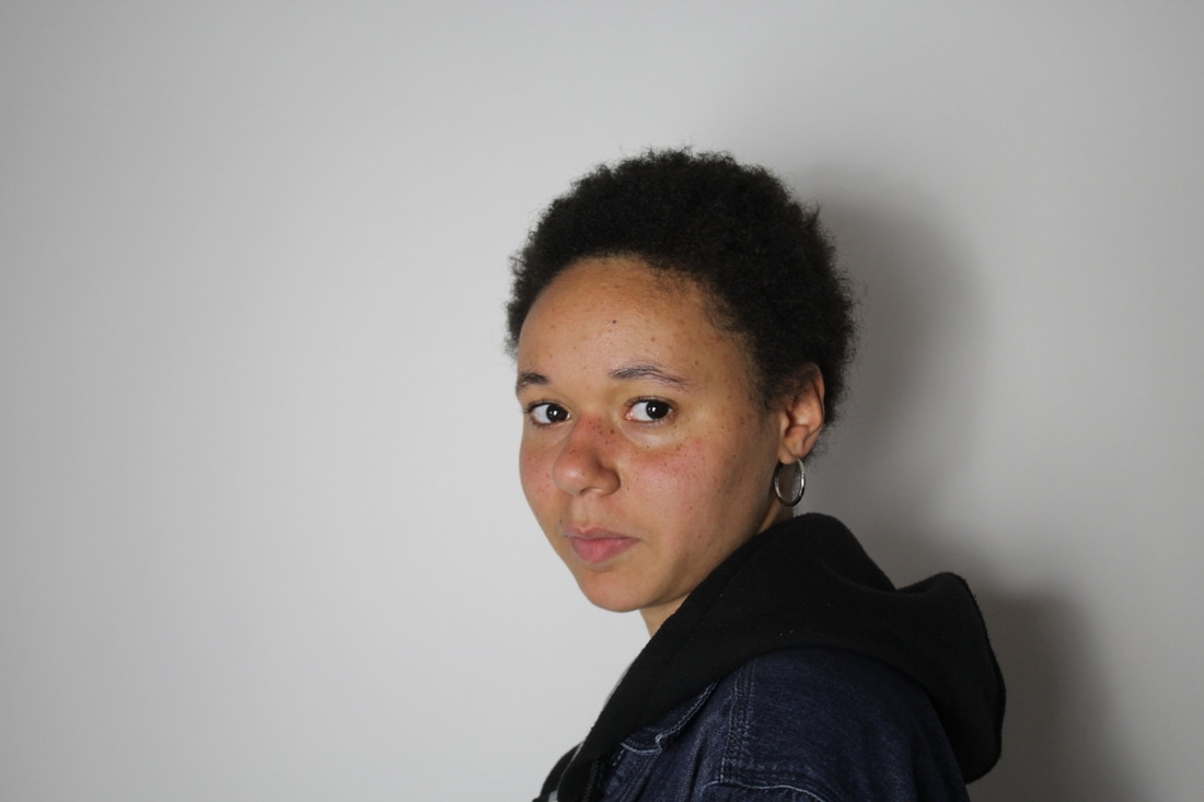
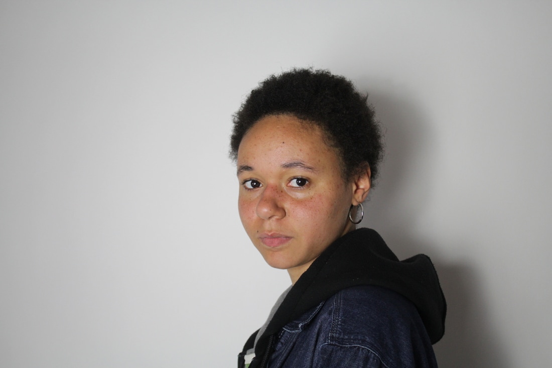
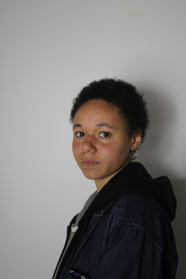
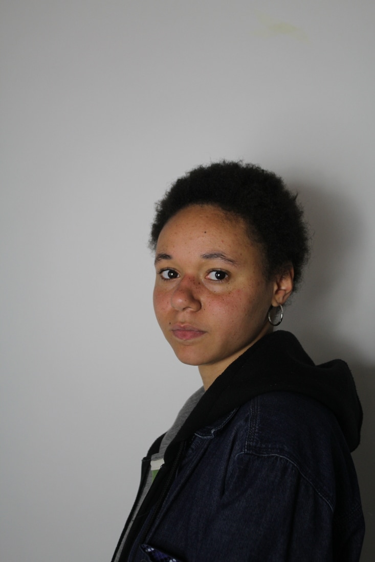
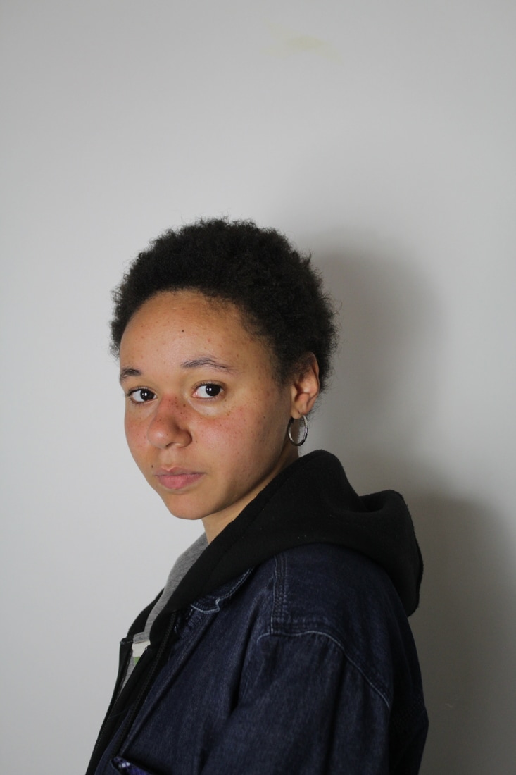
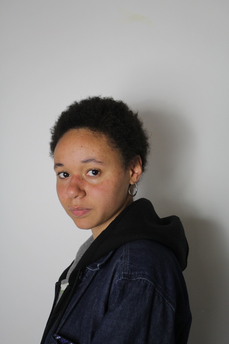
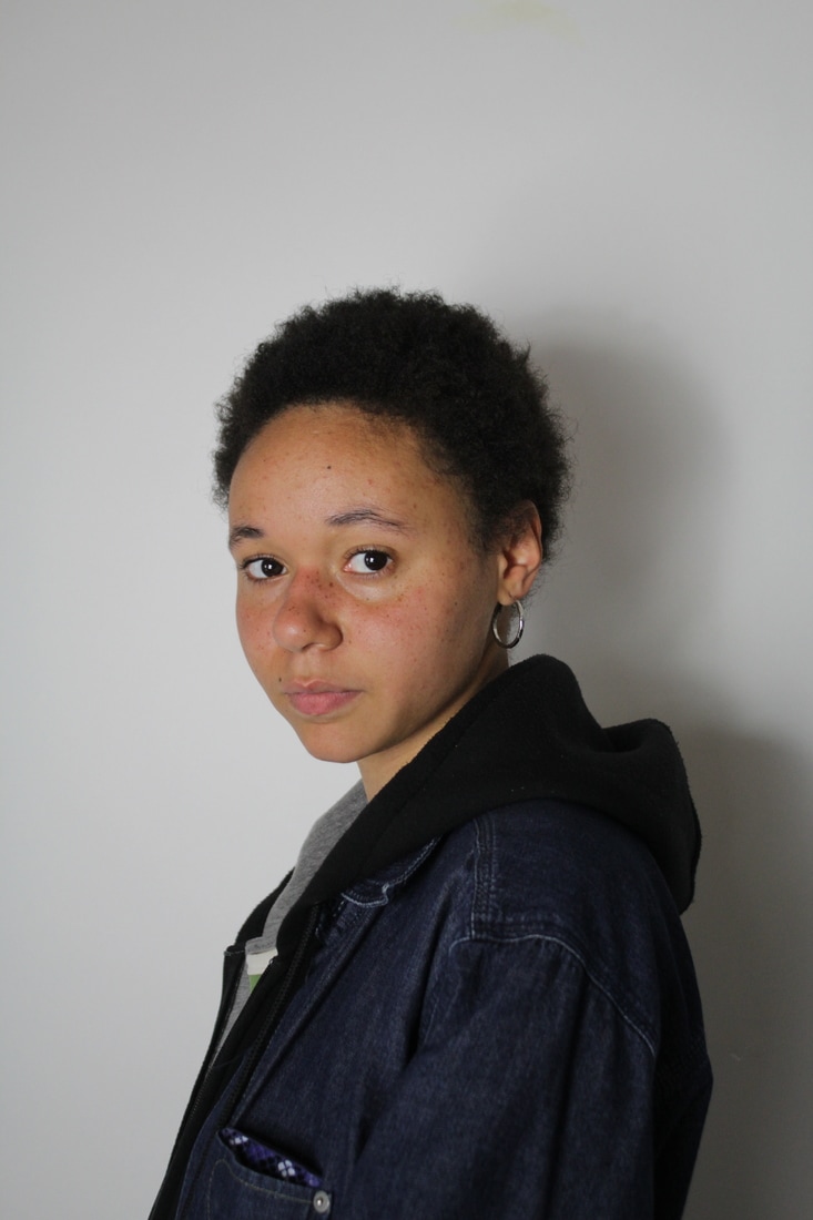
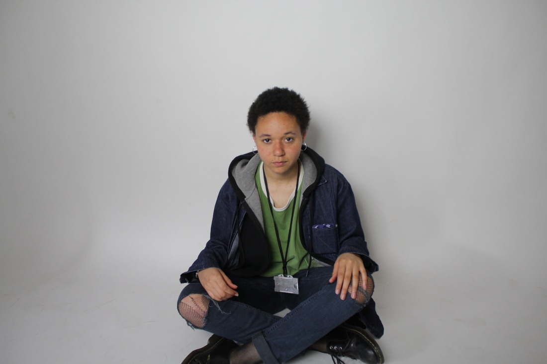
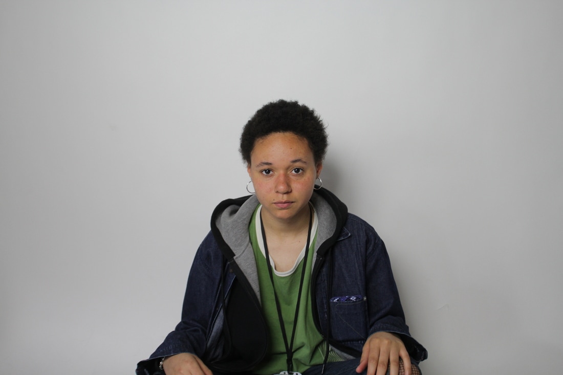
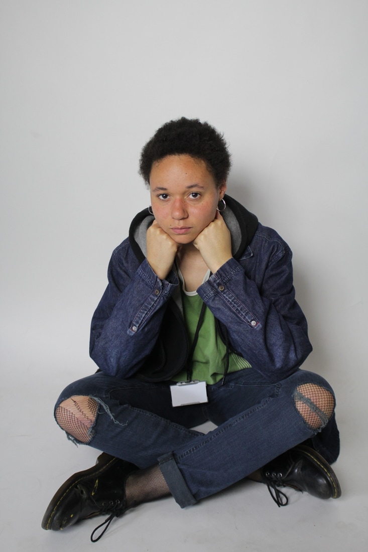
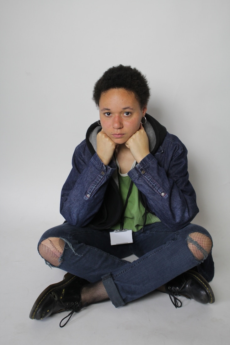
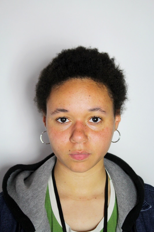
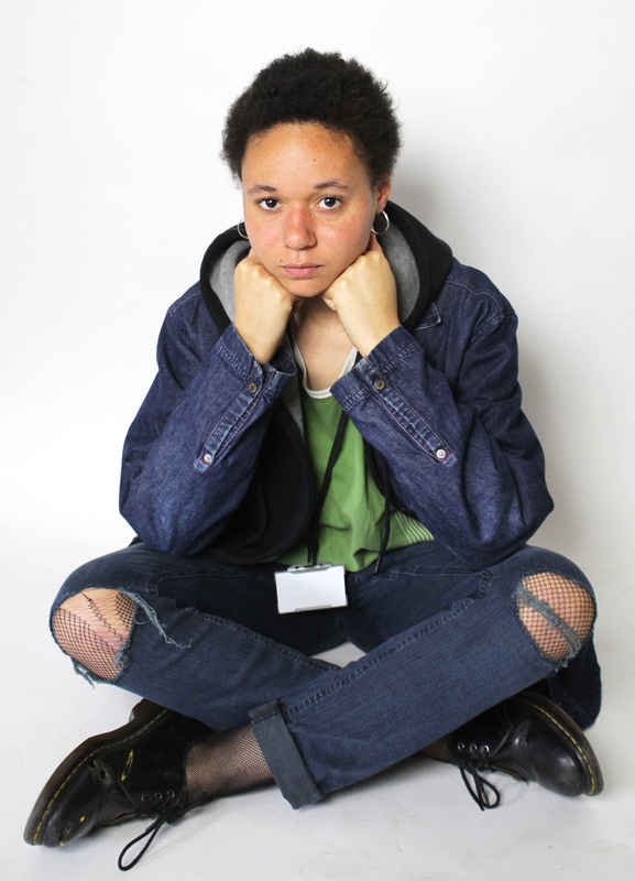
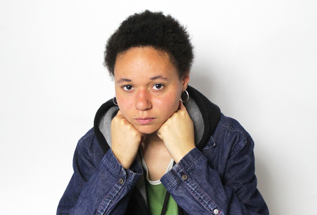
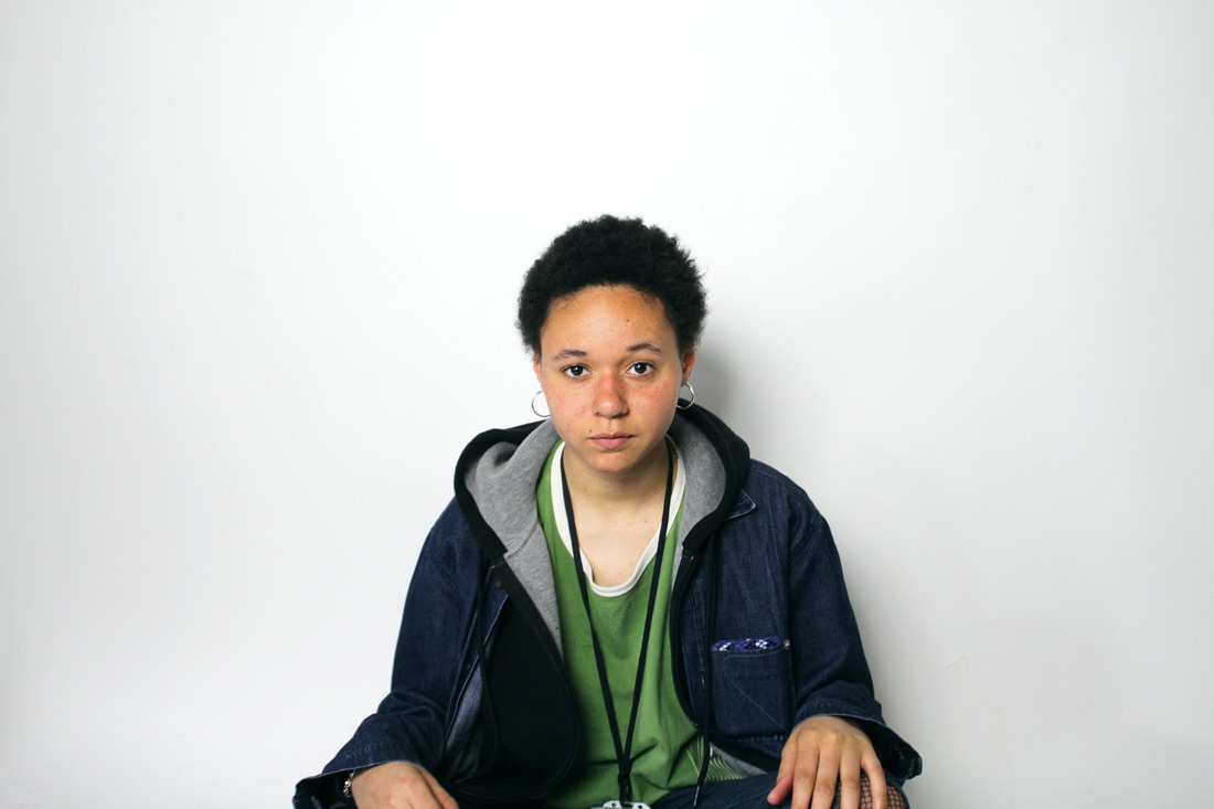
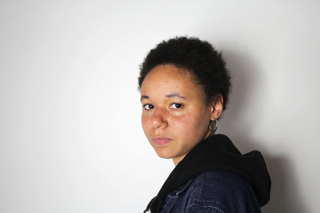
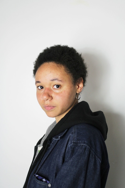
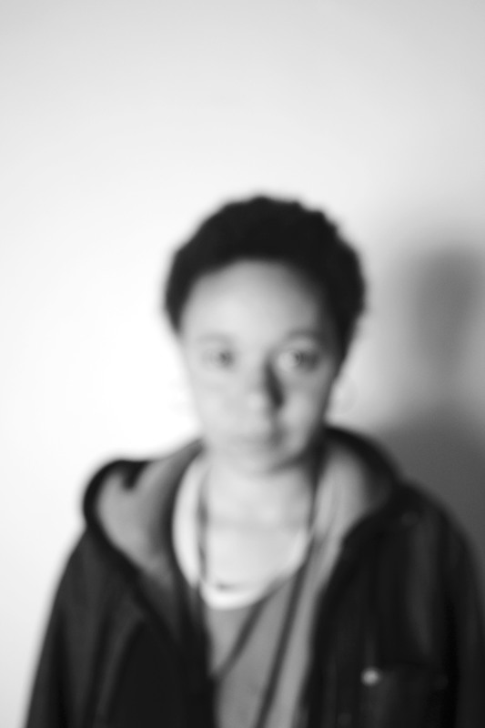
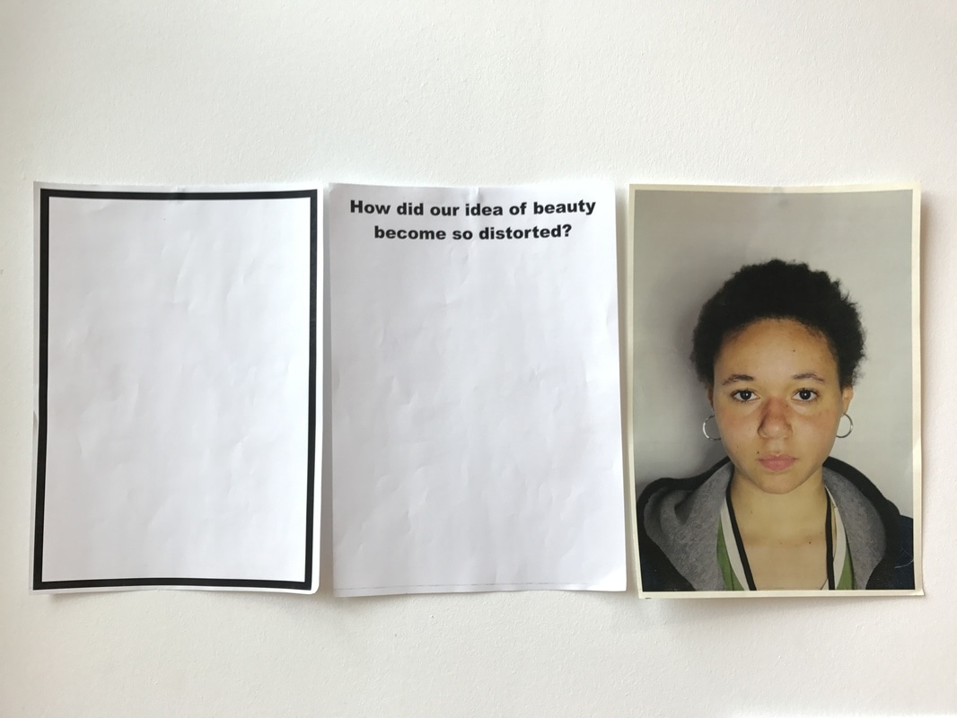
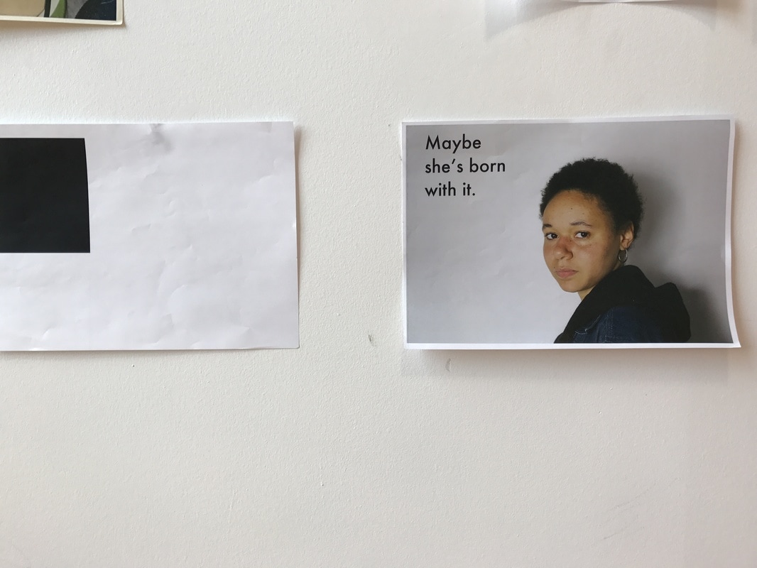
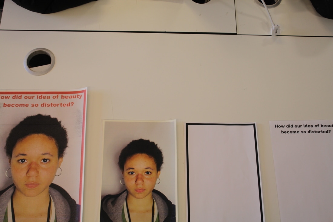
Another experiment I did was taking a series of images of a model that was very comfortable showing her natural beauty by not wearing makeup and having her natural curly afro out. I took these images in the studio using the lighting techniques that I previously learnt in my first experiment. I revised these images and selected the best ones and edited them. I used photoshop to make the background whiter and increase the brightness overall of the images, I also edited the contrast slightly for some of the images. To refine this experiment I then took these images and projected them onto a white wall; I asked my model to apply makeup and dress more feminine, I then placed her in front of the projections and photographed this. Although I like how these images came out, I did not use them as I felt that they did not convey the message of my campaign effectively. My intentions for this refinement of my feminist campaign was to show that natural beauty is powerful and ever present while the media and society force women to conform to beauty standards by wearing makeup and dressing a certain way. Because I did not like how these photographs came out, I refined my original edited images by creating Barbara Kruger style posters using beauty company slogans and turning them into rhetorics. I used a process of scanner screen printing to create my posters using the bold red colour that Barbara Kruger is well known for using and also her box logo. These photographs were heavily inspired by Barbara Kruger and the feminist movement. I decided to use a screen printing technique as I liked the personal and manmade feel of these results. I also wanted to experiment with different textures and process to see different results.
My final outcome is a digital version of my Barbara Kruger inspired posters. I did this by also creating a digital version of one of my posters on photoshop using different tools. I created two versions of this outcome, one using a tool that created a two-way colour effect to mimic the appearance of them being printed similar to my scanner prints. Although I like the scanner printed images, I prefer the digital version as it has a sleeker, professional appearance and also for a large-scale campaign, this is the process they are most likely to use so I felt it was more appropriate. I believe that the digital version of my posters immensely changed the quality of my response as it is more professional looking, it also means that I am able to print these images extremely large. When creating this outcome, I was hoping to create a personal, meaningful and striking feminist campaign illustrating how the media and beauty companies have become the ruling force of our own beauty standards. I am satisfied with this outcome and believe that it does work to reflect my original intentions. I know that it has been successful as I asked several people, strangers and non-photography students alike to review my photographs and tell me what they thought of it. The large majority picked up on both my intentions and the Barbara Kruger inspiration. Additionally, nearly all of the people I asked mentioned the relationship between idol beauty standards compared to natural beauty. I am pleased with the responses that I received regarding my outcome.
I am pleased with how I explored the theme of campaign photography because I believe I was able to resolve issues that I encountered along the way such as being unhappy with a refinement so refining my work again so that it closer relates to campaign photography. I also I successfully explored the theme as my outcomes are able to directly link to existing campaigns and although they are vastly differently, there are some similarities such as the impact it has on people.
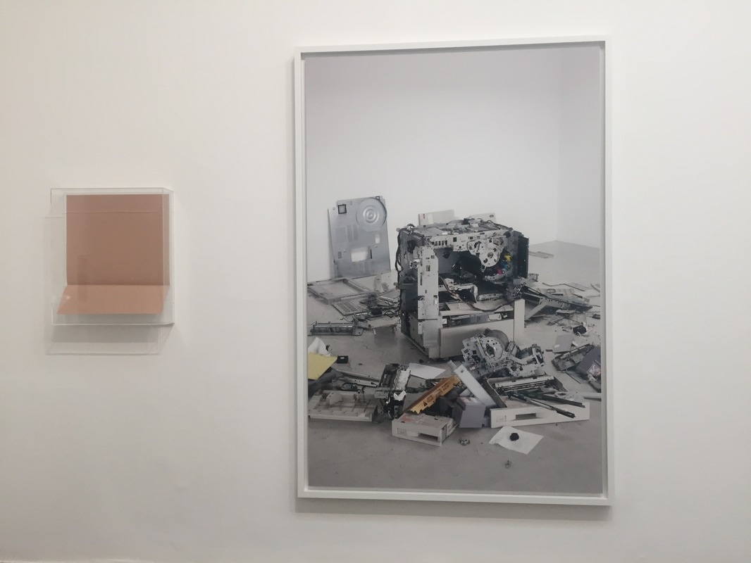
When displaying my work, I decided that I would present it in a large print, possibly bus stop poster size and I will be mounting it on the wall either using a frame or a perspex cover. I chose to display it this way as a real campaign such as a L'Oreal or Maybelline campaign would often create posters of this size. As I wanted my outcome to be satirical of companies such as L'Oreal and Maybelline so by presenting my work in this manner, I believe it will add another element to my work which creates a direct correlation between beauty campaigns and my campaign.
My work is personal because it explores a topic which is very poignant in my generation and society as a whole today. By creating work that encourages people to resolve the issues we have in society today about beauty standards and what defines our beauty, I created a personal and meaningful response to an issue that is very present in my life every day. I believe that photography isn't just about capturing a moment, but about a proactive choice to expose an issue, topic or subject which would otherwise be forgotten if not photographed.
I would like viewers to understand that my work is not just a campaign to look at and forget, I want my work to create a lasting effect and evoke emotions in viewers. I hope that when viewers look at my work, the see a sign of themselves and are able to understand that those beauty companies create insecurities and beauty standards to make money off the public, but in reality, we are not expendable products and we deserve to feel comfortable and beautiful regardless of the products we use. If I had more time, I would have liked to create more posters and possibly even a short commercial. I would like to try this to see the impact that different mediums have on a campaign and if the message changes when the method of presentation or scale of the work changes.
I have always been interested in feminist campaigns and the women's movement, so this was the perfect opportunity for me explore these movements and ideas in a deeper, personal way. However, initially, I was unsure if I would focus on the feminist movement side of campaigning or animal rights and animal activist movements. While exploring the question of campaign photography and feminist campaigns, I explored the threshold concept #9. The threshold concept #9 is that the due to the nature of photographs, they are susceptible to the abuse of power. I think that this concept applies very well to my question as the whole idea of campaigning and campaign photography is to take an image out of its context and sell it to a market audience. I believe that the 9th threshold concept also encourages photographers to send powerful messages and ideas through their images. Additionally, I believe that by removing the photographs or images from their original context, eg a set created for an advert, and placing them in the real world creates a curiosity for the viewers encouraging them to buy into your product.
I carried out several experiments playing with different materials, techniques and process. The first experiment I did was an experiment playing with plaques. I watched online demos on how to make an easy protest plaque and found quotes from different feminist campaigns/protests to use for my plaques. I then took a series of images in the studio using both artificial light and natural light. I learned how to properly use the artificial lights and the box lights to perfectly light my images. I believe that I have developed my skills in taking studio photographs as in the first few images, it is clear that I was unsure on what settings to use and where to place the lighting, however by the end, I drastically improved and so did the quality of the photographs. I refined these images by taking another series of images using my plaques but outside on the school concourse and on the basketball courts. I chose to go outside and use the lower school pupils, teachers and sixth formers to see the difference in attitudes towards the plaques along with helping me understand how plaques can work in a campaign. I found that the lower school pupils were more excited to be in my pictures, however very few understood the topics and had little to say about them, but word spread very quickly amongst them that I was asking for people to be involved so I ended up with a large selection of participants. With the sixth formers, there was more of a consensus that these issues were important and needed to be discussed and campaigned for, however, very few wanted to be in the pictures due to the fear of being ridiculed or told that they were being "too opinionated". I did get some amazing photographs with one sixth former inside the cafeteria where the natural lighting was perfect and created shadows that really highlighted the messages on the plaques. It was one of those 12-15 second golden moments that I happened to catch. The teachers that I asked were even more reluctant to participate for many reasons however this helped me develop my skills in talking to people about my campaign and explaining why it was important that they did participate. I then revised these images and thought that it would be a good idea to go into a public, crowded area and ask strangers on the street to participate and talk to them about my campaign. I found this quite challenging for many reasons, some being that many people did not want to stop to even hear what I was saying while other would listen then just walk off because they did not want to be photographed, even though they wanted to support the cause. Another problem I had was the changing lighting and adapting my settings and positioning to suit the lighting. I learned how to effectively match my aperture and shutter speed to match the changing lighting to get striking images. These changes in location had a great impact in the overall turn out of my images and helped me decide which I liked the most. I feel that the quality of my response was best in the studio images, however, the striking nature of the pictures in public with strangers is dramatic and closer relates to a feminist protest/march such as those in the 1970's.
Another experiment I did was taking a series of images of a model that was very comfortable showing her natural beauty by not wearing makeup and having her natural curly afro out. I took these images in the studio using the lighting techniques that I previously learnt in my first experiment. I revised these images and selected the best ones and edited them. I used photoshop to make the background whiter and increase the brightness overall of the images, I also edited the contrast slightly for some of the images. To refine this experiment I then took these images and projected them onto a white wall; I asked my model to apply makeup and dress more feminine, I then placed her in front of the projections and photographed this. Although I like how these images came out, I did not use them as I felt that they did not convey the message of my campaign effectively. My intentions for this refinement of my feminist campaign was to show that natural beauty is powerful and ever present while the media and society force women to conform to beauty standards by wearing makeup and dressing a certain way. Because I did not like how these photographs came out, I refined my original edited images by creating Barbara Kruger style posters using beauty company slogans and turning them into rhetorics. I used a process of scanner screen printing to create my posters using the bold red colour that Barbara Kruger is well known for using and also her box logo. These photographs were heavily inspired by Barbara Kruger and the feminist movement. I decided to use a screen printing technique as I liked the personal and manmade feel of these results. I also wanted to experiment with different textures and process to see different results.
My final outcome is a digital version of my Barbara Kruger inspired posters. I did this by also creating a digital version of one of my posters on photoshop using different tools. I created two versions of this outcome, one using a tool that created a two-way colour effect to mimic the appearance of them being printed similar to my scanner prints. Although I like the scanner printed images, I prefer the digital version as it has a sleeker, professional appearance and also for a large-scale campaign, this is the process they are most likely to use so I felt it was more appropriate. I believe that the digital version of my posters immensely changed the quality of my response as it is more professional looking, it also means that I am able to print these images extremely large. When creating this outcome, I was hoping to create a personal, meaningful and striking feminist campaign illustrating how the media and beauty companies have become the ruling force of our own beauty standards. I am satisfied with this outcome and believe that it does work to reflect my original intentions. I know that it has been successful as I asked several people, strangers and non-photography students alike to review my photographs and tell me what they thought of it. The large majority picked up on both my intentions and the Barbara Kruger inspiration. Additionally, nearly all of the people I asked mentioned the relationship between idol beauty standards compared to natural beauty. I am pleased with the responses that I received regarding my outcome.
I am pleased with how I explored the theme of campaign photography because I believe I was able to resolve issues that I encountered along the way such as being unhappy with a refinement so refining my work again so that it closer relates to campaign photography. I also I successfully explored the theme as my outcomes are able to directly link to existing campaigns and although they are vastly differently, there are some similarities such as the impact it has on people.
When displaying my work, I decided that I would present it in a large print, possibly bus stop poster size and I will be mounting it on the wall either using a frame or a perspex cover. I chose to display it this way as a real campaign such as a L'Oreal or Maybelline campaign would often create posters of this size. As I wanted my outcome to be satirical of companies such as L'Oreal and Maybelline so by presenting my work in this manner, I believe it will add another element to my work which creates a direct correlation between beauty campaigns and my campaign.
My work is personal because it explores a topic which is very poignant in my generation and society as a whole today. By creating work that encourages people to resolve the issues we have in society today about beauty standards and what defines our beauty, I created a personal and meaningful response to an issue that is very present in my life every day. I believe that photography isn't just about capturing a moment, but about a proactive choice to expose an issue, topic or subject which would otherwise be forgotten if not photographed.
I would like viewers to understand that my work is not just a campaign to look at and forget, I want my work to create a lasting effect and evoke emotions in viewers. I hope that when viewers look at my work, the see a sign of themselves and are able to understand that those beauty companies create insecurities and beauty standards to make money off the public, but in reality, we are not expendable products and we deserve to feel comfortable and beautiful regardless of the products we use. If I had more time, I would have liked to create more posters and possibly even a short commercial. I would like to try this to see the impact that different mediums have on a campaign and if the message changes when the method of presentation or scale of the work changes.
