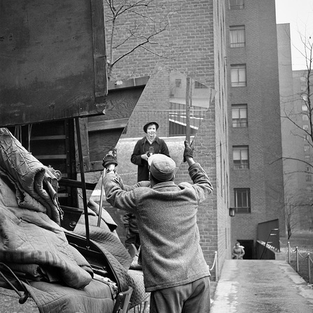
Vivian Maier, Mirror Image (Self-portrait, 1955)
Vivian Maier has used ambient light in this image to give a natural bright feel to the image most likely using sun light. The light seems to be coming from above the man, slighting from the side as the top of the mans hat is brighter than the lower sections of his body and the right section of his coat is highlighted a long with the side of the building. This image uses harsh lights with strong shadows, for example the shadows on the cart are extremely dark and don't diffuse much. Within the photography, many elements show textures such as the texture of the canvas on the cart is very rough and crinkled, creating dark shadows where the folds are. Also the fibres of the mans jacket each have a shadow and highlight giving them more depth and therefore giving them a rough texture. In contrast o this, the mirror has a smooth clean surface which seems to lack texture. When I first look at this image, the textures are one of the first things I notice as they stand out because of their shadows and highlights. Vivian Maier has decided to keep everything in sharp focus but has excluded minor details in the background such as a woman coming up some stairs which she has chosen to blur out to make her less important to the image and has created soft edges on sections of the background. The image has a generally cold feeling to it because of Vivian Maiers' use of selective focus such as the crisp edges and the soft background. Vivian Maier uses lines perfectly in this image such as the parallel lines of the building against the lines of the mirror. In addition to containing a lot of lines, Maiers' composition of this image means that she has used the rule of thirds separating the image into 3 sections using the mirror, the building and the wagon/cart.
Stephen Shore, Church and Second Streets, Easton, Pennsylvania
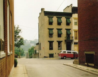
Stephen Shore has perfectly framed this image including both the urban area of the city and also the suburban area in the background which adds a contrasting feel to the image. By choosing to centre the nude coloured building, our eyes are drawn to it and can therefore assume that this is Shore's subject for the image. Shore has used lines to help frame this image by sectioning it into 3 sections, the foreground, the subject in he middle, and part of a wall on the right, this is called the rule of thirds. Shore has chosen to exclude additional detail as any people which could distract from the central interest of the building.
|
|
When taking my images, I focused on the elements of line, light and the rule of thirds. When considering light within my images, I had to consider whether I wanted to use natural such as the sunlight or artificial light. I chose to use natural light as this means that I can directly respond to Stephen Shore's images as he used natural lighting. I also had to consider how much line I was using in my images, I tried to incorporate as much line and shape was possible as Shore's images tend to include a lot of lines and this helps the image include lots of shape and in some cases, a lot of texture. Additionally to this, when examining the lines within Shore's images, I noticed that he had included the rule of thirds which means his images could be split into three sections which makes it more aesthetically pleasing. Taking this into account, I tried to focus on architecture and using the buildings and structures to separate the image into threes.
|
Ralph Eugene Meatyard, Untitled (Michael and Christopher outside brick building, 1960)
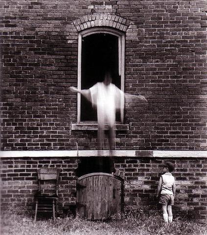
In this image, Ralph Meatyard uses ambient light to create a washed-out faded effect, presumably using sunlight as we cannot see where the light source is coming from. The image has a high contrast so there was probably a lot of light. The light is harsh with very strong shadows; we know this because of the vivid white tones and the deep black tones such as in the window, the hole in the wall and the shadows under the chair and around the little boy. Everything in this image is in focus to keep an all around importance of the image so nothing is isolated. Although the image is in focus, everything is worn out and old looking which creates some raw emotion making the image feel quite depressing and cold. Ralph Meatyard also used a slow shutter speed to create the blur of the man jumping. There has been a lot of use of lines in the image such as the bricks and also the window frame. Ralph Meatyard has used lots of rectangular shapes which gives the image a geometric pattern and depth. The man that is blurred and jumping is central to the image; Ralph Meatyard has achieved this by using the role of thirds with the man jumping as the white stone line uses line to divide the man from the little boy and also his arms and the window help create the other sections and also by selectively choosing what will be in the frame of the image. When you first look at this image, it seems to be soft and very smooth, lacking texture, but when you look at deeper, you can see that there is texture within the bricks which make up the wall and also on the gate and chair beside the wall. Because of the shadows of each brick, it also adds more texture as it makes them seem as if they stand out more and have cracks and spaces between them which you would be able to feel. Ralph Meatyard has the camera angel at eye level, looking straight on to the subjects of the image. This makes me feel as if I am actually standing there looking on to what is happening. In addition to this, by having this angle of view, Ralph Meatyard makes me feel as if the subjects are careless and they don't care about whats going on around them as they are not reacting to having their photo taken.
|
Ralph Eugene Meatyard focused a lot on texture, so when taking my images I tried to focus on texture as much as possible. I included subjects with a lot of texture or a lot of line. Three of my images focus more on line than texture so that I could tried to include as much line as possible while also incorporating the rule of thirds like Meatyard has. In addition to this, I have tried to include a main subject in my image, as in Meatyard's image that I have chosen to evaluate, he has include to two male subjects which are the focal point of his image.
|
|
Lisette Model, Running Legs
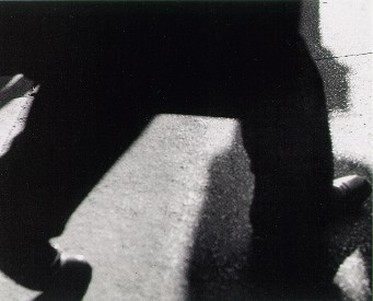
Lisette Model was an Austrian-born American artist in the 1940's . Her photography had a unique style. This image was taken in 1940-1941.
In this image the main source of light seems to be natural day lighting outside, she has used the legs to block the light source to create shadows. Although Model probably purposely took this image in this way, it looks natural and not staged. Within this image the use of texture is key as there is a contrast in the two textures that this image uses such as the roughness of the stone steps and then the softness of the texture of the legs which fade out and create smooth edges that blur out rather create a harsh line. The difference in texture makes the rough textures stand out more and draws your eyes to the textures. Through observation, I feel as Model has made the shadow the focus of the image and although she has used the legs to create a dark silhouette and the hard stone steps to create a blank space,the shadow creates a tonal contrast as its the only grey section within the image. When framing this image and the composition of this image, she has cropped the image to only include the lower portion of the persons legs.
In this image the main source of light seems to be natural day lighting outside, she has used the legs to block the light source to create shadows. Although Model probably purposely took this image in this way, it looks natural and not staged. Within this image the use of texture is key as there is a contrast in the two textures that this image uses such as the roughness of the stone steps and then the softness of the texture of the legs which fade out and create smooth edges that blur out rather create a harsh line. The difference in texture makes the rough textures stand out more and draws your eyes to the textures. Through observation, I feel as Model has made the shadow the focus of the image and although she has used the legs to create a dark silhouette and the hard stone steps to create a blank space,the shadow creates a tonal contrast as its the only grey section within the image. When framing this image and the composition of this image, she has cropped the image to only include the lower portion of the persons legs.
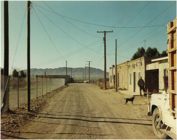
Stephen Shore, Presidio Texas, 1975
|
In this photograph, Stephen Shore has included lots of lines such as the lines from the road, the lines from the buildings and their doors and windows, the lines from the telephone poles, the telephone lines and also the fence and the mountain in the background also creates a line. By doing this, Stephen Shore has created different shapes within he image such as triangles and rectangles that section the image and prompts you to look at each section of the image as if it was it's own image. Stephen Shore has used jagged and irregular lines which creates a mood of tension and unrest. Shore's use of jagged and irregular lines also means that we do not know which line to follow and which one leads where which makes the image more interesting.
|
Edited responses for Stephen Shore and Ralph Eugene Meatyard
|
|
|

Francesca Woodman, Untitled (1980)
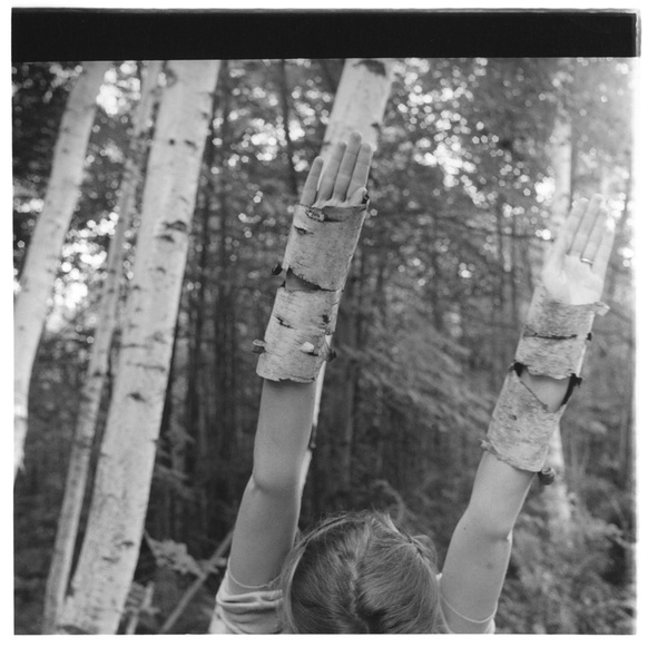
Francesca Woodman was an American photographer, best known for her black and white portraits or pictures of female models; usually in the nude and blurred out because of movement and long exposure times.
In this image, Francesca Woodman has used the models arms to mimic the direction and lines of the trees and then encased her wrists with bark to give the illusion that she is part of the trees and so that if the image was seen from far away or more out of focus, then it would all blend in and the girls arms would also seem to look like the trees.
In this picture, Francesca Woodman has used natural daylight as her light source which is shown to be coming from above the subject as the top section is considerably lighter than the lower section such as at the bottom in the background, it is a lot darker than at the top. The light in the image seems to be cloudy as the image has a general grey feeling to it and the light doesn't seem to be streaming through the tops but only shining through slightly. Francesca Woodman, has chosen to emphasis the lines in this image by making the subject mimic the trees using her arms creating parallel lines which section the image and create 3 rectangular sections within the image. There are also small organic circular patterns in the tree tops where the light is coming through and even more lines within the background from all the other trees all parallel to each other which also help create the small circular patterns by blocking out the light. Most of the textures in the image seem smooth and if you were to touch them they would feel smooth as most of the harsh lines have been blurred out and faded but on the other hand, the bark around her arms and wrists seem to be sharper and more in focus than the other trees and objects in the image, giving it a rougher texture and the details of the bark are more defined. The Focus of this photograph seems to be the girl and her arms as they are the sharpest and clearest in this photo whereas the background is slightly blurred out. Francesca Woodman has done this by taking the image with the background set to have a soft focus and the main, sharp focus to bee on the arms and bark. This gives the impression of that the background isn't as important but when you look deeper into the image, the use of blurring out the background could be to help blend the girls arms in with the surrounding as it draws your eyes away from her and more to the trees. Francesca has chosen to include the girl and a few trees in the foreground but exclude parts of trees in the background to draw your eyes to the centre of the image which is the subjects hand which is in focus and central to the image.
Refined Images
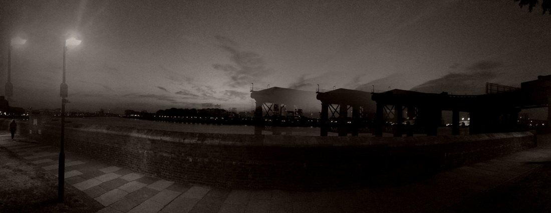
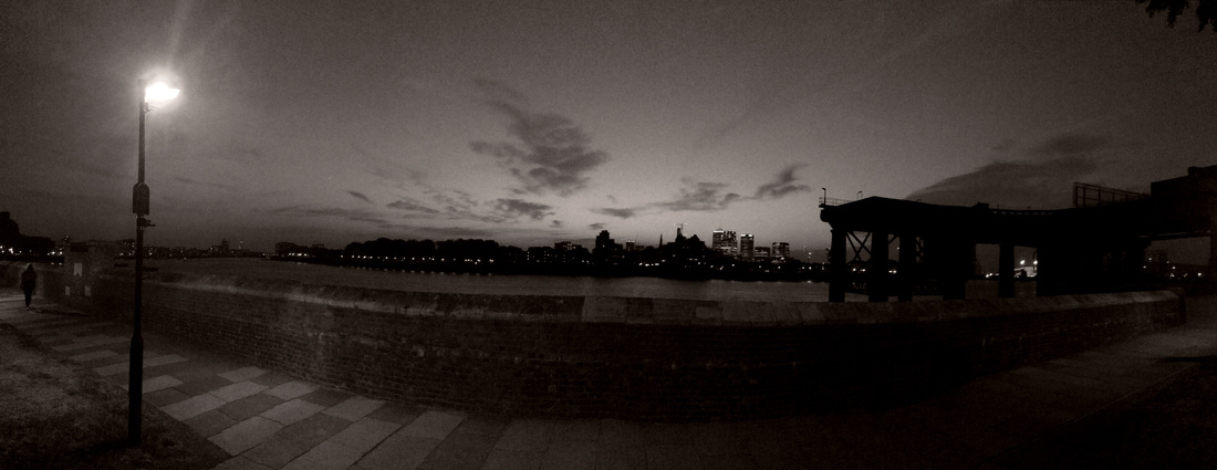
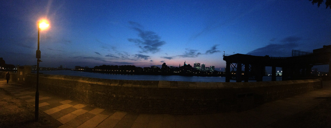
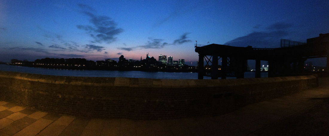
We were asked to take a series of images thinking about all four corners of the frame focusing on the formal elements of line and light. In my images I considered the foreground of the image and the background of the images and what information could be seen in the images. When improving my images, I focused on the smaller details of the subject to add definition to the lines and the light. In addition to this, an improvement I have seen in my ages is that the subject of the image is more clear and defined, when there is a subject, and the background is now just space behind which helps draw your attention to the subject even more as it isn't as distracting.
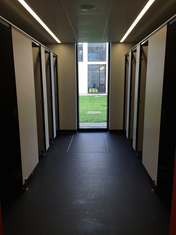
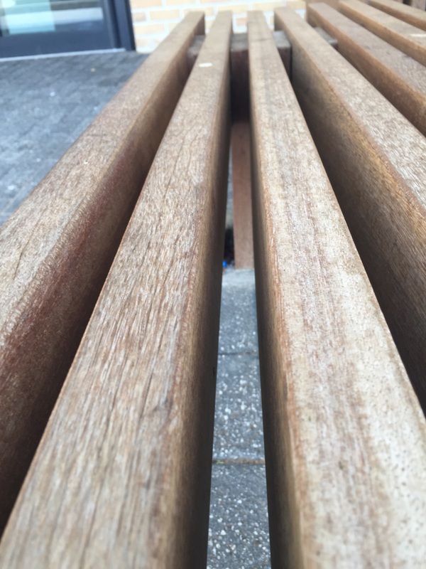
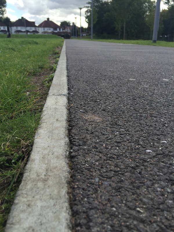
Photo without a camera
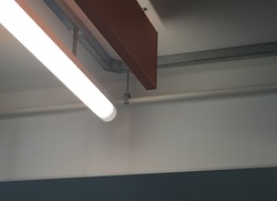
When framing the water pipe, the light hits the pipe in such a way that there is a highlight through the centre of the pipe which is reflecting the light off of it. The light reflecting onto the pipe is from the light in front of it from the fluorescent ceiling light. The direction of the light is from in front of the pipe. There is little texture on the pipe and it's smooth. In the image you can see a small section of the orange divider and the fluorescent light. There is a shadow of the pipe attachment, the divider and the light below.
|
When my partner captured my image, they composed it perfectly to the description and what I had constructed in my mind. They have captured the same detail from the lines and the a shadows while also keeping a similar proportion of the objects within the image. When having to describe my image to another person, at first it was difficult trying to focus on one specific area.
|
