Introduction to Photobooks
An Introduction to photobooks
A photobook, by definition, is a book which photographers make a significant contribution to the overall content of the book, but by no means is that what a photobook is in whole. Photobooks can be considered as an important form of communication for photographers and photographs. It is a body or a collection of photographs which the photographer has control over such as layout and design to display their work to a larger audience. According to Martin Parr, photobooks are a 'supreme platform' for photographers to spread their work to a larger, mass audience. As photobooks have only recently become a recognised art form, it is hard to say who created photobook and when but it is said that Anna Atkins in 1843–53 was the first photographer to create a photobook using cyanotypes of British Algae.
In this project, I planned to look at other photographers who have published photobooks and then create my own to help me better understand the processes of a photobook and also the significance that accompanies them. I would like to experiment with film for this project and also experiment with the formal elements to add a more detail and depth to my photographs
In this project, I planned to look at other photographers who have published photobooks and then create my own to help me better understand the processes of a photobook and also the significance that accompanies them. I would like to experiment with film for this project and also experiment with the formal elements to add a more detail and depth to my photographs
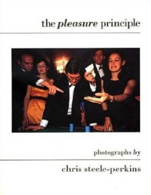
The Pleasure Principle - Chris Steele-perkins, Publicised in 1989.
Subject Matter
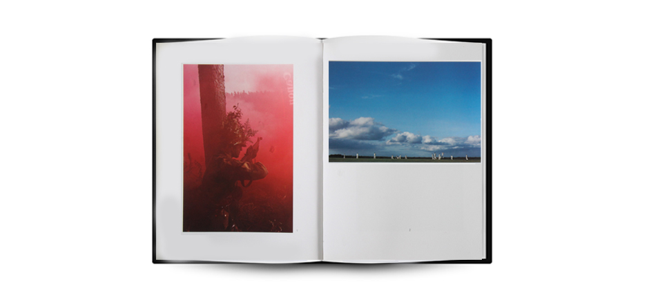
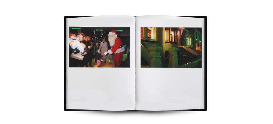
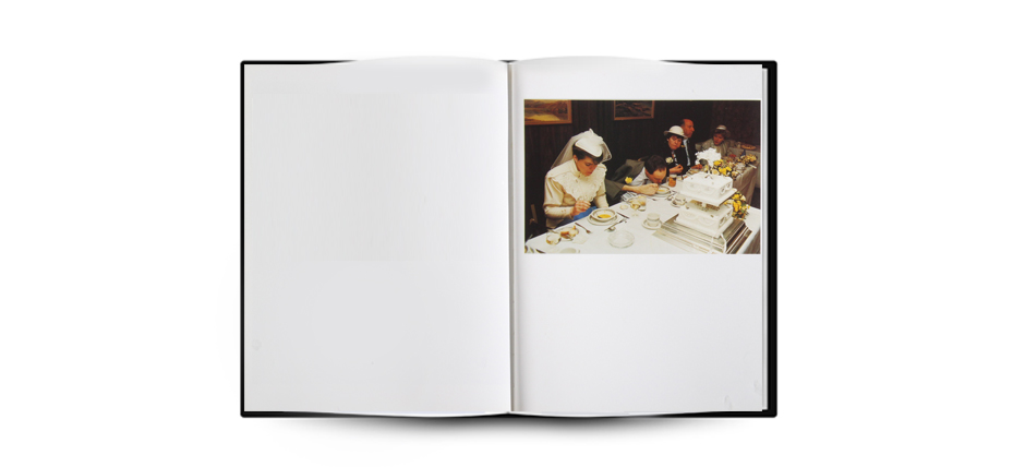
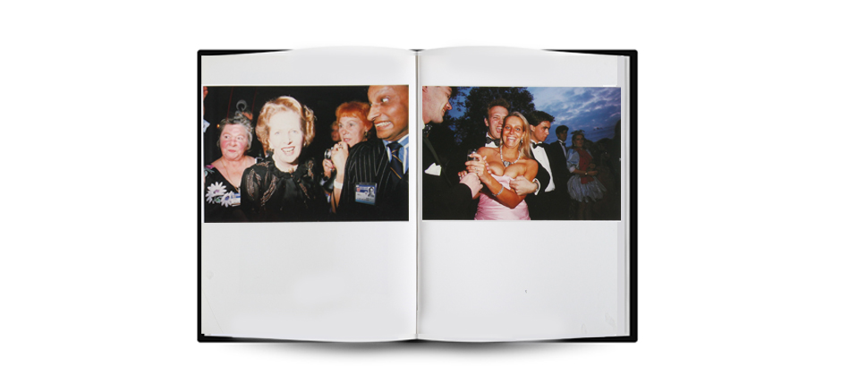
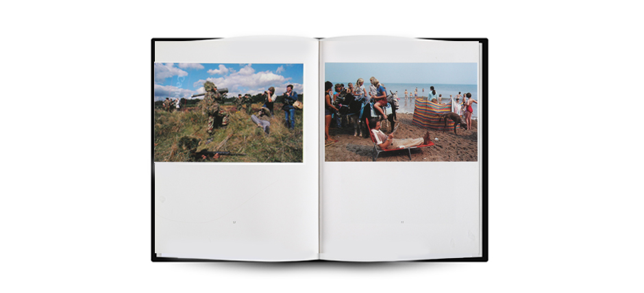
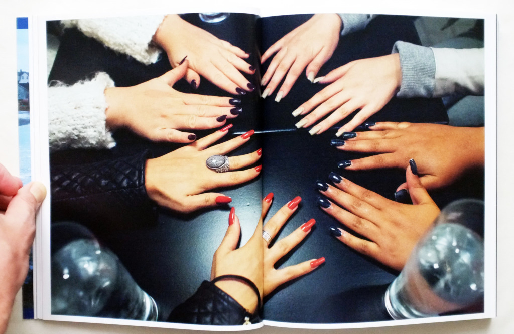
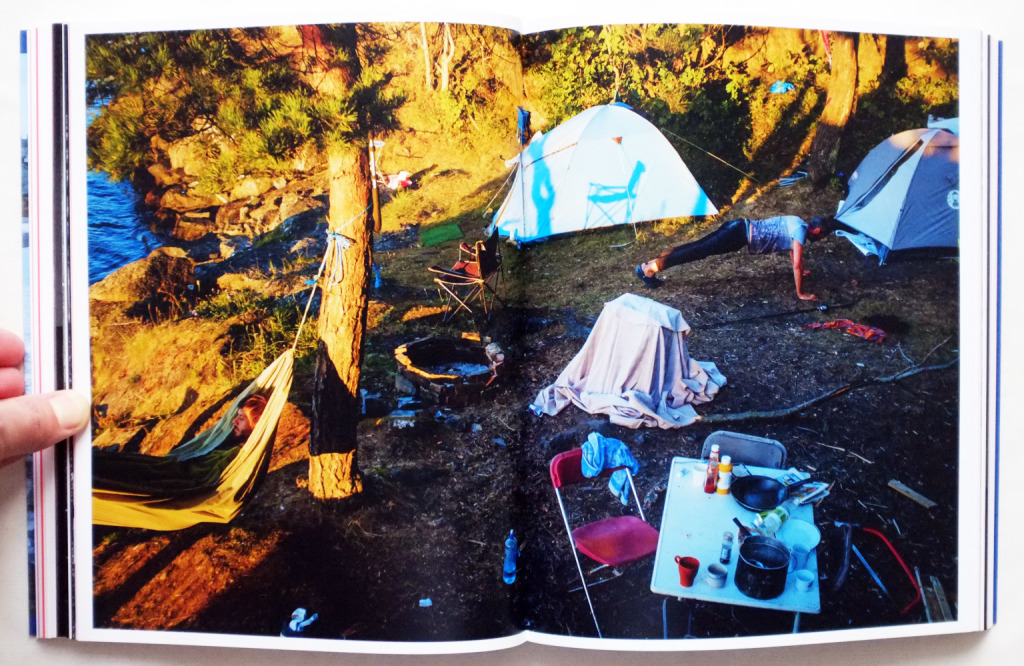
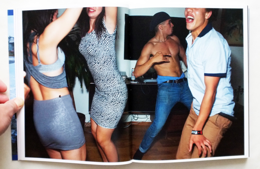
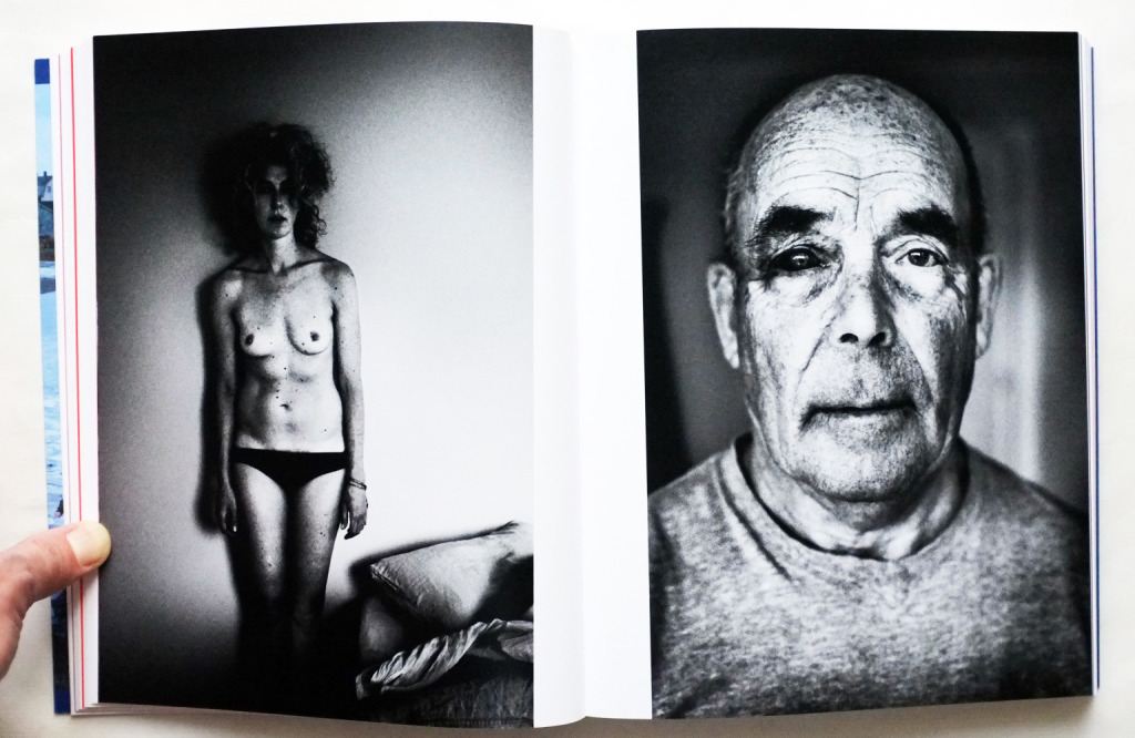
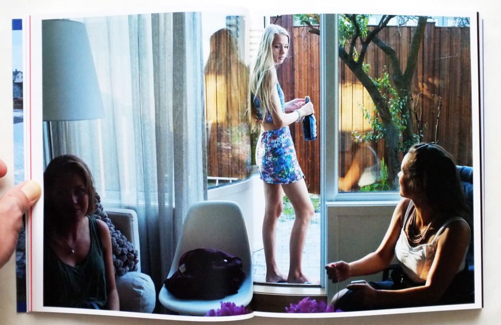
When choosing a book to study for my photo books, I chose to look at Chris Steele-Perkins book called 'The Pleasure Principle' which in the simplest form is a collection of photographs from his time back in London after travelling for a few years and how fascinating he found London. The book consists of shots that he believes to present "our hedonism and search for a better world" using crude imagery formed from abstract and atmospheric shots of people and places that he associated with seeking pleasure in life.
This book can be summarised as a journey to find pleasure, understanding and himself rather than a set of images he thought would allow us to analyse and deem worthy of being in a photo book. Steele-Perkins images are a way of expressing what everyone has seen but been unable to notice.
This book can be summarised as a journey to find pleasure, understanding and himself rather than a set of images he thought would allow us to analyse and deem worthy of being in a photo book. Steele-Perkins images are a way of expressing what everyone has seen but been unable to notice.
Cover page
|
Steele-Perkins chose to use one of his own images on the books cover. This could be to give a brief insight into the nature of the book and also the feelings that he wants to book to evoke within you. I like that Steele-perkins chose to put the photo central to the whole cover page as this ensures that the reader will focus more on the photo than any of the surrounding information. All the text on the cover is small, in comparison to the photo, and all in lower case. Steele chose to have the word 'pleasure' in italics, suggesting that this is the main subject of the book and he wants you to focus on this, rather than anything else, including his name.
|
Strength of the Photography
When flicking through 'The Pleasure Principle', the photographs are rather blunt and striking; even when they look like they have been constructed to look a specific way, they still seem natural and effortless. Due to the way the photos are taken, it is hard to say if they have been staged, if that is just how they came out or Steele-perkins waited for the perfect moment and then took the shot. When looking through Steele-perkins photos, the style of photographing changes but only slightly but due to the nature of the book, this does seem to have an affect on the photos as it aids you in viewing them from a different point of view and from a different perspective, maybe even placing you within the scenario. When taking images out of the book one by one, they can come across to seem very weird and childish, but when compiled together, there seems to be a fluidity in how they all affect you when reading The Pleasure Principle.
Page Layouts
The placement within the book seems to have no specific sequencing to them making them other than being split up into chapters which contain a variety of different events and photo styles. This allows the reader to take in the photographic information rather than feeling the need to relate them to anything else or to connect them up. The layout of the images are all haphazard, where he has some photos being full bleed printed and there is no consistent layout running through the book, with that being said, Steele has chosen to place many of the images in each chapter central to the upper section of the book but has these scattered throughout the pages of each chapter and breaks these up with many different variations of layout style. This also applies for sizing too where many of this photos are one consistent size when places at the top centre of the page but he then separates these with, again, full bleed photos or ones slightly larger than the standard size he has used in his book.
Editing and Sequencing
Chris Steele-perkins chooses to have a loose concept with the sequence of his photographs and there isn't a specific sequence for photos. Although there isn't a specific sequence, the photos flow together in an elegant way that seems to make sense even if you flicked through the book randomly. The photographs in themselves allow the reader to create their own sequences within the chapters of the book.
Overall Impact
In my opinion, the overall impact of the book is very emotive and captivating and makes you think about what Steele-perkins was trying to get across after viewing it. The photos in this photobook are easy to relate to in a sense that we are all trying to find pleasure and happiness in some form or another; this is what I believe from the overall impact of the book that Chris Steele-perkins wants to get across through the use of the photographs in the book and the way that he finished the book. The lack of sequencing in this book and the lack of a consistent page layout allows the reader to create their own opinions and feelings about the book that having to follow a specific story of a book does not allow you to do.
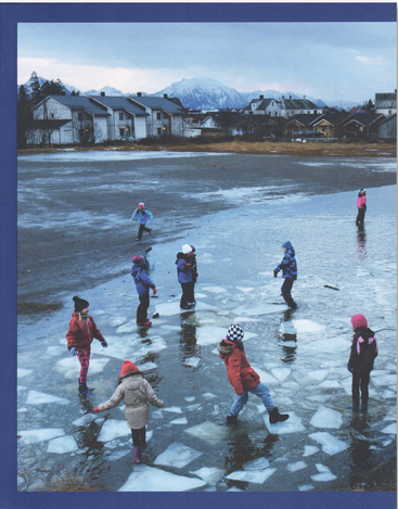
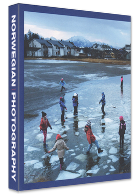
Journal of Norwegian Photography #2 - Various
|
|
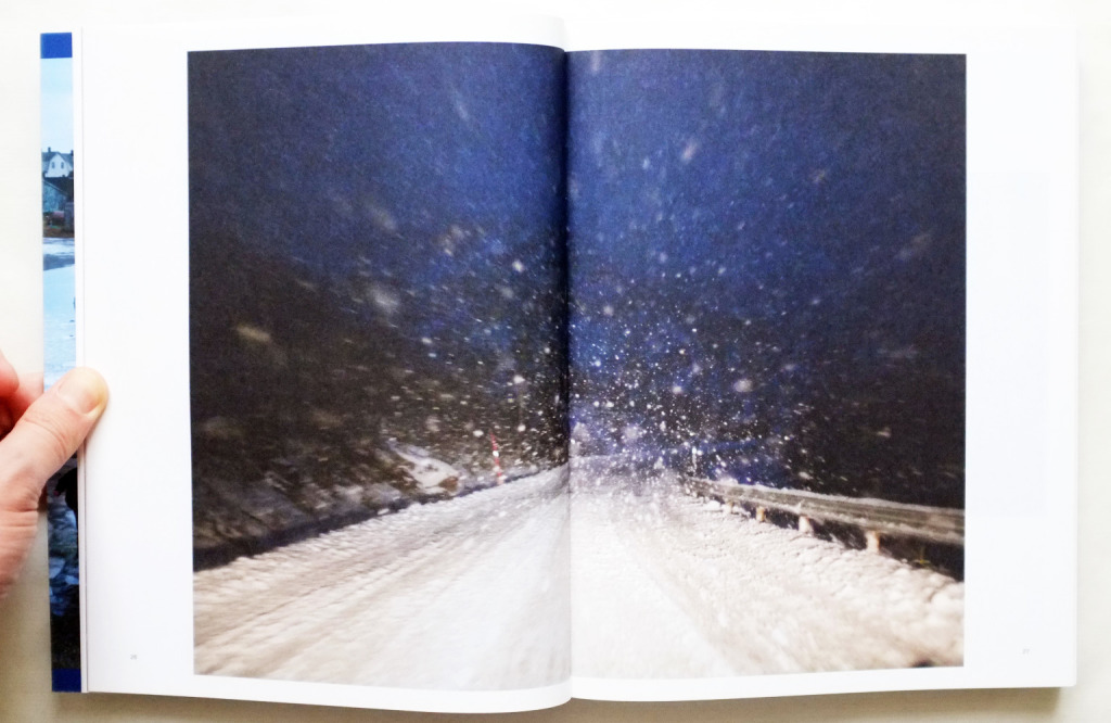
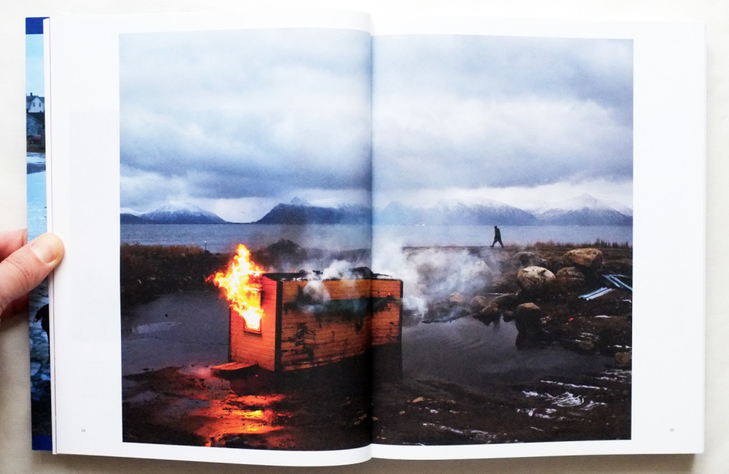
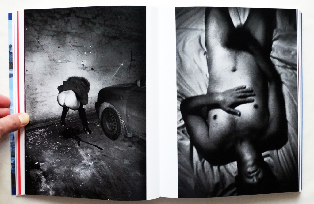
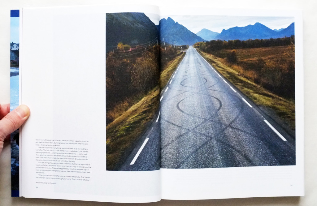
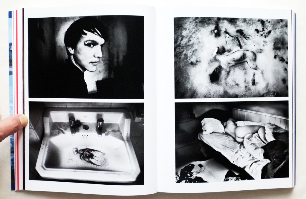
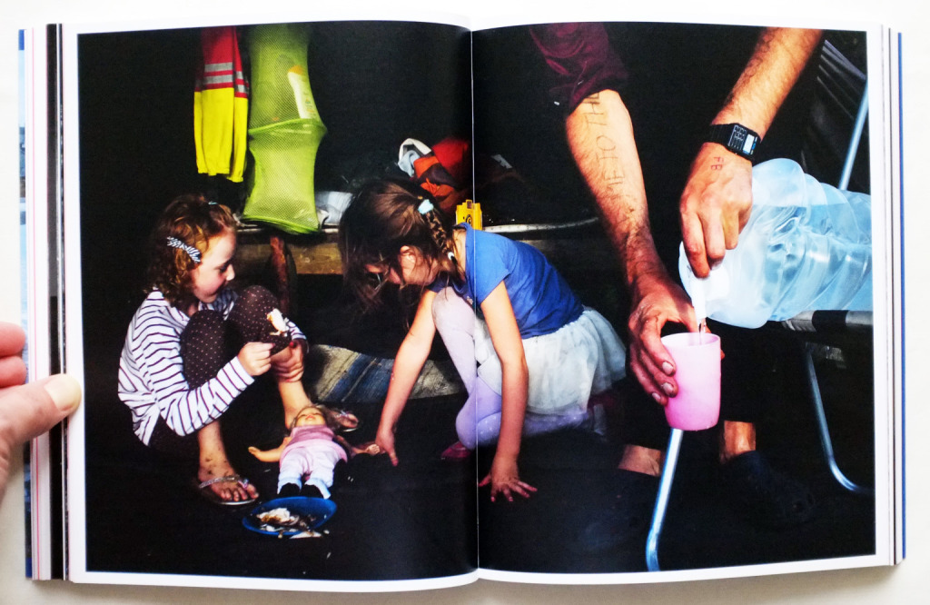
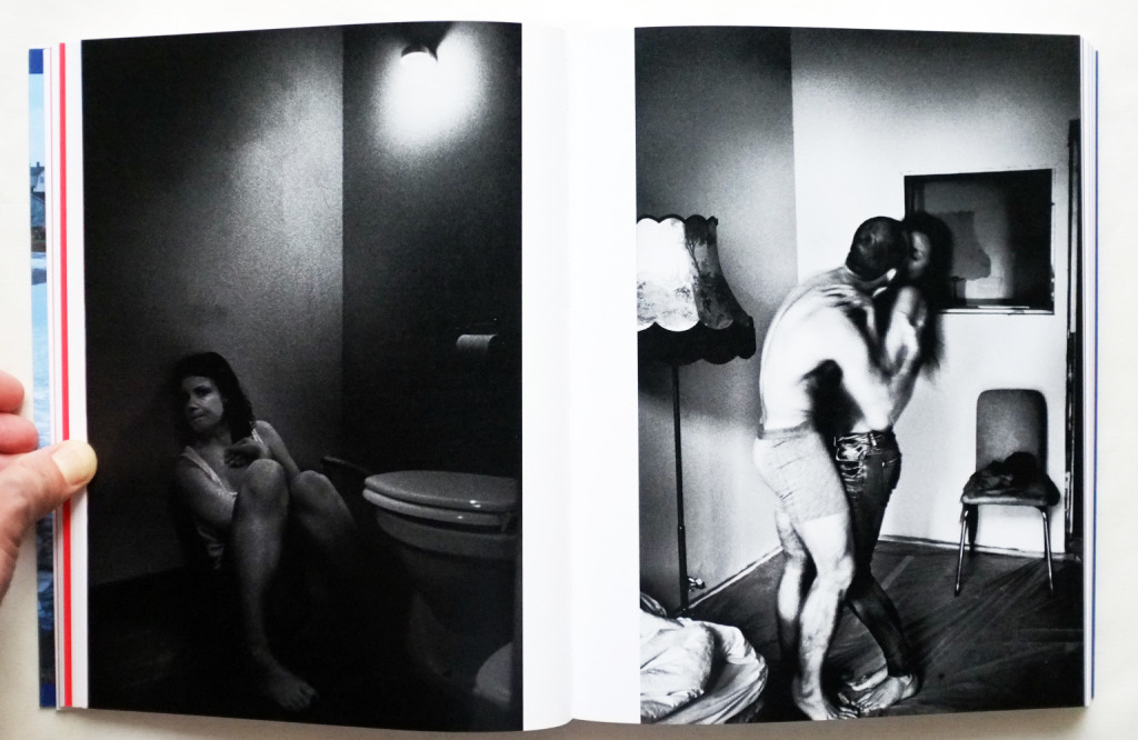
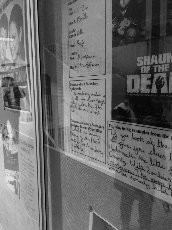
The Journal of Norwegian Photography is a collection of many different photographers who all focus on different subject matters so the subjects varies continuously throughout the book. I think, in short, I agree with what the new york times said, that the book "demonstrate how the search for objective truth cannot escape the filters of subjective perception. " All of the photographers in this collection of work have all captured honest, truthful, moments in either their own lives or the lives around them and presented them without needing to explain them and allowing the readers to create their own meaning and opinions on the work. I believe that each artist chose a different photo layout so there isn't a specific layout to identify that runs throughout the book. The design used for the cover of this book is quite simple and goes a small insight into what to expect from the book but it also doesn't give much away about the book either as it is so simple.
The book has an interesting layout as it has been sectioned off into the individual artists but then doesn't follow a specific pattern other than the requirements of the photographs themselves and the composition that they further require to add to them. Even with this in mind, the photographs in this volume are certainly effective and are made to stand out even if you don't think they have, when you flick through there are certain photos which you notice quicker than other due maybe the crude nature that the artist has chosen to taken them with or the quality of the photo as some are clearly done with film and have more grain to them whereas others are most likely digital because of their high clean quality.
The photographic styles and techniques also vary because of both that its multiple artists but also because of the different subjects each photographer has decided to focus on whether it be portraits or objects, each artist has chosen a specific style and technique which benefits their photos and which helps make this volume enjoyable and unique.
The photographic styles and techniques also vary because of both that its multiple artists but also because of the different subjects each photographer has decided to focus on whether it be portraits or objects, each artist has chosen a specific style and technique which benefits their photos and which helps make this volume enjoyable and unique.
I personally find the overall impact of this book extremely moving. There isn't just one specific feeling being evoked when reading this book and you aren't given the chance to analyse each feeling because with each page and chapter and artist, there is a new feeling being portrayed along with a new subject and a new theme. I believe that the artists of this book did not just want one overall feeling after the book has been read, but many different opposing feelings as the book has chapters of an intimate and gentle nature but then also has chapters and themes that are brutal and honest which can be extremely shocking to see at first.
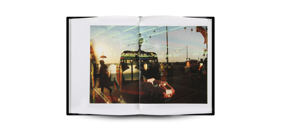
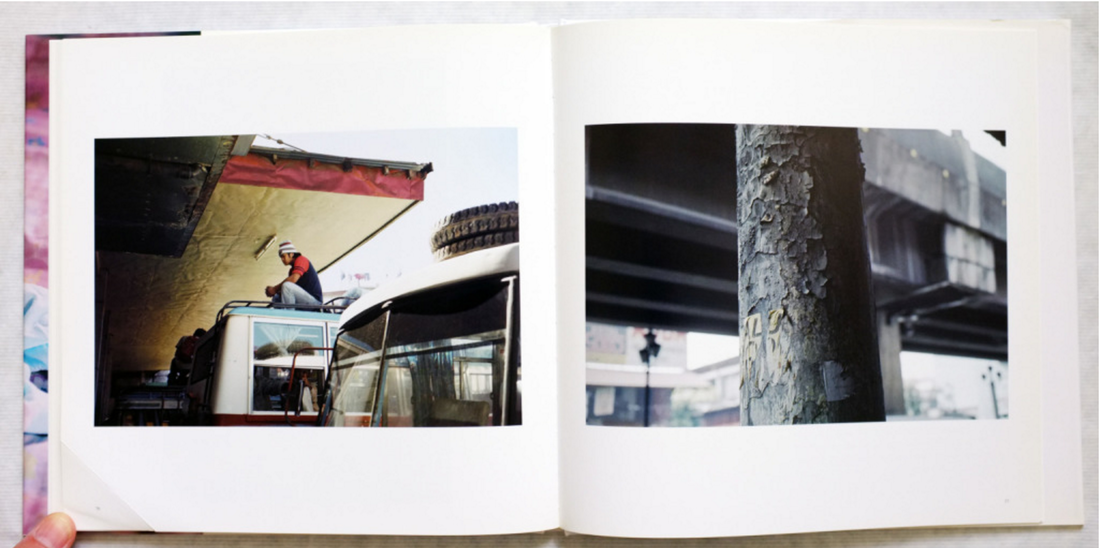
Shuichiro Shibata - Bus Stop バス停留所
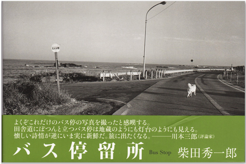
Shuichiro Shibata is a japanese photographer who photographed nostalgic scenery featuring the bus stop. The books concepts begin when Shibata was travelling around Japan and noticed the bus stops and the nostalgia that followed them. The actual subject of his book isn't just the bus stops but the nostalgia that follows with the bus stop and the isolation that he has witnessed around the bus stops.
When looking at the cover photo of this photo book, I find it extremely powerful and emotive as it gives you an insight into the book and what to expect from the book.The image itself is pretty interesting as it is a photo in his style but still isn't shocking or surprising while still maintaining the interesting nature of his work and what Shibata is trying to portray within his photo book. I personally think that the placement of the text distracts from the cover photo but it's pretty simple too as it is the only significant amount of text throughout his photo book.
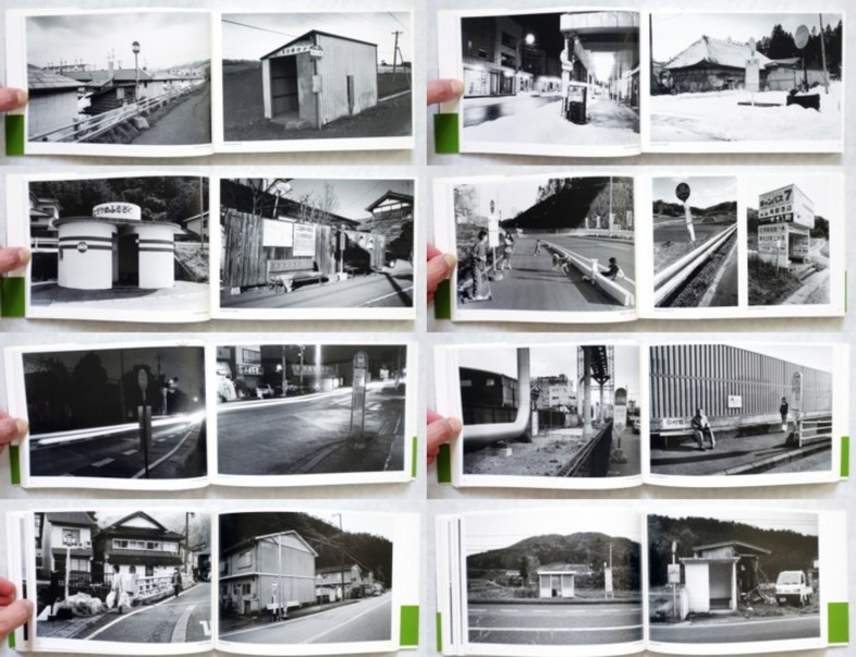
The collection of photos in this book stand out in a way that is hard to explain and overall they are effective and I, personally, feel that they do communicate Shibata's intentions and feelings. Initially, the body of work just seems to be a regular typology of bus stops but when further analysing the photos and the book itself, it becomes clear that Shibata is communicating his own personal feelings due to the personal and the fact that attention to detail has been thought about deeply such as the angle of the photographs, the lighting and the subjects that are in the frame which relate to the subject and can communicate Shibata's intentions, thus making these photographs very meaningful. The photographs on a whole stand out because of their typological nature because this allows for the small amount of variation and difference to stand out immensely because the content does depend on the time and event of the photograph.
The collection of photos in this book stand out in a way that is hard to explain and overall they are effective and I, personally, feel that they do communicate Shibata's intentions and feelings. Initially, the body of work just seems to be a regular typology of bus stops but when further analysing the photos and the book itself, it becomes clear that Shibata is communicating his own personal feelings due to the personal and the fact that attention to detail has been thought about deeply such as the angle of the photographs, the lighting and the subjects that are in the frame which relate to the subject and can communicate Shibata's intentions, thus making these photographs very meaningful. The photographs on a whole stand out because of their typological nature because this allows for the small amount of variation and difference to stand out immensely because the content does depend on the time and event of the photograph.
The layout of the book doesn't incorporates many different styles but they do display a focal point throughout the book. The photos are all slightly off centre leaving an extra margin at the bottom and near the spine of the book. There is no variation in the layout of his images and there is a consistency of how they are laid out on the page; due to the layout being of this nature, it is far from haphazard.
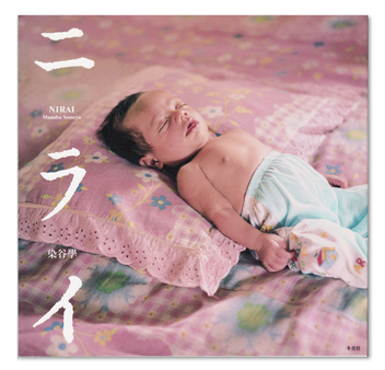
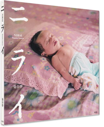
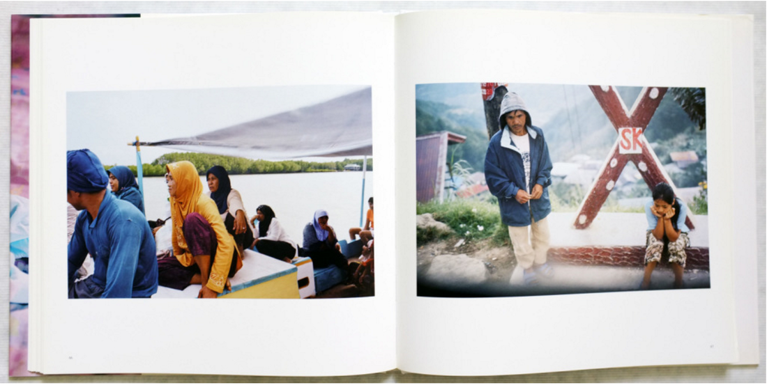
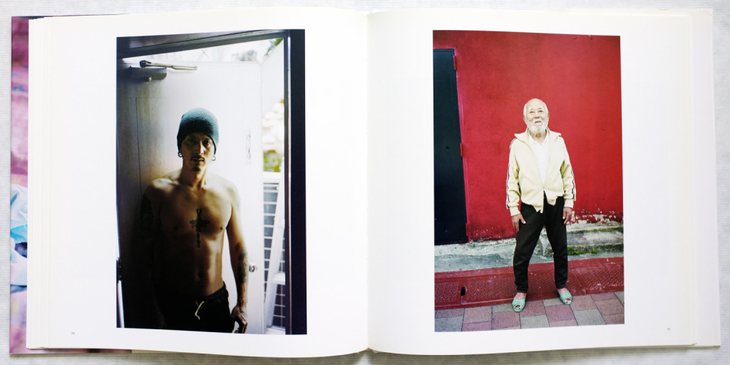
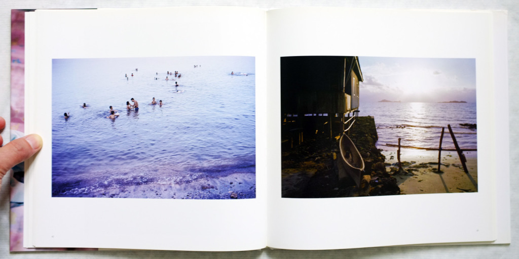
Manabu Someya - Nirai
|
|
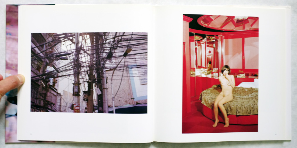
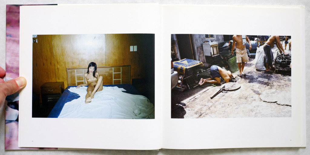
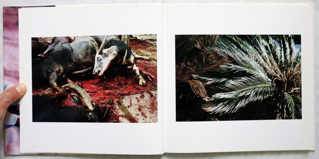
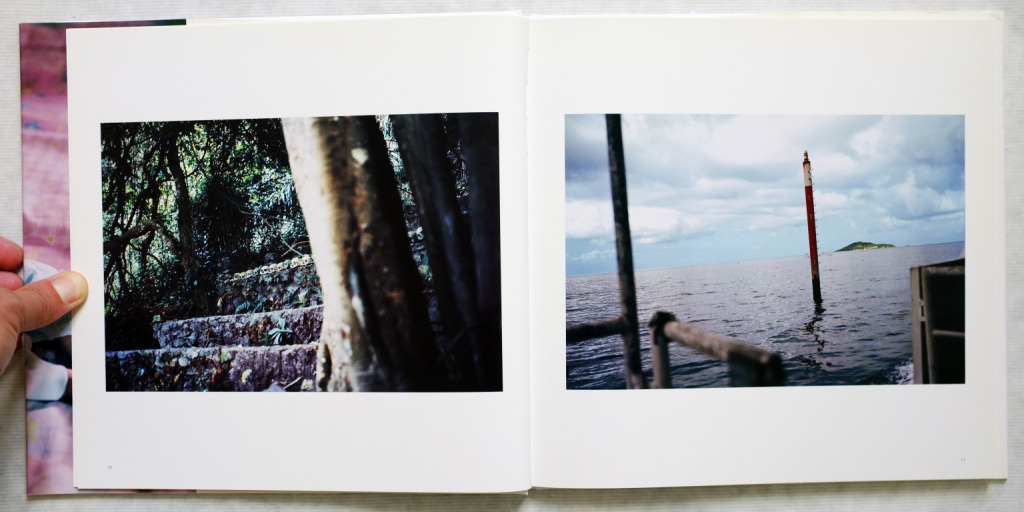
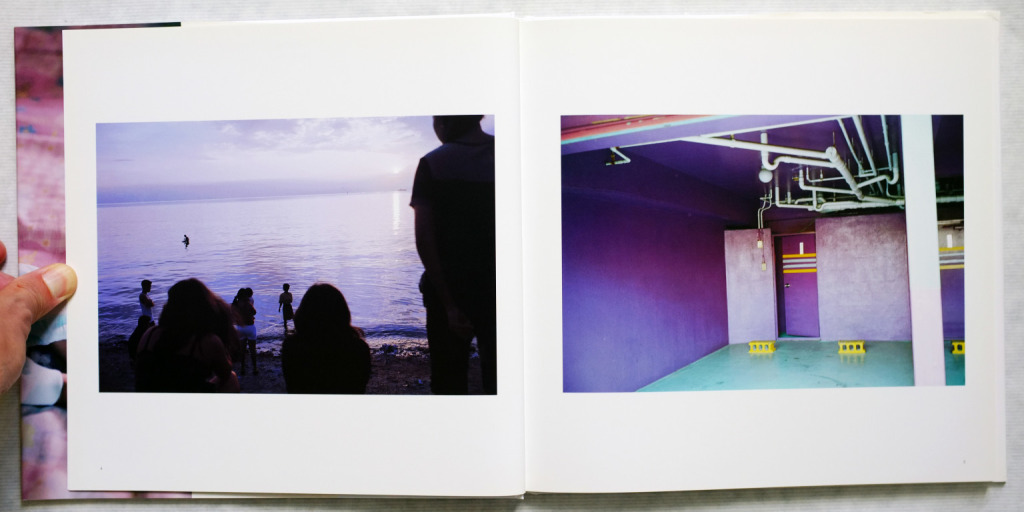
Manabu Someya, born 1964, Chiba prefecture. He attended Nihon University College of Art, majoring in photography. In my opinion, the book is about bringing us closer to life and death I believe that he is concentrating his views on Asia and Okinawa. The book is an attempt at a perspective on life and death.
When looking at Manabu Someya’s photographs in his book Nirai, I knew that I was instantly attracted to them and they appealed to me from the beginning. I believe the collection of photographs stand out due to the beautiful warm and brownish colour palette that Someya has decided to use to give signs that earth and vegetation set an important fundamental tone to the book in itself. These help the book to stand out from other books and work that is about life and death because it plays on our mind that nature is the closest thing to life and death that we have and it exists all around us. Where Someya has chosen to take his photographs and set them is in a climate and area where no matter what, life is going to thrive and exist constantly; Vegetation will grow quickly and the trees and bushes carry fruit that can become the basis of new life, just by dying. Looking at the photographs deeper, the style and technique do suit the subject matter and nature of the book as it has a raw feeling yet it is clean and enhances all the features of all the photographs, giving them a round about feeling that lets you experience life and death in it's fullest.
Each image has been laid carefully on the pages; central to the page, regardless of whether it is landscape or portrait. It's clear that consideration and a visible logic has been put into the page layouts and presentation of the photographs, especially the double-spread layout as the colours in the photos usually correspond to each other tying them together, and if not the colours then the formal elements of the photographs such as lines, tones and contrast and the subjects in the photographs such as people or nature. Other than the cover page, the book doesn't have any additional text or information on the images and as there are no captions with the images, we are left to realise ourselves that what we are seeing is Taiwan, Indonesia, The Philippines and Okinawa, but visually due to the composition and nature of the photographs, they are so well linked that any captions would have only been a distraction to the photographs and would've drawn away the attention to detail needed for the images. Although, it is clear that consideration has been put into the title of the book due to it's placement to avoid interfering with the cover image but yet to also make it stand out on it's own.
My first photo book response
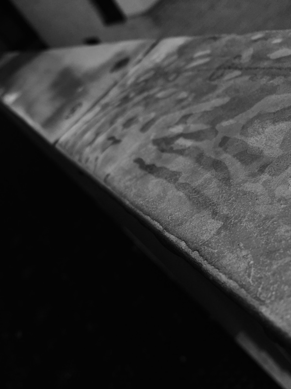
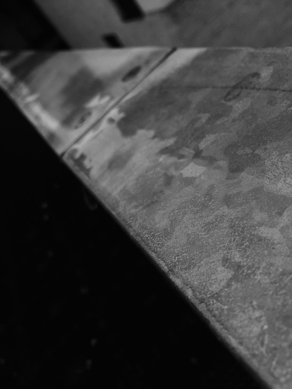
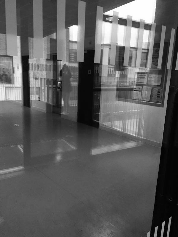
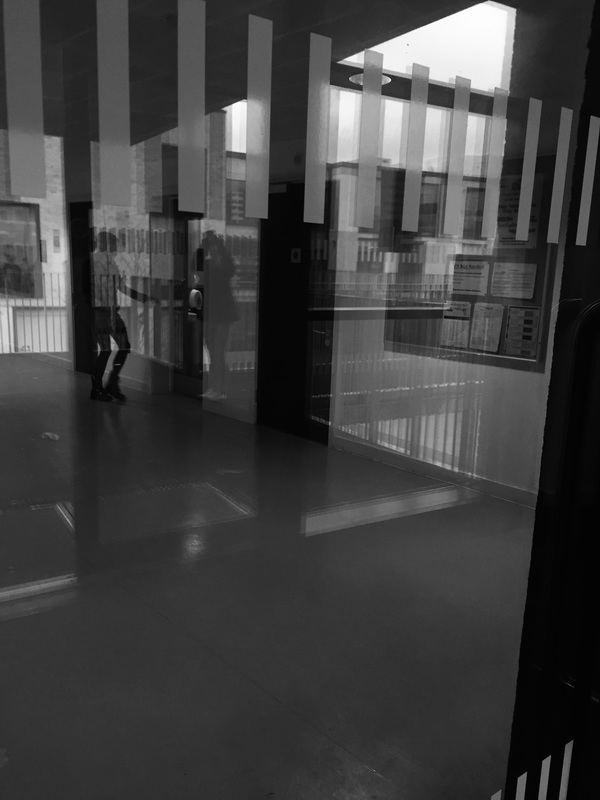
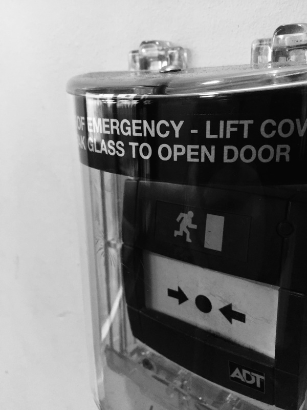
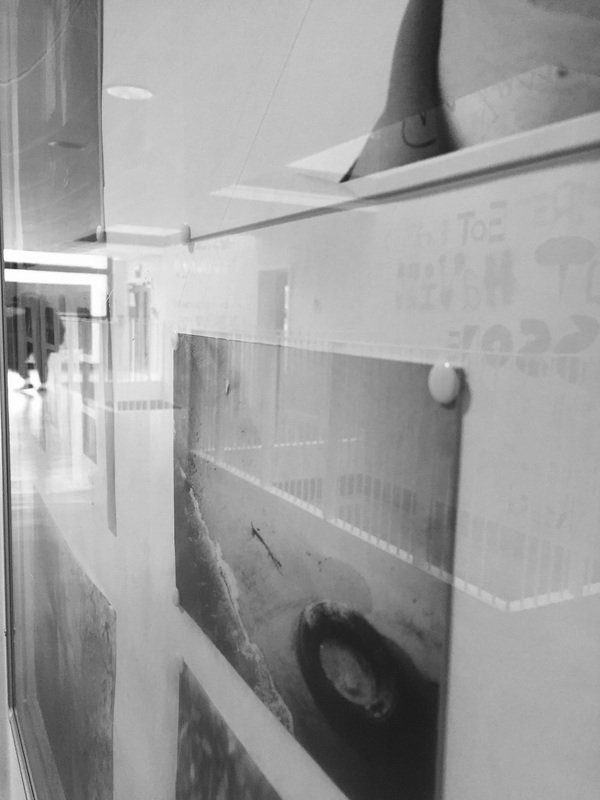

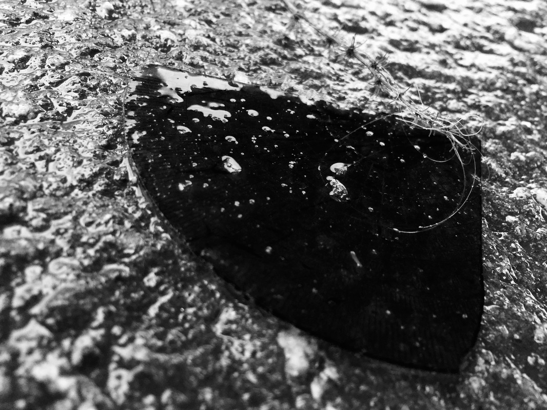
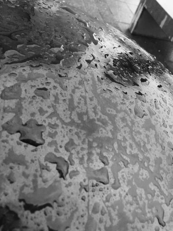

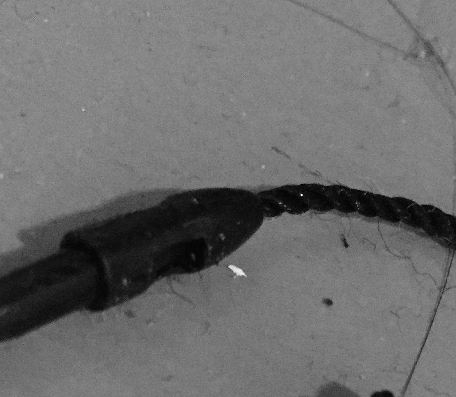
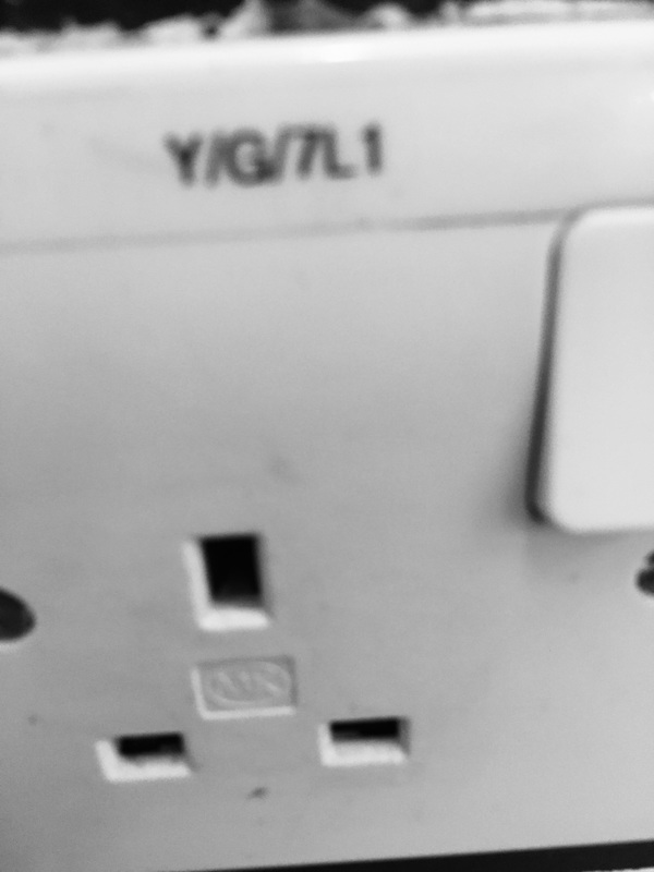

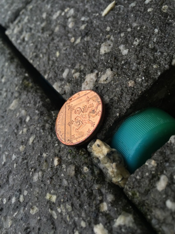
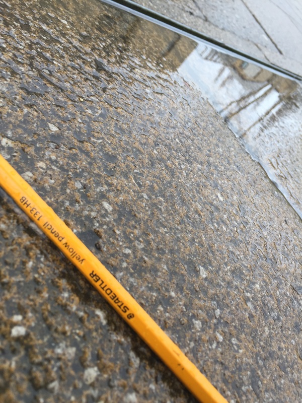
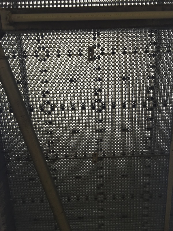
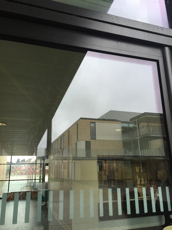
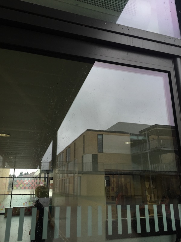

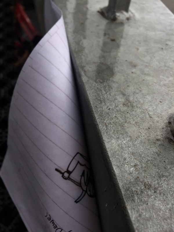
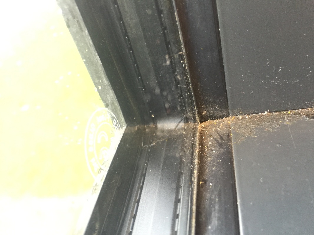
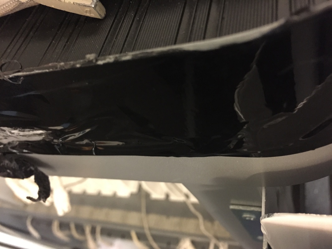

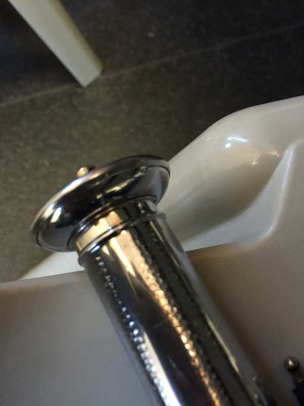
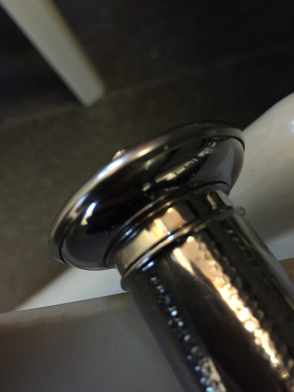
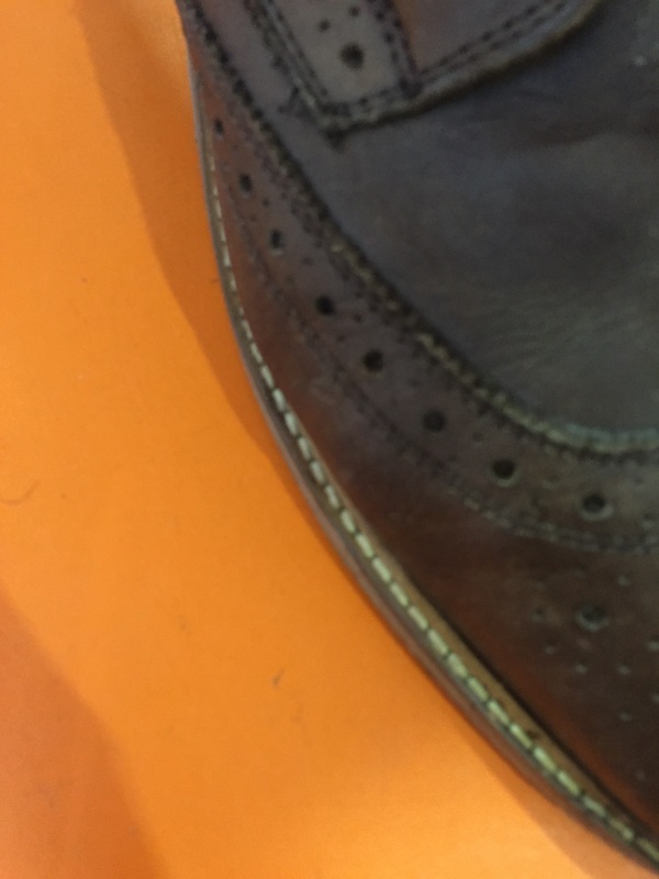
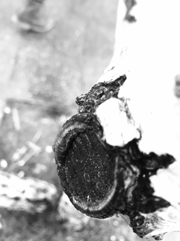
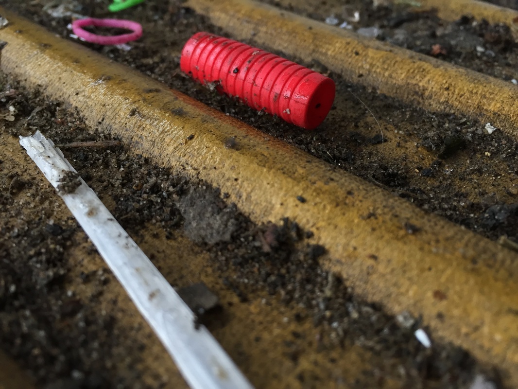
When i took these photographs, I focused on the formal elements of lines and and texture. At first, I found this task particularly difficult because I couldn't decide which formal element I wanted to experiment with but I found that once I had decided on line and texture, I was a lot more comfortable with the photos that I was taking. I believe this is evident in black and white photographs, which are the ones I had taken a few shots into the task.
I am really happy with the outcome of this task as it has helped me become more comfortable photographing things in a more unique kind of way and helped me to understand the importance the formal elements a bit more as I can see side by side, the difference in quality of the photographs between the ones where I was less comfortable and a lot more unsure compared with the ones where I felt like I had more of an understanding of what I was doing.
Looking at my photographs, even though I am happy with the outcome there is a few things I would change to help gain a better perspective and understanding of the formal elements. Firstly, I would focus on just one formal element at a time so that I am really able to capture them in a more obvious way and to prevent the photographs from being overwhelming, although I wouldn't purposefully exclude the other formal elements completely; secondly, I would've tried to take even more photographs and include a range of styles of taking the photographs. Additionally, I would like to try this experiment with film to see how the different medium changes the overall feeling of the response photographs.
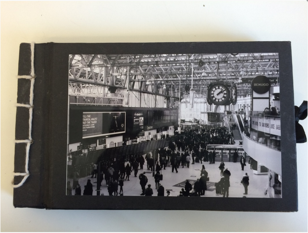
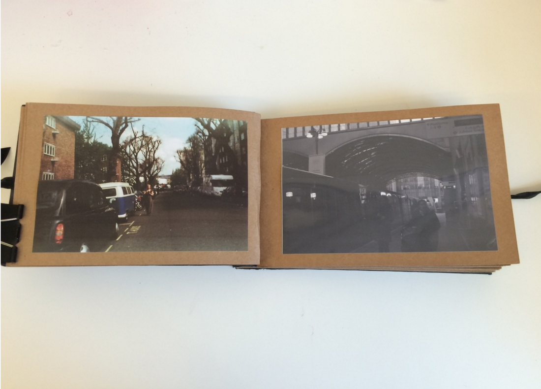
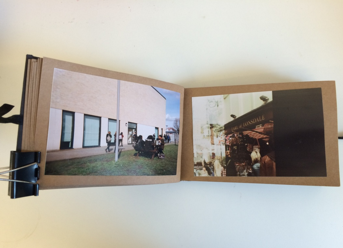
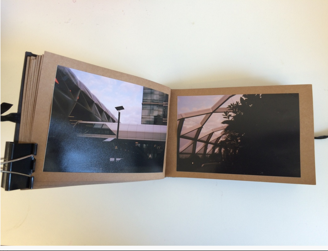
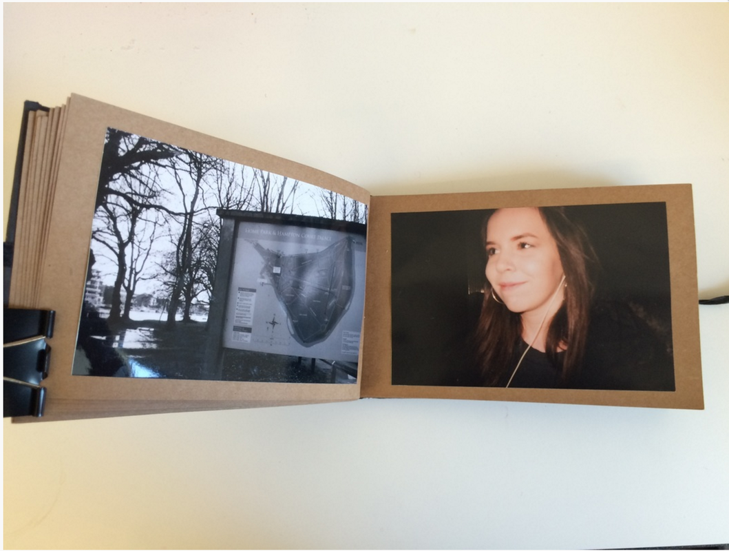
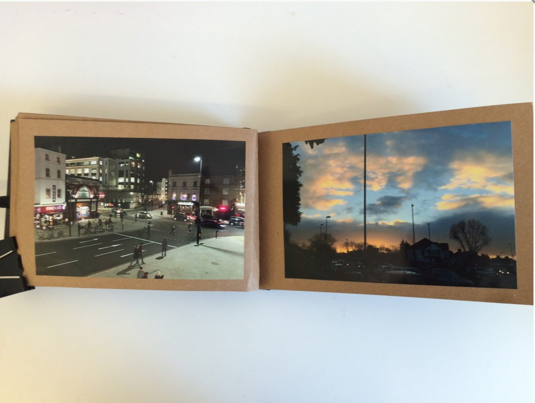
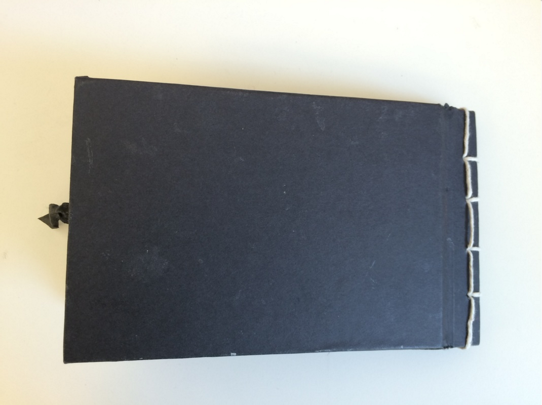
My Mock Photobook
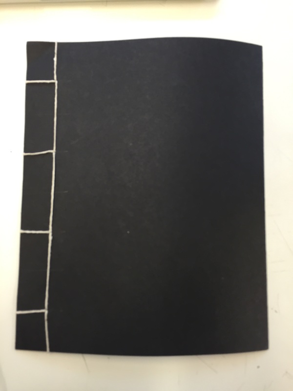
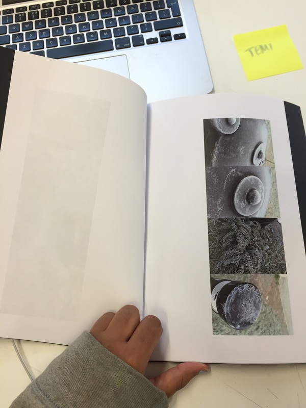
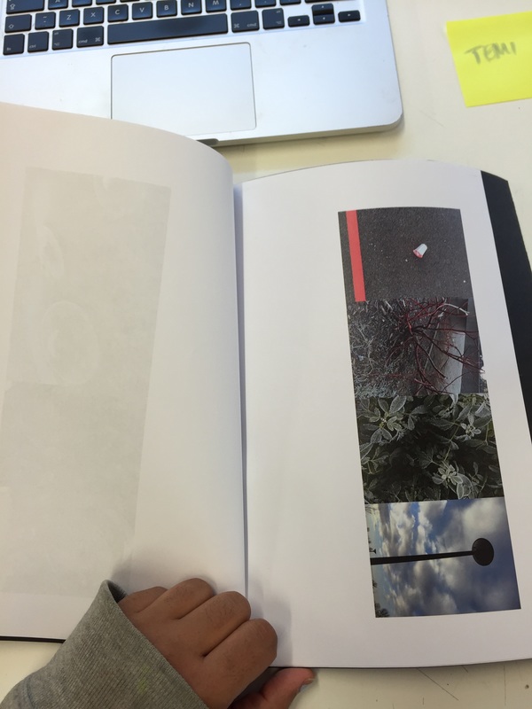
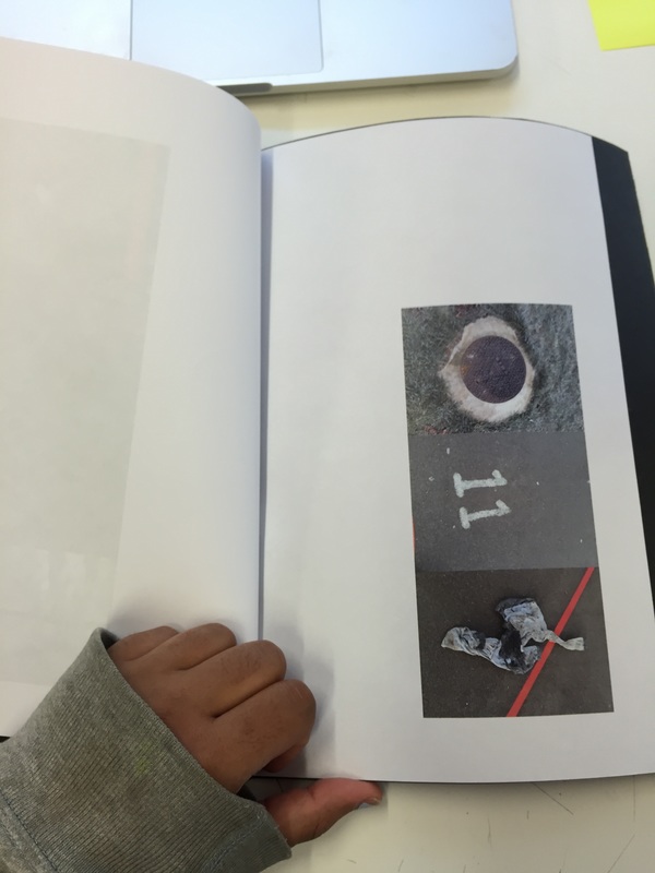
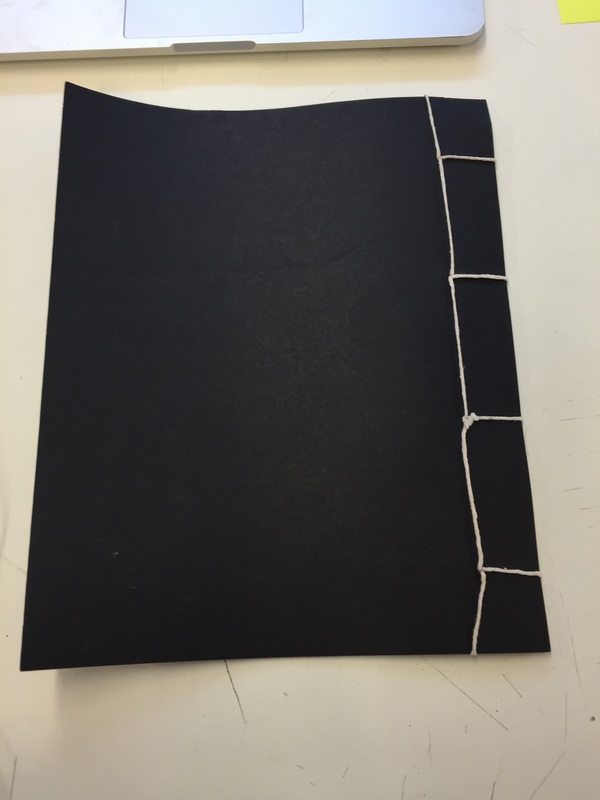
By doing a mock photo book, I decided that I make my own book and that I liked the idea of Japanese book binding. However, I did not like the large A4 size of the book and then decided I wanted it hard back. I took photographs around school and created pages that linked through their formal elements of light, line and contrast. I don't like the size of this mock book because it looks clumsy and creates too much space so draws away from the photographs. Additionally, I don't like how think the binding is on this book and would have preferred to use a thicker binding material. I like the empty space around the photographs but also like the idea of possibly doing full bleed images in my photo book, however I may not do this as I would also prefer to use the original prints.
Final Photobook
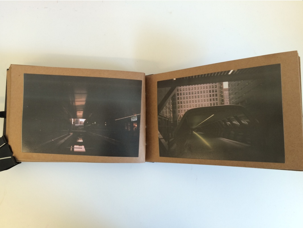
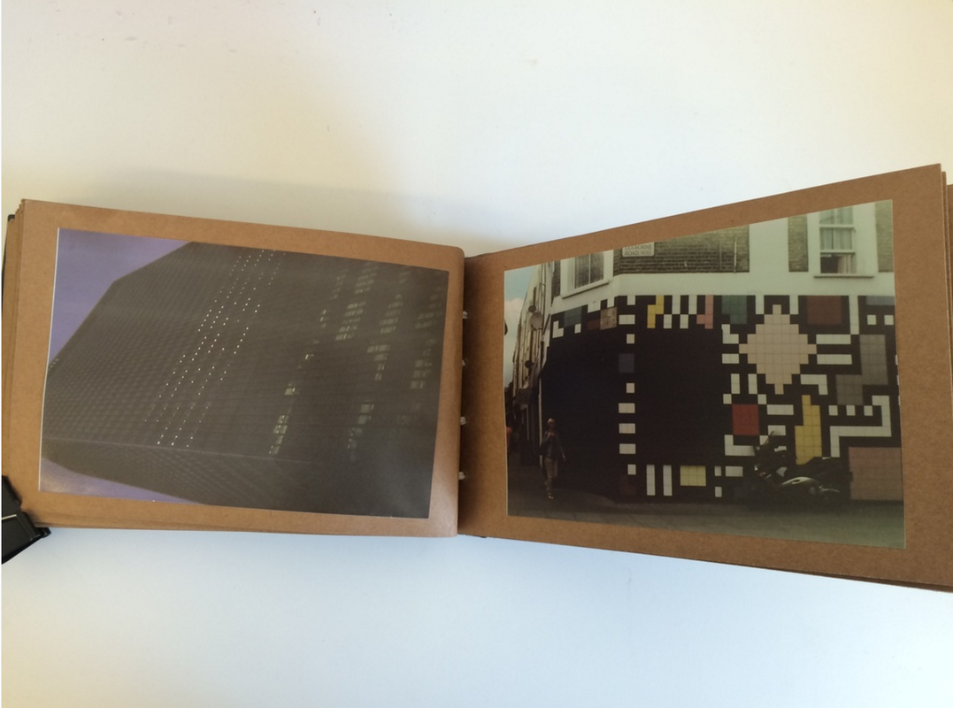
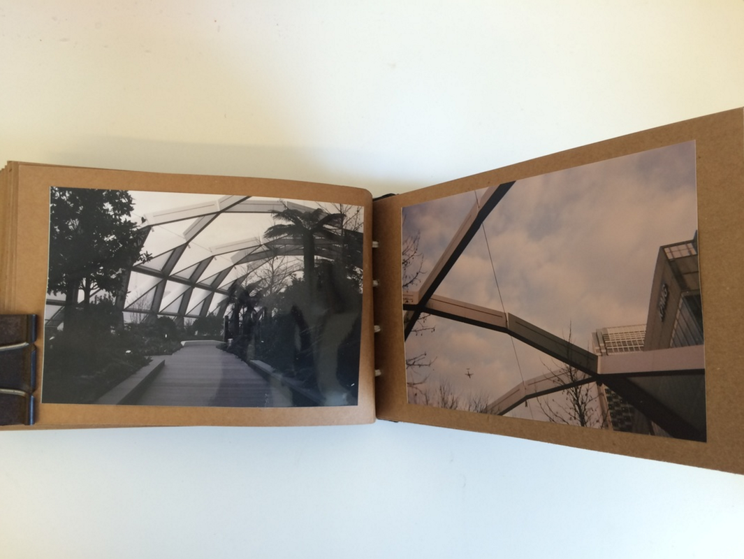
I began this project by researching a range of artist's work and the ideas behind their work such as Chris Steele-Perkins, Shuichiro Shibata and Manabu Someya. When looking for artists I used Josef Chladek bookshelf and also the photoPedagody photo book resource. These resources were extremely useful as they both were very detailed and the Josef Chladek bookshelf resource had hundreds of books online, allowing me to go through as many as I wanted and allowed me to visually see the artist's work. When studying their work, this resource allowed me to explore their work in more depth. I found that each artist had a different style, method and idea behind the concept of their books; Steele-perkins focused on the meaning of life and journeys and events that people go through during their life, how this influences them and how pleasurable life is to them, whereas Shibata, in contrast, focused on one single subject of bus stops but in different places throughout Japan and solidarity that accompanies them. I decided that researching these two were a good choice of artist's because they focus on two completely different concepts and themes, allowing me to explore more options for my own personal choice; they also helped me to understand the formal elements and the threshold concepts and how to utilise them to gain the best results from my photographs and my book in general.
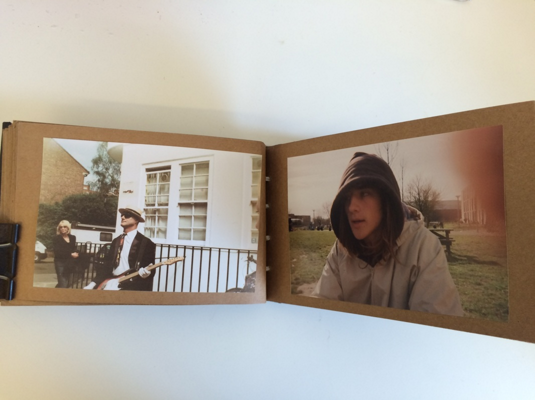
The work of Chris Steele-perkins really helped me to shape my project into one that was more personal and specific to my life which allowed the reader a deeper yet simple look into my life. When I first decided that I wanted a more personal theme rather than something broad or about other people. I chose to give myself less boundaries when saying that I wanted a more 'personal' theme as I felt that this wouldn't limit me a lot in comparison to if I had a specific theme about other people or an issue that I wanted to focus on. I prevented myself from being limited by addressing the threshold concepts 5, 7 and 8 (that cameras see the world in a different view than the way that we see it with our own eyes, that chance plays a very significant role in photography and that the meanings of photographs are never fixed). Threshold concepts (TC) 5 and 7, specifically, enables me to take photographs which I feel have more meaning and a deeper representation of my life. When exploring TC 5, I discovered that I was able to create connections and relationships between objects and subjects in my daily life that would never have been noticed if you just looked at what I was photographing in real time.
This allowed me to discover that my theme and concept play a very big part of the meaning and nature of my book, because of this, I was able to decide on the theme of life experiences and journeys. I felt that this was personal enough that I would be able to feel a passion for my work and also a connection to it but also that it allowed me to look at other people and their lives and document those as well because I find that is more interesting than just looking at your own life without taking into consideration of the influences around you.
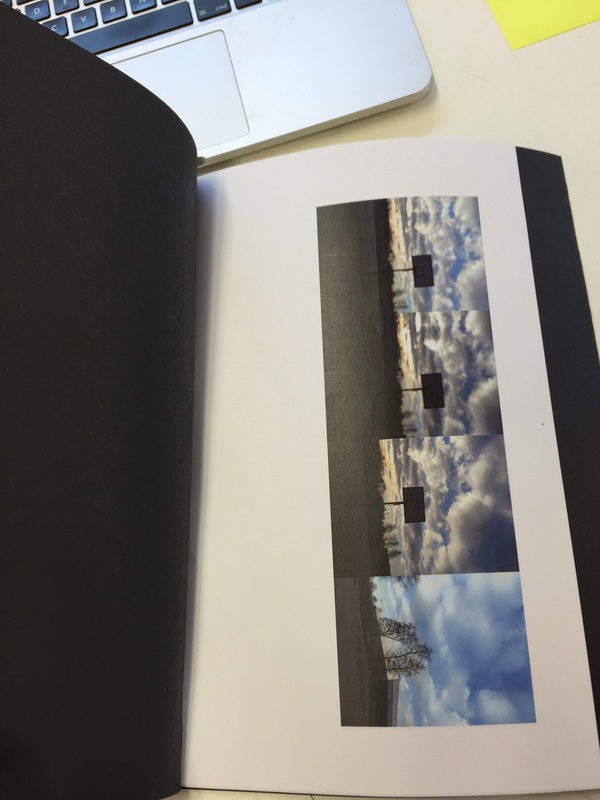
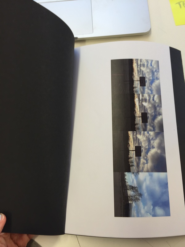
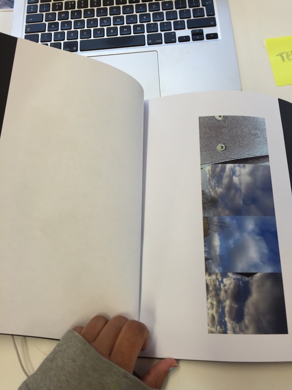
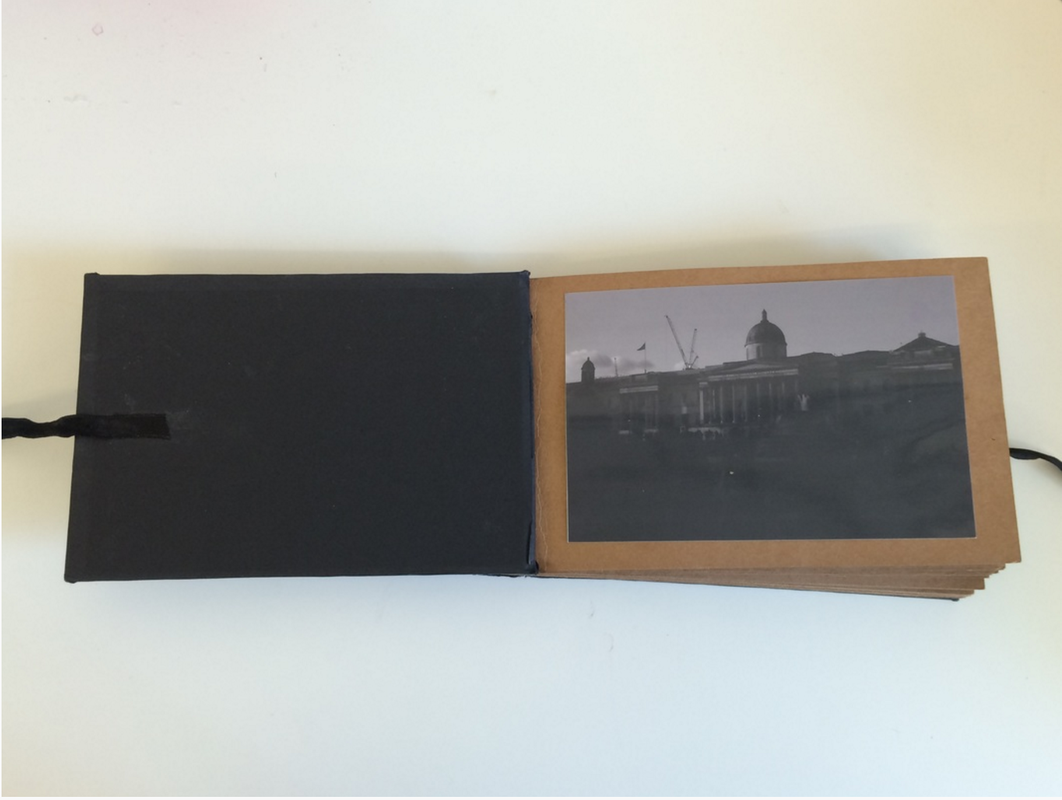
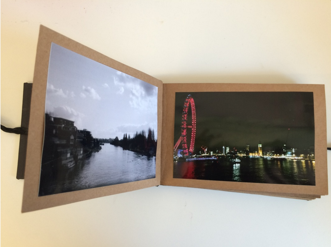
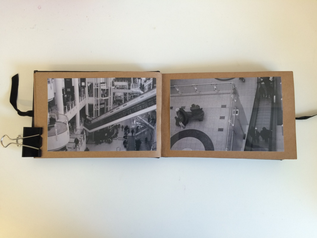
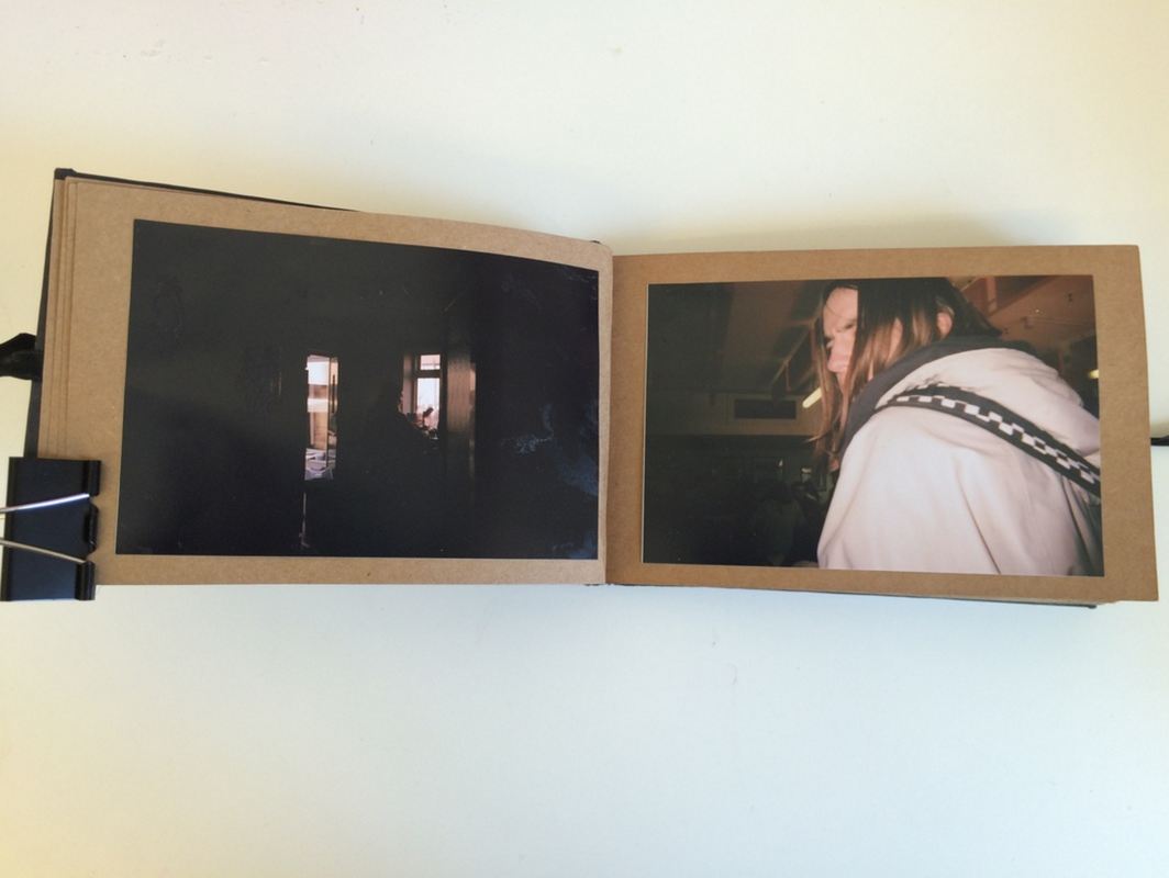
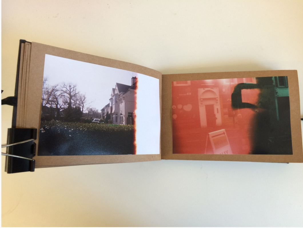
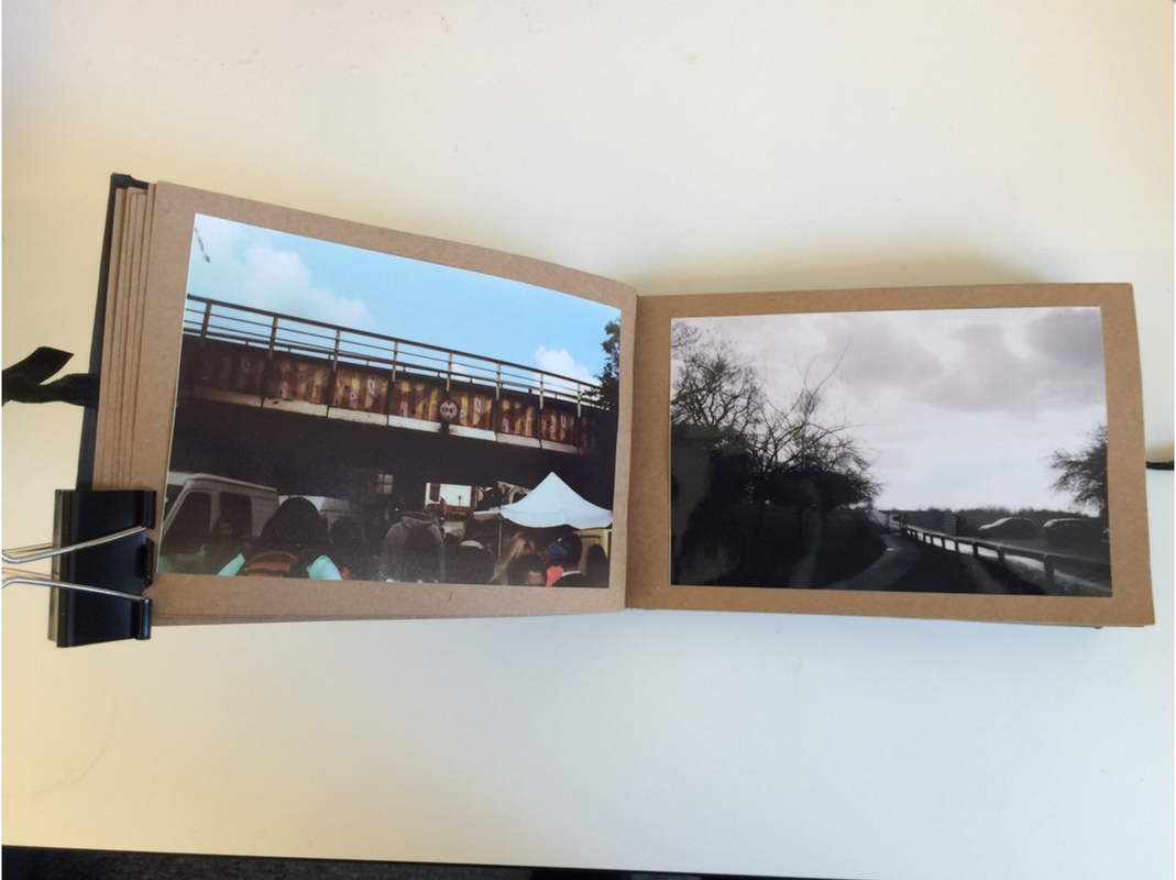
As I was experimenting with different mediums such as film and digital, I decided that I would prefer to make the book than get a published book made as I felt that I would be able to display and show off the differences between the mediums better if I made the book; not only that, but I felt that by making the book myself, it helped to express a more personal aspect which I had running through the book as it was more about my life and a personal life journey than journeys in general. I personally am happy with the outcome of the handmade book, but I would like to see how the book would turn out if it was professionally published and made. Although I like the overall outcome of my book, I found it challenging working with certain types of film such as the disposable camera's as they are more unpredictable than normal film cameras and there is even less control than with an ordinary film camera. In addition to this, I found the technique of developing the film also very challenging and it took me a long time and plenty of patience to make real progress, even after the practice, I still was not pleased with the outcome of the prints, so this then encouraged me to get the prints done in a shop.
I chose to create a handmade photobook as my photobook was a documentation of my journey and my life so by hand making my book, I felt that this created a more personal and emotional connection between my book and the photographs in it; by hand making my photobook it added another layer of the journey to the book along side the images. I also did not like the idea of a published book as I feel that sometimes they take away from the photographs and reduce them to mass produced images rather than one off originals that are timeless. I also have an aesthetic attraction to hand made, hand bound books as I find them a lot more interesting to read and look at.
I am pleased with my final outcomes because they represent how I feel about the theme of personal journeys as each an every photograph was personal to me and the journeys that I had been through whether it was a physical journey from one place to another or the journeys I made emotionally over the course of several months. If I were to do this project again I would consider making a published book with a variety of digital and film media to compare the differences in the overall outcome, however I do not feel the need to redo this project any time soon as I am pleased with the outcome. I feel that my journey comes across and it does make the reader want to pick it up and read it again. I think that my photobook has a lasting impact on the reader which encourages them to think about their own personal journeys and how their journeys are impacting their life as long as those around them. However, regardless of how pleased I am with my outcomes, there are a few minor improvements I would make, for example I would have preferred all my photographs to be matte as I personally prefer the feeling of matte photographs and also believe that they are more durable. Additionally, I would use a different material to create my cover and back of my book that gave it a more professional feeling and decreased imperfections such as tearing or the need for additional gluing.
The work of Chris Steele-perkins really helped me to shape my project into one that was more personal and specific to my life which allowed the reader a deeper yet simple look into my life. When I first decided that I wanted a more personal theme rather than something broad or about other people. I chose to give myself less boundaries when saying that I wanted a more 'personal' theme as I felt that this wouldn't limit me a lot in comparison to if I had a specific theme about other people or an issue that I wanted to focus on. I prevented myself from being limited by addressing the threshold concepts 5, 7 and 8 (that cameras see the world in a different view than the way that we see it with our own eyes, that chance plays a very significant role in photography and that the meanings of photographs are never fixed). Threshold concepts (TC) 5 and 7, specifically, enables me to take photographs which I feel have more meaning and a deeper representation of my life. When exploring TC 5, I discovered that I was able to create connections and relationships between objects and subjects in my daily life that would never have been noticed if you just looked at what I was photographing in real time.
This allowed me to discover that my theme and concept play a very big part of the meaning and nature of my book, because of this, I was able to decide on the theme of life experiences and journeys. I felt that this was personal enough that I would be able to feel a passion for my work and also a connection to it but also that it allowed me to look at other people and their lives and document those as well because I find that is more interesting than just looking at your own life without taking into consideration of the influences around you.
As I was experimenting with different mediums such as film and digital, I decided that I would prefer to make the book than get a published book made as I felt that I would be able to display and show off the differences between the mediums better if I made the book; not only that, but I felt that by making the book myself, it helped to express a more personal aspect which I had running through the book as it was more about my life and a personal life journey than journeys in general. I personally am happy with the outcome of the handmade book, but I would like to see how the book would turn out if it was professionally published and made. Although I like the overall outcome of my book, I found it challenging working with certain types of film such as the disposable camera's as they are more unpredictable than normal film cameras and there is even less control than with an ordinary film camera. In addition to this, I found the technique of developing the film also very challenging and it took me a long time and plenty of patience to make real progress, even after the practice, I still was not pleased with the outcome of the prints, so this then encouraged me to get the prints done in a shop.
I chose to create a handmade photobook as my photobook was a documentation of my journey and my life so by hand making my book, I felt that this created a more personal and emotional connection between my book and the photographs in it; by hand making my photobook it added another layer of the journey to the book along side the images. I also did not like the idea of a published book as I feel that sometimes they take away from the photographs and reduce them to mass produced images rather than one off originals that are timeless. I also have an aesthetic attraction to hand made, hand bound books as I find them a lot more interesting to read and look at.
I am pleased with my final outcomes because they represent how I feel about the theme of personal journeys as each an every photograph was personal to me and the journeys that I had been through whether it was a physical journey from one place to another or the journeys I made emotionally over the course of several months. If I were to do this project again I would consider making a published book with a variety of digital and film media to compare the differences in the overall outcome, however I do not feel the need to redo this project any time soon as I am pleased with the outcome. I feel that my journey comes across and it does make the reader want to pick it up and read it again. I think that my photobook has a lasting impact on the reader which encourages them to think about their own personal journeys and how their journeys are impacting their life as long as those around them. However, regardless of how pleased I am with my outcomes, there are a few minor improvements I would make, for example I would have preferred all my photographs to be matte as I personally prefer the feeling of matte photographs and also believe that they are more durable. Additionally, I would use a different material to create my cover and back of my book that gave it a more professional feeling and decreased imperfections such as tearing or the need for additional gluing.
